Back to Web Design Glossary

What Is a Hero Image?

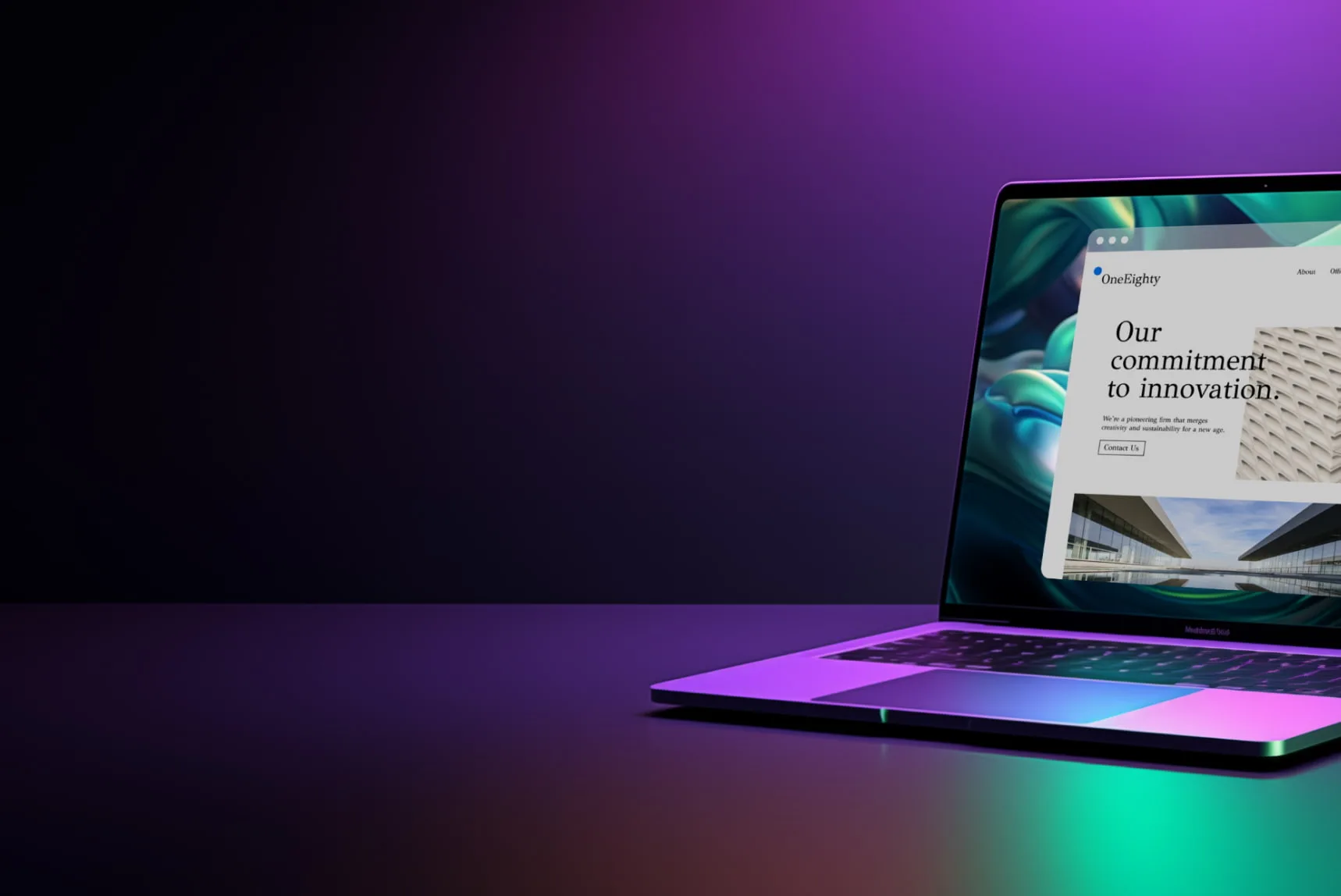
A hero image is the large photo, illustration, or video featured in a hero section: a prominent block at or near the top of a webpage, often spanning the full width. The hero section (also called a hero header) typically combines a headline, supporting text, a call-to-action button, and the visual.

More About Hero Images

A hero section sits at or near the top of a page, most often a website's homepage, usually spanning the full width and filling much of the space above the fold (the part of the page visible before scrolling). The hero image is the visual inside that container. Together they give the page a single focal point: one image, one message, one action.

That prominence is a trade-off, not a free win. A strong hero guides visitors toward the action you want them to take, but the more visual weight the image gets, the less attention the navigation and other page elements receive. Nielsen Norman Group documented the effect in 2014: on Southwest Airlines' image-focused homepage, the top navigation links were small with no background color, and the flight search, the page's core function, sat several inches down the page, where many users wouldn't even see it without scrolling.

Anatomy of a hero section

A hero section combines up to 4 parts:

Wireframe of a webpage's first viewport showing the hero section: a navigation bar at top, then a full-width hero image serving as background for a headline, a subheadline, and a call-to-action button, with a dashed fold line marking where visible content ends before scrolling.
  • Headline: one line stating the page's main promise.
  • Subheadline: a short supporting sentence that adds context.
  • Call to action (CTA): the button for the one thing you want visitors to do next.
  • Hero image: a background photo, illustration, or short video. Not every hero section has one.

Every part competes with the others for attention. If an element doesn't support the one action you want taken, cut it.

Hero image size and file weight

There's no universal hero-image size. The right dimensions depend on how your design renders the image: the width of its container, the height of the hero, the aspect ratio those two create, and the crop each responsive breakpoint (the screen widths where your layout changes) shows. Find the largest size the image actually renders at, export to those pixels, and compress hard. Published recommendations only make sense with their use case attached:

  • Shallow desktop hero (a wide strip under the navigation): Crazy Egg's sizing guide (January 6, 2026) recommends 1600×500 pixels as the default and no smaller than 1200×400, a roughly 3:1 shape.
  • Full-screen desktop hero (fills the whole first viewport): Blocksy's WordPress image guide (April 1, 2025) sizes these at 1920×1080 and Optimizely says at least 1280×720, both the 16:9 shape of a desktop display.
  • Portrait mobile crop: Optimizely recommends about 800×1200 pixels, uploaded as its own file rather than the desktop image scaled down.

Whatever the shape, keep the file under roughly 500 KB, the ceiling Blocksy's guide sets for header images. Export to WebP, and crop rather than stretch when you change the aspect ratio.

When a hero goes wrong

The most expensive failure is weight. The hero image is usually the largest element in the first viewport, which makes it the page's Largest Contentful Paint (LCP) element: the metric that times how quickly a page's main content renders. Google's web.dev guidance (last updated March 31, 2025) calls 2.5 seconds or less a good LCP, so one unoptimized multi-megabyte image can fail Core Web Vitals on its own. Compress and resize the hero, preload it, and check your page load time after every image swap.

Two other failures show up constantly:

  • Unreadable text: light text over a busy photo disappears. Add a dark overlay or gradient behind the text and check the contrast.
  • Bad mobile cropping: a wide desktop image can cut faces or products out of frame on portrait screens. Preview the mobile crop before publishing, and upload a separate mobile version if your theme or builder supports one.

Hero image vs. banner

People use the terms interchangeably, but placement and job differ:

  • Hero image: the single large visual at the top of a page. It anchors the hero section that carries the page's main message and, usually, its primary call to action.
  • Banner: any wide image strip, often promotional or an ad. A banner can sit anywhere on the page, and one page can hold several.

When to use a hero (and when to skip it)

Use a hero when the page has one primary message and one primary action: product launches, landing pages, portfolios, and most homepages. Skip or shrink it when visitors come for dense content. On news sites, documentation, and dashboards, a full-screen hero only pushes the material people want below the fold.

If you're building one, decide first whether the product or the message is the hero. Product-led heroes put a large photo of the product itself under a short headline; Optimizely recommends the style for ecommerce and direct-to-consumer brands because it shows visitors immediately what's on offer. Message-led heroes flip the emphasis and sell the outcome: a bold headline and CTA button over a photo or plain background. For the full how-to, read our guide, Make Your Homepage Irresistible (Hint: It Starts With the Hero).

Frequently Asked Questions

Yes, but video is heavy. Keep the clip short, compressed, and muted: Chrome's autoplay policy (in force since April 2018) always allows muted autoplay and blocks most autoplay with sound. Show a static image on mobile instead, and set a poster image so visitors see something while it loads.
Design agency Foxxr's history of the hero image (July 21, 2023) traces the name to the theater's "hero prop": the extra-detailed prop built to be seen up close. Web designers borrowed it for the oversized image that gets the close-up spot at the top of a page.
No. Typography-only heroes, a bold headline and call-to-action button on a solid color or gradient, are a recognized style; Optimizely's glossary lists them as a way to lead with a key statistic or message. They also load faster than any photo, which helps Core Web Vitals.
Special Offer

Custom Website Design

Get a one-of-a-kind, mobile-friendly website that makes your brand truly shine. Share your vision with us and we'll take it from there.

Custom Web Design