
In less time than it takes to read this sentence, people have already decided how they feel about your small business.
Design does a lot of talking.
And color is core to that.
Shoppers aren’t shallow; it’s literally just psychology.
The right palette can instantly start building trust. It can make you recognizable and lodge you in consumers’ brains, creating loyalty.
The wrong palette, or an eleventh-hour change to the one you’ve chosen, can scare off customers — and they themselves may not even know why.
Are you a little scared, but also a little excited?
Then you’re in the perfect headspace to dive right into how to choose your brand colors well.
What Is a Brand Color Palette?
A brand color palette is a set of colors that you use consistently across everything that represents your business: website, social media, packaging, email templates, and marketing materials.
These colors are a deliberate visual system that creates recognition, signals your personality, and communicates your values at a glance.
For example, when you spot that familiar robin’s egg blue on a Tiffany & Co. box, you don’t need to see the logo. The color is the brand.
Consider the Psychology of Color
Colors aren’t neutral — heck, even “neutrals” aren’t really neutrals!
Colors carry emotional weight shaped by cultural conditioning and personal experience. These associations directly influence how people perceive your brand before they’ve consciously registered anything about it.
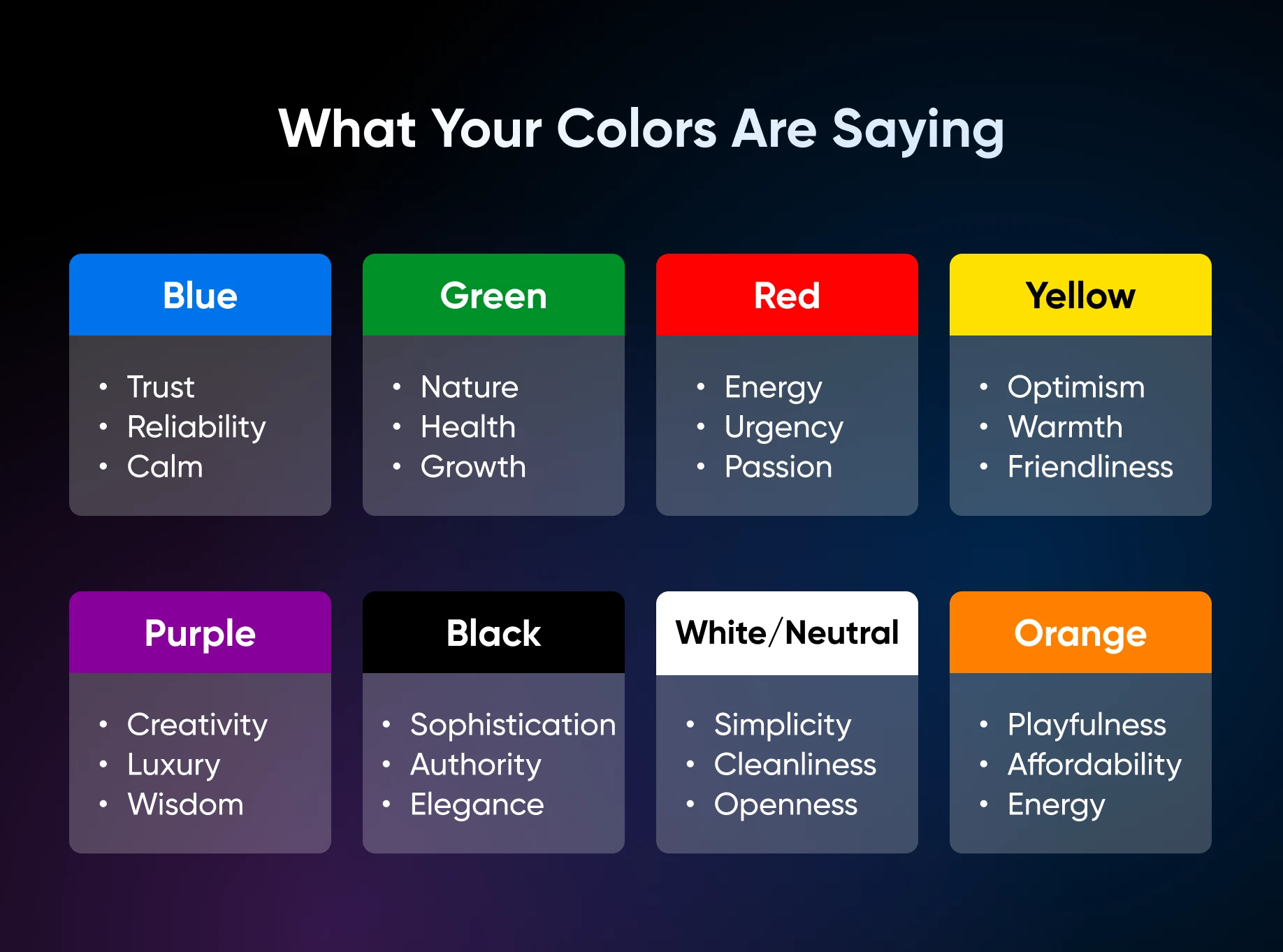
Here’s what your colors are saying before anyone reads a word:
- Blue: Trust, reliability, calm. Used widely in tech, finance, and healthcare.
- Green: Nature, health, sustainability, growth. Common in wellness, food, and eco-focused brands.
- Red: Energy, urgency, passion, appetite. A powerful action-driver, but use it sparingly — it can feel aggressive.
- Yellow/gold: Optimism, warmth, friendliness. Great as an accent; overwhelming as a dominant color.
- Purple: Creativity, luxury, wisdom. Often used in beauty and premium product categories.
- Black: Sophistication, authority, elegance. Signals premium and high-end positioning.
- White/neutral: Simplicity, cleanliness, openness. A reliable backdrop that lets other colors breathe.
- Orange: Playfulness, affordability, energy. Draws attention without the intensity of red.
Your colors should feel congruent with your brand personality and what your ideal customer is looking for.
Choose Your Colors
You don’t need a design degree to build a great color palette, ya need a process.
And you’re in luck, because next up is one that actually works for busy small business owners.
Step 1: Get Clear on Your Brand Personality
Before you get any further, answer these questions:
- What three words describe the feeling I want my brand to evoke? Go back to your values here if you’re stuck.
- What does my ideal customer need to feel to trust me and buy from me? Again, you can go back to any voice documentation you’ve created to brush up on your ideal audience.
- Are there brands I admire visually whose colors feel right for what I’m building? Go on Instagram or TikTok and look at your feed to save them to your swipe file.
These answers are your brief. Everything else flows from here.
Step 2: Start With One Anchor Color
Pick one color that best represents your brand personality from your Step 1 answers. This becomes your primary color, the one your audience will most strongly associate with you.
Most of all, don’t overthink it. Pick a color and live with it for a week to see how it feels. Ultimately, you can always pivot and refine later.
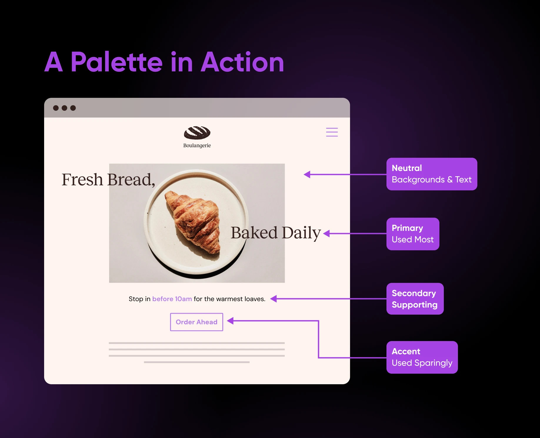
Step 3: Build Out a Palette of 3-5 Colors
To create a strong brand, you really only need three to four colors. Any more than this will dilute your brand identity and make it harder for customers to recognize you.
A functional palette typically includes:
- 1 primary color: Your dominant brand color, used most frequently (chosen above).
- 1-2 secondary colors: Supporting colors that complement your primary.
- 1 neutral: Usually white, cream, light gray, or black, used for backgrounds and text.
- 1 accent color: A bold pop used sparingly for buttons, highlights, and calls to action.
Consider your industry norms, but don’t feel locked into them.
Brands that want to stand out can reach for unexpected colors to signal innovation, while established brands emphasizing reliability may benefit from conventional, trust-evoking colors.
Step 4: Test Your Colors in Context
Colors look different on screen than they do in your head. Before committing, test your palette on actual designs — even a simple mockup of your website header, or a social media post template.
Our guide to website color schemes is a helpful resource for seeing how various palettes look in real website contexts, with 40 curated examples across different styles and industries.
Step 5: Record Your Palette With Hex Codes
Once you’ve landed on your colors, record the hex codes (six-character color identifiers like #F4A261) for every color in your palette.
These are the exact codes you’ll need from time to time when working with templates, designers, and printers.
Having them written down in one place means your colors will always be consistent, regardless of what tool or provider you’re using.
Focus on Accessible Color Combinations
Inaccessible color choices mean a portion of your audience literally cannot read your website.
Notably, color contrast is the top accessibility violation on the web.
So before finalizing your palette, run your color combinations through WebAIM’s free Contrast Checker. Paste in your hex codes, and it tells you instantly whether you pass or fail the standards set by the Web Content Accessibility Guidelines (WCAG).
Three quick rules to keep in mind:
- Never use color as the only way to signal something important, like an error message.
- Be careful with text overlaid on photos or gradients; these are the most common culprits.
- Light gray text on a white background will almost always fail, even when it looks fine on your screen.
Free Tools To Generate Color Palette Options
These three free tools will get you most of the way there to building a professional-looking color palette
- Coolors is a fast and intuitive place to start: Hit the spacebar to generate a palette instantly, lock in colors you like, and keep generating until you land on something that feels right. You can also upload an image, and it’ll extract a palette automatically.
- Adobe Color is a good option if you want to understand why certain colors work together: Build palettes using color harmony rules, upload images to extract themes, and run a built-in accessibility check.
- Canva’s Color Palette Generator is ideal if you’re already using Canva for your marketing: Upload a photo or pick a starting color to browse hundreds of Canva templates built around your chosen palette.
Why a Solid Color Palette Is Critical for Small Brands
According to a 2025 Adobe survey, half of all consumers have chosen one brand over another based on color alone, and close to half (46%) say a brand’s color scheme is important when they’re making a purchase.
Color also builds the kind of loyalty that keeps customers coming back.
One in three consumers said they’re more likely to stay loyal to brands that don’t change their colors. For a small business working hard to build a repeat customer base, that’s a compelling case for nailing it and then keeping it consistent.
Craft a Palette That Earns Its Keep
Choosing your brand colors isn’t just about vibes, or even copying what’s popular right now.
Turns out there’s a process for this, and it works.
It begins with getting clear on your brand personality, picking one anchor color you love, and building out a focused palette of just three to five colors that work together.
From there, put ‘em to the test.
You want to mock up your colors on real designs, run every combination through a contrast checker so everyone can read your site, and record your hex codes in one place. You can lean on free tools like Coolors or Adobe Color when you get stuck.
The last piece of the puzzle is staying consistent.
Businesses that show up with the same colors everywhere — website, social, packaging, email — are the ones customers recognize, trust, and return to.

Your Brand Is Working Before You Say a Word
Half of all consumers have chosen one brand over another based on color alone, and one-third of brands saw substantial revenue growth thanks to consistent branding. This 40-page DIY playbook gives small business owners the strategy, voice, color palette, logo, typography, and style guide blueprint to build a pro-level brand with free tools, no designer required.
Get the eBook