Everyone can recognize a good font choice. It makes reading a pleasure and enhances the overall design of a website.
Yet, picking the right font for your own website somehow feels really hard. Google Fonts has over 1,500 free and open-source typefaces to choose from. How do you even narrow down the options?
That’s probably why you ended up here. And we’re happy to help.
Whether you’re aiming for suave and sophisticated or fun and flamboyant, this article should guide you toward the perfect Google Font — and help you build the ideal pairing.
Ready to dive in? Let’s do it.
The AI website builder that turns conversation into designer-level sites. Free with hosting.
Start Free Trial
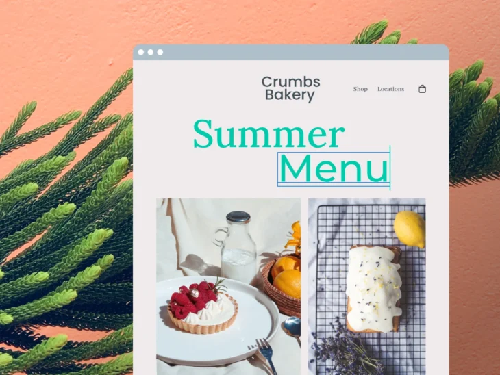
How To Choose the Right Fonts for Your Website
Most website owners don’t actually pick a font. They just go with whichever font is the default on their chosen theme.
That’s okay (most of the time). But it’s worth taking a few moments to make an active choice.
Why? Because your choice of font can influence:
- How people perceive your brand
- The trust levels of potential clients
- How easy your site is to navigate
- Whether people will read your content
- How easily people can buy stuff
Hmm, so basically your font choice can make or break your whole brand. Cooooool…
Don’t worry, though. Choosing a good font isn’t rocket science. Just follow these golden rules:
- Choose the right “personality”: Every font has a certain character. Some seem formal and corporate. Others are dramatic, futuristic, or childlike. Ideally, your font should match the mood of your brand and appeal to your intended audience. (We’ll profile some of the best options later.)
- Prioritize readability: Google Fonts has everything from simple lettering to calligraphic handwriting. While it’s okay to experiment with stylish fonts, you should always prioritize reading comfort over aesthetics, because eye-strain is a thing.
- Pick no more than two: You shouldn’t need any more than this. And adding more fonts will only impact the performance of your website.
In other words, it’s about creating the right visual vibe and keeping it simple.
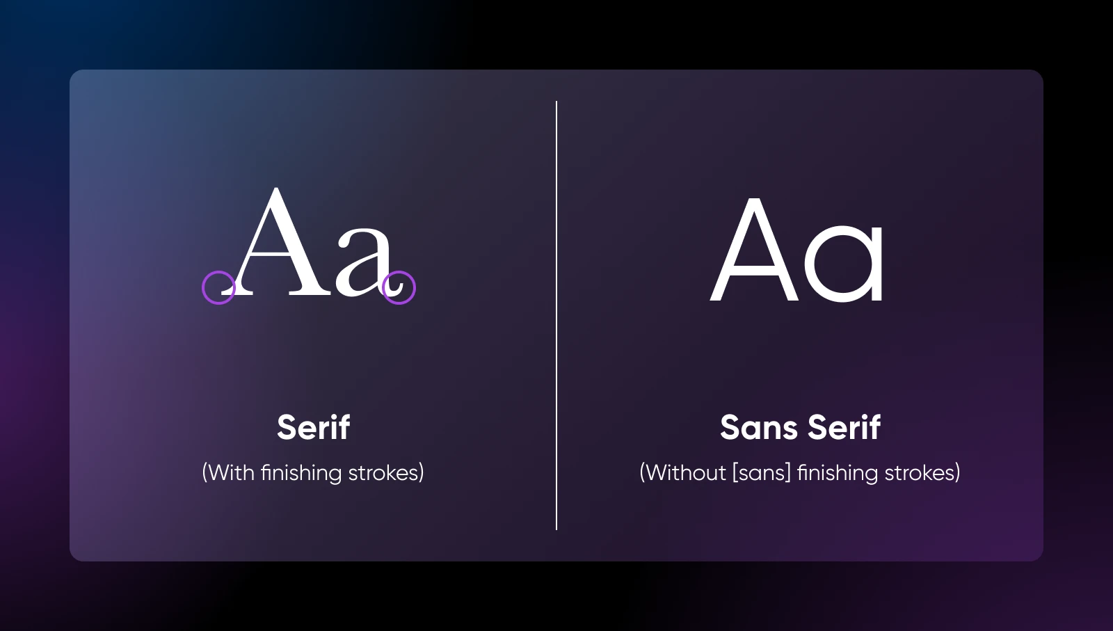
Serif vs. Sans Serif Fonts
You’ve probably heard of the terms “serif” and “sans serif.”
A serif is actually the little foot you sometimes see on the bottom of letters. It kinda mimics the flourish you make as you lift your pen off a page.
Serif fonts have these little feet. Sans serif fonts don’t have little feet.
And that matters because…
Well, those feet actually make quite a big difference to the overall look of a font.
- Serif fonts tend to feel classic, traditional, and dependable. That’s partly because they’re commonly used in books and newspapers. They can be very readable, although they work best on high-resolution displays.
- Sans serif fonts seem more modern, clean, and straightforward. With no feet to trip over, these fonts are super readable on all screens. But being simple can also mean a bit bland.
TL;DR: Choose serif if you want a more traditional, high-brow look. Choose sans serif for a sleek, modern appearance. Pair them for the best of both worlds.
20 Google Fonts To Match Any Small Business Website
Enough with the web design theory. Let’s dive into some actual fonts.
Rather than throwing a giant list at you, we’ve split our recommendations by vibe. Look for the heading that best matches your website to discover your perfect fonts!
💼Powerful Fonts for Professionals
Whether you’re a legal eagle, a medical practitioner, or a finance whizz, your website font should leave visitors impressed.
Here are some slick, sophisticated suggestions to try.
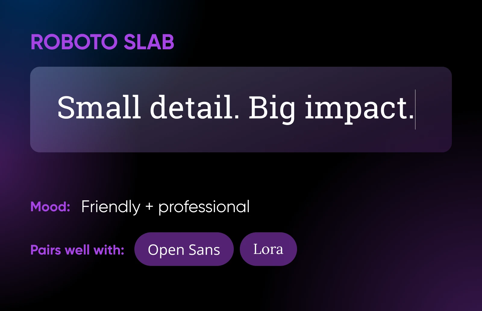
1. Roboto Slab
Roboto Slab is a typeface with open curves that allows letters to fill as much space as they need. That means visitors will enjoy a smooth reading experience at all font sizes.
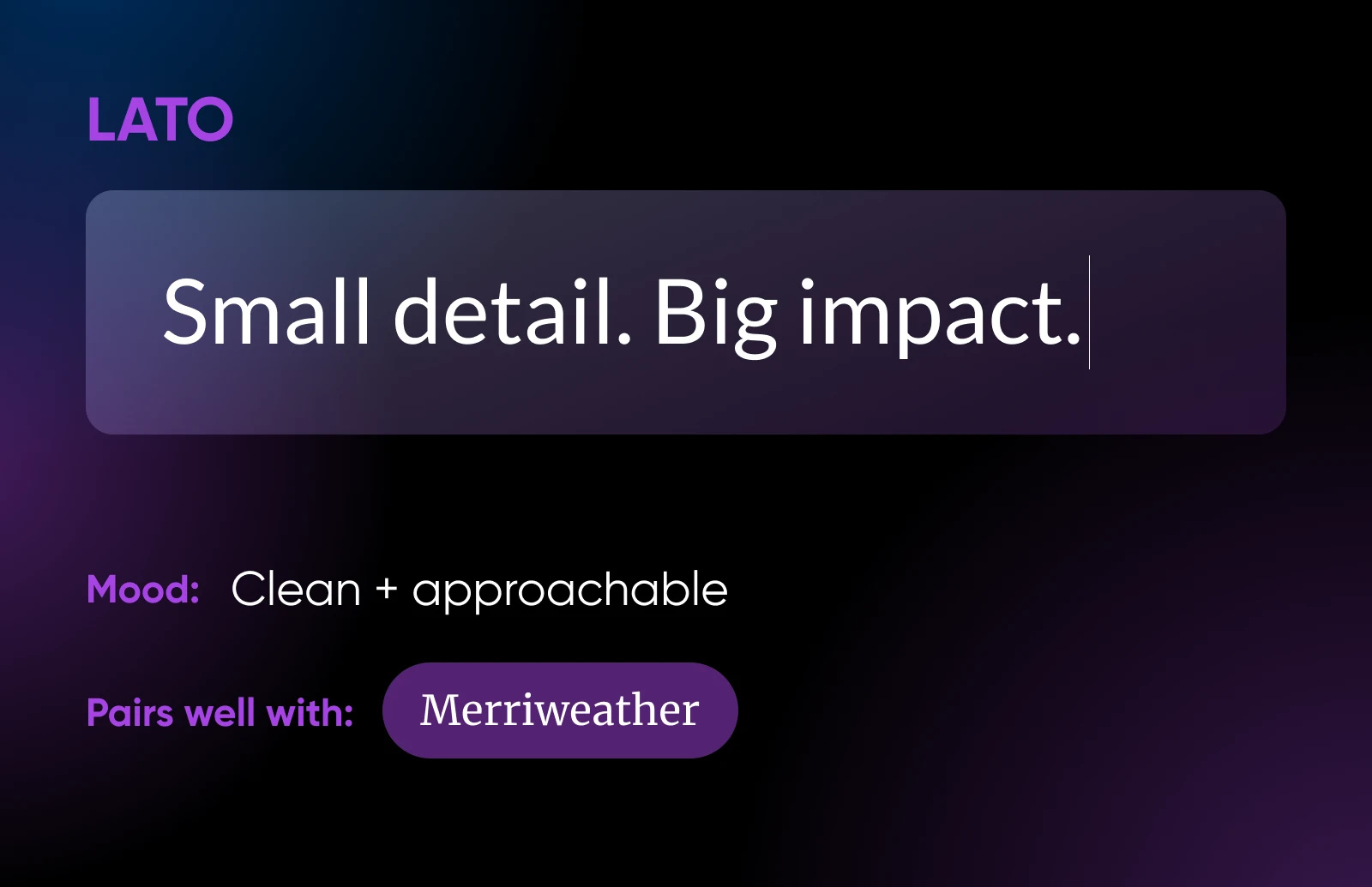
This font pairs well with a long list of sans serif fonts, like Lato and Open Sans.
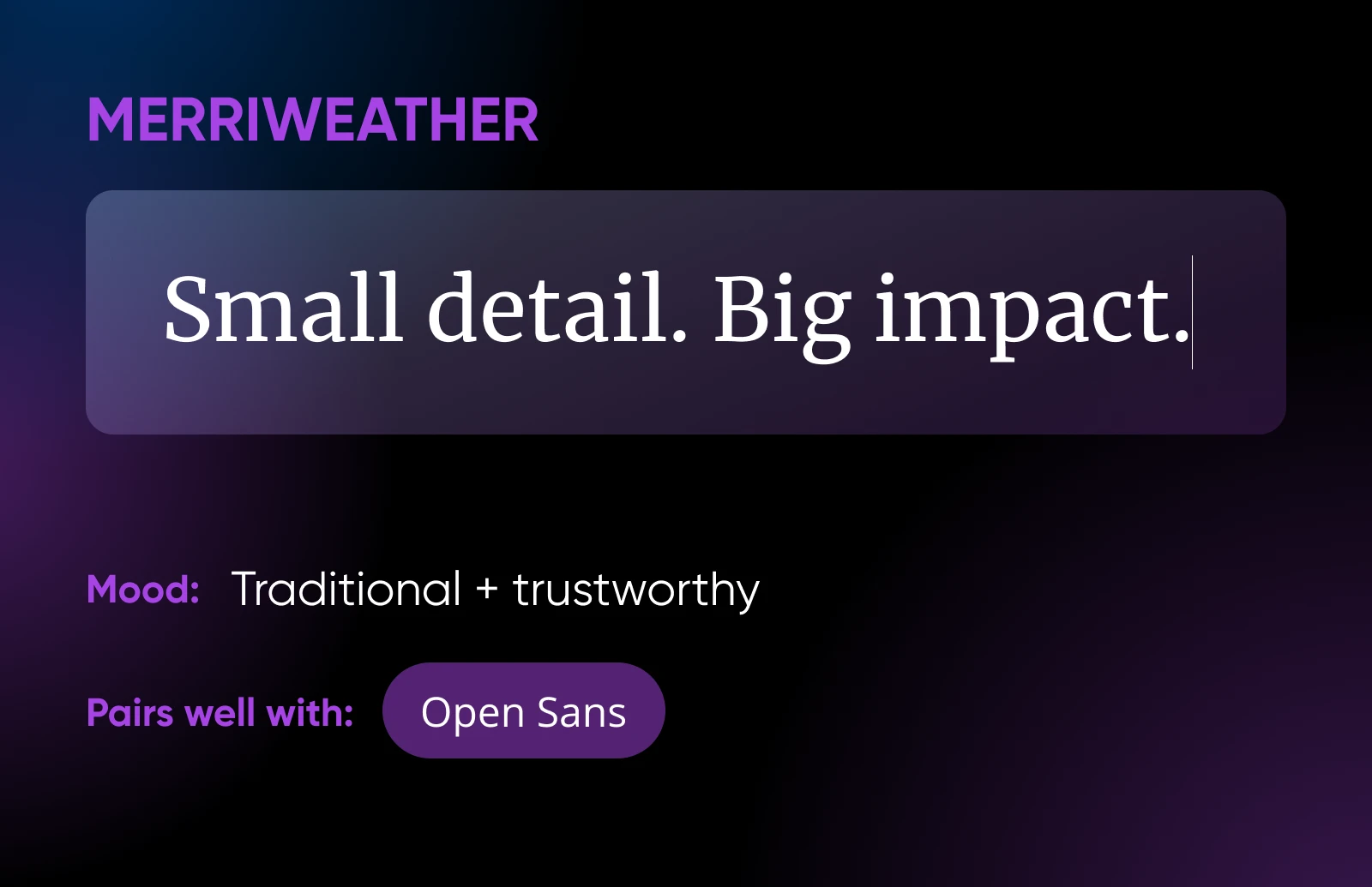
2. Merriweather
Merriweather was designed to be easy to read on screens. It features mild diagonal stress — that means the thinnest parts of the letters are slanted for a dynamic feel.
That said, the overall look is quite traditional, so your brand will come across as the “tried-and-tested” option.
This font goes really well with Merriweather Sans.
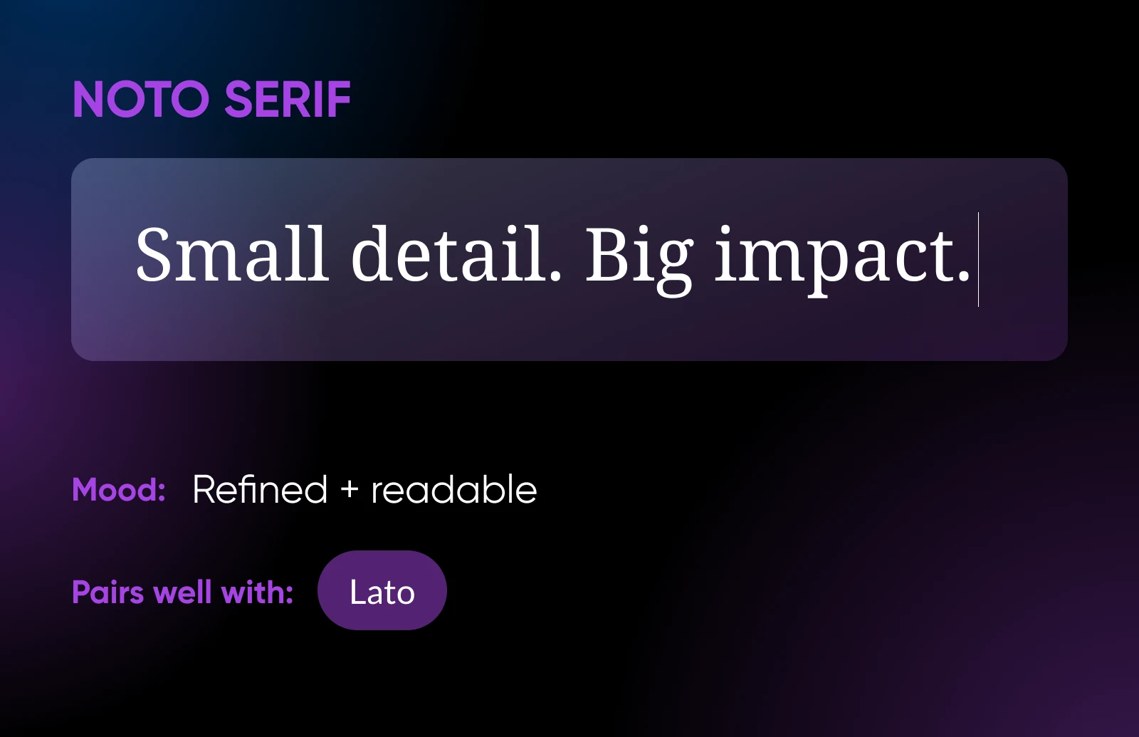
3. Noto Serif
A hybrid of classic and modern, Noto Serif offers great legibility and a refined style that’s perfect for professional sites. Thanks to slightly condensed letterforms, this font works well in tight spaces.
It pairs well with clean sans serif fonts, such as Lato and Open Sans.
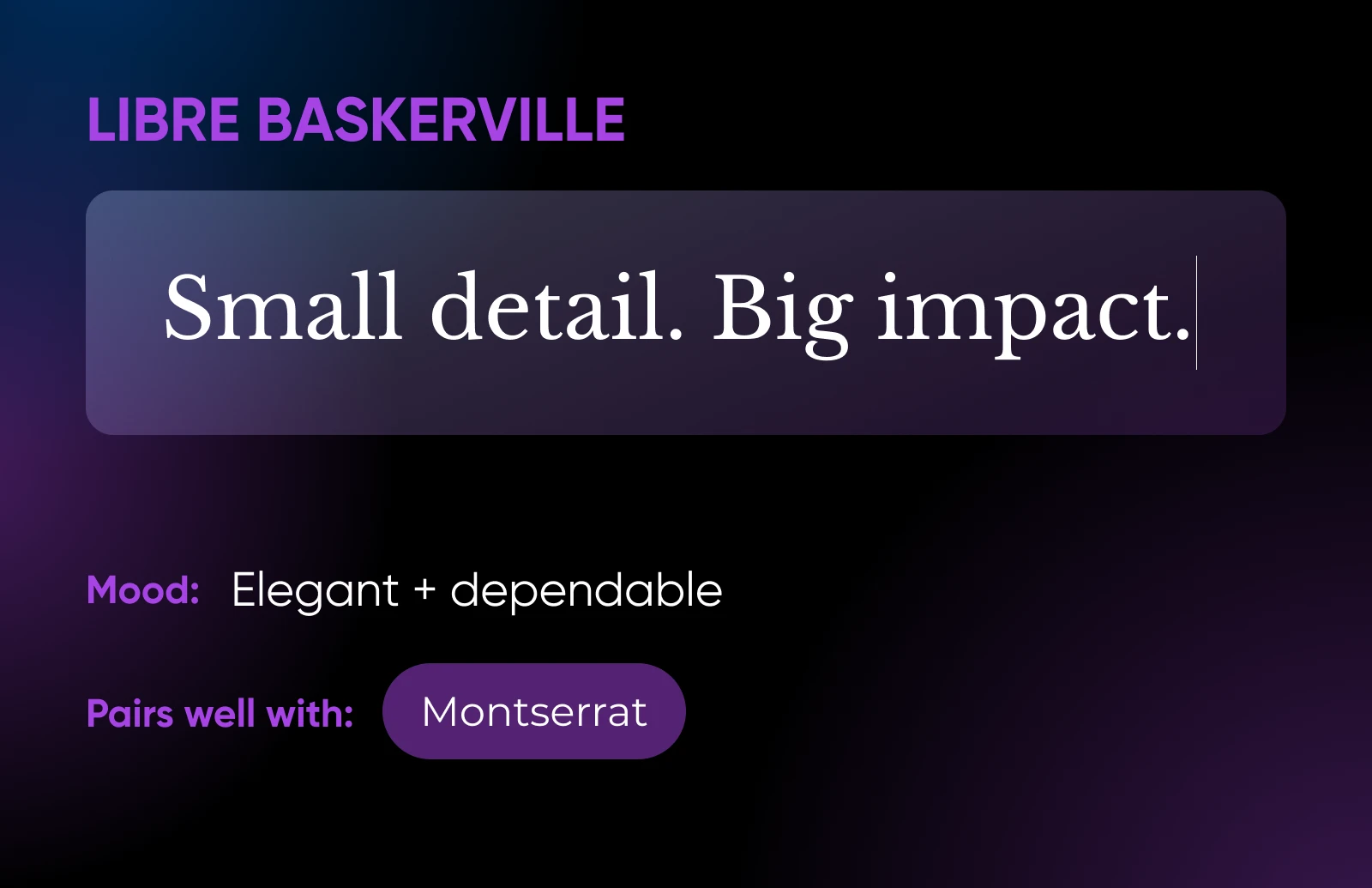
4. Libre Baskerville
Libre Baskerville is a digital-friendly take on the classic Baskerville typeface, well-known for its elegance and readability in print.
The traditional style has been tweaked for better screen clarity, but it retains plenty of sophistication. Pair this font with Montserrat or Lora for some serif-on-serif action.
5. Slabo
Made specifically for web projects, Slabo can adapt to any pixel density. This means it looks equally clean on Retina displays and ancient PC screens.
The overall look is slick and professional, making it a good choice for business sites.

🎨Captivating Fonts for Creatives
If you want to be known for creativity, the last thing you need is a boring typeface.
Here are some attractive, eye-catching options that your visitors will love:
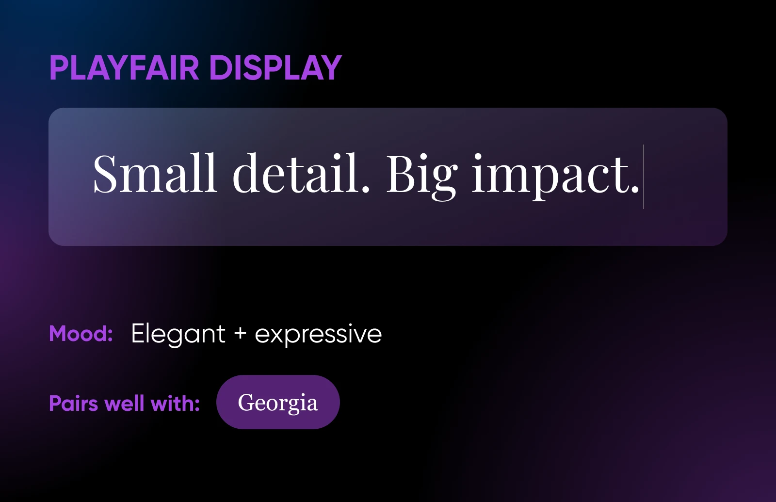
6. Playfair Display
Influenced by 18th-century designs, this typeface is perfect for sites with a touch of classical elegance.
Playfair Display conveys a strong sense of authority, and the bold style can make headlines stand out on a busy page. It pairs well with Georgia or its all-caps sibling, Playfair Display SC.
7. Lato
The clean lines of Lato were originally created as a set of corporate fonts. But there’s plenty of warmth in this typeface, and even a touch of quirkiness.
It’s well suited to portfolio sites and agency websites, both for headings and body text.
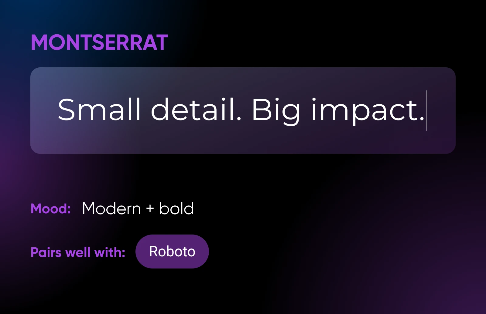
8. Montserrat
Created by acclaimed graphic designer Julieta Ulanovsky, Montserrat was inspired by the old posters and signs in Buenos Aires. It reflects the beauty of urban typography.
The modern version has been made lighter, which makes it more appropriate for longer texts. It makes a good pair with Roboto.
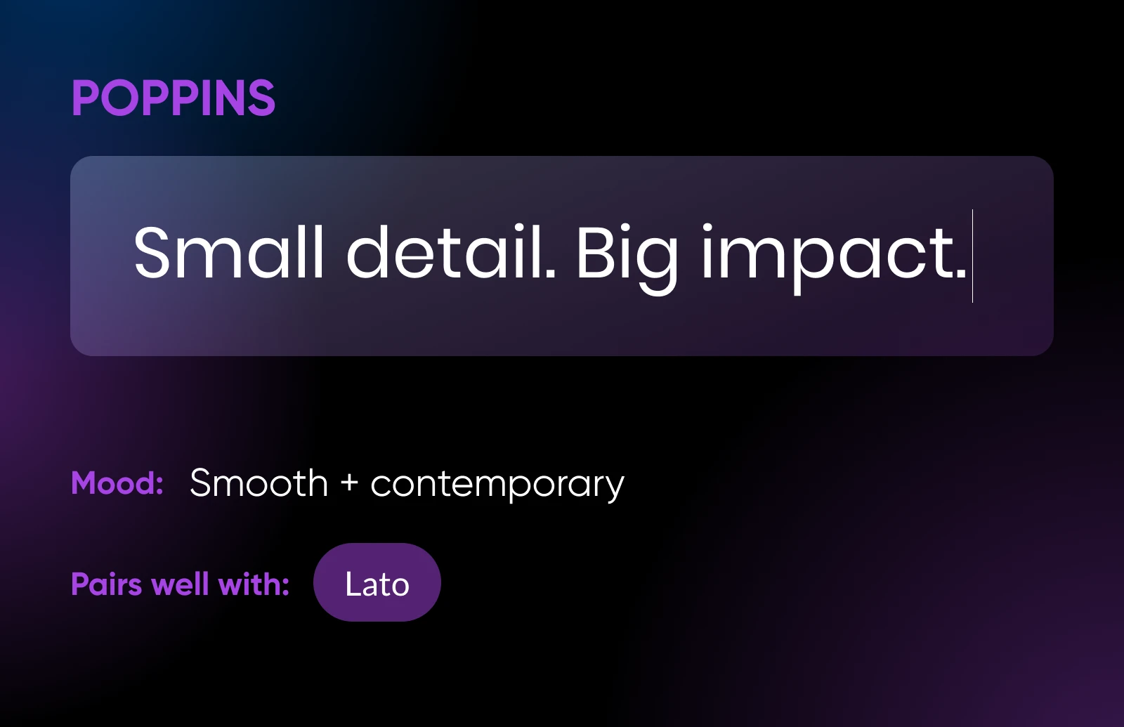
9. Poppins
One of the newer sans serif typefaces, Poppins, is beautifully smooth and round. It works well on websites where you want to sprinkle in some contemporary style, without sacrificing readability.
It’s a favorite in the tech community, but it would also make your portfolio pop in combination with Lato.
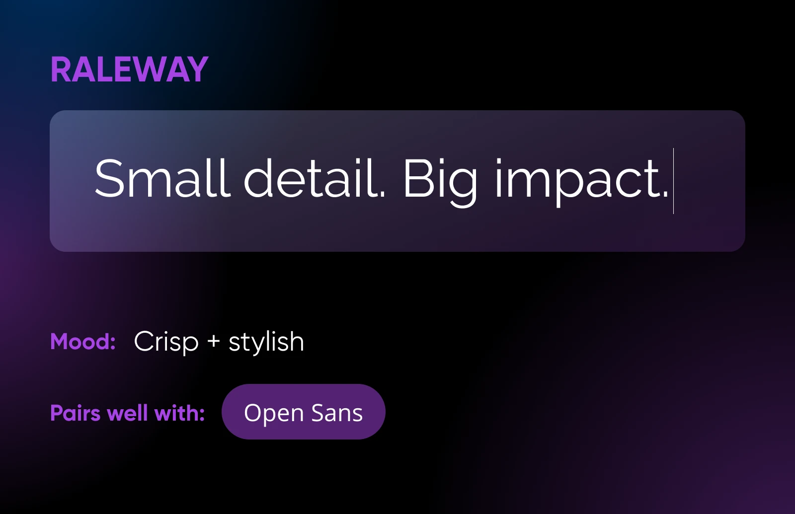
10. Raleway
You could technically use Raleway as a sans serif body font. In truth, though, this elegant typeface looks best when written large.
It’s all clean lines and sharp angles, adding a modern crispness to portfolios, agency websites, personal blogs, and many other projects.
💻Modern Fonts for Digital Natives
Building a software business or blogging about the latest tech? Either way, you need a font that feels cutting-edge.
These clean, modern options should fit the bill:
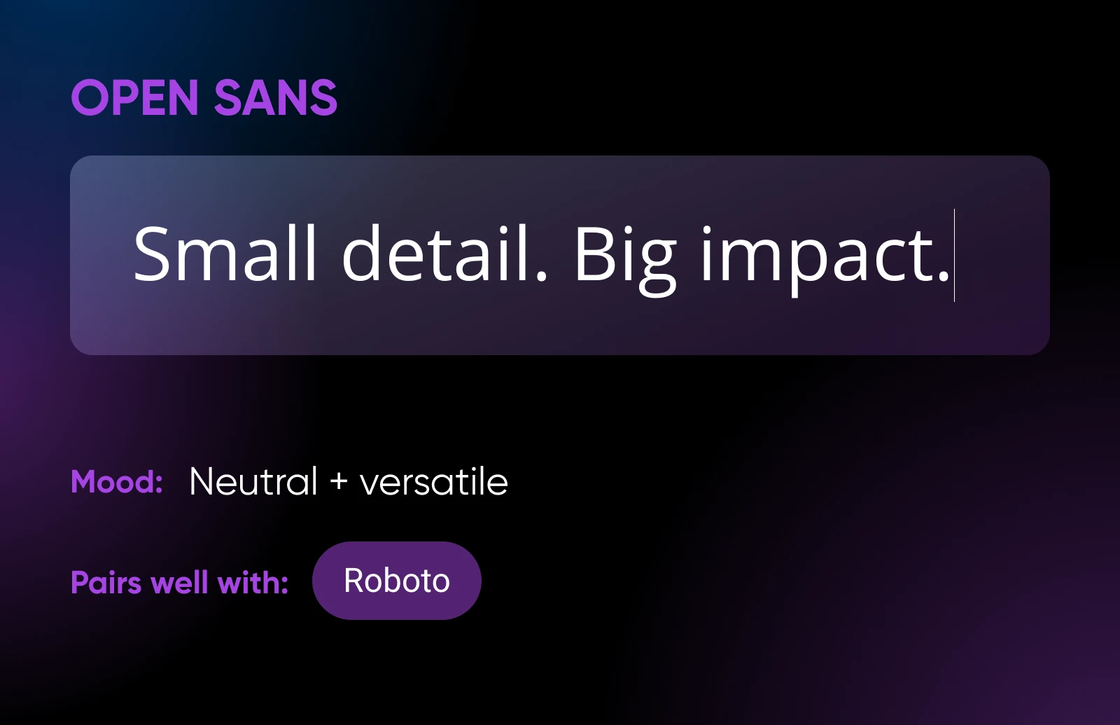
11. Open Sans
As a humanist sans serif typeface, Open Sans was designed to appear clean and neutral. This makes it a great choice for body text in a wide range of web and mobile projects.
It works nicely in combination with Roboto or as a contrast to Merriweather.
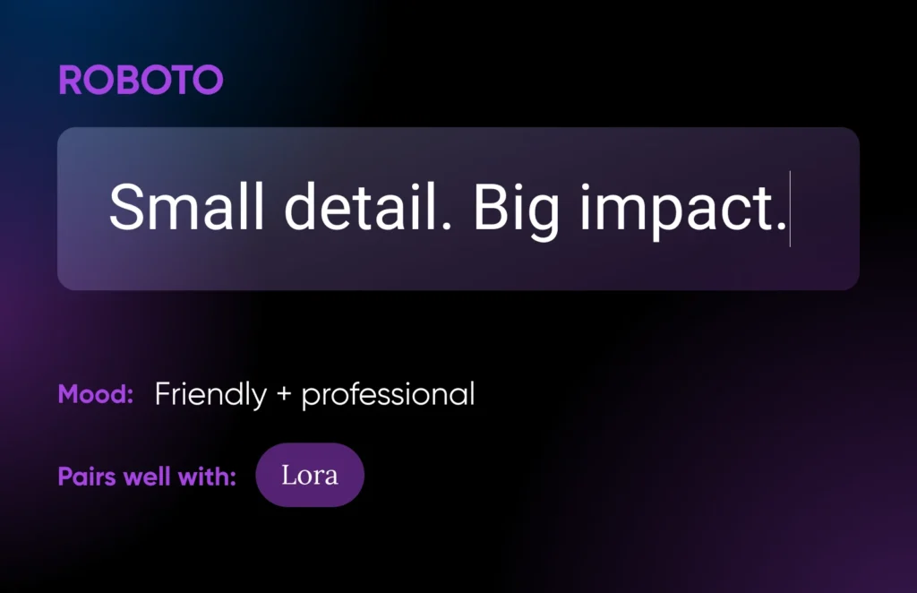
12. Roboto
Roboto comes in twelve different styles, which are all very popular. They’re all a bit geometric, which is nicely balanced out by soft open curves.
This mix makes Roboto seem friendly, yet professional enough for business sites. Use it for header or body text; pair with Lora.
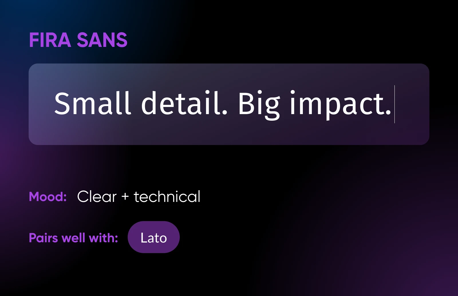
13. Fira Sans
Fira Sans was originally created for Mozilla, the organization behind the Firefox web browser. If you use the app regularly, you might recognize the clean, open letterforms.
Offering excellent clarity on all screens, Fira Sans works well for mobile-optimized sites, mobile apps, and reading platforms. Try putting it together with Lato.
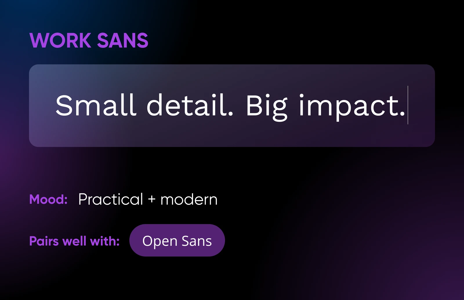
14. Work Sans
As the name suggests, this typeface was made for professional use cases. In the context of web design projects, it makes a good choice wherever legibility is important — particularly on smaller screens.
Pair with Open Sans for a super clean look.
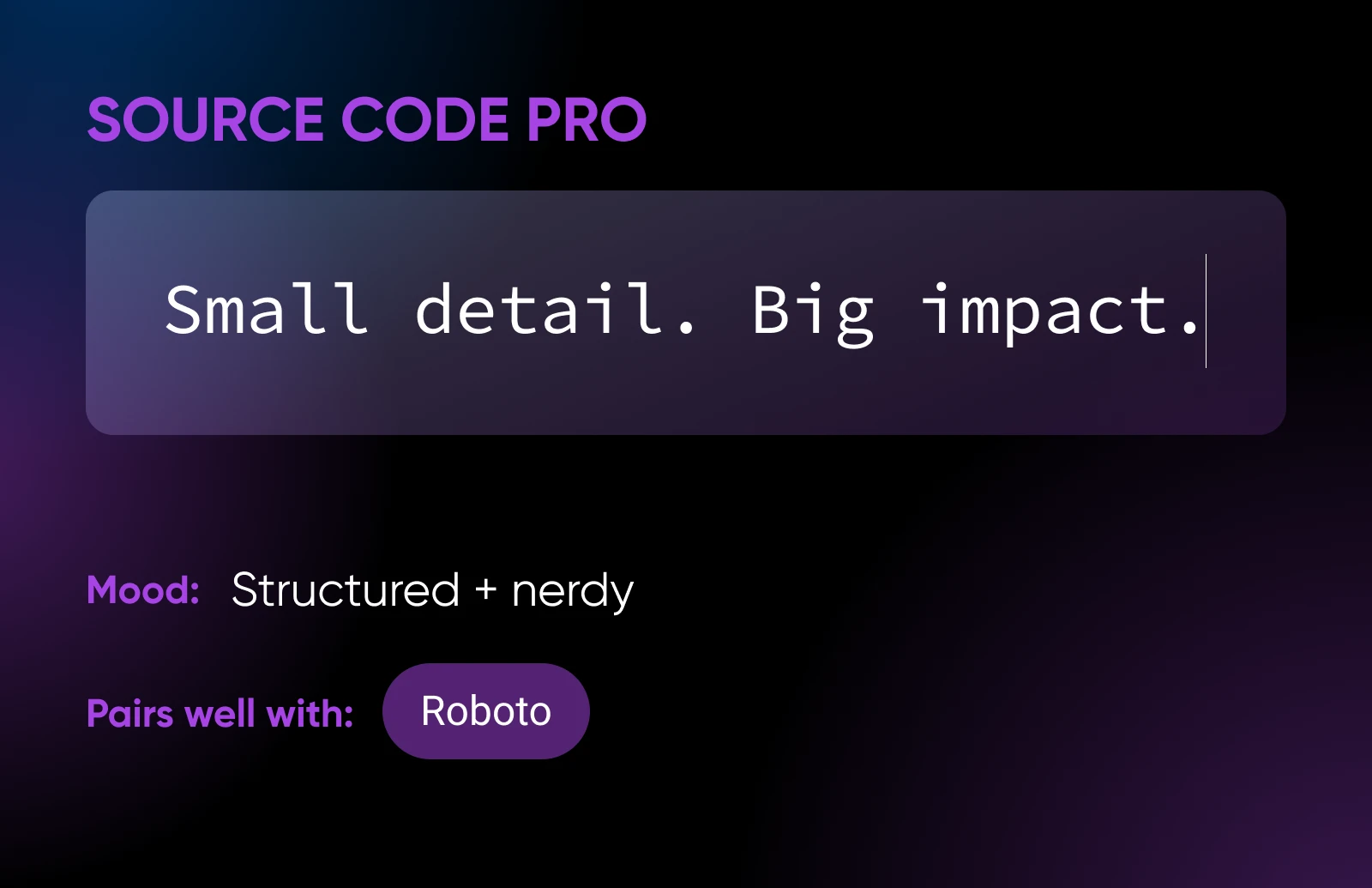
15. Source Code Pro
Source Code Pro is a monospace font, meaning the letters are slightly spaced out. That makes it great for coding environments and other situations where legibility is vital.
It can also work as a refined body font, with just a hint of nerdiness.
🤝Friendly Fonts for Lifestyle Brands
From cafés to coaching, many businesses are about personal connections. Fonts that seem relaxed and friendly are generally the best choice for these lifestyle and local brands.
Here are some good examples:
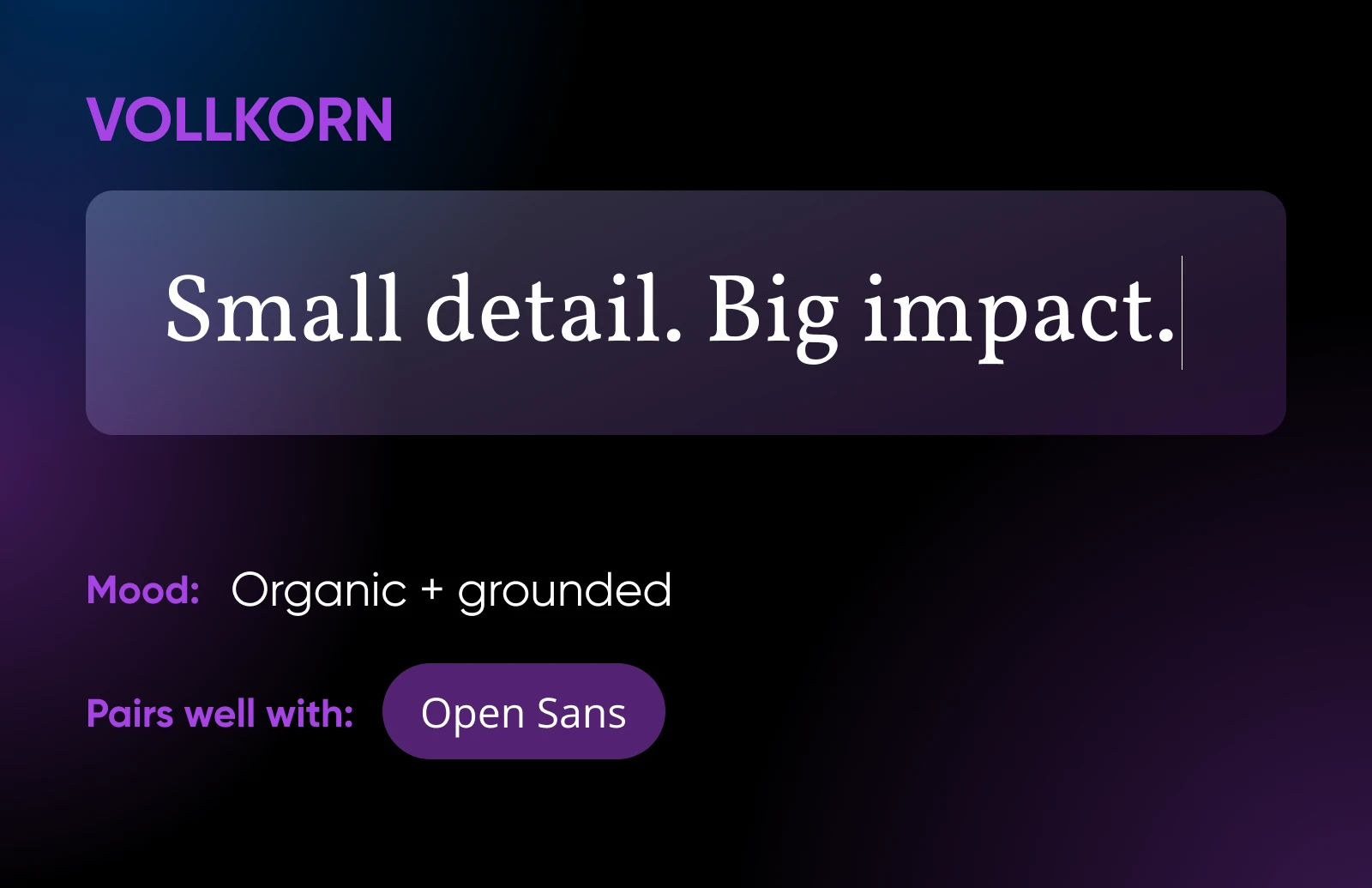
16. Vollkorn
In German, Vollkorn means “whole grain.” The font lives up to this description, with an organic, wholesome feel. It invites visitors to read your content by the fire, with a cup of cocoa.
As such, Vollkorn works best for sites related to crafts, food, or nature. Pair it with neutral sans serif fonts, such as Open Sans.
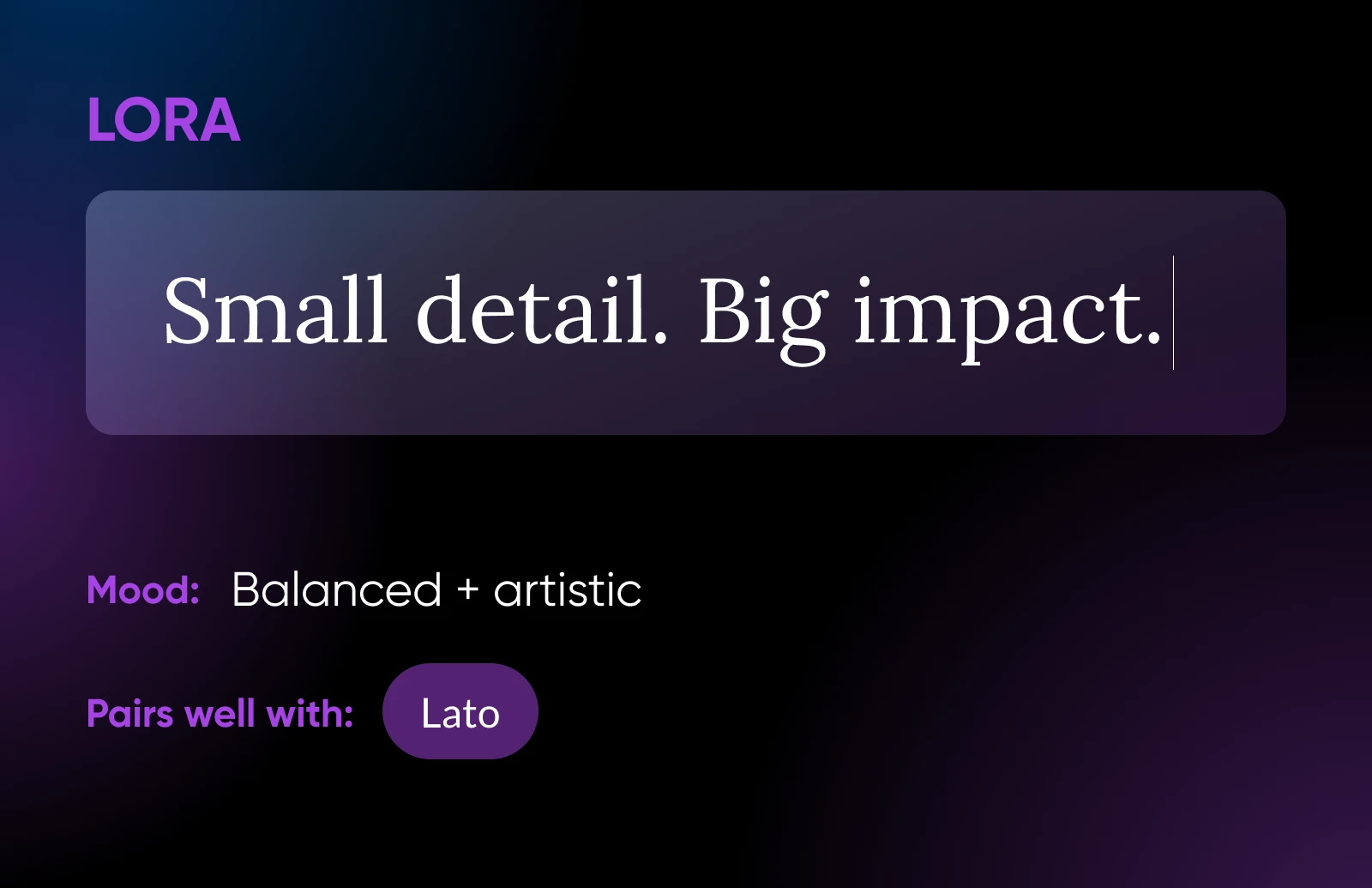
17. Lora
Lora is a modern, well-balanced font with roots in calligraphy. It has beautiful brushed curves and rounded serifs, but nothing too fussy.
The overall look is really clean. And that makes Lora an excellent choice for both body text and headings. Pair it with Lato to complete the look.
18. PT Serif
Fun fact: PT Serif was developed for the “Public Types of the Russian Federation.”
The letters of this font are long and elegant, and the mix of thin and thick strokes makes it easy to read in many different languages. It’s a great match for PT Sans.

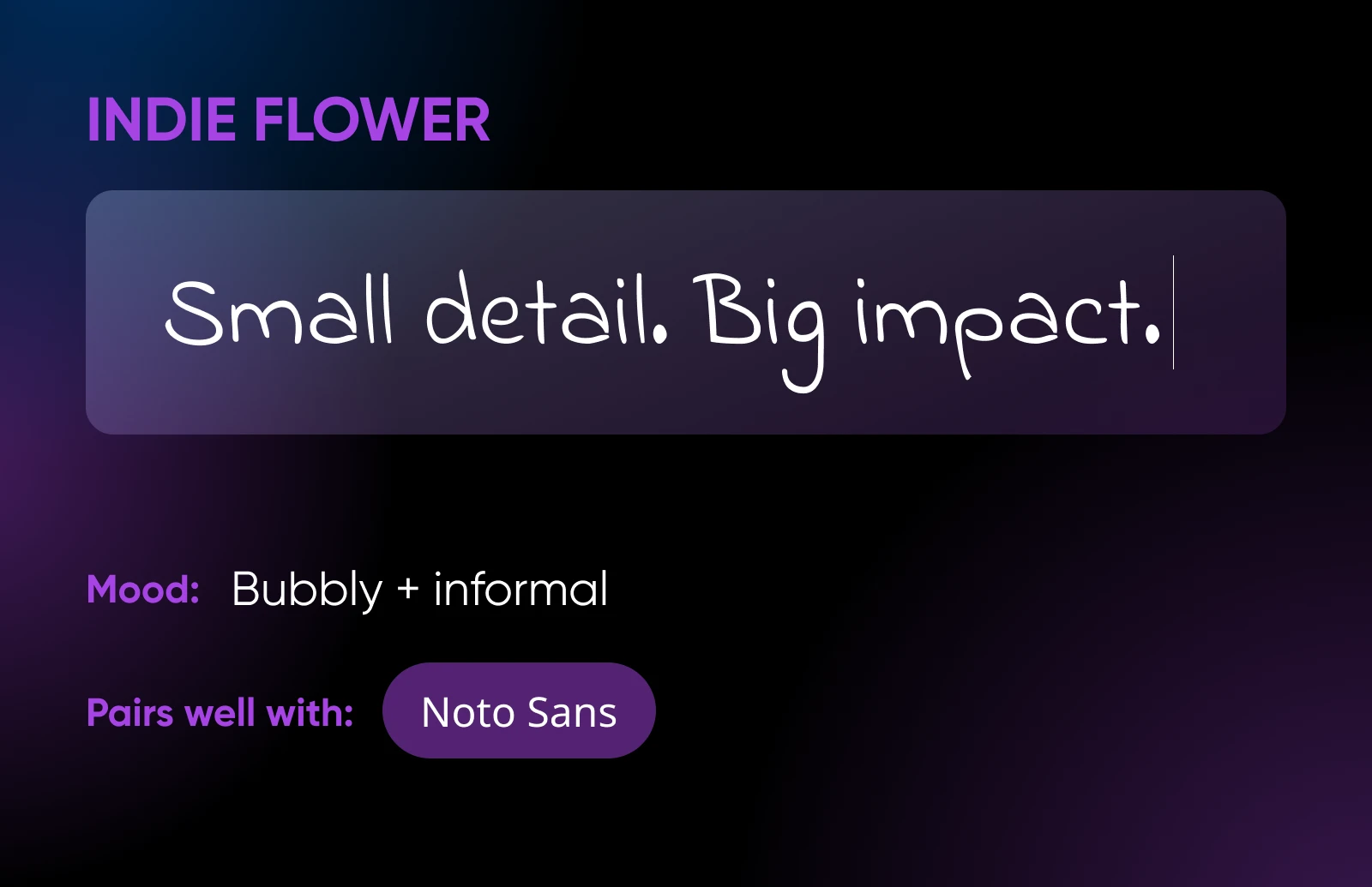
19. Indie Flower
Carefree and open, Indie Flower has a bubbly character. It’s a little bolder than some handwriting fonts, and there is more space between the letters, providing extra clarity for your readers.
Use it alongside Noto Sans for a nice balance between style and functionality.
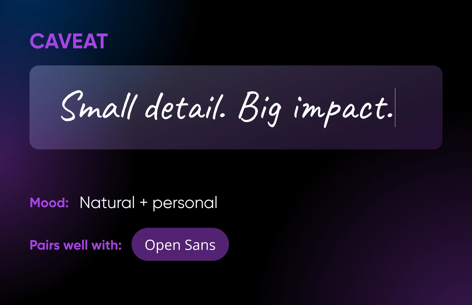
20. Caveat
Caveat was designed for short annotations and body text. Its OpenType features allow the letters to have slight variations according to their placement in a word.
For example, a letter might appear more “handwritten” in some instances. The slightly uneven nature of this font adds an organic feel to lifestyle sites. You can balance it out with the clean shapes of Open Sans.
How To Pick the Perfect Font Pairing
Hopefully, at least one of these fonts takes your fancy.
You could just grab it and stop there. Job done.
Generally, though, we recommend using two fonts. This creates visual contrast, which looks good and helps visitors navigate your content.
For instance, you could have one font for headers, titles, and captions, and another font for body text.
Of course, the two fonts still need to work together. Here’s how to pick the perfect pairing.
- Use a bold, distinctive font for headlines: The whole point is to grab attention! As long as the text is legible, you can get creative here.
- Choose a clean, readable font for body text: If you want visitors to plow through your blog posts and product descriptions, you need to choose a font that’s easy to read.
- Create visual contrast without causing chaos: We’re looking for fonts that complement each other rather than clash. So, they need to have something in common.
- Try the classic serif-sans serif combination: Use one for titles and one for body text. It doesn’t matter which way around.
- Alternatively, combine different versions of the same font family: For example, Roboto can play nicely with Roboto Condensed or Roboto Mono.
Matching fonts is obviously a matter of taste. But there are some go-to combinations that seem to work every time.
Here’s your cheat sheet:
| Business Type | Headline Font | Body Font | Why It Works |
|---|---|---|---|
| Legal/professional | Merriweather | Open Sans | Conveys trust and readability |
| Creative agency | Playfair Display | Lato | Elegant yet approachable |
| Tech startup | Montserrat | Roboto | Modern and clean |
| Local café/lifestyle | Vollkorn | PT Sans | Warm and inviting |
| E-commerce | Oswald | Source Sans Pro | Bold and user-friendly |
Best Practices for Using Google Fonts
Setting up your chosen Google Fonts is pretty easy. If you’re using WordPress, you can get a plugin to do all the work.
But before you move on with your life, we’d recommend doing a few pre-flight checks. It’s better to fix the issues up front, rather than finding out later that your site is unreadable!
Here’s the checklist:
- Choose 400 or 600 weight for body text: Lighter weights are generally better used for headlines. They fade away at small font sizes.
- Only load the font weights and styles you need: That includes Regular, Bold, Italic, and so on. The more you add, the greater the impact on page loading speed.
- Test your new fonts on different devices: Some fonts are more difficult to read on small screens. You might need to up your font size for mobile devices or switch to a different font.
- Optimize your fonts: There are several ways to reduce the performance drain of Google fonts, including using the official Web Font Loader.
- Don’t forget languages: Thinking of publishing in more than one language? Make sure your font supports all the characters you need.
Optimize Your Site With Fonts
Whether you’re crafting a busy news website or a minimalist masterpiece, Google Fonts should have your typographic needs covered. The sheer quantity of free fonts on offer is crazy.
In fact, your main challenge is to narrow down the options. Just keep these principles top of mind:
- No more than two fonts.
- Make sure they match your brand and suit your audience.
- Focus on readability.
- Look for a matching pair or use the old serif-sans serif combo.
If you would prefer the professionals to do the hard work, the DreamHost team can help.
Our design department can build you a unique WordPress website, complete with fonts that truly match your brand. It’s a great way to make your business stand out online, without spending hours learning about typography.
If you prefer the DIY route, invest in rock-solid hosting. All our plans come with a 100% uptime guarantee, so visitors can always enjoy your choice of fonts!
Sign up today to try the DreamHost experience for yourself.