Whether you run an e-commerce site or a web development business, you want to attract as many visitors as possible to your website. And that means making sure as many people as possible can use your site–by prioritizing website accessibility.
Website accessibility involves making sure that your site is usable by everyone, including those with disabilities and impairments. There are a variety of resources, tools, and tips you can leverage to make creating an inclusive website a lot easier.
In this post, we’ll cover everything you need to know about website accessibility: why it’s so important, how you can check your site’s current accessibility levels (and barriers), and a complete guide to designing highly accessible web pages. Let’s get started!
What Is Website Accessibility?
Accessibility
Accessibility is the practice of making a website accessible to as many users as possible. Accessible websites can be viewed by anyone on any device.
Read MoreWebsite accessibility refers to the extent to which a site can be used by individuals with disabilities. This can include people who are blind or have low vision, those who are deaf or hard of hearing, people with mobility impairments, cognitive disabilities, and other disabilities. It involves designing your website so that its content is available to and functional for everyone, including those who might use assistive technologies like screen readers, voice recognition software, or specialized input devices.
This idea goes beyond just helping individuals. It’s about embracing the diversity of web users and recognizing the importance of equal access on the internet. By prioritizing accessibility, you’re not only expanding your audience but also promoting inclusivity and social responsibility.
Website accessibility also aligns with various legal standards, such as the Americans with Disabilities Act (ADA) in the United States and similar legislation globally. These laws require certain websites, especially those of public institutions and businesses, to be accessible to people with disabilities to avoid discrimination.
Who Manages And Enforces Website Accessibility Rules And Laws?
The responsibility for managing and enforcing website accessibility rules and laws is shared by various governmental and non-governmental organizations, each playing an important role in establishing and maintaining the accessibility standards we’ll cover later in this article.
- Governments and governmental agencies. In the United States, the Department of Justice (DOJ) is primarily responsible for enforcing the ADA, which includes rules for website accessibility. Other countries have their own governmental bodies overseeing similar laws and regulations.
- International standards organizations. The World Wide Web Consortium (W3C) has developed the Web Content Accessibility Guidelines (WCAG), a set of internationally recognized standards that outline how to make web content more accessible to people with disabilities. These guidelines are widely accepted as the benchmark for web accessibility and are often referenced in legal requirements.
- Advocacy groups and NGOs. Non-profit organizations and advocacy groups actively promote website accessibility, often offering resources, conducting audits, and sometimes pushing for legal action against non-compliant websites.
- Legal system. The legal system often becomes involved in cases of non-compliance with web accessibility laws. Lawsuits and legal actions can be taken against organizations that fail to meet required standards, particularly under the ADA. Legal proceedings can set important precedents that create future standards for enforcement of accessibility rules.
It’s important to note that the landscape of web accessibility is constantly evolving. We all have a shared responsibility to stay up-to-date with the latest news, legal developments, and other changes that impact website administrators.
What Are Web Accessibility Standards?
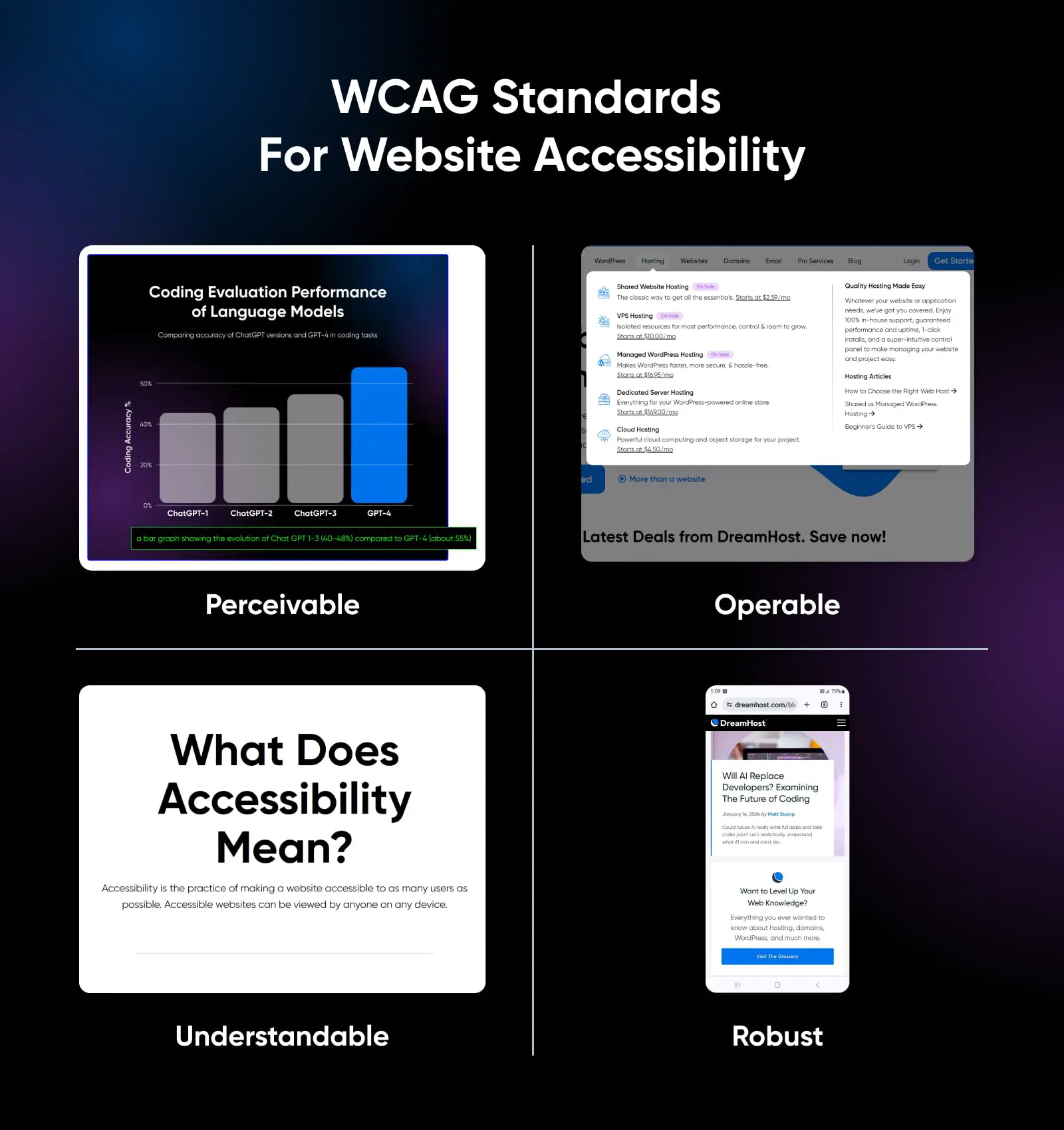
Under WCAG, there are four principles you must follow when creating an accessible website. They say that your site must be:
- Perceivable. Visitors must be able to perceive or understand and be aware of the content and information on your site. Like, having access to alt text.
- Operable. Visitors must be able to use every part of your site without disruption. A well mapped and organized navigation menu can achieve this.
- Understandable. All content on your site, whether written or otherwise presented, should be easy to understand. Clear, concise language and clean, uncluttered pages can be used to communicate information.
- Robust. The underpinnings of your site, like its HTML code, should be easily read and interpreted by all visitors, including assistive technology like screen readers. Another example of this is optimizing your website for various devices like phones and tablets.
Examples Of Accessibility Barriers Online
These common barriers can prevent users with disabilities from accessing or interacting with a website. Here are some examples of barriers and how they impact users.
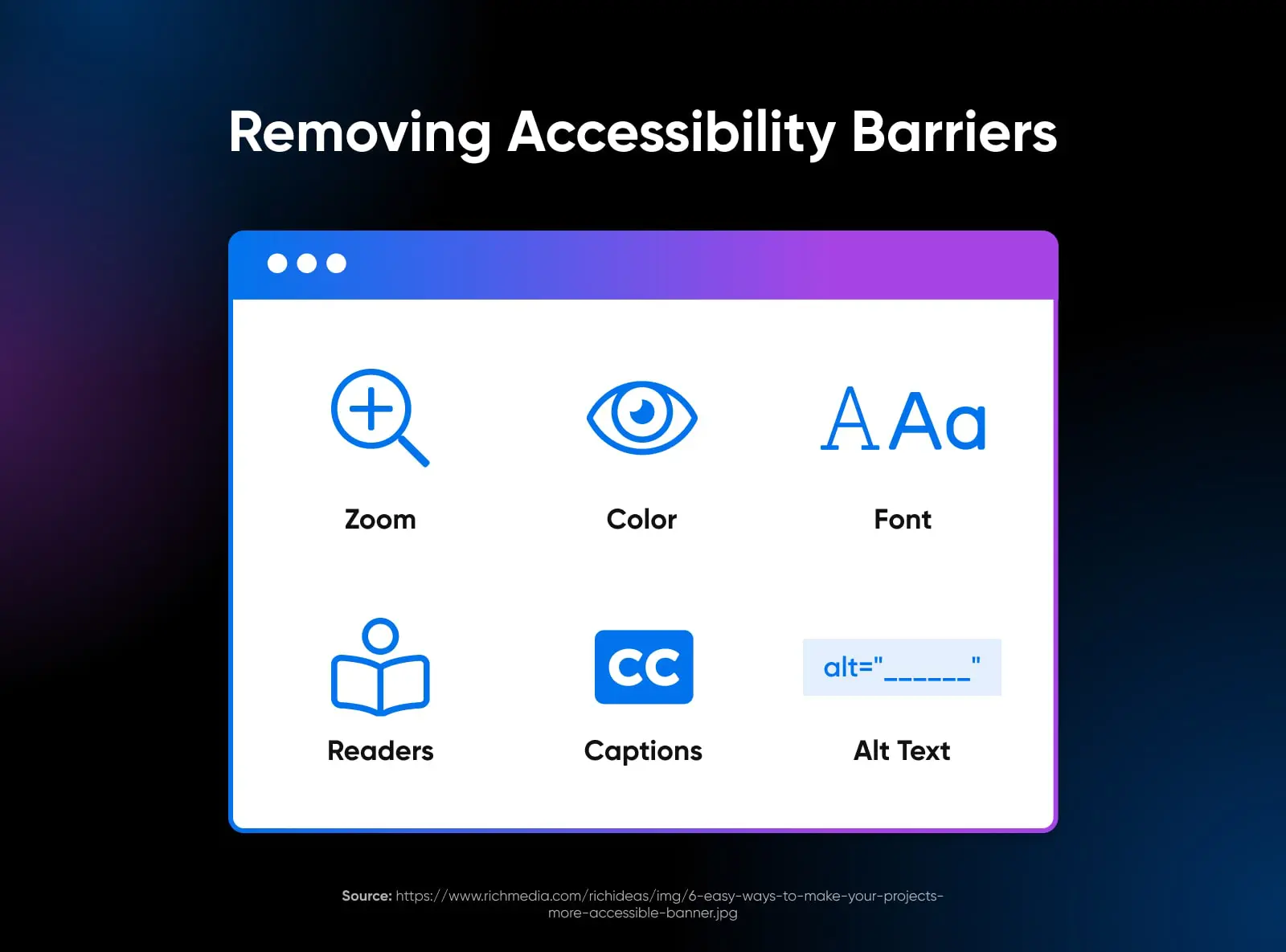
- Lack of alt text for images. When images on a website don’t have alternative text (alt text), screen readers used by visually impaired users can’t interpret what the image is about. This can lead to a lack of understanding or missing out on crucial information.
- Inadequate keyboard navigation. Many users with motor disabilities rely on keyboard navigation instead of a mouse. Websites that don’t support keyboard navigation or have complex layouts can be inaccessible to these users.
- Poor color contrast. Insufficient contrast between text and background colors can make content difficult to read for users with visual impairments, including color blindness. This can render texts practically invisible for some users.
- Non-descriptive link text. Using vague phrases like “click here” for link text does not provide enough information about the link’s destination, especially for screen reader users who might browse links out of context.
- Lack of captioning or transcripts for audio and video content. Users who are deaf or hard of hearing rely on captions or transcripts for audio and video content. Without these, they can miss crucial information.
- Complex and inconsistent navigation. Inconsistent or overly complex website navigation can be confusing, particularly for users with cognitive disabilities. Simple, predictable, and consistent navigation aids better understanding and ease of use.
- Time-limited content and interactions. Content that disappears after a certain time or requires quick interaction can be a barrier for users with cognitive or motor impairments who may need more time to read or interact with content.
- Use of jargon or complex language. Overly complex language or industry jargon can be a significant barrier for users with cognitive disabilities or those who are not native speakers of the website’s language.
Why You Should Prioritize Website Accessibility
The World Health Organization (WHO) estimates that 15% of the world’s population — as many as one billion people — live with a disability. Rates of disability are increasing as life spans increase, causing chronic health conditions to rise. People with disabilities deserve to be able to access the same information as those without, which is why it’s so important for all of us to work together to make digital content accessible and work to remove barriers to accessibility online.
As a website owner, it’s important to make sure you’re not excluding people with disabilities — even inadvertently. The ADA is a civil rights law that prohibits businesses and organizations from discriminating based on disability, so if your website isn’t accessible to everyone, it could land you in legal hot water! But legal compliance isn’t the only reason accessibility should be a top priority when you design your site.
Making your website accessible sends a message that your company has inclusive values, and studies have shown that companies that are more diverse and inclusive are up to 35% more likely to have financial returns above their industry average.
And while accessible website design allows people with disabilities to easily navigate your site, it includes design principles that can actually improve the user experience for all your site’s visitors.
User Experience (UX)
User Experience (UX) refers to how online visitors interact with a website. Users often evaluate their virtual experience based on a site’s usability and design, as well as their general impression of its content.
Read MoreCreating an accessible website doesn’t have to be difficult or time-consuming. By taking just a few simple steps, you can significantly improve your site’s accessibility. This way, you can broaden your audience while also contributing to online accessibility efforts. You may even inspire others to do the same!
How To Check Your Site’s Web Accessibility
Before we get into tips and steps for designing an accessible website, it’s a good idea to start with knowing where your site currently stands–how it measures up against accessibility standards and best practices, and what accessibility barriers you may need to overcome with changes or redesigns.
There are many different ways to check your site’s accessibility. Let’s explore a few of the easiest and most popular options.
Use An Online Accessibility Checker
One of the fastest and easiest ways to check your site’s accessibility is by using an online accessibility checker, like WAVE Web Accessibility Evaluation Tools.
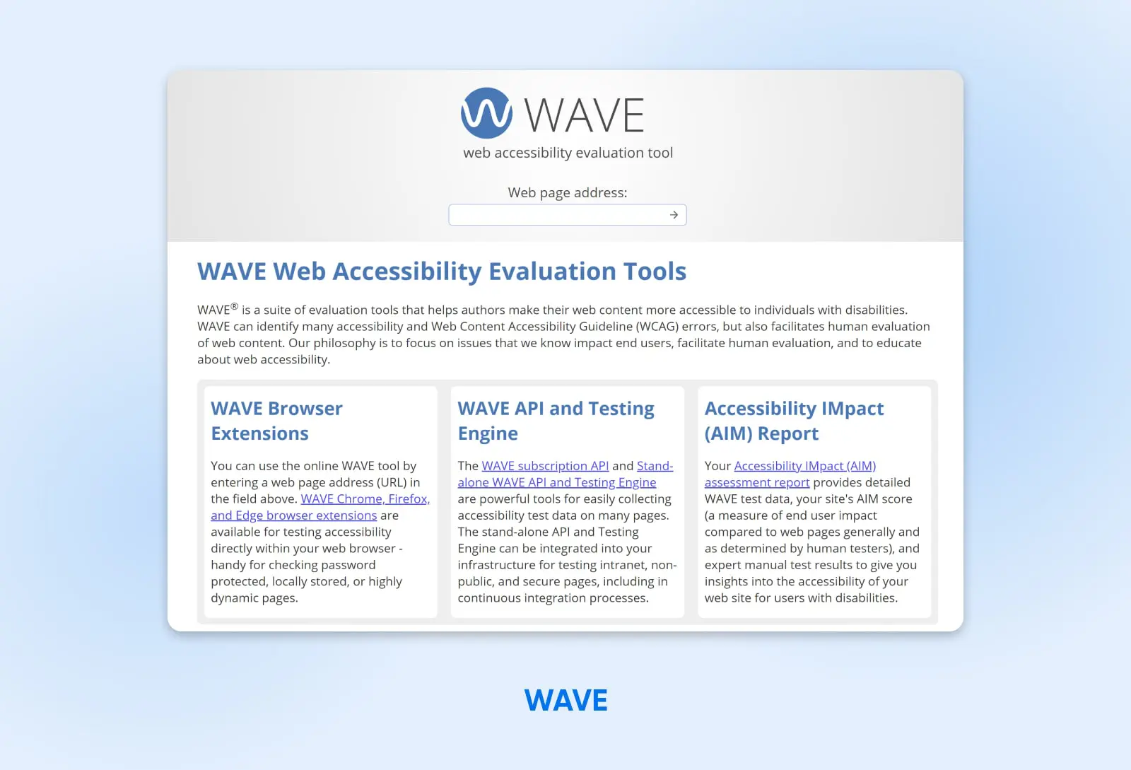
WAVE is a suite of evaluation tools that you can use to evaluate your web pages and content and make them more accessible to individuals with disabilities. WAVE tools check for compliance with accessibility standards, such as the WCAG, but can also facilitate manual human reviews of your content, if you want to go a step further.
To use WAVE, simply enter the URL of the web page you want to evaluate in the “Web page address” field and click on the arrow button. WAVE will then generate a report that shows you any errors or potential accessibility issues on that page. You can also install WAVE’s browser extensions for Chrome, Firefox, and Edge to test accessibility directly within your web browser.
In addition to the error report, WAVE provides feedback on how you can improve your pages to enhance their accessibility. For example, it can point you to images that are missing alt text or structural elements that are organized in a way that might confuse site visitors.
Install A Browser Extension For Accessibility
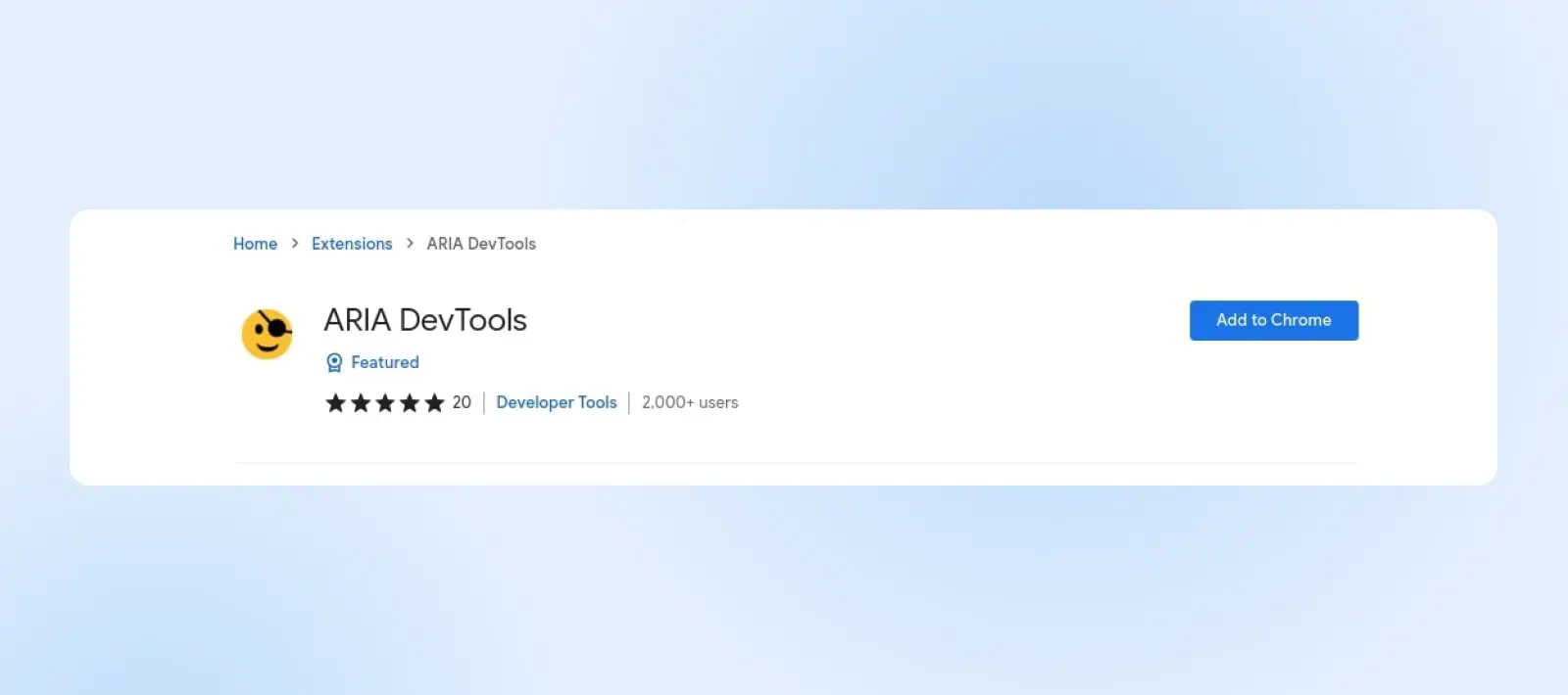
WAVE isn’t the only browser plugin that will automatically check sites for accessibility issues — there are many others you can download and use. A popular choice for Chrome and Firefox is the Accessible Rich Internet Applications (ARIA) extension.
The ARIA DevTools extension is a free and open source accessibility resource that allows users to customize the way they interact with web content. ARIA is designed to improve the usability of web pages for people with disabilities, and to make them more accessible to assistive technologies, like screen readers.
ARIA does this by providing a set of attributes that you can use to improve the accessibility of your site’s HTML elements. For example, the “aria-label” attribute can serve as a marker for an element that is not otherwise accessible, while the ‘aria-describedby’ attribute can be used to provide an explanation.
To use the ARIA extension, install it from your browser’s extension marketplace. You may have to enable it before it starts working.
Manually Check For Common Accessibility Issues
Another option to check for accessibility issues is to use a manual approach. Of course, this can be more time-consuming than using online tools and extensions.
However, if you do a manual check, it may be more thorough than some digital tools. Plus, this method is free and available to all website owners.
If you decide to look for accessibility issues manually, you might want to use a checklist to get you started and help ensure you’re as thorough as possible. WebAIM offers a comprehensive WCAG 2 Checklist with entries like:
- All content is accessible to everyone, including those with disabilities.
- All images are properly tagged with alternative text.
- The website is navigable using only a keyboard.
- All video or audio content on the site include transcripts or captions.
- The website is free of color contrasts that could make it difficult to read.
- Content can be interpreted by a wide variety of user agents, including assistive technologies.
- Content doesn’t require a specific input type, such as touch-only or keyboard-only, but supports alternatives (such as using a keyboard on a mobile device).
Hire A Web Accessibility Expert To Audit Your Site
If you have the resources, a fourth option is to hire an expert to audit your website. This is often the best way to get the most comprehensive review of your website accessibility, making it an especially good choice for anyone who wants to make accessibility a core value of their online business.
At DreamHost, we have Pro Services offering web design, website management, and more, which can include identifying and fixing any accessibility issues on your site.
Our team of experts will carefully evaluate your web pages and provide you with accessibility solutions for any barriers they identify. Contact us today to learn more about Pro Services or to schedule a free consultation.
How To Design An Accessible Website (A Complete Guide)
Now it’s time for the fun part: designing and building your website so that everyone can use and navigate it with ease. Starting your website accessibility journey is exciting, and the steps below will guide you through the design process and help ensure that your website meets the legal requirements and technical standards to be accessible for all users. Let’s dive in.
1. Ensure Your Site Allows Keyboard Navigation
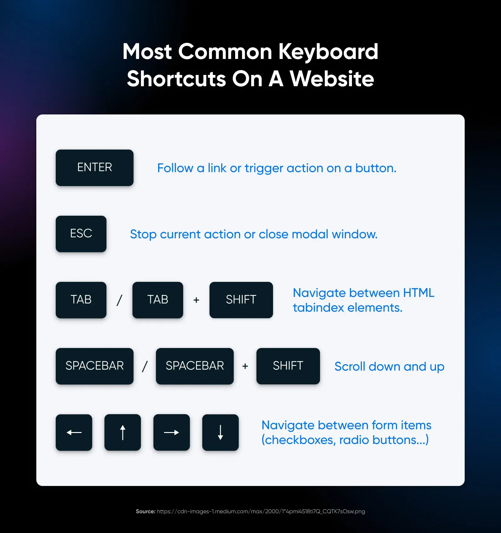
Keyboard navigation is a cornerstone of website accessibility. Many users, particularly those with motor disabilities, rely on a keyboard rather than a mouse to navigate websites. Ensuring your site supports keyboard navigation makes it accessible to a broader range of users, including those who depend on assistive technologies.
Best practices:
- Make sure the tab order of your website is logical. This means that as users press the Tab key, the focus should move through interactive elements in an order that makes sense, typically following the visual layout of the page.
- When users navigate using a keyboard, have clear visual indicators showing which element currently has focus. This could be a border, a change in color, or another noticeable style change.
- Include a “Skip to Main Content” link at the top of each page. This allows users who rely on keyboards to bypass repetitive navigation links and directly access the primary content.
- If your site uses drop-down menus, make sure they can be navigated and activated using keyboard commands. This includes being able to expand and collapse the menus and select items within them.
- Implementing custom keyboard shortcuts can enhance usability, but be careful not to conflict with existing browser or screen reader shortcuts. Clearly document custom shortcuts for users.
- Make sure that keyboard users don’t get stuck in any part of your site. They should be able to navigate to and from all elements using only their keyboard.
2. Make Content Easy To See And Hear
Ensuring that your website’s content is easy to see and hear is essential for making it accessible to users with visual and auditory impairments. This includes individuals who are blind, have low vision, are colorblind, or are deaf or hard of hearing.
Best practices:
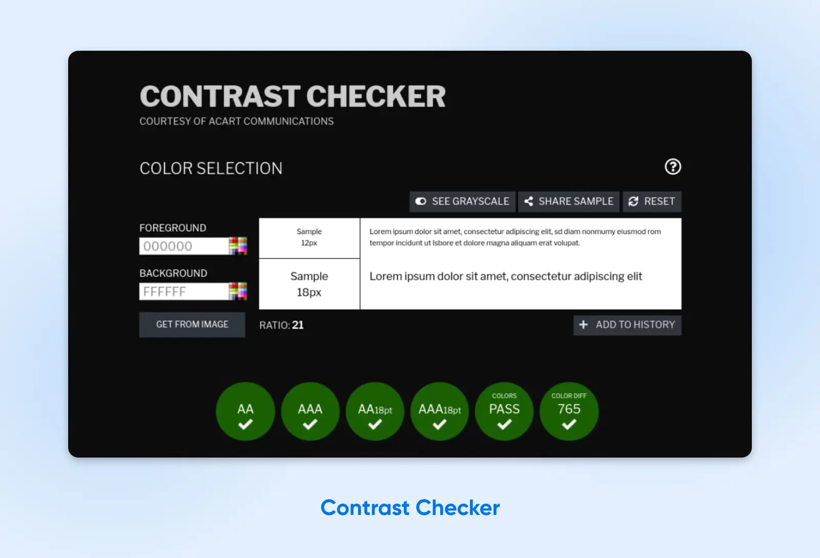
- Use high-contrast color combinations between text and backgrounds to make sure text is easily readable. Avoid using colors that clash or blend too closely. Also, use legible font sizes and styles.
- Use an online tool like Contrast Checker to help you choose a color palette with high-contrast for good visual accessibility.
- Make sure information conveyed with color is also available without color, such as through text labels or patterns. This is particularly important for users who are colorblind.
- Allow users to adjust text sizes without breaking your site’s layout.
- For visually impaired users, ensure that any audio content is clear, well-paced, and descriptive enough to convey all necessary information.
- Use ARIA (Accessible Rich Internet Applications) roles and landmarks. These can help screen reader users understand the layout and navigate the content more effectively, particularly in complex web applications.
3. Provide Text Alternatives
Text alternatives make your site’s non-text content accessible to people with visual and auditory disabilities. These alternatives provide a textual equivalent of information conveyed through images, videos, and audio files, ensuring that all users, including those using screen readers or other assistive technologies, have access to the same information.
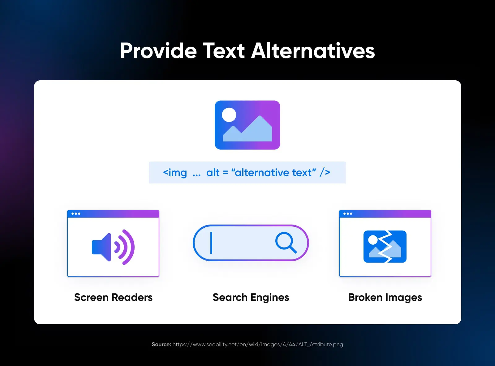
Another benefit is that alt text can help optimize your site to be more visible in search engines. You can use it to incorporate frequently-searched key terms that are relevant to your images.
Best practices:
- Every image on your site should have a corresponding alt text that accurately and succinctly describes the image’s content or function. This description should convey the same message or purpose that the image does for sighted users.
- Add alt text to images in WordPress through your Media Library.
- Provide captions for videos, which describe not only the spoken content but also other relevant sounds and non-speech information. Transcripts are also important, offering a text-based version of all audio content, including spoken words and other relevant sounds.
- For videos, include audio descriptions that narrate the visual information. This is particularly important for content where the visuals carry significant information not conveyed through audio alone.
- Make sure all links and buttons are text-based or have text alternatives so their function is clear to screen reader users. Avoid using images as the only means to convey important actions or links.
- For complex visual content like charts and graphs, provide a text-based summary or description that explains the data or information being presented.
- Interactive elements like forms should have clear and descriptive labels. This helps users understand what each form field is for and how to interact with it.
4. Organize And Structure Content In An Adaptable Way
Organizing and structuring content in an adaptable manner helps make sure all users, regardless of how they access your website, receive the information in a coherent and logical way. This approach benefits users who rely on assistive technologies, such as screen readers, and those with cognitive disabilities who may find complex layouts or inconsistent structures confusing.
Best practices:
- Employ HTML5 semantic elements like
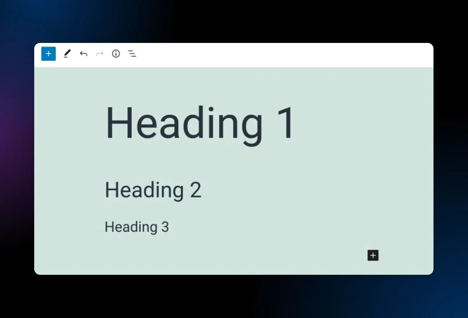
<header>,<footer>,<nav>,<article>, and<section>to structure your content clearly. These elements provide context to assistive technologies, allowing them to convey the structure and layout of your web page to users. - Use headings (H1, H2, H3, etc.) to structure content hierarchically and logically. Ensure that headings are descriptive and give a clear indication of the content that follows.
- Design your website’s layout to be flexible. This means it should adapt to different screen sizes and orientations without losing information or functionality. This is particularly important for users with low vision who may need to zoom in or for those accessing your site on mobile devices.
- If using tables for data, make sure they’re marked up correctly with row and column headers. Avoid using tables for layout purposes, as this can be confusing for screen reader users.
- Use ordered (numbered) and unordered (bulleted) lists to group related items. This helps screen readers convey the structure and organization of the content.
5. Offer Alternative Ways To Consume Time-Based Media
Time-based media includes audio and video content. People who are deaf or hard of hearing, as well as those who are blind or have low vision, will need alternative ways to consume time-based media.
Best practices:
- Provide closed captions for all video content. Captions should accurately reflect spoken dialogue and describe relevant non-dialogue audio cues, like music or sound effects, that are important for understanding the content.
- Create transcripts for both audio and video content.
- Include audio descriptions in videos, which narrate the visual aspects of the video.
- Ensure that the media players used on your site are accessible. They should be navigable and operable using a keyboard, and their functions (like play, pause, and adjust volume) should be clearly labeled and understandable to screen reader users.
- For key video content, consider providing a sign language interpretation. This can be a separate video track or a picture-in-picture display within the video, offering a sign language translation of the spoken content.
- Include options to control playback speed and to pause, rewind, or fast-forward content. This flexibility can be particularly beneficial for users with cognitive disabilities, learning disabilities, or those who need more time to process audiovisual information.
- As of WordPress 5.6, you can add captions and subtitles to WordPress videos using the Web Video Text Tracks Format (WebVTT) feature. To access it, simply insert a Video block on your page, then select the text tracks button in your horizontal navigation menu.
6. Design Forms Carefully
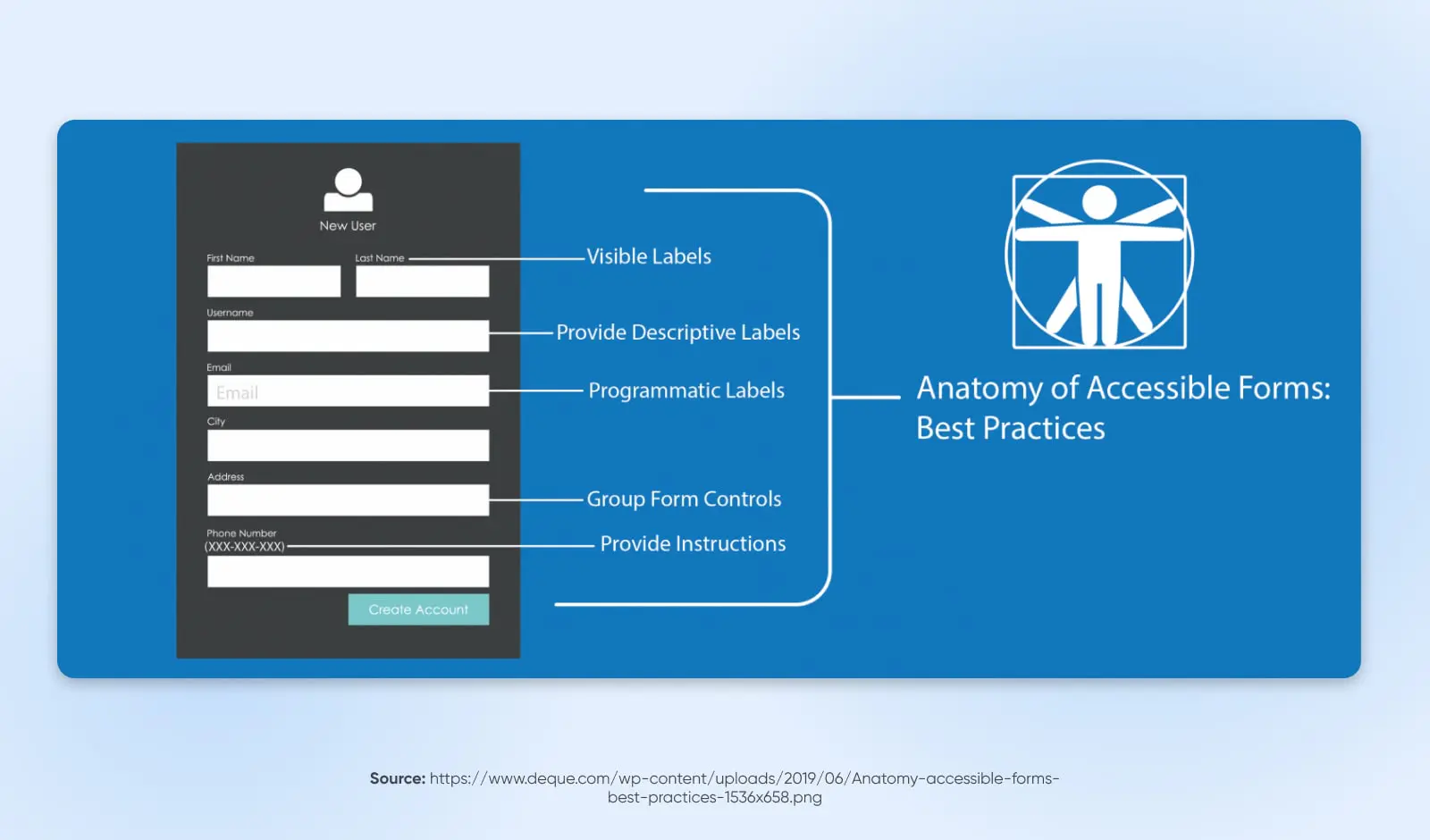
Forms are necessary for many sites and are used for everything from contact information to online purchases. Properly designed forms ensure that all users can input their information, make selections, and understand any errors that may occur during submission.
Best practices:
- Each form field should have a clear and descriptive label that is programmatically linked to the field. This assists screen reader users in understanding what type of information is expected.
- When users make an error, such as missing a required field or entering invalid data, the error should be clearly identified and described in text. This helps users understand what needs to be corrected.
- Ensure that the tab order of the form follows a logical sequence, allowing users to navigate through the form fields using the keyboard in a predictable manner.
- As users tab through the form, there should be a visible indication of which field currently has focus, such as a border or background color change.
- Use fieldsets and legends to group related fields. This is particularly helpful for screen reader users, as it provides context and helps in understanding how different fields are related.
- If your form includes dropdowns, checkboxes, or custom controls, ensure they are fully accessible and can be navigated and selected using a keyboard.
- Where necessary, provide instructions or examples for fields, especially for those that require data in a specific format, like dates or phone numbers.
- If your form has a time limit for completion, provide a way for users to extend the time if needed, as some users may require more time to read and fill out the form.
- Make sure that the form is usable across different devices and screen sizes, especially for users who may be zooming in or using a mobile device.
- Plugins such as Formidable Forms come with helpful accessibility tools built-in.
7. Give Visitors Enough Time To Engage With Your Site
Some site visitors may read slowly, have cognitive or learning disabilities, or use assistive technologies that require additional time to navigate and interpret content. Make sure you allow them sufficient time to read, watch, and use everything on your site.
Best practices:
- If your website has features or content with time limits (like timed quizzes, forms with session timeouts, or rotating carousels), provide a way for users to adjust, extend, or disable them.
- For any moving, blinking, or scrolling content, and for auto-updating information (like news tickers), provide controls that allow users to pause, stop, or hide them.
- Avoid automatically updating content without user initiation, as this can be disorienting for screen reader users.
- If a timeout is necessary (such as for security reasons on a banking site), warn users before time expires. This gives them a chance to extend their session without losing data.
8. Avoid Blinking Or Flashing Content
Avoiding blinking or flashing content can make your website more accessible to users who are susceptible to seizures caused by flashing lights or patterns, a condition known as photosensitive epilepsy. Additionally, rapidly blinking or flashing content can be distracting, or even painful for users, contributing to an unpleasant or inaccessible web experience.
Best practices:
- As a rule, avoid content that flashes more than three times in any one-second period. This guideline, part of the Web Content Accessibility Guidelines (WCAG), helps reduce the risk of seizures.
- If your website must include content that flashes or blinks (for artistic or informational reasons), provide a clear warning before the content is displayed. This allows users with photosensitivity to avoid or prepare for exposure to such content.
- Be mindful of animations and transitions in your web design. Ensure they’re subtle and do not involve flashing or rapid movements. Provide options to reduce or turn off animations if possible.
- Instead of using flashing content to draw attention, consider alternative methods like using bold colors, patterns, or static graphics that are equally effective but don’t pose a risk to users.
- When in doubt, consult with web accessibility experts who can review your site for potentially problematic content and suggest safer alternatives.
9. Provide Clear Navigation
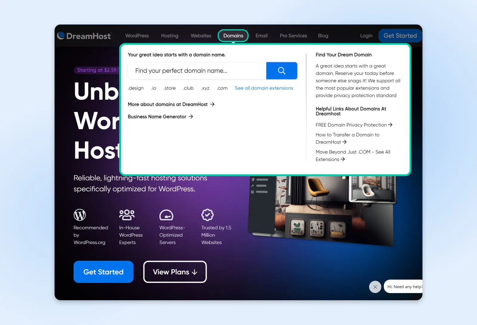
Clear navigation is a cornerstone of web accessibility. It enables all users, including those with disabilities, to find their way around your site with ease. Good navigation is especially beneficial for users with disabilities and those who rely on assistive technologies. Clear, predictable navigation structures help users understand where they are on your site, how to get to their desired destination, and how to return to previously visited pages.
Best practices:
- Keep your navigation layout consistent throughout the site. Consistency helps users learn and remember how to navigate your site, reducing confusion and frustration.
- Group related navigation items together. This can be achieved through well-organized menus, clear section headings, or a site map that provides an overview of your website’s structure.
- Make sure all menus are accessible with keyboard navigation and screen readers. This includes drop-down menus and other dynamic content.
- For websites with multiple layers of content, use breadcrumb trails. These provide users with a clear path of their journey from the home page to their current location and help with easy navigation back to previous sections.
- Implement a robust search feature, especially for larger sites. This allows users to quickly find information without navigating through multiple pages.
10. Make Content Clear And Easy To Understand
Making your website’s content clear and easy to understand can help visitors with disabilities, learning difficulties, or those who are not native speakers of the site’s language. Clear, straightforward content ensures that information is accessible to a wider audience and helps all users to quickly grasp the intended message or action.
Best practices:
- Write content in plain language. Avoid complex sentences, jargon, and technical terms. When technical terms are necessary, provide simple explanations or a glossary.
- Use headings and subheadings to structure your content logically. This helps users, especially those using screen readers, to understand the layout and find information more easily.
- Keep paragraphs and sentences short and to the point. This structure makes the content easier to read and understand.
- Use bullet points or numbered lists to break down information into manageable, easy-to-digest pieces. This is especially helpful for instructions or complex information.
- Maintain a consistent layout and design throughout your site. Consistency in fonts, colors, and styles helps users to better understand and navigate your content.
- Where appropriate, use images, icons, or diagrams to support the text. Visual aids can help convey complex information more clearly and can benefit users who process visual information more effectively than text.
- Make call-to-action buttons or links clear and descriptive. Users should be able to understand what will happen when they click on them.
11. Write Useful Error Messages
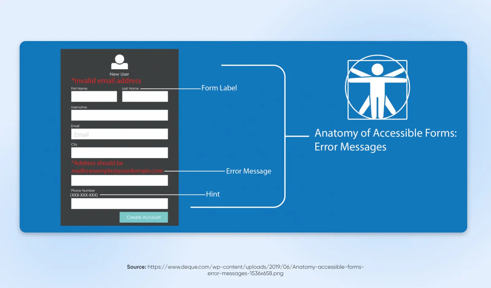
Effective error messages guide users through resolving issues they encounter, which is particularly important for users with disabilities who may find it more challenging to understand and rectify errors. Clear, informative error messages help prevent frustration, ensuring that all users can successfully interact with your website and complete their intended actions.
Best practices:
- Error messages should clearly state what the problem is. Avoid vague or technical language that might confuse users. For instance, instead of saying “Invalid input,” specify what is wrong, such as “Email address format is incorrect.”
- Whenever possible, pair the error message with a suggested solution or next steps. For example, if a required field is empty, the error message should prompt the user to fill in that field.
- Visually highlight the field or area where the error occurred. This can be done by changing the border color, adding an icon, or using text styles. This is particularly helpful for users with visual impairments.
- Use a friendly, non-technical tone in your error messages. This approach reduces frustration and anxiety, especially for users who may already be struggling to navigate your site.
- Position error messages close to the point of error, ideally above or next to the form field in question. This makes it easier for users, including those using screen readers, to locate and understand the error.
- Ensure that error messages and indicators are accessible to screen reader users. Use ARIA roles and properties to communicate the presence and nature of errors.
- Use a consistent method for identifying and presenting errors throughout your website. Consistency helps users understand and predict how errors may be communicated.
- In cases of complex or repeated errors, provide an option for additional assistance, such as customer support contact information.
12. Write HTML That Can Be Parsed
HTML
HTML stands for HyperText Markup Language. It is the most fundamental building block of the web and the standard markup language for creating web pages and applications.
Read MoreFinally, write HTML that can be parsed, or correctly processed by web browsers and assistive technologies. Well-structured and valid HTML code allows screen readers and other assistive tools to accurately interpret and convey the content to users. This practice is fundamental for creating a web environment that is inclusive and navigable for everyone.
Best practices:
- Stick to standard HTML tags and avoid proprietary tags or attributes. This ensures that your HTML code is universally understood by all browsers and assistive technologies.
- Structure your HTML document properly. Use a logical order for HTML elements, and ensure that elements like headings (
<h1>through<h6>), paragraphs (<p>), lists (<ul>,<ol>,<li>), and other standard elements are used appropriately. - Utilize HTML5 semantic elements such as
<header>,<footer>,<article>,<section>, and<nav>to define the structure of your webpage. - Use HTML validators to check your code for errors or inconsistencies. Valid HTML is more likely to be interpreted correctly by browsers and assistive technologies.
- Keep content, style, and behavior separate. Use external CSS for styling and external JavaScript files for behaviors, rather than inline styles or scripts. This separation helps maintain clean, readable, and accessible HTML.
- Use meaningful title tags and meta descriptions to convey the purpose of the page.
- Declare the language of the page using the lang attribute in the
<html>tag. This helps screen readers pronounce content correctly.
Make It Easy for Everyone To Access Your Site
Continued improvements in web accessibility are a reason to celebrate. After all, if you run a WordPress website, you want to reach as many people as possible, including people with disabilities. Fortunately, designing an accessible website is well within your reach.
In this post, we discussed many strategies you can use to design a site that’s easier for all your visitors to navigate and use. For instance, you can make sure that your website is keyboard-navigation friendly to be compatible with assistive technologies. You can also use alt text and video transcriptions for all your visual media. Most importantly, when you follow our guide, you support a more equitable web experience, ensuring your site is available to as many people as possible.
Want to hire a developer who can maximize web accessibility for your evolving WordPress projects? If you’d rather leave this important task to the professionals, check out our DreamHost Development Pro Services!

You Dream It, We Code It
Tap into 20+ years of coding expertise when you opt for our Web Development service. Just let us know what you want for your site — we take it from there.
Learn More