Here at DreamHost, we believe everyone should be able to use any website on the internet, regardless of impairment or disability. However, while we care about web accessibility, we also understand that designing a website that’s both accessible and visually attractive can be challenging.
The good news is that you can design accessible websites without sacrificing visual impact. In fact, some of the most stunning websites out there are designed specifically to be more accessible to people with disabilities — and we could all learn a thing or two from them.
Accessibility
Accessibility is the practice of making a website accessible to as many users as possible. Accessible websites can be viewed by anyone on any device.
Read MoreIn this post, we’ll start by showing you what strong web accessibility looks like, and cover some web accessibility standards designed to help democratize access to websites. Then we’ll show you 12 of the best web accessibility examples on the internet, including some popular websites that have committed to accessibility, and see what they can teach us.
Let’s get started!
What Great Web Accessibility Looks Like
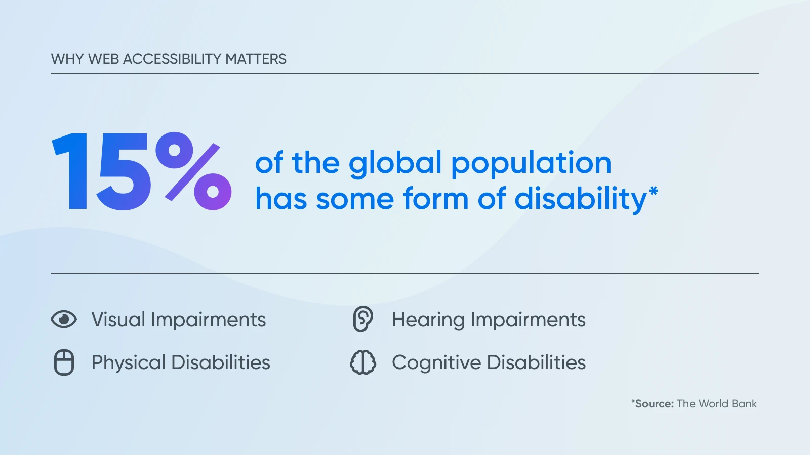
According to The World Bank, around a billion people, or 15% of the global population, have some form of disability. These can include:
- Visual impairments: Some users have a visual disability that inhibits their ability to see clearly or perceive color contrast ratios. A range of people may fall into this category, including blind users or those with color blindness. For users with visual impairments, you might use audio descriptions or accessible color combinations (for example, avoid using dark text on dark background colors).
- Hearing impairments: Users with hearing impairments may include D/deaf people and those with partial hearing loss (hard of hearing/HoH). Captions for audio content can provide these users with a more accessible experience.
- Physical disabilities: Some people have mobility impairments that can impact their dexterity and ability to make precise movements, possibly making using a mouse difficult. Those with physical disabilities may be assistive technology users. Ensure your site is properly coded for assistive devices to provide accessible content for users with physical disabilities.
- Cognitive disabilities: Some users may have cognitive impairments like dyslexia, dementia, or an auditory processing disorder. You may consider using a specific font, like Dyslexie. You should also ensure that any audio content has a transcript available for those with auditory processing impairments.
It’s important to keep all of these different abilities in mind when creating your website to make sure there aren’t barriers for disabled users. To help web designers with this, W3C has developed a set of Web Content Accessibility Guidelines (WCAG).
Solid web accessibility means adhering to these guidelines and carefully following the four guiding principles of accessible design. These guiding principles state that all websites should be:
- Perceivable
- Operable
- Understandable
- Robust
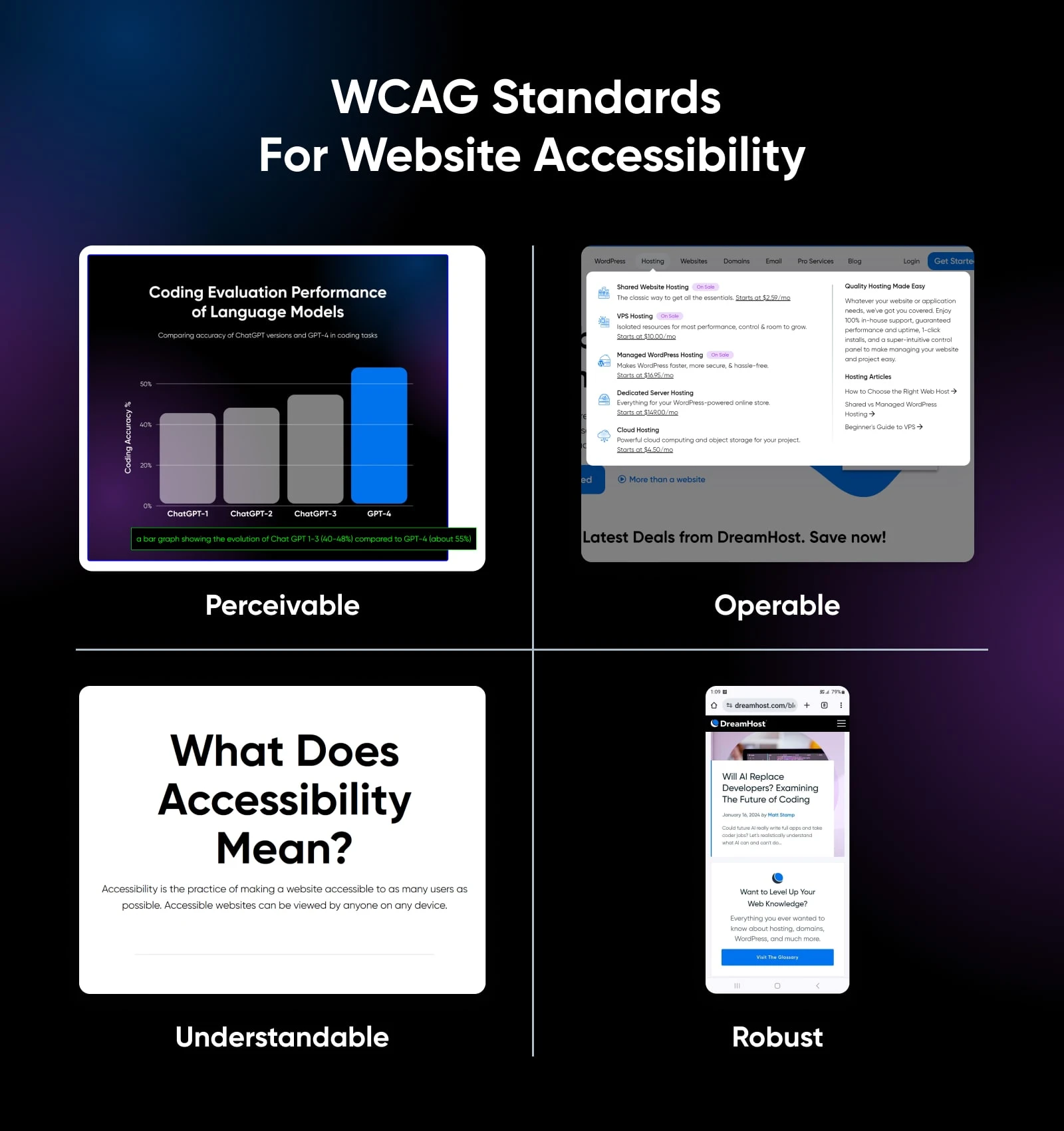
Ensuring that your website is “operable” might mean implementing keyboard-friendly navigation for people who can’t use a mouse. “Perceivable” could mean using high-contrast colors for people with visual impairments.
Ready to see what these principles look like in practice? Below, we have 12 examples of websites that are doing accessible design right.
12 Great Web Accessibility Examples To Inspire You
Here, you’ll find some of our favorite web accessibility examples. These 12 websites are examples of accessible web design at its best.
1. Scope
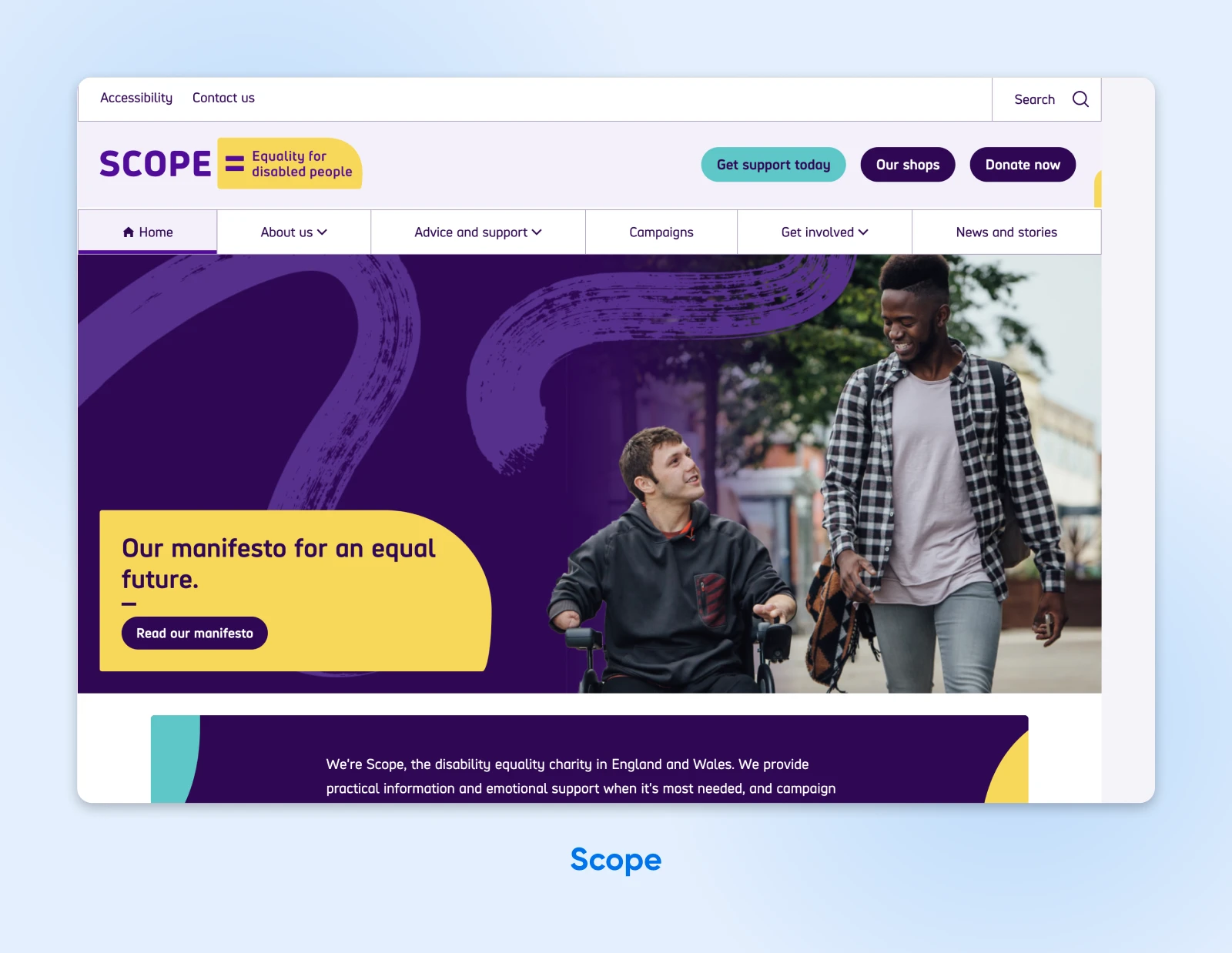
Scope is a disability equality charity based in England and Wales dedicated to creating a fairer, more equal society. As a champion of disability equality, you’d expect that this organization’s website would be as accessible as possible — and it is.
Not only does it fully adhere to WCAG 2.0 and WCAG 2.1 guidelines, but the site is even customizable for individual users. For example, users can change the site’s colors, increase the text size, or even turn on text narration to have the content read aloud.
If you look at the top-left section of the home page, you’ll see an Accessibility tab. Click on this, and the site will bring you to its accessibility page, which includes instructions on how to adapt the experience to your needs, links to assistive technologies, and a list of known accessibility issues that are being worked on.
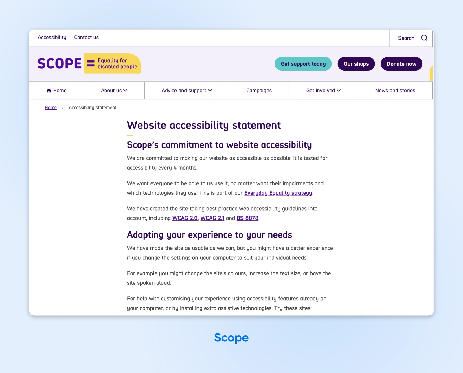
Scope uses short sentences and large, clean fonts throughout the site for maximum readability. Plus, the site is fully compatible with screen reader software.
Despite already being a fantastic example of website accessibility, the team at Scope continues to make improvements. Every four months, they test the website for accessibility and make updates wherever necessary.
2. Harvard University
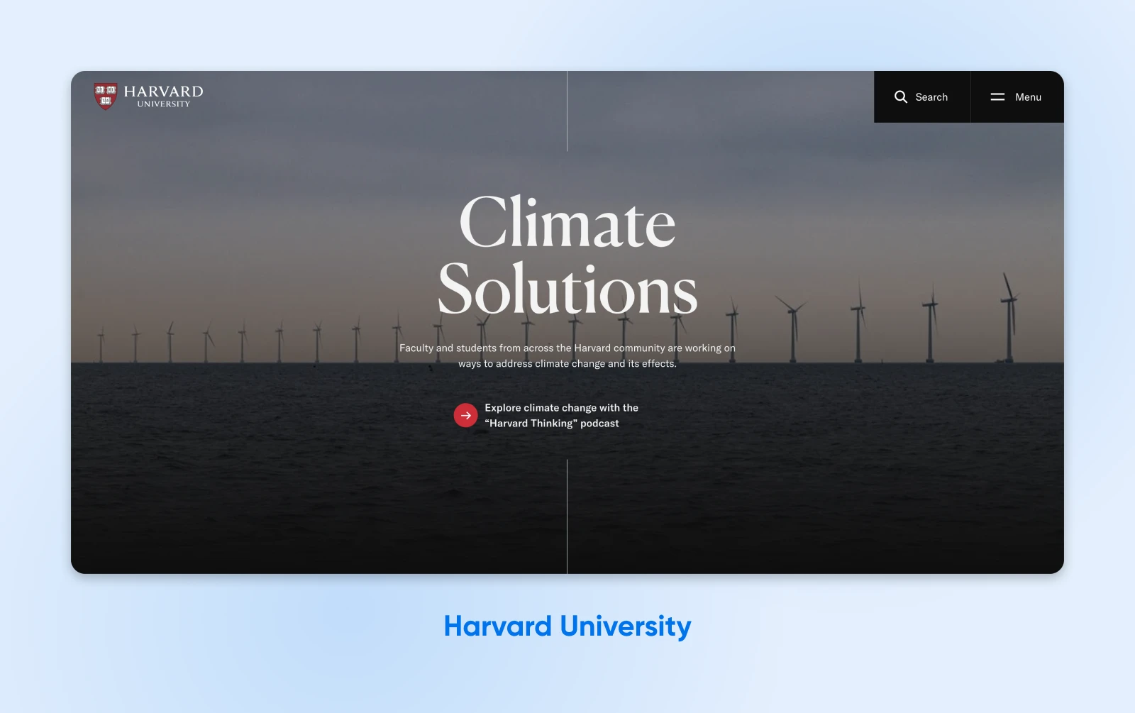
Harvard’s education isn’t its only strong suit. The world-renowned university’s website also stands out for its accessibility, offering an army of reading tools, multilingual video subtitles, and carefully curated color schemes that meet the needs of color-blind visitors.
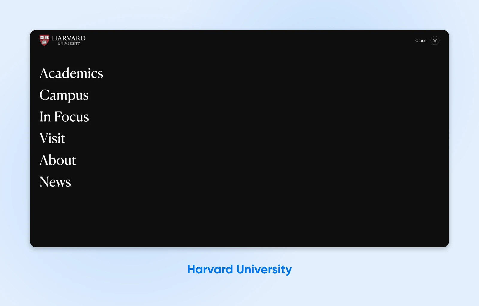
Harvard’s navigation menu also gets points for accessibility. It’s simple but effective, with large, easy-to-read text in a high-contrast color. It’s also clear and easy to find.
3. Paralympic.org
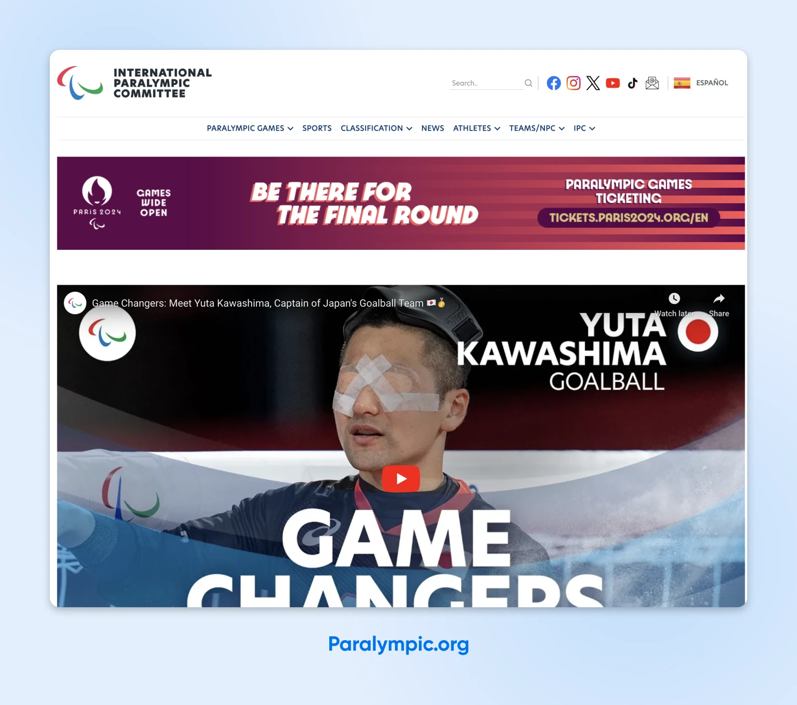
Paralympic.org is the official website of the International Paralympic Committee (IPC). The IPC is a powerful advocate of social inclusion, and its website is a testament to that.
It features keyboard-friendly tab navigation and an instant “scroll-to-top” arrow button to make it easy to move around the page. Images and videos are large and prominently visible, and there’s plenty of white space to make visual elements stand out.
If you go to the home page, you’ll notice a text size adjuster in the top-right corner of the screen. This is easily visible and allows users with visual impairments to quickly customize the size of the text to meet their needs.
4. Walmart
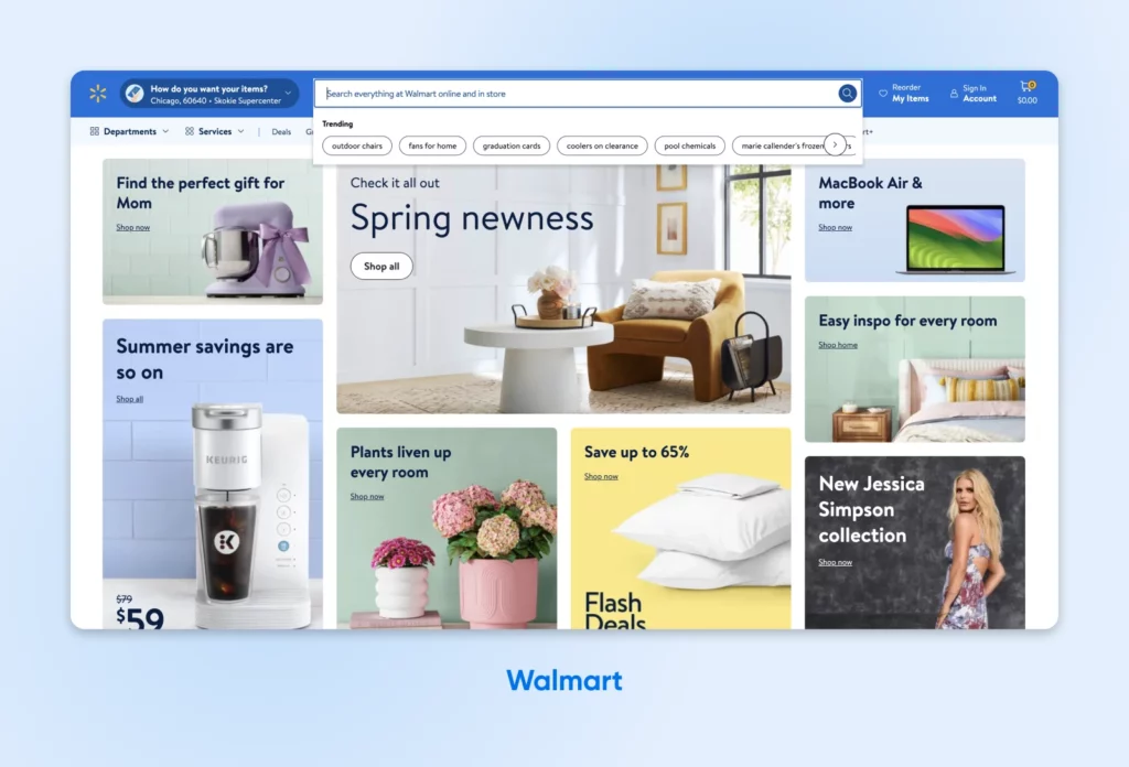
One of the WCAG’s requirements for accessible websites is that they need to be “focus visible,” meaning that the part of the site that is in use is highlighted. Walmart’s website is a great example of this. It has a ton of interactive elements like buttons, links, and form fields — but visitors can only focus on one at a time, and the one they’re interacting with is distinctly highlighted for maximum visibility.
It’s also easy to navigate between different interactive elements, from the navigation menu to different buttons, the search bar, links to your account page and shopping cart, and more, whether you use mouse or keyboard navigation.
5. KidsWish
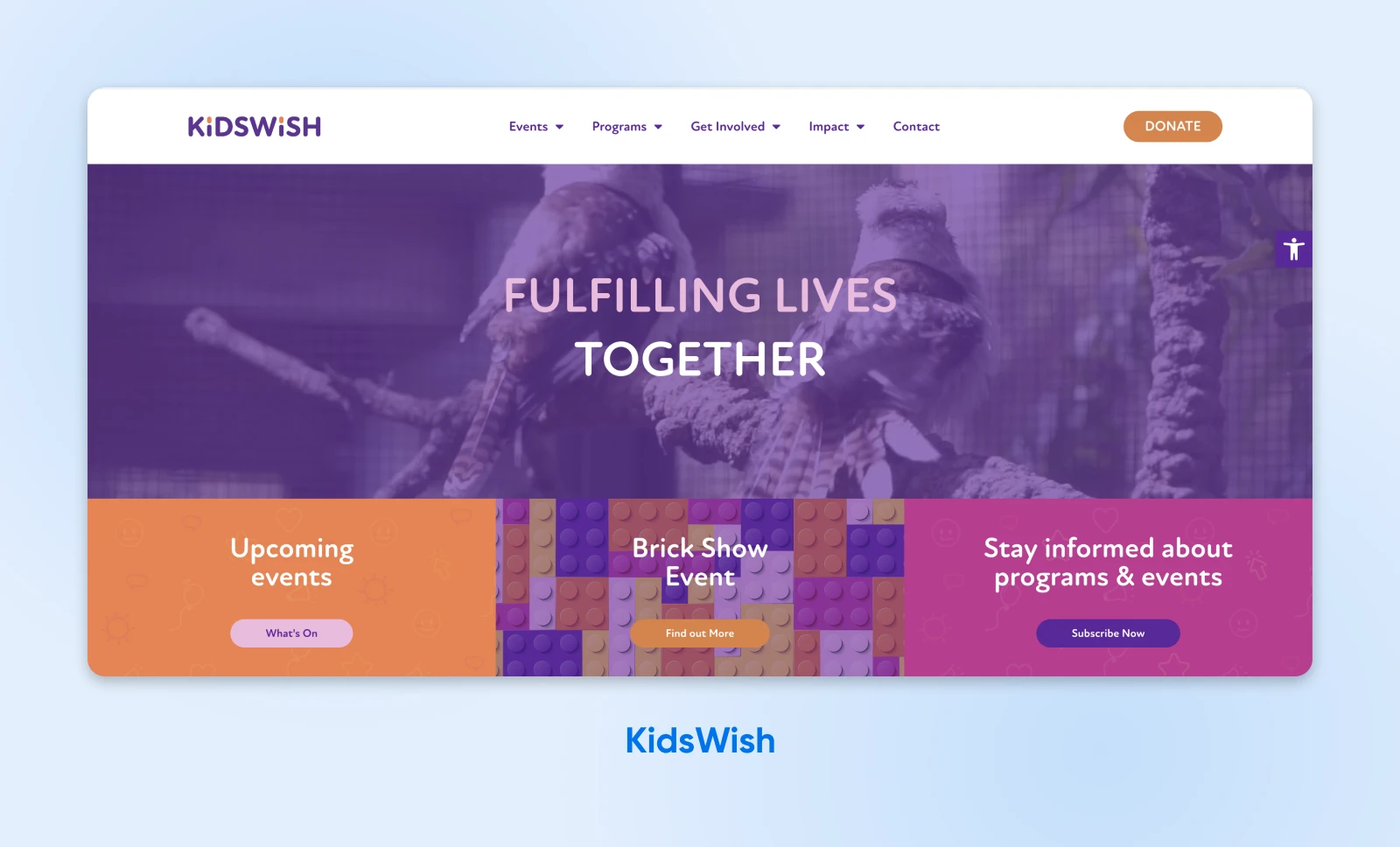
KidsWish is an organization that provides therapy, support services, and an annual Christmas party for children who are disadvantaged or have a disability. It caters to many people with different disabilities, so naturally, their developers built a website that was as accessible as possible.
And guess what? They nailed it. The KidsWish website is wonderfully designed, with a logical structure, keyboard-friendly navigation, high-contrast colors, and large text. Plus, it’s easy to browse with prominent, clickable elements.
The design is also very child-friendly. It boasts a bright, bold color scheme and tons of fun graphics.
6. Nomensa
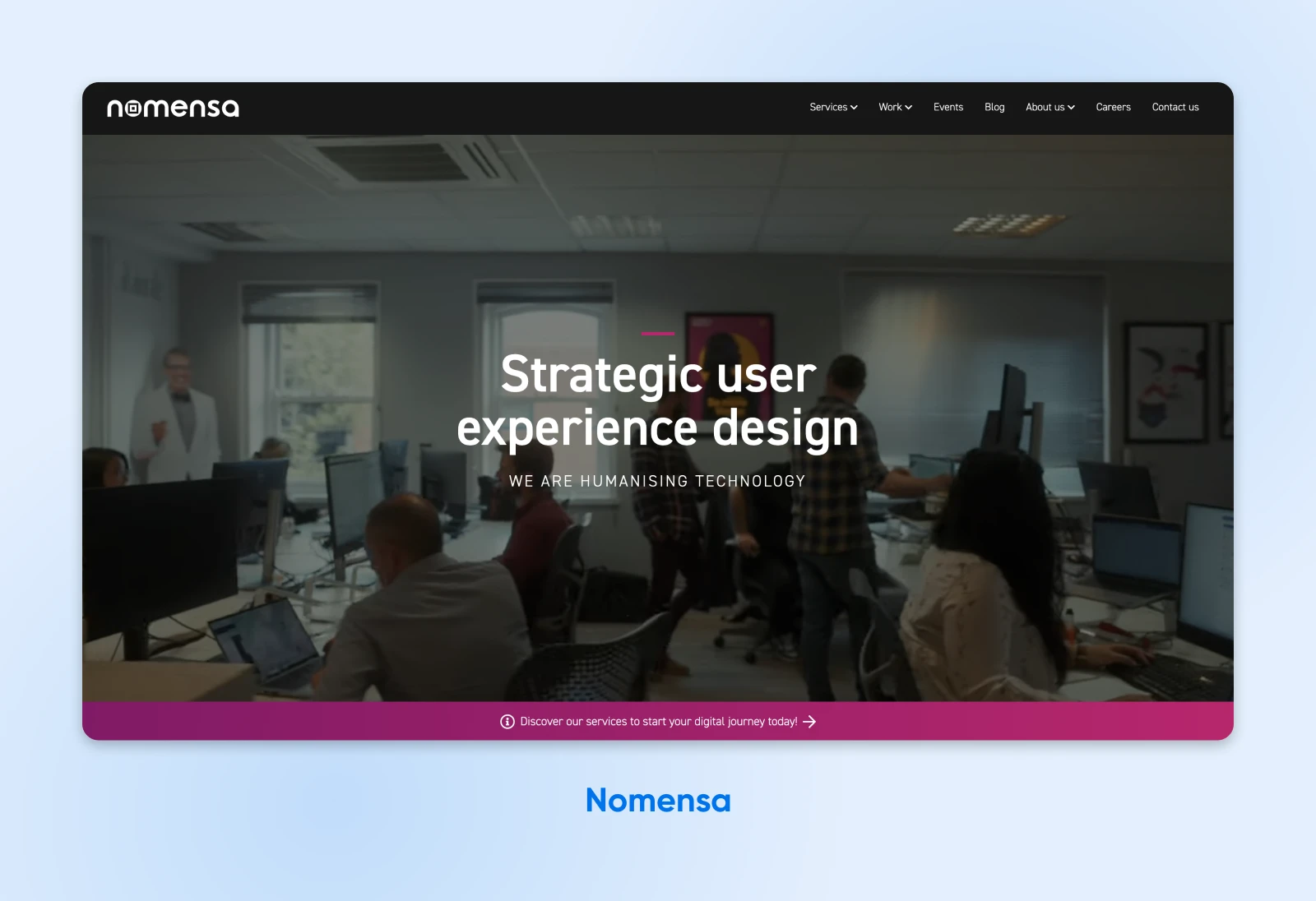
Nomensa is a strategic user experience (UX) design agency based in London. They put such a focus on accessible design, that they offer a web accessibility test that their current and prospective customers can take to see how their sites measure up against international standards.
The agency then offers design services to help customers correct any issues discovered by the accessibility testing tool.
Get this: the firm’s co-founder is a co-chair of the World Wide Web Consortium (W3C) and helped write the WCAG guidelines that direct web accessibility best practices. It’s no wonder Nomensa takes accessibility solutions so seriously!
7. Ovo Energy
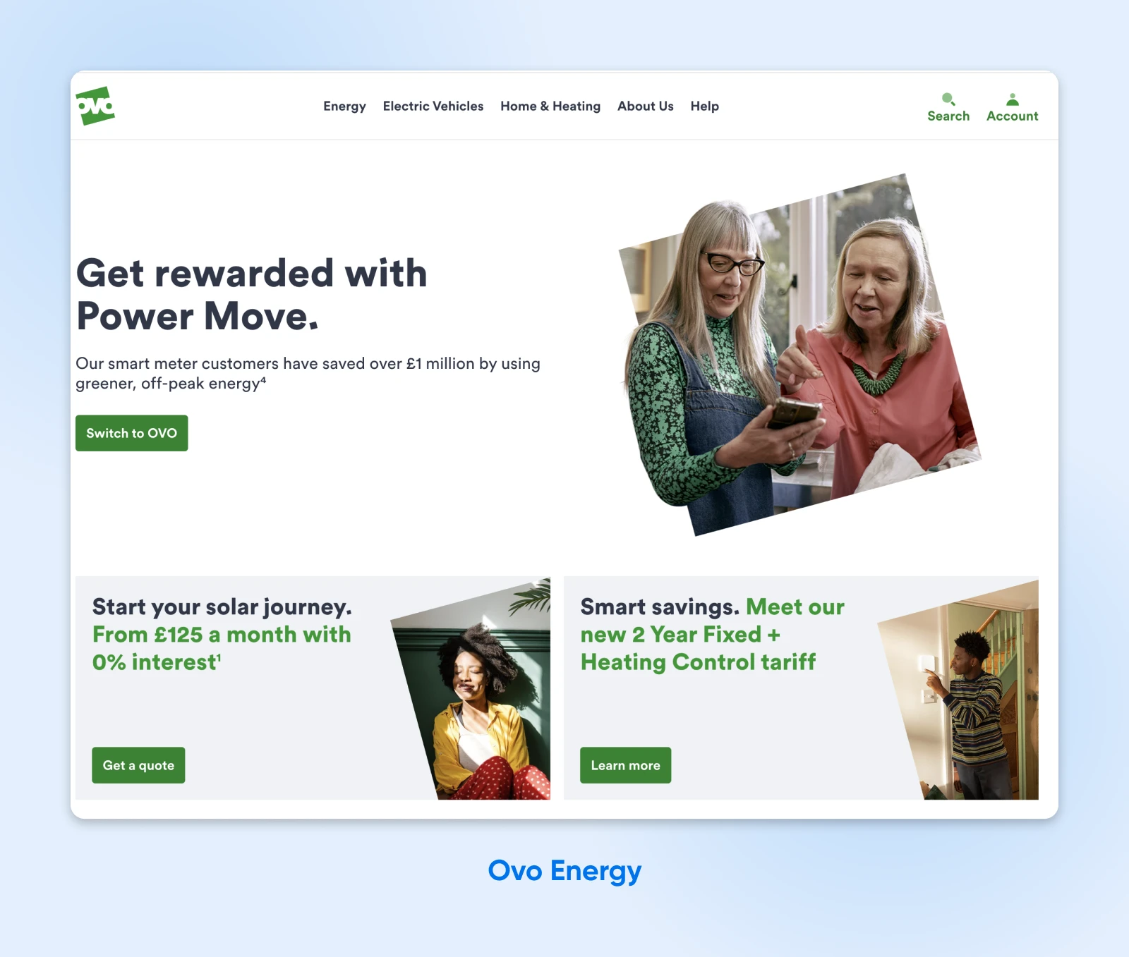
Ovo Energy is a UK-based energy company. Its website features information about tariffs and bundles and includes a main login portal for customers to service their accounts.
The company has done a wonderful job of making the site accessible to all by using large readable text and a clear interface. It also incorporates keyboard navigation to make it easy to get around the site.
The designers went above and beyond to ensure that the site is accessible to visually- and hearing-impaired users. There are SignVideo services for British Sign Language users, and the color contrast meets WCAG guidelines.
Customers can also request bills in Braille and larger formats. In addition to all of this, the site is compatible with assistive technology.
8. Bleacher Report
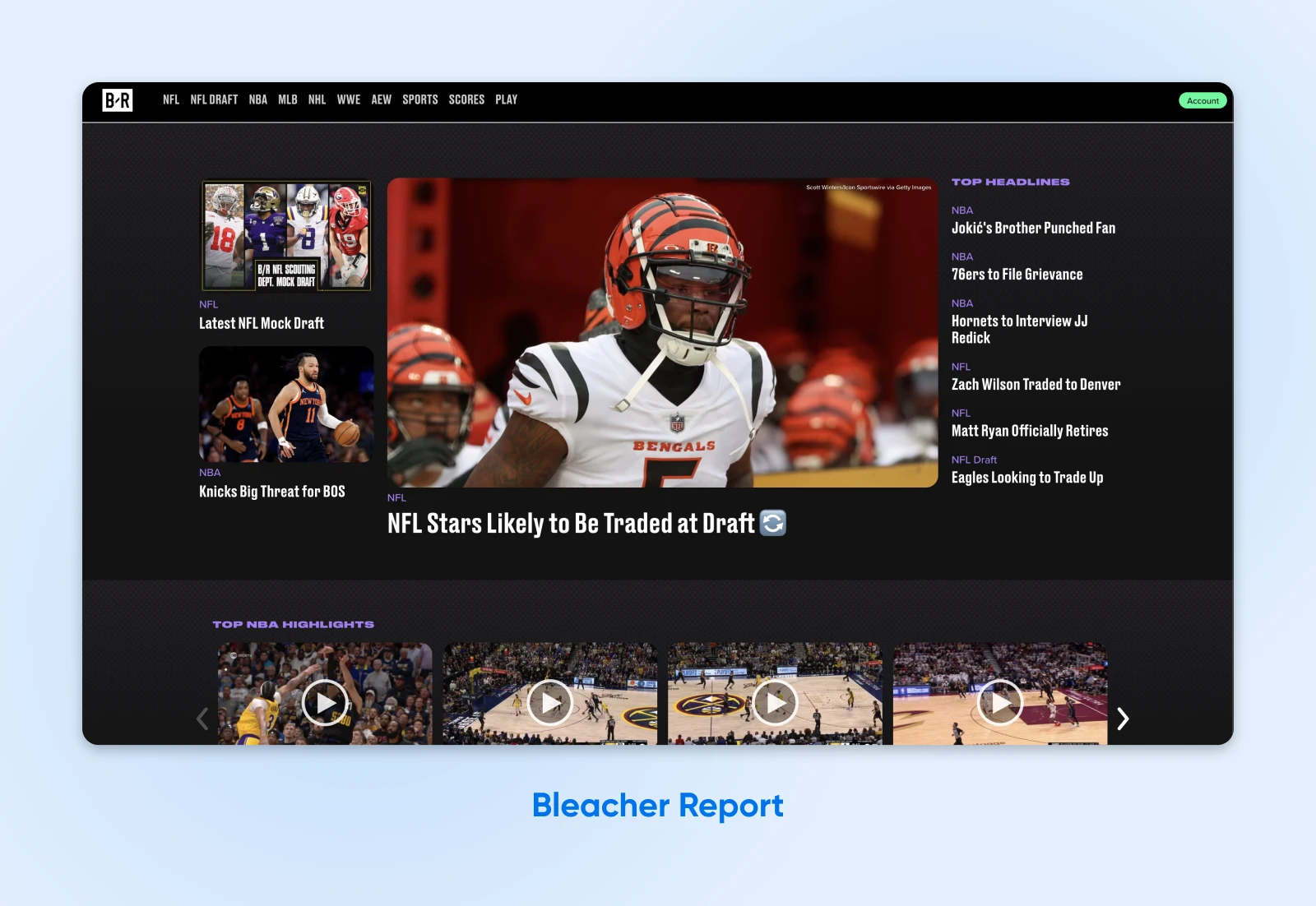
Sports news site Bleacher Report does something different that’s extremely helpful for users who access their site using screen readers or keyboard controls. The first focus points are the cookies notification, Privacy Policy, and Terms of Use, and if you click on the external link for these, they open in a new window.
To users without disabilities, this may not seem like a big deal, but this gives all visitors to Bleacher Report’s site access to important legal information. On most sites, the legal and cookies alerts are at the bottom of the page, which means visitors who use keyboard controls or screen readers get to them at the end of their visit, after browsing through the rest of the site. This is a small change with a big impact for people with disabilities.
9. BBC iPlayer
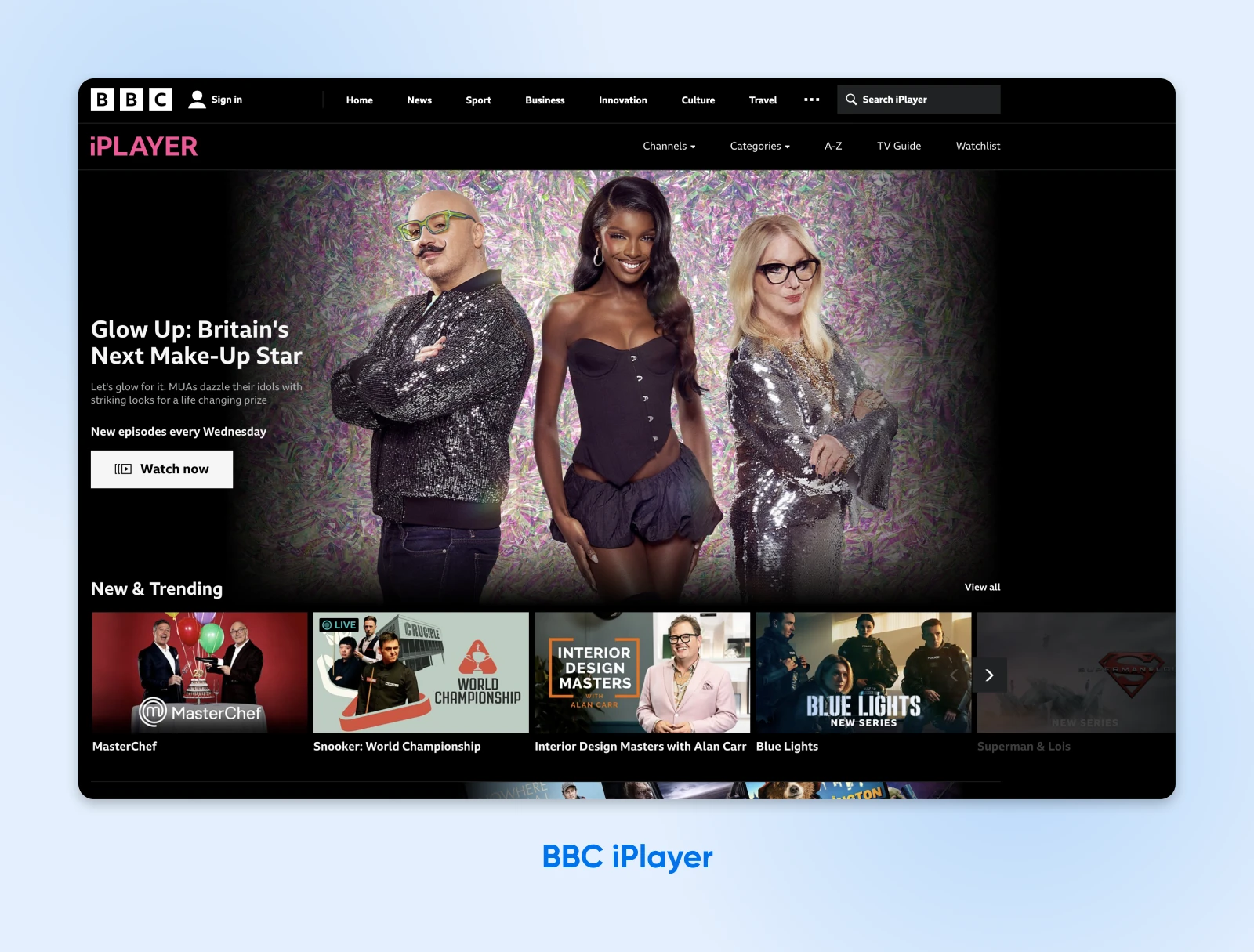
BBC iPlayer is the BBC’s online streaming service. Users watch programs online on its website. It’s also another fantastic web accessibility example that we can all learn from.
First, the website is both very easy to navigate and compatible with assistive technology. You can move around the page by clicking on the Tab button. Navigating over the iPlayer logo brings up an option for Accessibility help, which links to a resource page with a lot of useful information for users with disabilities.
The content is logically laid out, and all buttons use a clear visual design with high-contrast colors. There are also keyboard and mouse-accessible tooltips that provide extra information for users and descriptive alt text for all images.
The video content is also accessible. All shows on BBC iPlayer feature subtitles. There are also audio-described and signed content categories.
10. Metropolitan Transportation Authority
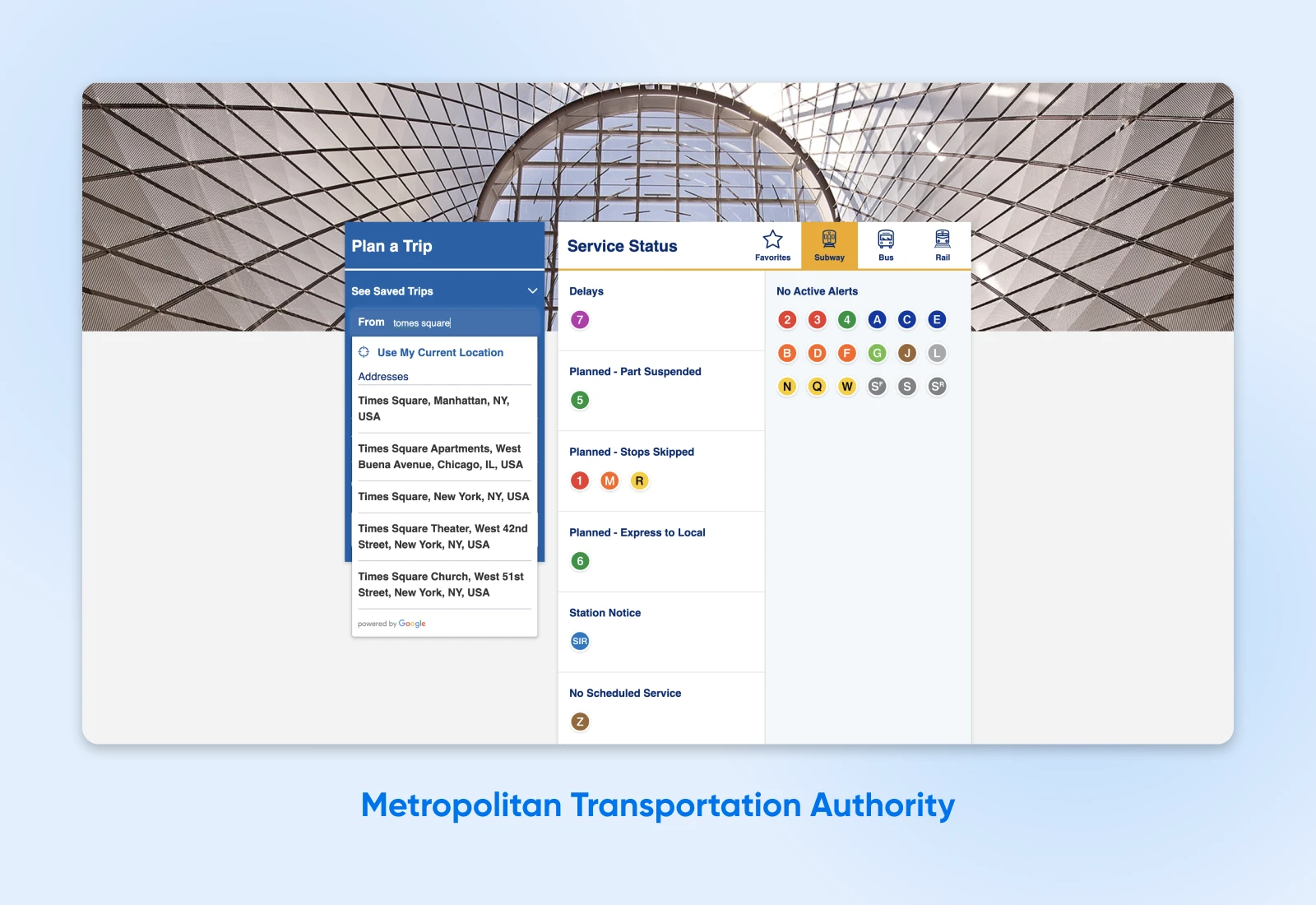
In addition to having a responsive site that’s easy to use on devices with screens of all sizes, New York City’s Metropolitan Transportation Authority also has a built-in search experience that helps users find the information they’re looking for more quickly and easily. How? The search function still provides results even if users misspell words or provide inputs in the wrong formats.
For example, if a user inputs an address or neighborhood into the MTA’s trip planner with a typo, the search bar will still suggest addresses based on its best guess of what the user was looking for.
11. NSW Government
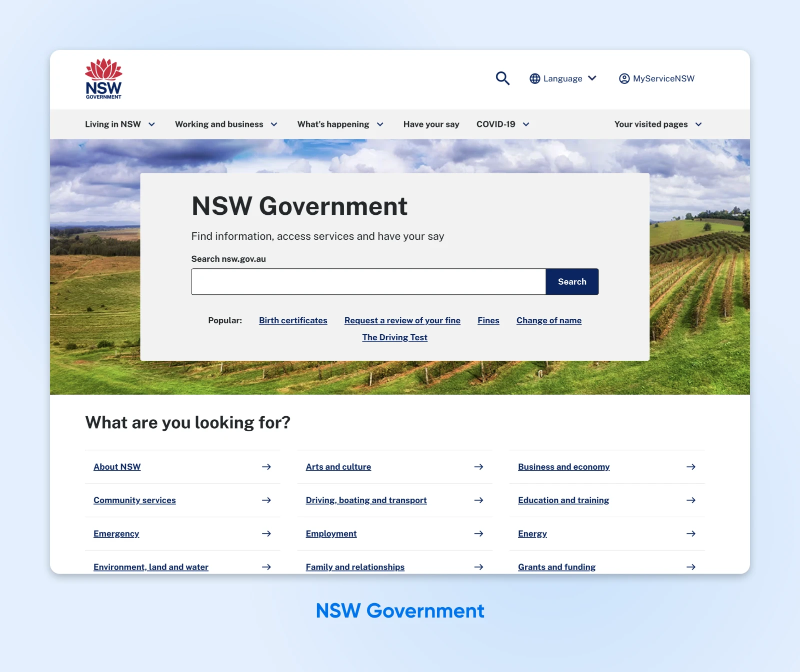
The NSW Government website is the government hub for the New South Wales area of Australia. The website is designed to be user-friendly for residents from all backgrounds and abilities.
The website features tab navigation, making it simple to navigate pages using a keyboard or screen reader. Thanks to large fonts and contrasting colors, it’s also extremely readable and gets points for being compatible with assistive technology.
12. GOV.UK
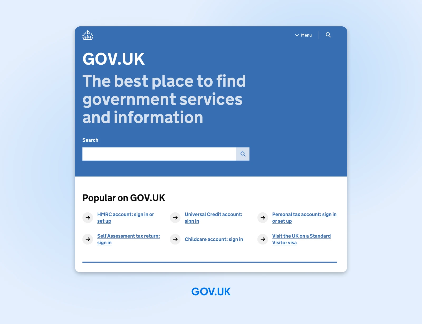
GOV.UK is the central hub for all U.K. government web pages. The site provides information about everything from disability aid and benefits to visa and immigration support.
The U.K. Government has done an amazing job of making its site accessible for everyone who needs it. The website features keyboard navigation and ARIA attributes, so you can find pages easily. Furthermore, it’s designed to support 300% zoom for visually-impaired readers.
Make An Accessibility Statement
Making sure your website is as accessible as possible is both a moral and a professional obligation. It might seem like a challenge, but we promise you — it’s worth it. The examples above will guide you in creating an inclusive website that will be accessible to all users.
Ready to build your accessible website? Let us take care of the technical side for you, so you can focus more of your time and energy on what matters: the design. Sign up for our Shared Unlimited Hosting Plan and get unlimited, secure hosting for all of your websites.
Note: We do extensive research on disability-inclusive language for our articles. Remember to utilize your resources when creating accessible content, and when in doubt, always ask.

You Dream It, We Code It
Tap into 20+ years of coding expertise when you opt for our Web Development service. Just let us know what you want for your site — we take it from there.
Learn More