
Modern web design can feel a bit like alchemy: the ancient practice of trying to turn lead into gold. Even a beginner can recognize what makes a good website, but when it comes to building it themselves? Let’s just say making gold from scratch is harder than it seems.
What are the elements of web design?
The 7 key elements of web design are layout and visual appearance, color scheme, typography, navigation, content, video, and mobile responsiveness. Get those seven right on a foundation of fast loading, reliable uptime, and accessibility, and your site will earn visitors’ trust and keep them around long enough to convert.
“Website elements” can also mean the structural parts of the page itself: the header, hero, CTA buttons, forms, and footer. Page structure and design principles solve different problems, so this guide covers both — jump to the core elements of a web page for the anatomy tour, or the 7 key elements of web design for the design principles.
Here’s where it gets complicated, though: Modern website design is more than just visual elements and aesthetics. Your site’s design affects your search engine optimization (SEO), how your audience perceives your brand, and how visitors behave when they land on the page. It’s not really overstating it to say your site’s design and layout can impact your entire online presence.
SEO
Search Engine Optimization (SEO) is the practice of improving a site’s ranking in search results. Search results are aggregated based on a number of factors, including a site’s relevance and quality. Optimizing your site for these factors can help boost your rankings.
So whether you’re starting from scratch or redesigning an existing site, you’ve come to the right place. Read on as we explore some of the basic elements of web design, from modern design trends to ways non-designers can get involved in the design process. Through it all, we’ll learn more about how a well-designed website can be a golden ticket for your online business.
First, take care of the tech stuff (or have your host do it for you)
You thought effective website design was all about choosing the right color palette and imagery, right? Well, you’re not wrong, per se. We’re just taking a more comprehensive look at using design to create a positive user experience for your site’s visitors.
Here are a few of the technical issues you’ll want to make sure you address before moving on to the prettier parts of your website design:
- Site loading time: No matter your audience, internet consumers are a somewhat impatient bunch. In a 2009 Forrester Consulting study for Akamai, 40 percent of consumers said they would wait no more than three seconds for a page to load before abandoning a site. Faster site loading speeds, on the other hand, reduce your bounce rates (the number of visitors who click away after only seeing one page). If you need to speed up load times for your site, check out our guide.
- Uptime: The same can be said for sites that don’t load at all. Data center outages cost businesses nearly $9,000 per minute on average, per the Ponemon Institute’s 2016 Cost of Data Center Outages study. Signing up with a reliable web hosting provider can help ensure your site stays up as much as possible. For example, DreamHost uses high-performance NVMe SSD storage in our servers, which is dramatically faster than traditional hard disk drives. Uptime guarantees are another vital measurement to consider when evaluating reliability. DreamHost guarantees 100% uptime. If we fall short, eligible customers may receive compensation under the terms of that guarantee.
- Cross-browser compatibility: Your site should render properly across all major browsers and operating systems. Cross-browser testing before your site goes live can help you make sure users won’t run into compatibility issues with different browsers.
- Accessibility: Accessibility means every person can access and use your site — even if they have disabilities. Learn how to design an accessible website with our ultimate guide.
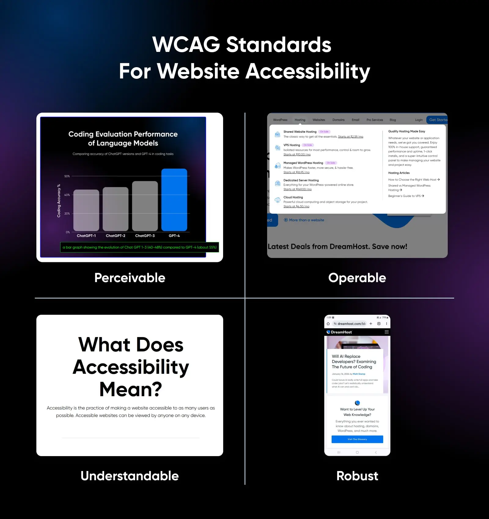
The core elements of a web page
Nearly every website, from a one-page portfolio to a sprawling online store, is assembled from the same structural parts. Before we get into the design principles, here’s the anatomy of a typical web page and the job each element does.
| Element | Its job | Quick tip |
|---|---|---|
| Header | Anchors your logo and primary navigation at the top of every page | Keep it slim; a sticky header keeps navigation within reach on long pages |
| Navigation menu | Routes visitors to the information they want | Use plain, predictable labels; clarity beats cleverness |
| Hero section | Delivers your main message and imagery the moment the page loads | One message, one strong visual, compressed to load fast |
| Call-to-action (CTA) buttons | Turn interest into action: buy, book, subscribe, get in touch | One clear primary CTA per screen, placed after the content that earns it |
| Forms | Collect leads, signups, and messages | Ask only for what you truly need |
| Search | Lets visitors skip the menus and jump straight to what they came for | A must for content-heavy and e-commerce sites |
| Breadcrumbs | Show visitors where they are in your site’s structure | Helpful on deep sites like stores and documentation; skip them on small sites |
| Content sections | Carry the actual information visitors came for | Break them up with headings and white space so they’re skimmable |
| Sliders and carousels | Rotate several messages or images through one space | Use sparingly, and give visitors manual controls instead of auto-rotation |
| Footer | Catches visitors who reach the bottom without converting | Include contact info, key links, and an email signup |
Think of these parts as the rooms of the house. The seven elements below are how you decorate them.
7 key elements of web design
Now we can get into the fun stuff, like colors, typography, call-to-action buttons, white space, navigation, and other web design elements!
Below, we’ll explore seven basic elements, but remember that web design is an art form, not a science. You can always take risks with your website if they’re calculated and reversible. You may even start the next big web design trend.
1. Overall layout and visual appearance
Your site’s overall look is, of course, a crucial element of design. First impressions are critical, so you want to wow visitors as soon as the page loads. Users take only 50 milliseconds to form an opinion of your website or business, which will help determine whether they stay or leave.
Below, we’ll cover a few specific elements of your site’s layout and visual appearance that you may want to spend more time on.
Visual hierarchy
Visual hierarchy is how you steer a visitor’s eye. Size, contrast, and position signal importance: big, high-contrast elements near the top of the page get seen first, so your most important message and primary CTA should claim that real estate.
More About Visual Balance
Visual balance is the distribution of visual weight (the pull elements exert on the eye through their size, color, contrast, and position) across a design so no single area overpowers the rest. Designers achieve it through symmetrical, asymmetrical, radial, or mosaic arrangements, and a balanced layout feels stable and easy to scan.
It also pays to design for how people actually scan. Nielsen Norman Group’s eye-tracking research, first published in 2006 and reconfirmed in 2017, found that users often scan pages in an F-shaped pattern: across the top, a shorter sweep farther down, then a quick vertical skim down the left side. The antidote is structure — front-load your headings and first lines with the words that matter most, and break content up so key points sit where eyes actually land.
Minimalistic design
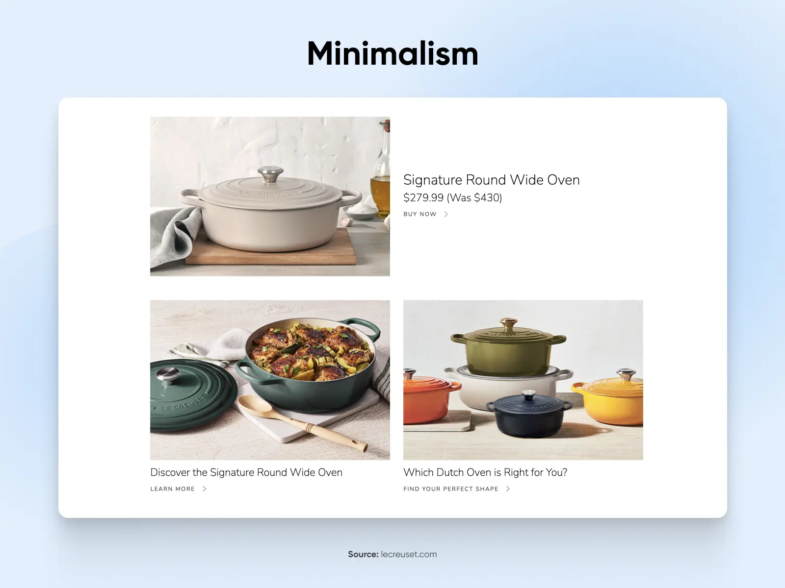
Minimalistic design (or minimal design) means placing only necessary elements on your home or landing page. Its visual design should be simple, familiar, intuitive, clean, and accessible. Minimalist web design uses negative, or white, space to make the page skimmable and draw visitors’ eyes to what’s most important.
A trendy and effective way to use minimalism on your site is with card design. This is a popular web design style where you group text and images together on individual cards, giving visitors bite-sized pieces of content that they can absorb quickly without becoming overwhelmed.
Hero images
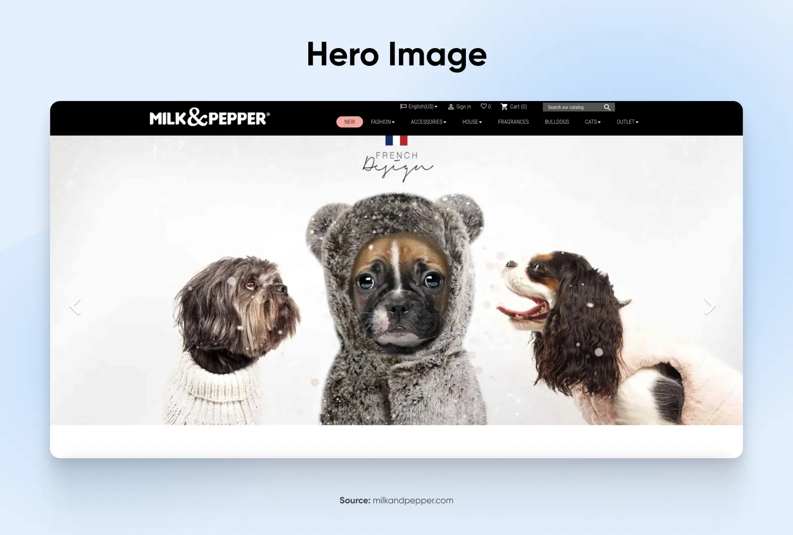
Hero images have become trendy in modern web design. Just keep in mind that if you’re going to use a hero image (one large image that dominates the page), high-quality images are a must — as are modern compression tools to reduce the file size so having a large image doesn’t slow down your page load times.
E-commerce elements
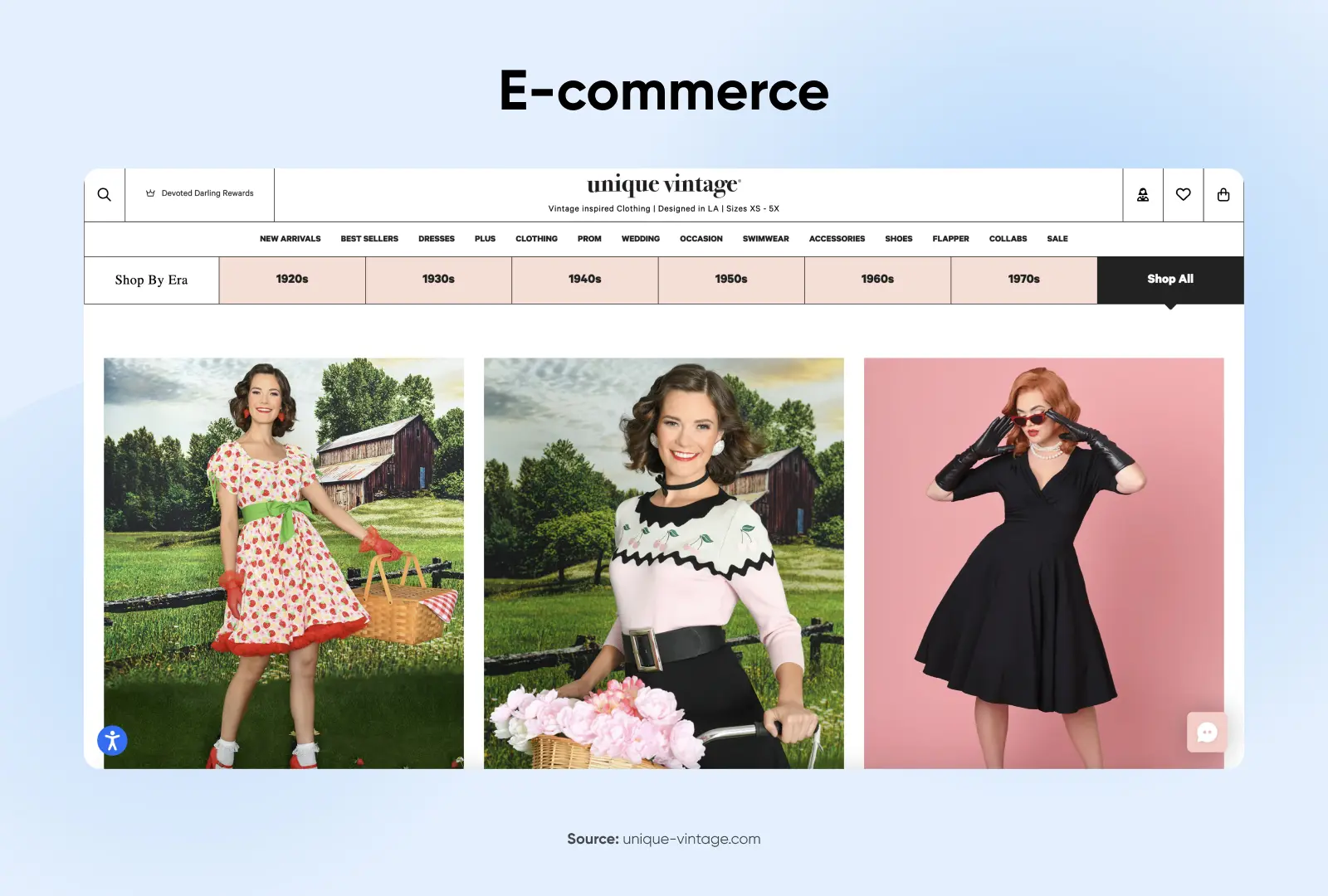
If your site is for e-commerce, you have a lot more visual elements to think about, but we’ll focus on two of the most important: product images and calls-to-action (CTAs).
For e-commerce sites, the design elements need to look great and help motivate and facilitate purchases. High-quality product images help shoppers see a detailed and appealing view of the products you have on offer, making them absolutely essential for any site that includes online shopping.
Call-to-action buttons are critical on any website, not just stores: every site has a next step it wants visitors to take, whether that’s buying, booking, subscribing, or getting in touch. Place your primary CTA after the content that makes the case for it, and avoid stacking competing CTAs in the same view — one clear next step beats three. Buttons should be designed to stand out, prominently placed, and clearly labeled to help shoppers move smoothly through the entire purchasing experience.
Iconography
Icons can be helpful for providing supplementary information, but how they’re designed needs to match the rest of your site and branding. There are two main types of graphic design for icons:
- Skeuomorphic design: When icons are designed with details, shadows, 3-D effects, etc.
- Flat or semi-flat design: When icons are designed more minimally or cartoonishly, without details
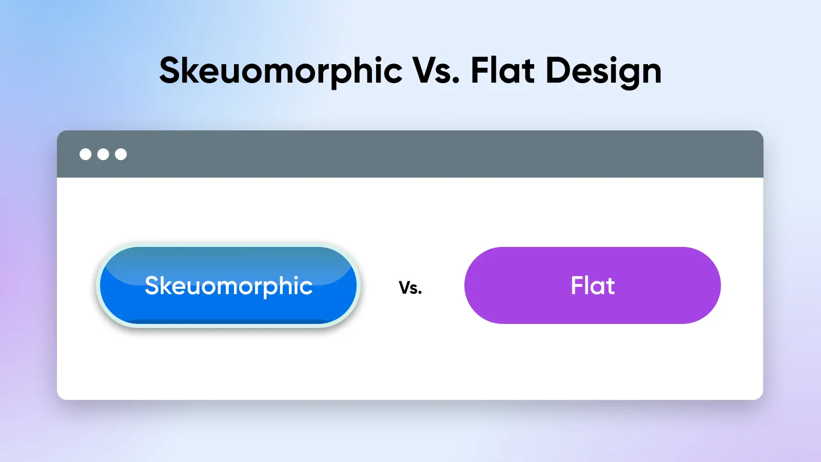
In the past, skeuomorphic icons were more trendy. In recent years, though, we’ve seen design trends move toward flat and semi-flat design. However, trends aren’t all you should consider when designing your icons; consider what fits best with your branding and overall site design.
2. Color scheme
When choosing a color scheme, there are quite a few factors you can consider: your brand, your industry, your target audience, and demographics, just to name a few. And with roughly 7 million hues detectable by the human eye, you have a lot to choose from.
Think about how your color choices might represent you. For example, navy blue or forest green is a professional color often used by lawyers and doctors. Photographers often use black and white because it helps their images stand out.
But more than just your industry, think about your audience and their expectations. If your primary audience is young children, they may gravitate toward bright colors like red and yellow. If your primary customers are teens and young adults, bold colors might be the best choice. If you work with older adults, something more muted and refined might speak to them.
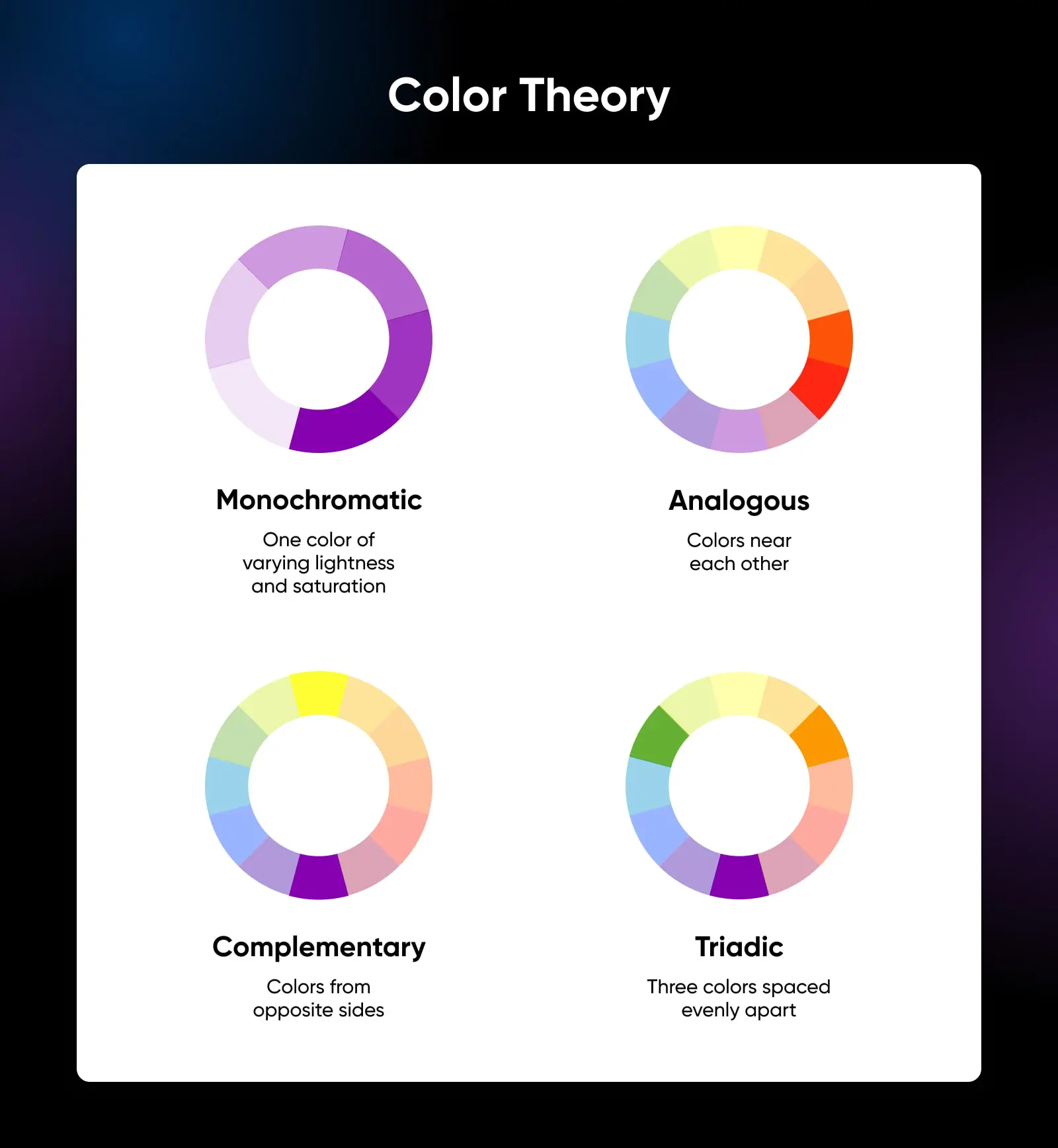
Once you choose a primary color, that can inform the rest of your color palette. When designing elements like navigation buttons and icons, it’s important to use a complementary color combination with your site’s background, text colors, etc.
Need more help? Check out our ultimate guide to website color choices.
3. Typography
As you think about how your website’s color palette will represent you and your business, you should ask the same questions about your site’s typography. Are you a professional who should use a distinguished serif font? Or is your business more casual and better represented by a light and airy sans serif?
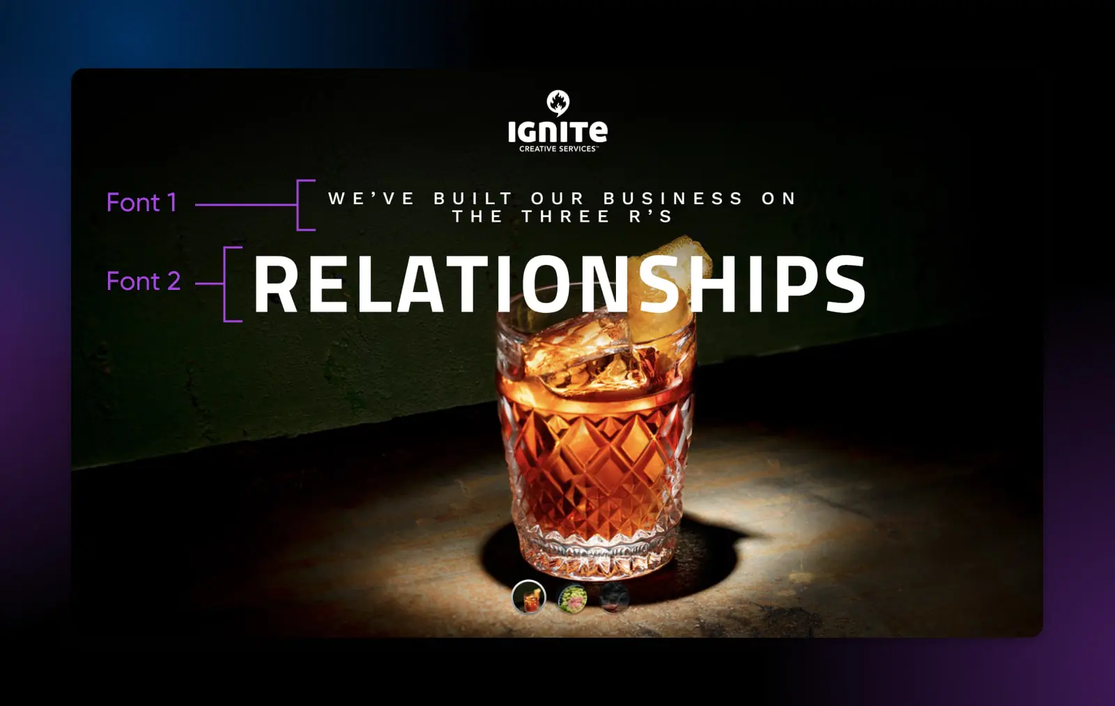
No matter what you choose, your site’s text must be easily readable, which means the body copy should be at least 16 pixels, you should use a complementary font for headings and accents, and you’ll need plenty of contrast between the text and background (no red fonts on green backgrounds unless you want to give your visitors headaches).
Other than that, though, there’s some freedom here. You can play around with your font, as long as it’s readable. Feel free to balance normalcy with freshness and try something a little different from Arial or Times New Roman. You can mix fonts as long as they complement each other.
Just stay away from Comic Sans.
4. Navigation
Your site’s navigation is not a space where you can be creative.
Don’t fall into the trap of animated hover effects and complex, multi-tiered subnavs. Navigational elements — which can exist in a site’s header, body, and footer — are there to direct your visitors to the information they desire as quickly as possible. Period.
The first navigation menu should be at the top of the page, and here, you have a polarizing design decision to make: do you use a vertical navigation menu, or a hamburger menu? Hamburger menus, which collapse a vertical menu into three parallel, horizontal lines, provide an economical way to save space by hiding your navigation menu off-screen (plus, they’re mobile-friendly). However, hamburger buttons can obscure vital information — and they tend to have lower click rates, which means they’re less effective for visitors.
Smooth navigation extends past your site’s header. For long, scroll-heavy, or one-page designs, you may want to include directional arrows to help users navigate through each section. These types of sites can also benefit from a sticky “Back to Top” button that quickly delivers visitors back to the top of the page.
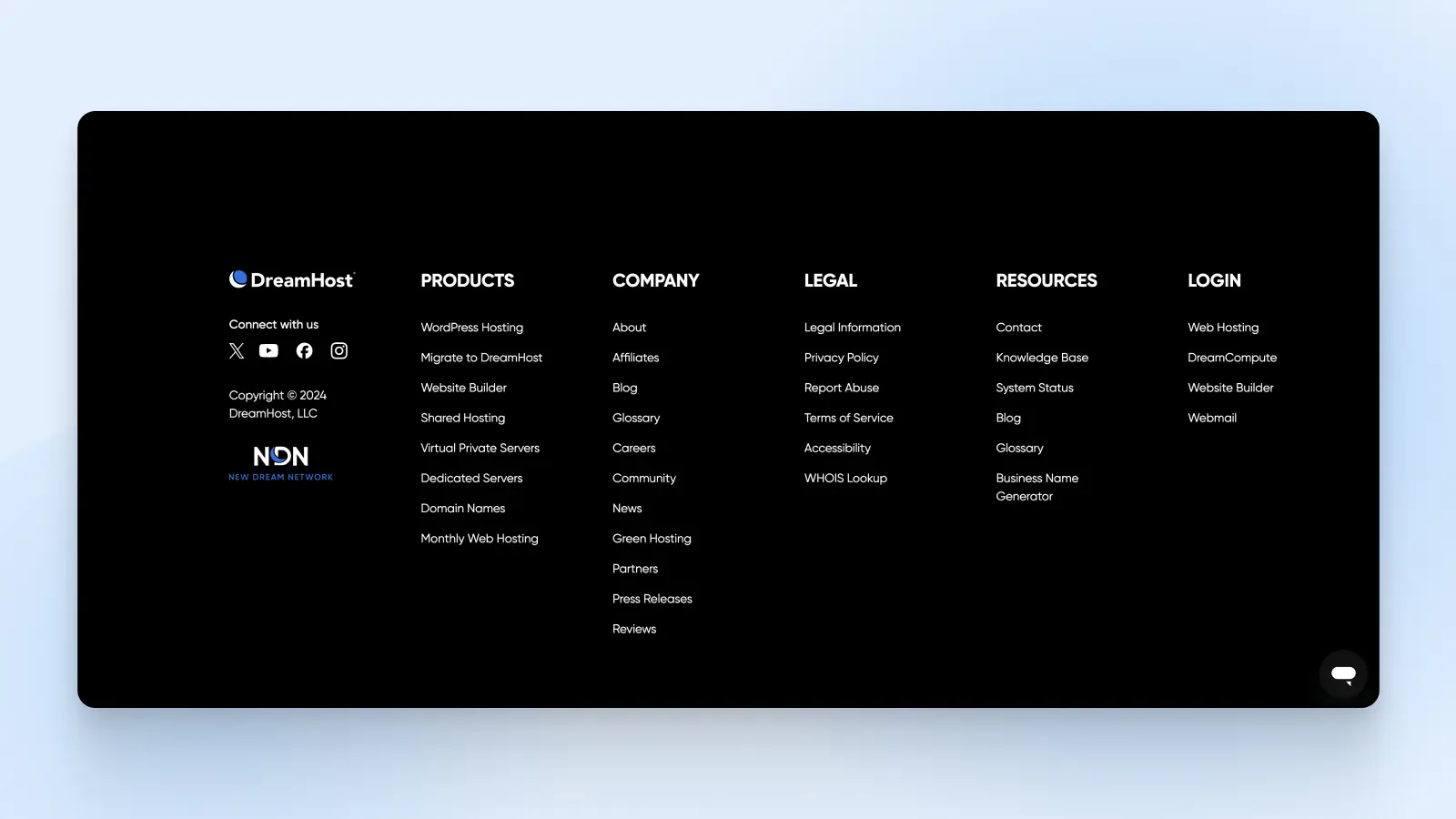
And finally, don’t forget to include a navigation bar in your site’s footer. An optimized footer with a contact form or an email-signup CTA gives visitors one more chance to convert.
5. Content
Just like interior designers don’t stop once the walls are painted, your website isn’t done once the layout, color scheme, typefaces, and other aesthetic elements are picked out. It’s time to bring in the sofa and hang family photos on the wall — by paying attention to how your messaging interacts with your design.
Your site’s visitors might notice its design, but they’re there for its content. Is your brand trustworthy? Experienced? Capable of delivering top-notch products and services? Communicating clearly is critical; information should be easy for visitors to find, read, and digest — and that’s where content comes in.
Design answers those questions before your copy gets the chance. A few structural trust signals worth building in: visible contact information in the header or footer, consistent branding and spacing from page to page, clean alignment with nothing broken or overlapping, and zero dark patterns (no pre-checked boxes or hidden fees). Visitors may never comment on any of these, but they feel it when one is missing.
Use headings and display text to organize content into sections so readers can skim and quickly find the information they need. Remove any information that doesn’t need to be there. Break up long content into lists — remember that content-heavy websites will compete with the design elements you’ve worked so hard on.
Apply the same content strategy to each page. For example, even your “About” and “Contact” pages should have the same branding and tone and convey the right information quickly.
6. Videos
Use video where motion actually helps explain something: a product demo, a how-to walkthrough, or a founder introduction that text can’t carry as well. A tight 90-second demo can answer questions a whole page of copy can’t.
Video isn’t free, though. It earns its place on a page only when you budget for the trade-offs:
- Page weight: Video is the heaviest content you can put on a page. Embed from a video host rather than self-hosting large files, and never autoplay with sound.
- Accessibility: Plan for captions or a transcript so the content works for viewers who can’t hear it (or are watching on mute), and give every player visible controls.
- Production effort: A shaky, poorly lit video hurts trust more than no video at all. If you can’t produce something solid, clear photos and tight copy will serve visitors better.
7. Don’t forget about mobile
Phew! Finally, we’re nearing the end of our web design journey with a sleek, compact, user-friendly website. Ready to do it all again — but smaller?
The amount of mobile web traffic overtook desktop traffic years ago and shows no signs of slowing down. Additionally, Google now uses mobile-first indexing to rank sites in search results, and since 2021, the search engine has used Core Web Vitals, a set of metrics to measure how well your site delivers a quality user experience (including on mobile devices), to help determine which sites should get a rankings boost.
Core Web Vitals (CWV)
Core Web Vitals (CWV) was developed by Google and represents a trio of user experience metrics designed to help create a faster, more accessible, and higher quality web browsing experience. The three Core Web Vitals metrics include Largest Contentful Paint (LCP), Interaction to Next Paint (INP), and Cumulative Layout Shift (CLS).
In other words, mobile-friendly websites are an absolute necessity today.
Most WordPress themes or templates are already primed for mobile traffic. But if you design a custom look or hire a web designer, you need to make sure your site works equally well when accessed from all device types.
Responsive design vs. mobile-friendly layout
It’s also important to understand the difference between responsive website design and mobile-friendly or mobile-first design.
When a website is responsive, that means that when a mobile user accesses it, it scales down to fit the screen size.
On the other hand, a mobile-friendly design might change the layout to be more ideal for each screen size, changing column layouts or button sizes to make them easier to see and use for different types of devices.
While a responsive design is better than a site that doesn’t adjust at all for mobile users, it’s not as ideal as a mobile-first design that adjusts for every screen size and device type. Take this into consideration when choosing your template or working with a web designer.
FAQs about web design elements
What are the main parts of a website?
Most pages share the same anatomy: a header with your logo and navigation, a hero section, content blocks, call-to-action buttons, forms, and a footer. Bigger sites add search and breadcrumbs to help visitors find their way.
What are the 3 most important elements of good web design?
Navigation, readable typography, and fast loading. If visitors can’t find your content, read it, or load it, nothing else about the design matters. Get those three right first, then layer on color, imagery, and video.
What are the basic principles of web design?
Visual hierarchy, simplicity, consistency, readability, accessibility, mobile responsiveness, and clear navigation. Put together, they mean a visitor can instantly see what matters, read it comfortably on any device, and get where they’re going without thinking about it.
What does website design include?
Website design includes a visual layer (layout, color, typography, imagery), a structural layer (header, navigation, CTAs, forms, footer), and a technical layer (loading speed, mobile responsiveness, accessibility). A complete design addresses all three, not just how the site looks.
What makes a good website design?
Clarity. A good design combines a clean layout, consistent colors and typography, intuitive navigation between well-linked pages, and fast load times, so visitors find what they need without friction. Decoration is optional; clarity isn’t.
Get a stunning website designed from scratch
Now that you’ve learned about the key elements of modern web design, it’s time to build your website!
At DreamHost, we make it easy for DIYers to launch a website fast with Remixer, our AI website builder: describe your site in your own words, and it builds a starter site for you to refine. But if you’re looking for a polished, custom WordPress website that’s 100% unique to your brand, consider our Custom Website Design service.
Here’s how the process works: You’ll start with a one-on-one call with your project manager, who will discuss your requirements, content, and goals. Then, we’ll gather your existing logo and branding materials into a simple, one-page reference sheet to ensure your website design accurately reflects your brand.
Next, our pro designers will create a custom prototype of your new website. You can offer feedback, and once you’ve approved the design, we’ll code it into a high-performance WordPress site. We ensure you’re satisfied with the final product by including revisions from the get-go; you’ll get two rounds of design and code revisions for every page on your site.
Your finished website will be search engine optimized, mobile-friendly, and loaded with features like a custom blog, contact forms, analytics, and e-commerce tools. We can even upload products to your online store for you, if needed.
If you’re ready to move beyond WordPress templates, check out our Custom Website Design service today.

Web design: DIY it or hand it off
Remixer, DreamHost’s AI website builder, is the lower-cost DIY route. Prefer to hand it off? Our Custom Website Design service starts at $1,499 for a custom WordPress homepage and five subpages — more upfront, but professional design and implementation are done for you.
Learn More