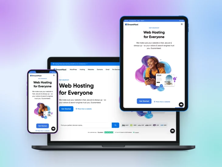
Picture this: Lisa, a small business owner, finally gets a second to breathe.
She pulls out her phone and decides to check her website. But what she sees…is a nightmare.
Her site loads slowly, the text needs a pinch-and-zoom to read, and the buttons are impossible to tap. On mobile, her site is a hot mess — and some customers won’t stick around to fight with it.
If her customers are struggling, so is Google: it uses the mobile version of your site’s content for indexing and ranking. A site that frustrates users simply can’t compete online.
What is mobile optimization?
Mobile optimization is the practice of designing and tuning a website so it works well on smartphones and tablets: pages that load fast, text you can read without zooming, buttons big enough to tap, and forms you can finish with one thumb. Responsive design — a layout that adapts to any screen — is one part of the job, not the whole job.
The short version: audit your site with Google Lighthouse, write responsive CSS, choose responsive themes and plugins, test your Core Web Vitals, speed up loading, redesign your pop-ups, pick a reliable host, consider a mobile app, build goal-based conversion paths, and put AI tools to work. We walk through all 10 steps below — but first, why it matters.
Why mobile optimization matters
Lisa’s story isn’t unique.
84% of people own smartphones, and most use their phones as their main device. That’s far more than the number of people with access to PCs and laptops.
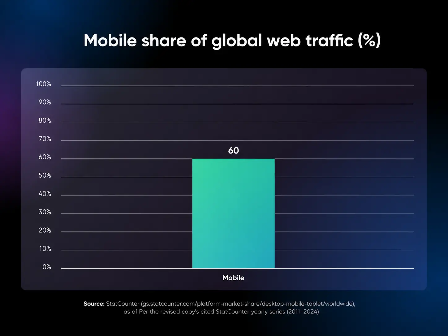
Mobile browsing now makes up over 60% of web traffic, and Google now indexes and ranks sites based on their mobile version — a policy called mobile-first indexing.
If your site offers a poor user experience on mobile, you lose twice: frustrated visitors leave, and because Google judges the mobile version of your site, your search rankings can sink along with them.
It’s that simple.
A mobile site fix isn’t just another project for any business. If anything, it’s what will breathe life into the business, retain customers, and add yet another channel for customers to find you.
So, if you’re ready to optimize your online presence, start with mobile. Because it’s where your customers are, and it’s how your site will succeed.
Responsive design vs. mobile optimization: what’s the difference?
Responsive design means that your website automatically adjusts to fit any screen size — a smartphone, tablet, desktop, or even a smartwatch.
Think of it as the layout half of mobile optimization: responsive design makes your site fit the screen, while mobile optimization also covers speed, readability, and touch-friendly interaction.
It should also display information in a clear and accessible format. You want to make sure users don’t have to zoom or scroll around just to see content that could fit on whatever screen they’re on.
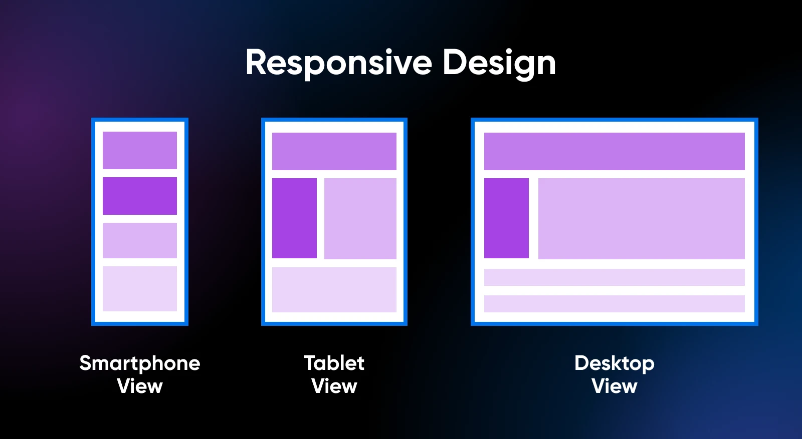
When you browse a website, you should notice that it adapts to the size of your screen.
For large screens, elements will scale up to a point so they don’t look oversized, but remain easy to engage with.
The opposite happens with mobile devices. When you’re using a smaller screen, you want the content of your site to scale down, but not so much that it becomes unreadable or impossible to interact with.
Here’s what the DreamHost homepage looks like on desktop, tablet, and mobile.
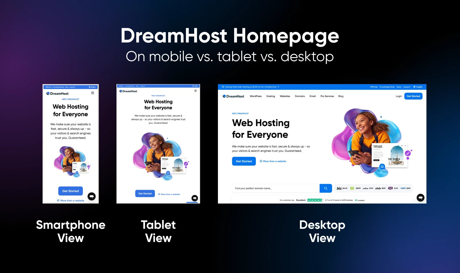
Websites that can pull off this balance are considered responsive. Web design and development go hand in hand here, as the site’s graphical assets need to scale.
In the background, there are CSS stylesheets that govern how the website will display across different size screens.
Until recently, responsive design was an afterthought. We used to design websites all around the desktop experience.
Now that mobile traffic comes first, so does mobile design. That’s why you’ll often hear the term mobile-first in web design circles.
There’s another term that’s commonly thrown around with responsive design.
That term is adaptive design, which involves creating multiple versions of a single page and serving them depending on what type of devices visitors use.
That approach to web design is considered outdated nowadays, as responsiveness is the more efficient option.
How to think mobile-first when it comes to web design
Bryan Clayton, CEO of GreenPal, spent nine months building his company’s site from scratch.
“Right out of the gate, there were major problems,” he says.
“We assumed that the majority of our users would shop for a lawn care service from their desktop or laptop computer. But it became very clear, very quickly that more people were accessing the website from their mobile phones and tablets than from a desktop or laptop computer — 4-to-1.”
The original full-featured desktop experience included all kinds of bells and whistles, such as animations.
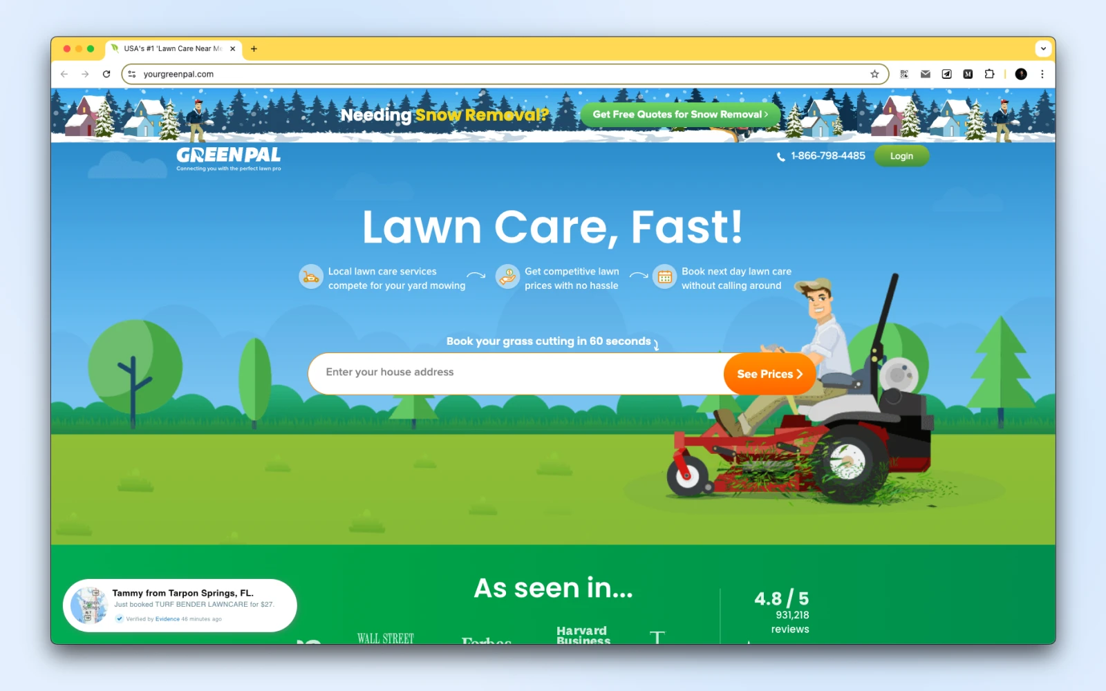
“We had all kinds of other features that make a desktop experience delightful,” he recalls. “The problem with this approach was that the desktop experience would not translate to a mobile web browser.”
As a result, the website was bloated and didn’t work well on mobile. Users found that they had to pinch and zoom to get through the sign-up process.
“Before our website was rebuilt for a mobile-first experience, conversion on a mobile browser was less than 4%,” he says.
“That means that people who attempted to sign up abandoned in the process 96% of the time.”

After rebuilding the site to be mobile-first, Clayton found that 82% of people who initiated the sign-up process to get a free price estimate completed the entire process from their mobile devices and tablets.
“Our mobile-first product is the only reason why we are even in the game today,” he says.
Key takeaways:
Drawing on GreenPal’s mobile-first journey, Bryan Clayton offers insights that can simplify your approach to mobile design:
- Understand your user base: Start with data on how visitors access your site. If most users are on mobile, make sure mobile experience is your top priority. Clayton’s data showed that 4 out of 5 visitors used mobile, and this reshaped GreenPal’s approach.
- Eliminate desktop-only features: Avoid features that clutter or complicate the mobile experience, like complex animations or tiny icons, which work well on desktops but not on smaller screens.
- Optimize critical actions: On mobile, the path to key actions, such as signing up or making a purchase, should be as simple and intuitive as possible. Track and refine conversion steps for mobile-specific flow.
- Keep visuals clean and functional: Limit distractions and focus on usability by keeping the layout simple, with well-spaced elements and clear calls-to-action.
- Test, iterate, and improve: Regularly test your site on mobile devices to identify potential pain points in the user journey. Adjust based on feedback to enhance accessibility and ease of navigation.
- Prioritize conversion paths: Test and optimize sign-up flows on mobile. An 82% mobile sign-up completion rate showed that refining the process pays off in user satisfaction and conversions.
When it comes to responsive design, there are a lot of things that we can learn from GreenPal’s experience.
Let’s start by talking about honing in on your audience.
Hone in on your audience and ask for customer feedback
When it comes to redesigning a website, you’ll likely need to figure out how customers are currently interacting with it. That means looking at analytics and seeing if the engagement numbers look different for mobile and desktop users.
Analytics might reveal a higher bounce rate among mobile visitors or less time spent on site.
Bounce Rate
A website’s bounce rate indicates the percentage of users who try to access one of its pages but decide to leave before interacting.
Those are dead giveaways of a poor mobile user experience. If the data points in that direction, your best option is to ask customers what they like and what they don’t like about your site.
Zondra Wilson, the owner of Blu Skincare in Los Angeles, only found out that her site wasn’t mobile-friendly when she started asking for feedback from customers.
“I would ask my customers to write a review and they would say they couldn’t find where to write it,” she recalls.
“I would ask them about my blog or articles that I posted and they had a hard time finding them. They had trouble viewing my site on their cell phones. They had to scroll down a lot before my first picture or any information about my company popped up. They didn’t know how to navigate through my site. Many were frustrated and didn’t go past the first page.”
When Wilson upgraded her site to a more mobile-friendly version, she noticed right away that users started viewing more pages on the site than usual.
Key takeaways:
- Listen to direct feedback: Wilson’s customers shared difficulties with site navigation on mobile screens, from finding review sections to reading her blog. Their feedback highlighted specific problem areas, guiding improvements that increased engagement on her mobile site.
- Observe user behavior in analytics: A high bounce rate on mobile or low session times can indicate a poor experience. Use these metrics to prioritize design changes and enhance key mobile touchpoints.
- Make navigation intuitive and content accessible: Wilson’s site adjustments focused on making her content immediately visible on mobile, reducing excessive scrolling, and improving the ease of finding critical sections like reviews and product details.
There are a lot of tried-and-true techniques for optimizing a website for mobile devices. However, customer feedback will often reveal parts of the user experience that you would otherwise miss.
One more tip: treat those analytics as your before-and-after scorecard. Note your mobile vs. desktop engagement and conversion rates before you change anything, compare the same segments a few weeks after launch, and re-run Lighthouse or PageSpeed Insights to confirm the scores actually moved.
Optimize what goes on your page
The amount of information users can see and interact with in one view, also known as UI density, is an important decision when considering mobile design.
Take a look at these images and see which one’s more dense:

Both have the same number of dots, but image A looks more dense than image B. Simply organizing the dots into two columns makes image B look less dense.
Earlier designs tried to pack in as much as possible.
Think of the Yahoo! homepage, for instance:
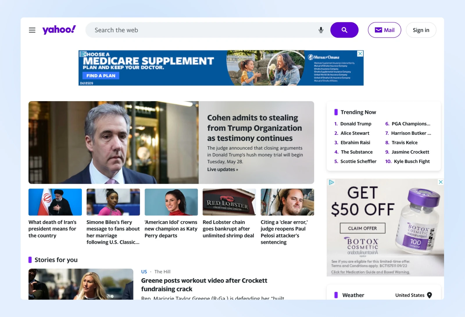
Even to this day, you’ll see a lot of websites that are similarly packed with information.
However, modern mobile interfaces prioritize clarity over clutter, giving users exactly what they need — no more, no less.
And that’s the design style Google followed right from their initial days.
Here’s an image of Google from the early 2000s:

As design expert Matthew Ström writes, “UI density isn’t just about how much we see on a screen; it’s about how intuitively information flows, moment to moment.”
Too much clutter on mobile forces users to hunt for what matters, slowing them down. But a sparse design that sacrifices important information can be equally frustrating.
Key takeaways:
- Prioritize essential actions: Identify the most important actions for your users — like calls-to-action and forms — and keep these elements prominent. Then, trim unnecessary links or buttons to prevent clutter.
- Use visual hierarchy to guide flow: Structure content so it naturally guides users through the page, reducing the need to backtrack. As we saw in the dots example above, grouping related items with clear headings can help direct attention while making the UI feel less cluttered.
- Use white space wisely: White space is valuable real estate on mobile. Use it to separate distinct actions or elements, but avoid overdoing it. Proper spacing can help users visually group related information without adding too much scrolling.
- Design for touch-friendly interactions: Ensure buttons, links, and icons are large enough for easy tapping on small screens. Aim for at least 44×44 pixels per touch target.
- Keep text readable without zooming: Maintain consistent font sizes and spacing to make text readable at a glance. Responsive grids and media queries can help ensure content scales correctly across different devices.
For a mobile site, maintaining an effective balance in UI density makes sure that users quickly find what they need without feeling visually overloaded.
Think small (in terms of screen size)
Modern smartphones are powerful, and a big part of your audience will have access to a decent internet connection.
However, you’ll want to make sure that your site loads as fast as possible. This makes taking away excess clutter one of the best design strategies.
Vitaliy Vinogradov, CEO of Modern Place Lighting, found that switching to a responsive, mobile-first site design led to 30% more conversions compared to desktop.
“One important thing to do is to remove excess plugins, pop-ups, or any other screen inhibitors on the mobile version of the site,” he says.

His team combed through the site and eliminated a few social sharing plugins that took up valuable real estate on the screen. When you design with large screens in mind, you might find that you end up including a lot of elements that don’t provide much value to users.
“You need to design for small,” explains Matt Felten, a Los Angeles-based product designer.
“You have to be a little more focused. You have to cut down on information and content.” After your mobile site is in place, you may find that you don’t need to add more to the desktop version of the site after all.
You can make your website easier to use on mobile by removing all that visual clutter. Also, visitors will be able to focus on the content that really matters. That means calls-to-action, forms, posts, and other key elements in the user journey.
Key takeaways:
- Prioritize speed over excess features: Simplify the mobile experience by removing non-essential plugins, pop-ups, and large images that can slow loading times.
- Emphasize essential content: Focus on what your users need most, especially on mobile devices. Trim down large sections of text, unnecessary images, and redundant features. Keep critical elements, like calls-to-action and navigation buttons, within easy reach.
- Make navigation intuitive: On small screens, users benefit from a straightforward layout. Stick to a single-column layout that scrolls vertically, collapse deep menus into a tap-to-open hamburger menu, and keep your most important actions in a sticky navigation bar — ideally near the bottom of the screen, where thumbs naturally rest.
- Design with tap targets in mind: Buttons and links should be large enough to be tapped comfortably on a small screen. Avoid tiny buttons or closely packed links that lead to accidental clicks.
- Reduce visual clutter: White space is crucial for readability on mobile. It gives each element room to breathe and improves the overall usability of the page.
Refine your design aesthetic
“Consumers today expect more sophisticated design,” says Felten. “There’s a big push to see the business cases of a beautiful and well-performing website,” he says.
“If I’m a small-business owner and all of the competition has a really nice, responsive website and I don’t, in less than a second, people make a negative judgment about my product.”
A professional-looking website shows off your eye for design while highlighting the effort you put into a great user experience.
Unless you work in an incredibly niche field, customers almost always have other alternatives online.
Your site’s design should represent your business well, so put your best foot forward.
How to optimize your website for mobile (10 ways)
Now that you know why it’s necessary to prime your site for mobile usage, let’s get a little more practical. In the next few sections, we’ll walk you through some of the most critical aspects of creating a mobile-optimized website, ranging from the simple to the more technically complex.
We recommend that you take the time to implement as many of these methods as possible to improve the odds that your website performs well on all devices — and is favored by Google’s mobile-first index.
Let’s get to work!
1. Test your site using Google Lighthouse
Take inventory of your site’s mobile-friendliness right now before taking any further action.
This will help you hone in on the specific areas of your site that need work, and give you useful information on how you can make improvements.
One way to do this is by simply using your website on several different devices. Pull it up on your own phone and a tablet, switch off Wi-Fi so you’re loading it over a cellular connection, and try to finish the action you care about most: a signup, a purchase, a contact form.
If you catch yourself waiting on a spinner, pinching to zoom, or mis-tapping buttons, your visitors are doing the same — and they’re less patient than you are.
To go deeper and get detailed diagnostics, use Google Lighthouse — an open-source tool that offers audits focused on performance, accessibility, search engine optimization (SEO), and more.
Lighthouse is now directly integrated into Chrome DevTools, making it accessible and easy to use for a comprehensive analysis of your web pages.
Searching for Google’s Mobile-Friendly Test instead? Google retired the standalone tool in December 2023 — Lighthouse and Search Console’s Core Web Vitals report are now the way to check your site’s mobile-friendliness.
Here’s how to access it:
- Open Google Chrome: You need to be on the latest version of Chrome, as you need Chrome DevTools to be able to use Lighthouse.
- Go to an incognito tab: You can press Ctrl + Shift + N on Windows or Cmd + Shift + N on Mac. The reason why we want to do incognito is because plugins can interfere with Lighthouse performance analysis, and even Google recommends running this test while in incognito mode.
- Navigate to the website you want to check: Enter your site’s URL and allow it to load fully to get an accurate reading.
- Open DevTools: Right-click anywhere on the page and select Inspect, or use the keyboard shortcut Ctrl + Shift + I on Windows or Cmd + Option + I on Mac to open DevTools.
- Select the Lighthouse tab: Once in DevTools, click on the Lighthouse tab at the top. This section is where you’ll configure and run the audit.
- Configure the audit settings: Choose Mobile to evaluate your mobile performance. Keep all categories checked for a full analysis — “Performance,” “Accessibility,” “Best Practices,” and “SEO.”
- Run the audit: Click Analyze page load to initiate the analysis. Lighthouse will begin testing and compiling results for each selected category, including mobile optimization for mobile pages. This process may take a few seconds to a minute.
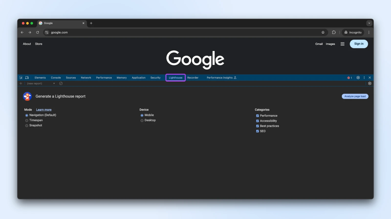
Lighthouse gives you scores and recommendations in each category:
- Performance: Tells you about loading speed and responsiveness.
- Accessibility: Shows how user-friendly your site is for people with disabilities.
- Best practices: Checks for issues with security, mobile design, and quality.
- SEO: Offers tips on how well your site is optimized for search engines on mobile.
Each section has specific suggestions. Going through these can help you improve your site’s mobile performance, making it faster and easier to use.
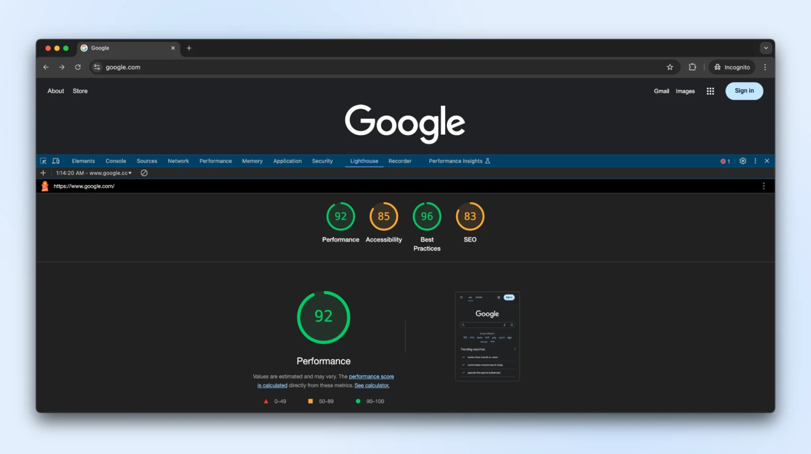
Now don’t get too caught up in the scores. As you can see, even Google scores 83 on SEO. You simply want to improve it as well as you can, and bring it as close to 100 as you can.
At this point, you can deal with each listed issue in turn. For example, if you run the test on a particular page and the analysis doesn’t finish, your robots.txt file could be blocking Google’s bots.
Simply edit your robots.txt file to allow Google to access blocked files or fix any redirection errors.
2. Use custom CSS to make your website responsive
A big part of implementing responsive web design involves using CSS. You’d be surprised how far just a little CSS knowledge can take you when it comes to making your site mobile-friendly.
To give you an example, you can use CSS to implement what we call media query ranges.
With media queries (or responsive breakpoints), you can tell browsers when to load different layouts for a page depending on the size of the screen they’re using.
Here’s what a simple media query looks like:
@media (max-width: 768px) {
  /* CSS rules for screens 768px and smaller */
}
Any styling rules you add inside this block will apply to devices with screen sizes 768 pixels wide or smaller.
This is one of the ways you can tell the browser to stack two buttons on top of each other, or show them side by side, based on the screen sizes.
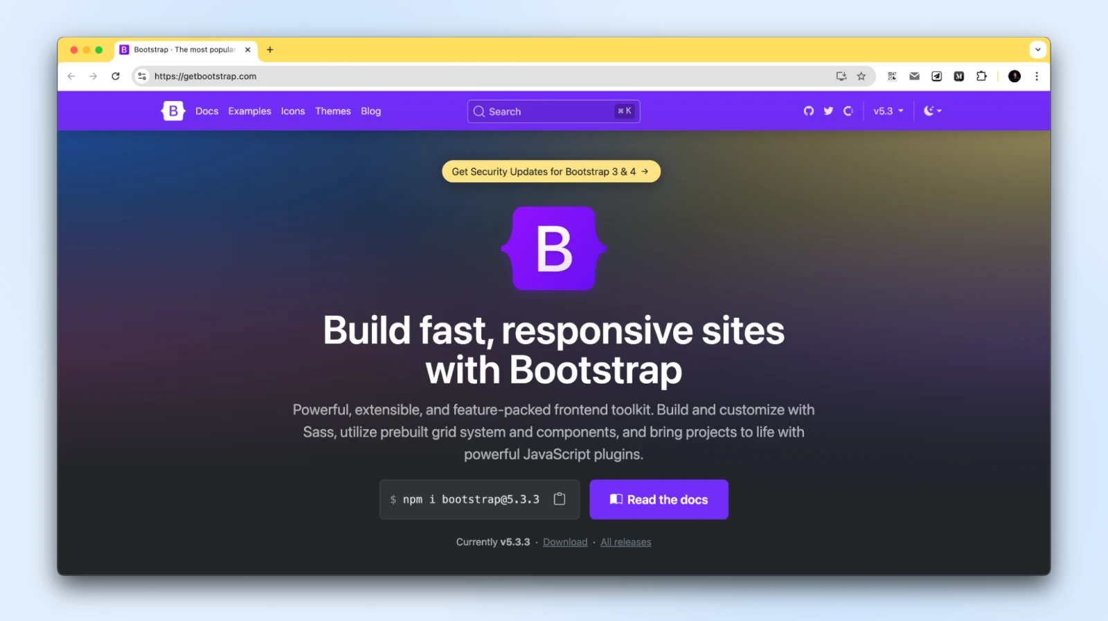
Media queries are an essential component of HTML, CSS, and JavaScript libraries, including Bootstrap, as they allow for mobile responsive design.
Other ways that you can use CSS to make your website more responsive include:
Creating a CSS grid layout:
CSS grid layouts, such as the one that Bootstrap provides, offer a simple way to help you adjust designs to various screen sizes. Having a layout with well-defined elements can enable you to configure how they appear and how much space they take with each size of the screen.
.container {
  display: grid;
  grid-template-columns: repeat(auto-fit, minmax(200px, 1fr));
}
Using size percentages for layout elements:
As you might know, CSS enables you to set the height and width of elements using pixels and other units of measurement. To make your website more responsive, we recommend using percentages. That way, elements such as buttons can adapt as screens get smaller.
img {
  width: 100%; /* Scales with container size */
  height: auto;
}
Fluid typography and spacing:
Images and other visual elements on a page shouldn’t be the only things that scale for smaller screens. Text also needs to be responsive, or you can end up with a mobile site where users can only see a word or two on their screen before needing to scroll down. Setting fonts in relative units, like em or rem, makes them scale with the device.
h1 {
  font-size: 2.5rem;
}


@media (max-width: 600px) {
  h1 {
    font-size: 2rem; /* Smaller font size for smaller screens */
     }
}
Controlling the spacing between elements:
CSS helps you easily add spacing between different HTML blocks using padding and margin.
Here’s a simple example of how margin and padding can be added to a block, as well as how you can apply media queries to add different spacing:
.card {
  margin: 20px;
  padding: 15px;
}
@media (max-width: 768px) {
   .card {
       margin: 10px;
       padding: 10px;
     }
}
If you feel comfortable using HTML and CSS, designing a fully responsive website can be easier than you think.
However, if you use a content management system (CMS) such as WordPress, the whole process becomes much simpler since you rarely need to deal with code, even when working on responsive design.
3. Choose responsive themes and plugins
WordPress makes it easier than ever to build a responsive website, thanks to a huge range of themes and plugins designed for mobile-friendliness.
Most new themes (over 10,000 of them!) are built with responsive design principles, so choosing the right WordPress theme should be easy.
And whichever theme you choose should automatically adapt to any device without any extra work.
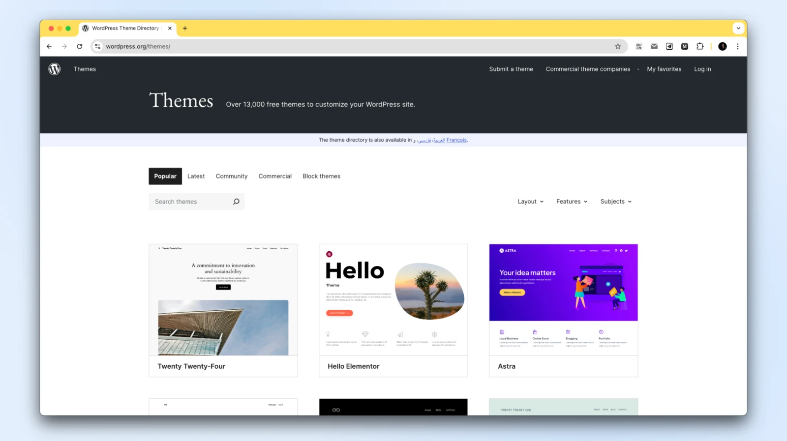
If you want to check if a theme is responsive before installing — or buying — it, we recommend that you check out its demo. A lot of theme demos will include previews of how their designs look on smaller screens.
Tips for ensuring responsiveness:
- Preview using page builders: With tools like Gutenberg (Block Editor), Spectra, Elementor, and Divi, you can preview how your pages will look on desktop, tablet, and mobile views. This step helps ensure each page is optimized for different devices from the start.
- Avoid heavy plugins: Stick to plugins that focus on performance and responsiveness. Some plugins add significant load times, impacting mobile performance. Use lightweight plugins or opt for built-in WordPress features whenever possible.
- Test with staging sites: Use a staging environment to test new themes and plugins. This gives you a safe space to adjust settings, add content, and ensure your site is responsive on all devices before pushing changes live.
- Consider alternatives to the Classic Editor plugin: The Classic Editor is less visual than newer editors, making it harder to preview mobile-friendly designs. Upgrading to the Block Editor or a visual page builder like Spectra ensures a better experience for mobile design.
Spectra is a powerful WordPress plugin that helps you design beautiful sites with a native drag-and-drop interface optimized for mobile devices.
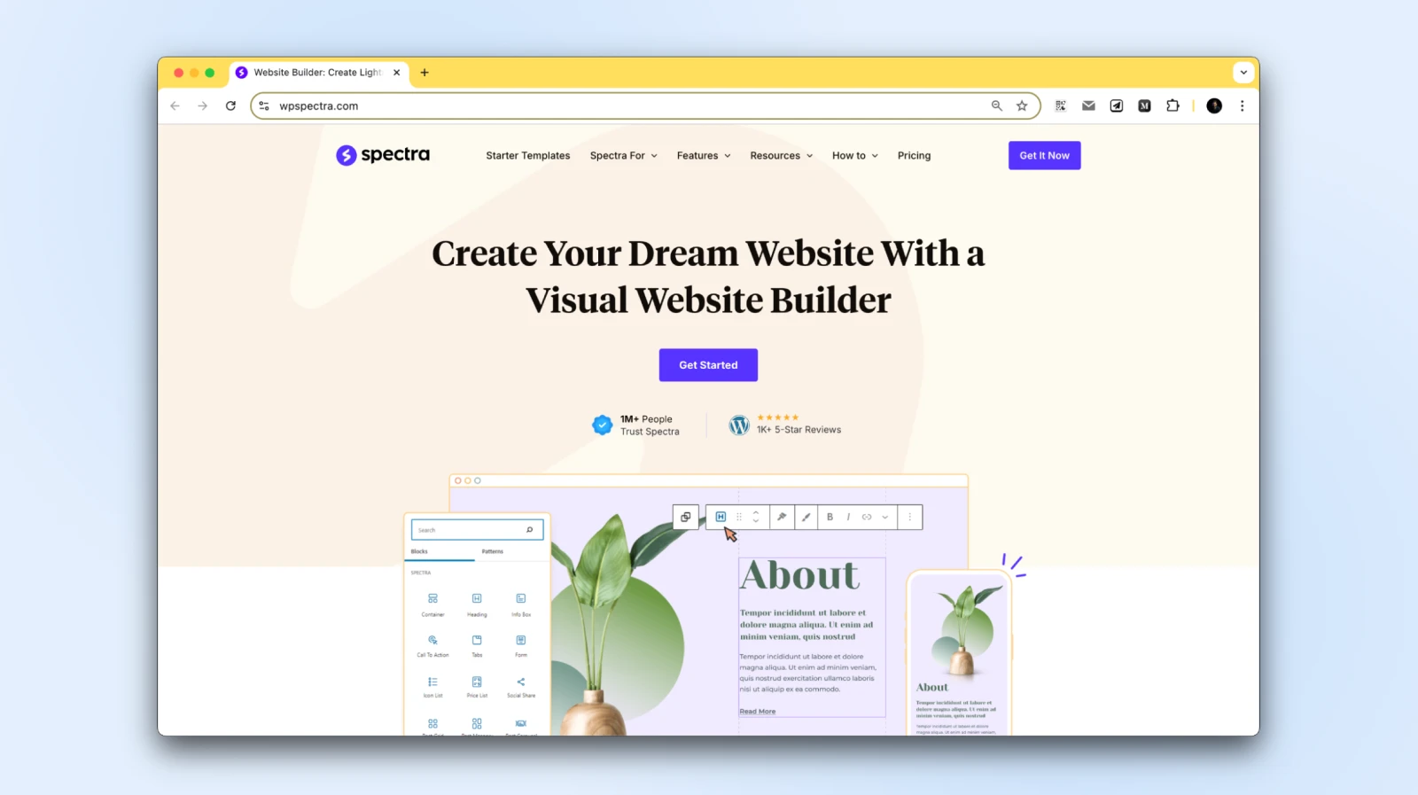
It extends the capabilities of the WordPress Block Editor and helps you create user-friendly websites that are inherently responsive, making sure they look great on every screen size, from smartphones to large desktops.
Its intuitive design options allow you to customize each element for optimal viewing on all devices, making the mobile-friendly design even more accessible.
If you’re finding it difficult to create responsive pages, try out an AI website builder like Remixer, or switch themes. These can make major changes to any page, so you’ll want to take your time and familiarize yourself with how the new plugins and themes work.
4. Test your website’s Core Web Vitals
Core Web Vitals are Google’s performance metrics focused on user experience. They help evaluate how a site loads, interacts, and stabilizes — factors that strongly impact SEO and user satisfaction.
Here’s a quick breakdown of these metrics:
- Largest Contentful Paint (LCP): This metric measures how long it takes for the largest element on a page to load (generally the hero image or heading text). A low LCP score means that the page loads quickly overall. Faster LCP means your main content is accessible sooner, ideally within 2.5 seconds.
- Interaction to Next Paint (INP): This metric measures responsiveness — how quickly your page reacts when users tap, click, or type. To provide a good user experience, pages should have an INP of 200 milliseconds or less, per web.dev. INP replaced FID as the Core Web Vital for interactivity.
- Cumulative Layout Shift (CLS): This tells you how much the layout of a page “shifts” or moves around as it loads. To provide a good user experience, pages should maintain a CLS of 0.1 or less, per web.dev.
Putting a score on a website’s user experience is tough. Therefore, Core Web Vitals don’t paint an entire picture of the overall user experience of a site. However, they enable you to measure key technical aspects of any page that have a direct impact on how enjoyable they are for users.
Furthermore, Core Web Vitals aren’t just a theoretical exercise.
They’re one part of the overall page experience that Google’s ranking systems look to reward, though they aren’t the whole picture. Google allows you to test Core Web Vitals using its free PageSpeed Insights tool.
Enter a URL, and PageSpeed Insights reports how the page performs on both mobile and desktop, including an assessment of its Core Web Vitals, per Google’s PageSpeed Insights documentation:
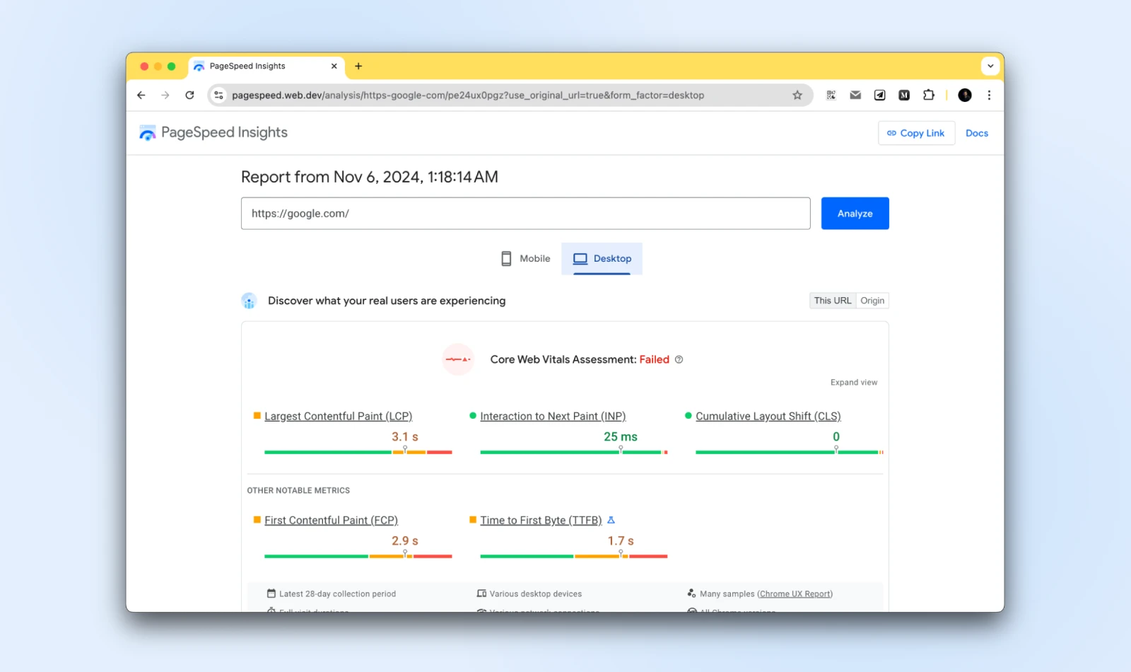
Just as with the Lighthouse tool, Google provides specific suggestions on what improvements you can make to optimize the website.
Since Core Web Vitals focus more on performance, most of the suggestions that you’ll see here have to do with speed optimization:
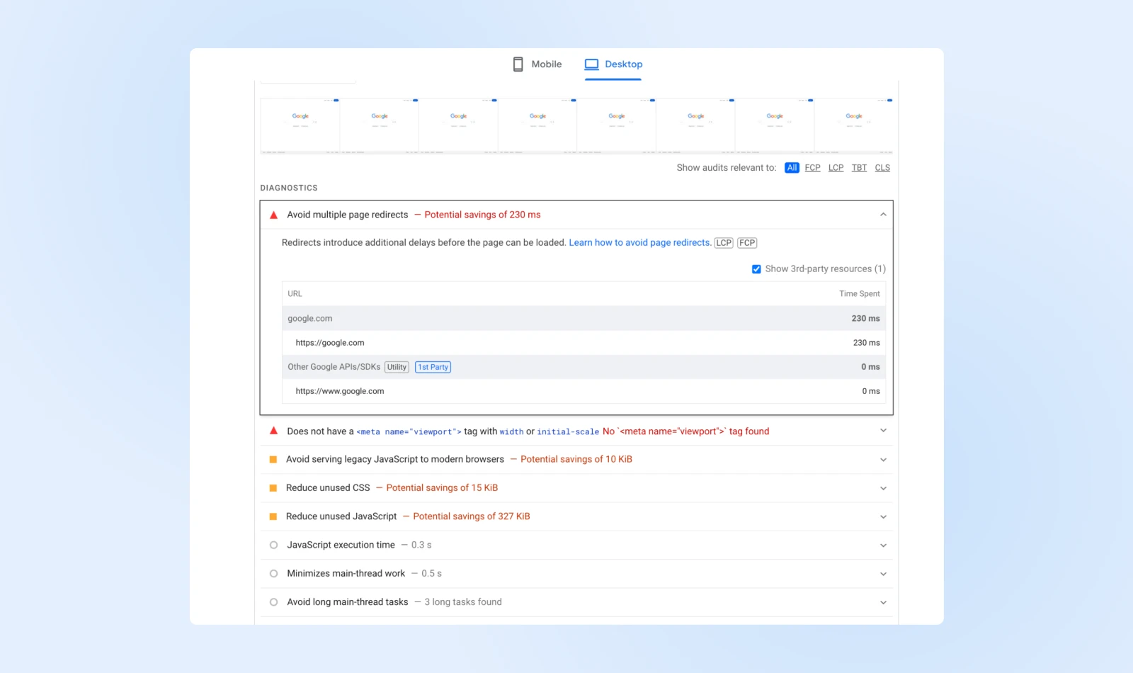
Keep in mind that PageSpeed Insights returns separate results for the mobile and desktop versions of your site.
That means you might get a different set of suggestions for each version. Focusing on the mobile optimization suggestions will drastically improve both sets of scores.
5. Improve your site’s loading times
As we hinted at in the previous section, website speeds are particularly significant on mobiles.
Optimizing your site for speed helps keep your bounce rate down and improves your users’ experience, which is good news for your bottom line.
Testing your website’s Core Web Vitals will give you an accurate idea of how long it takes to load.
Armed with that information and the performance optimization suggestions the tool provides, you can get to work on improving your site’s loading times.
Here are some of the most impactful optimization methods that you can use on your website:
- Implement caching: When you use caching, some of your website’s files will be saved in a more convenient location (such as on each visitor’s local device), so they don’t need to be downloaded every time a new page is accessed. There are many free caching plugins available, although some hosting plans, such as DreamPress, include this feature by default.
- Use a content delivery network (CDN): Instead of delivering your files from one central server, a CDN lets you store copies of them in a series of servers that are spread out geographically. This makes loading times more balanced regardless of a given user’s location, while also reducing your bandwidth usage.
- Optimize your images: Large image files are often the culprits behind slow loading times. By compressing them, you can reduce their size without affecting their quality. There are several free and premium solutions to help you do this, including the ShortPixel plugin and the TinyPNG website.
- Minify your code: By optimizing your site’s CSS, HTML, and JavaScript code, you can make it more efficient and shave precious seconds off your load times.
- Keep all aspects of your site up to date: Using outdated software to run your website not only leaves you vulnerable to security issues, but also prevents it from performing at peak efficiency. By keeping your plugins, themes, and CMS updated at all times, you can avoid those problems.
While this may seem like a lot of work, most of these techniques can actually be implemented using simple, free solutions that require little to no configuration on your part.
As a result, your site should perform considerably better on mobile devices and have an advantage in search engine rankings.
6. Redesign your pop-ups for mobile devices
While pop-ups get a lot of criticism for being intrusive and interruptive, they remain a surprisingly effective lead-generation method.
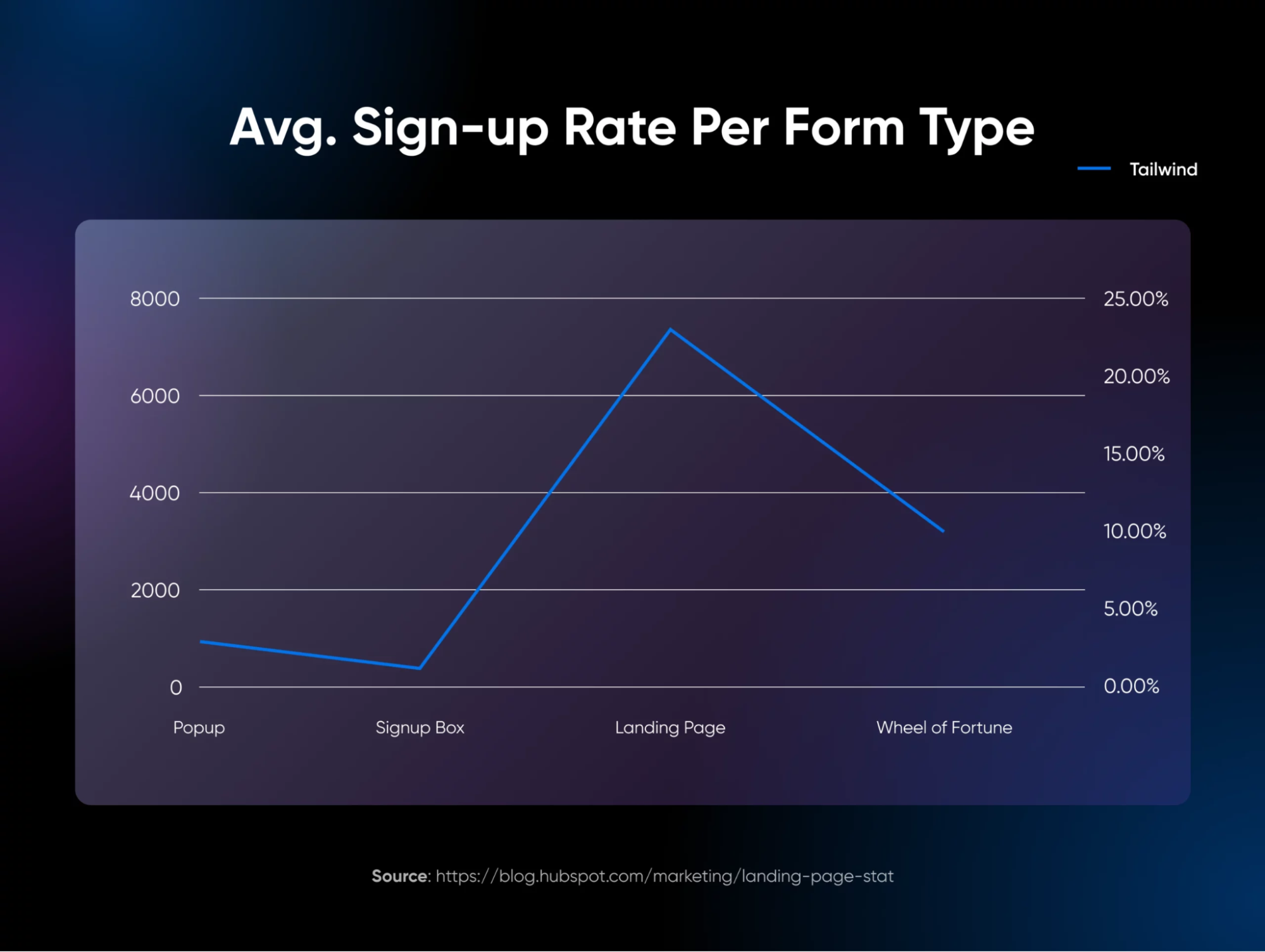
As such, we wouldn’t be surprised if your site contains at least one or two strategically positioned pop-ups, designed to capture leads or pass vital information on to users.
Although pop-ups can be highly effective, they can negatively impact the mobile experience.
On a smaller device, screen space becomes more important, and even medium-sized pop-ups can become far more disruptive than they appear on the desktop version of your website.
A while back, Google began to crack down on pop-ups by implementing a set of rules these elements needed to follow so they didn’t overly affect the user experience.
Here’s an example of what Google considers intrusive:
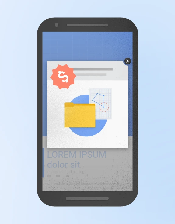
The pop-up interrupts the user flow and covers the main content, either immediately after the user navigates to a page from the search results or while a user is looking through the page.
On the other hand, here’s an example of what’s good in Google’s eyes:
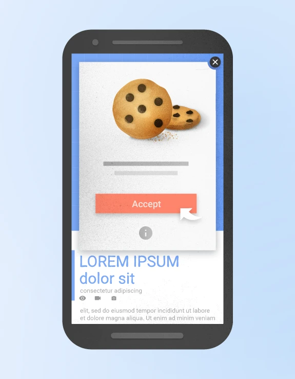
This pop-up is a-okay by Google because it has an easy-to-click big button.
Also, most pop-ups created in response to a legal obligation, such as for cookie usage or for age verification, are perfectly fine as long as they’re not overdone.
These rules include the following:
- Pop-ups must be as non-obstructive as possible: On mobile devices, pop-ups should only cover a small fraction of the screen.
- They should be easy to close: It should be clear how mobile users can dismiss the pop-up, usually via a visible, decently sized button. Add a clearly visible and adequately sized close button, enabling users to dismiss the pop-up effortlessly.
- Pop-ups containing necessary information are exempt: Per Google’s current guidance, legally required dialogs — such as cookie consent notices and age verification — and login dialogs for content that isn’t publicly available aren’t treated as intrusive.
As long as you bear these considerations in mind when designing your pop-ups, your site shouldn’t be at risk of any negative impacts. However, websites that don’t follow pop-up guidelines might get penalized in the rankings.
7. Choose a reliable web host
We’ve said it before, and we’ll say it again — picking the right web host for your site is one of the most important decisions you’ll make.
Why?
Mobile visitors are often on cellular connections that magnify every bit of server slowness, and none of the front-end fixes from step 5 can outrun a slow host.
A good host keeps your site fast and consistently reachable.
The simple fact is that if you choose a host or plan that doesn’t offer the speed and resources you need, no amount of work on your part can stop your website from performing poorly.
With that in mind, match your plan to your measured traffic and resource needs rather than defaulting to the biggest one. For most smaller sites, DreamHost web hosting or a managed WordPress plan like DreamPress delivers fast mobile load times without the cost or upkeep of running your own server. A VPS or dedicated plan earns its higher price once your analytics show sustained traffic or resource demands that entry-level hosting can’t absorb.
Virtual private server (VPS) hosting is ideal for websites that need consistent speed and flexibility without breaking the bank. With VPS, you get a virtualized server with resources allocated just to your account, which reduces contention from other customers’ sites. It can’t prevent every slowdown (traffic spikes, heavy plugins, and plan limits still matter), but it makes performance more predictable.
At DreamHost, we offer a variety of VPS plans suited for WordPress and other CMS platforms, so you can scale as your site grows.
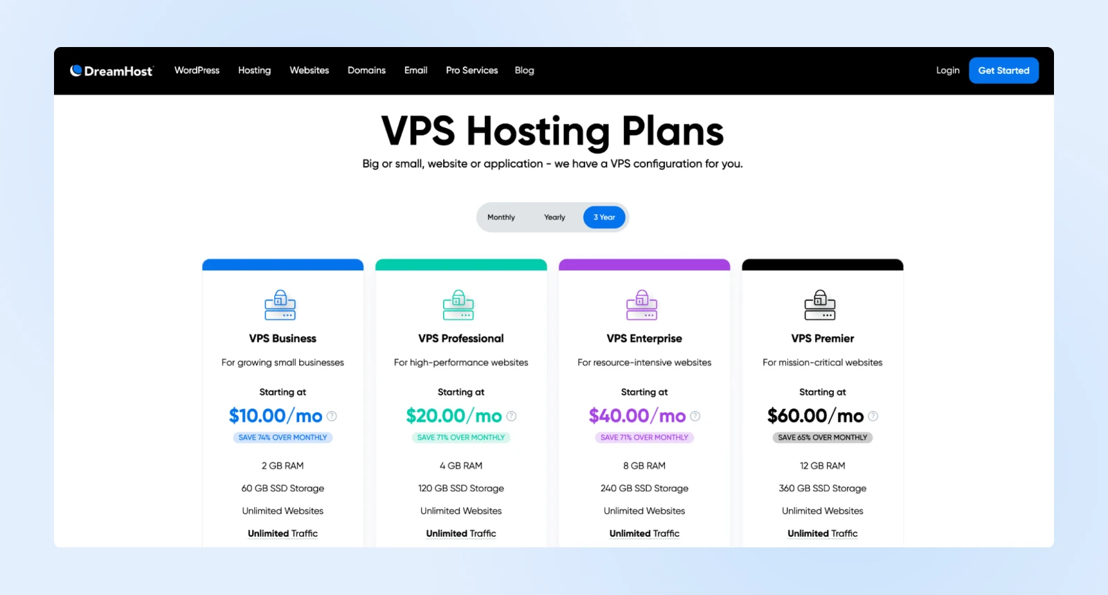
If you need even more out of your web hosting, you might want to go with a managed dedicated server — which means you’ll be able to use a server that’s reserved specifically for your site.
For larger sites or e-commerce platforms, managed dedicated hosting offers the most control: an entire server you can tailor to your site’s needs. The trade-offs are a higher price and more server to look after, so let your traffic data justify the jump.
What to look for in a host for mobile optimization:
- High uptime guarantee: Look for a host that provides at least 99.9% uptime, ensuring your site is always accessible to mobile users. For instance, DreamHost provides a 100% uptime guarantee.
- Content delivery network (CDN): A CDN can further speed up your site by delivering content from servers closer to your users. With DreamHost, you don’t need to subscribe to and configure a third-party CDN — one is ready to speed up your website for you.
- Caching and compression: Choose a host that supports caching and image compression to reduce load times, which is particularly valuable for mobile users on slower connections. DreamHost automatically caches your website on our servers as well as optionally on the user’s browser to speed up page load times.
8. Create a mobile application
Finally, we arrive at a seemingly monumental task — creating a mobile application.
Mobile apps are no longer exclusive to major brands. The market has changed significantly, and it’s now commonplace for almost any type of business or organization to offer a mobile app in addition to its standard, responsive site.
Having a dedicated app also comes with many unique benefits that a simple website can’t provide. For example, you can offer exclusive content, manage subscriptions directly, and use push notifications to reach users instantly — keeping them engaged with news, offers, or updates.
You don’t need to start from scratch, either.
While it’s possible to code a mobile app from scratch (or hire a developer), a far easier solution is to use a tool that helps you turn your site into an app.
With tools like AppPresser, specially designed for WordPress users, you can convert your existing website into an app with minimal coding.
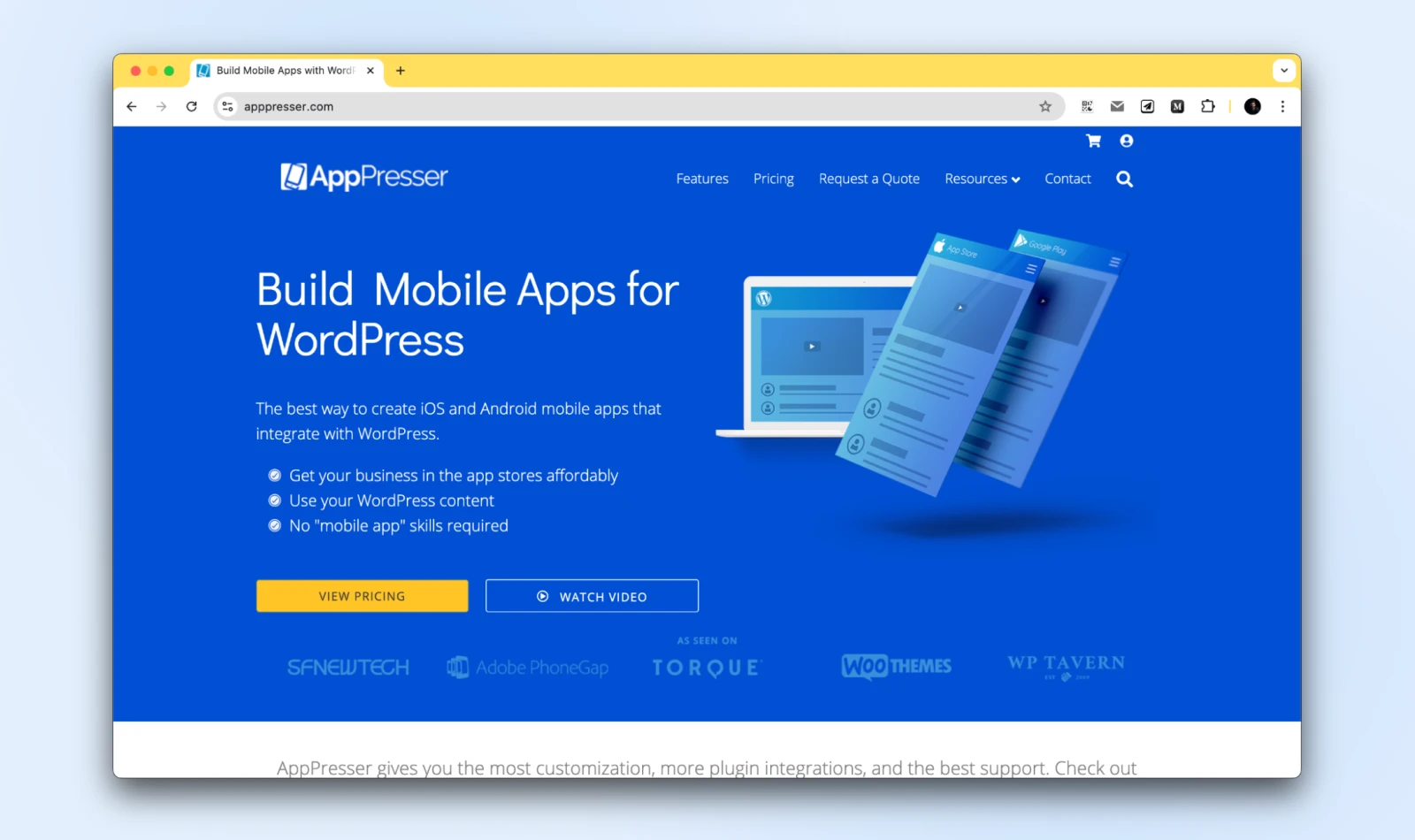
This is a premium tool with plans starting at $59 per month billed annually, or $79 per month billed monthly, per AppPresser’s pricing page (checked July 2026). For that, you get an intuitive app-builder interface that should be easy to use if you’re already familiar with WordPress.
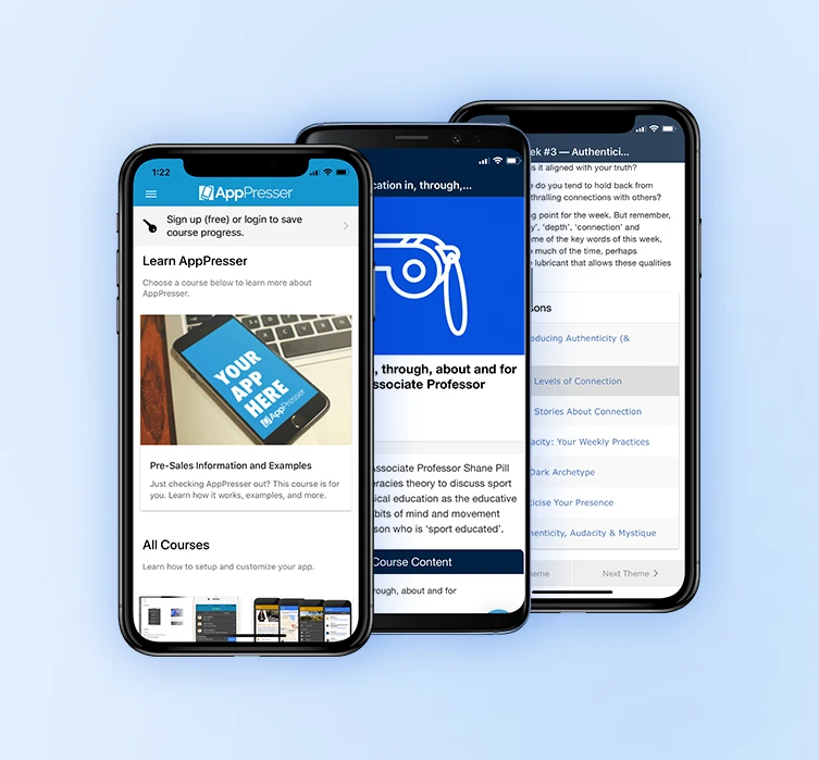
With this tool, you can quickly put together a mobile app based on a specific site for both Android and iOS, which you can then share with your users via the App Store or Google Play Store, or provide it directly to your site’s visitors or subscribers.
9. Design mobile conversion paths around your goal
Getting visitors to a fast, readable mobile site is only half the job. The other half is making the action you want them to take — call, sign up, buy — nearly effortless on a small screen.
Match the path to the goal:
- Phone calls: Add a tap-to-call button and make every phone number clickable, so nobody has to memorize or copy a number.
- Leads: Keep forms short and thumb-friendly. Ask only for what you truly need, use large input fields, and flag entry errors as users type instead of after they hit submit.
- Sales: Cut checkout to the fewest possible steps and offer a guest option — a forced account signup is where many mobile purchases die.
- Cross-device journeys: Let visitors save a cart or email themselves a link, so someone who browses on a phone can finish the purchase later on a desktop.
10. Put AI tools to work on the busywork
AI won’t replace the steps above, but it can compress them.
- AI website builders: Remixer, DreamHost’s AI website builder, creates a site from a plain-language description, so you start from a working design instead of hand-coding layouts.
- AI-assisted image optimization: Image tools with AI-driven compression can flag oversized assets, generate right-sized variants for each screen, and shrink file sizes automatically. Give the results a quick visual check before publishing so quality holds up along with page weight.
- AI coding assistants: If you’re writing your own CSS, an assistant can draft the media-query breakpoints from step 2 and explain what each rule does. You still test the result on a real phone.
- AI-assisted diagnostics: Not sure what a Lighthouse warning means? Paste it into an AI assistant for a plain-language explanation and a suggested fix. DreamPress plans also include AI-powered error log analysis to help you spot issues fast.
FAQs about mobile optimization
How can I ensure my website is mobile-friendly?
Run a Lighthouse audit in Chrome DevTools with the Mobile setting selected, then fix what it flags: slow loading, small tap targets, and hard-to-read text. Google retired its standalone Mobile-Friendly Test in December 2023, so Lighthouse and PageSpeed Insights are the tools to use now.
What are the benefits of optimizing a website for mobile users?
A mobile-optimized site loads faster, keeps visitors around longer, and converts more of them. It also protects your visibility: Google indexes and ranks sites based on their mobile version, so a poor mobile experience can drag down your rankings everywhere.
What are the best image dimensions for a mobile website?
There’s no single required size — what matters is serving scaled, compressed images. Set image widths in percentages, use the srcset attribute so browsers pick the right file for each screen, and compress files with a tool like TinyPNG so they don’t slow mobile loading.
How do I test my site’s mobile performance?
Enter your URL into Google’s free PageSpeed Insights and check the mobile results for the three Core Web Vitals: LCP (2.5 seconds or less), INP (200 milliseconds or less), and CLS (0.1 or less). Re-test after each change to confirm your scores actually improved.
Mobile optimization can’t wait!
Taking your site mobile means reaching your audience where they are — right in their hands.
With more people relying on mobile devices, a quick-loading, user-friendly mobile experience has become essential for any online presence.
So, each improvement, from responsive design to optimized loading times, helps strengthen user engagement and positions you favorably in search rankings.
Whether you’re working with a hard-coded website or using a CMS like WordPress, don’t wait.
A mobile-optimized site is the foundation for growth and connection with your audience.
Ready to go mobile-first? DreamPress, DreamHost’s managed WordPress hosting, comes with built-in caching and a CDN for fast mobile load times — and Remixer, DreamHost’s AI website builder, makes it easy to create pages that look fantastic on mobile devices!

You Dream It, We Code It
Tap into 20+ years of development expertise. Just let us know what you want for your site – we’ll take it from there.
See MoreThis page contains affiliate links. This means we may earn a commission if you purchase services through our links, at no extra cost to you.