
Web design is basically about choices. Which template shall we use? What layout will our visitors like? How do we fix that image that always loads a few pixels out of line? Every decision contributes to the look and feel of your site.
Selecting your site’s color scheme might seem like one of the smaller decisions. It’s just the finishing touch, right?
Well, actually, no. Website color schemes are important in conversions, brand identity, and visitors’ feelings about your site.
In this guide, we’ll explore the freshest color schemes on the planet and learn why they work. Let’s get started!
What Exactly Is A Website Color Scheme?
Every dash of color you can find on your website is part of the overall color scheme or color palette. That includes every link, graphic, icon, button, and variety of text. It even includes the logo of your site.
Icon
An icon is a small image representing an object, concept, or action. Icons are often used in user interfaces to visually represent a function or command. In many cases, you can use icons to represent common tasks or commands without text labels.
Read MoreWhen designing your website, it’s important to consider how these colors fit together. You can do this by planning out a color scheme from scratch or adapting the default color scheme of your chosen template.
Why The Color Scheme Of Your Website Matters
A well-crafted color scheme will make your site visually appealing to visitors. But that’s not all. Colors can help to guide visitors through the website, create a specific vibe, and support your branding.
Here’s a closer look at the real-world impact of your color scheme:
It Helps To Define Your Online Brand
Visitors to your site are more likely to purchase or subscribe to your newsletter if your site seems professional. It’s a matter of trust and credibility.
Color has a part to play here. Playful primary colors would work well on a nursery school website. Meanwhile, a kaleidoscope look will have you laughed out of court for a legal services firm.
The color scheme of your website should also play nicely with the rest of your brand. We would recommend avoiding colors that clash with your logo!
It Can Improve Usability
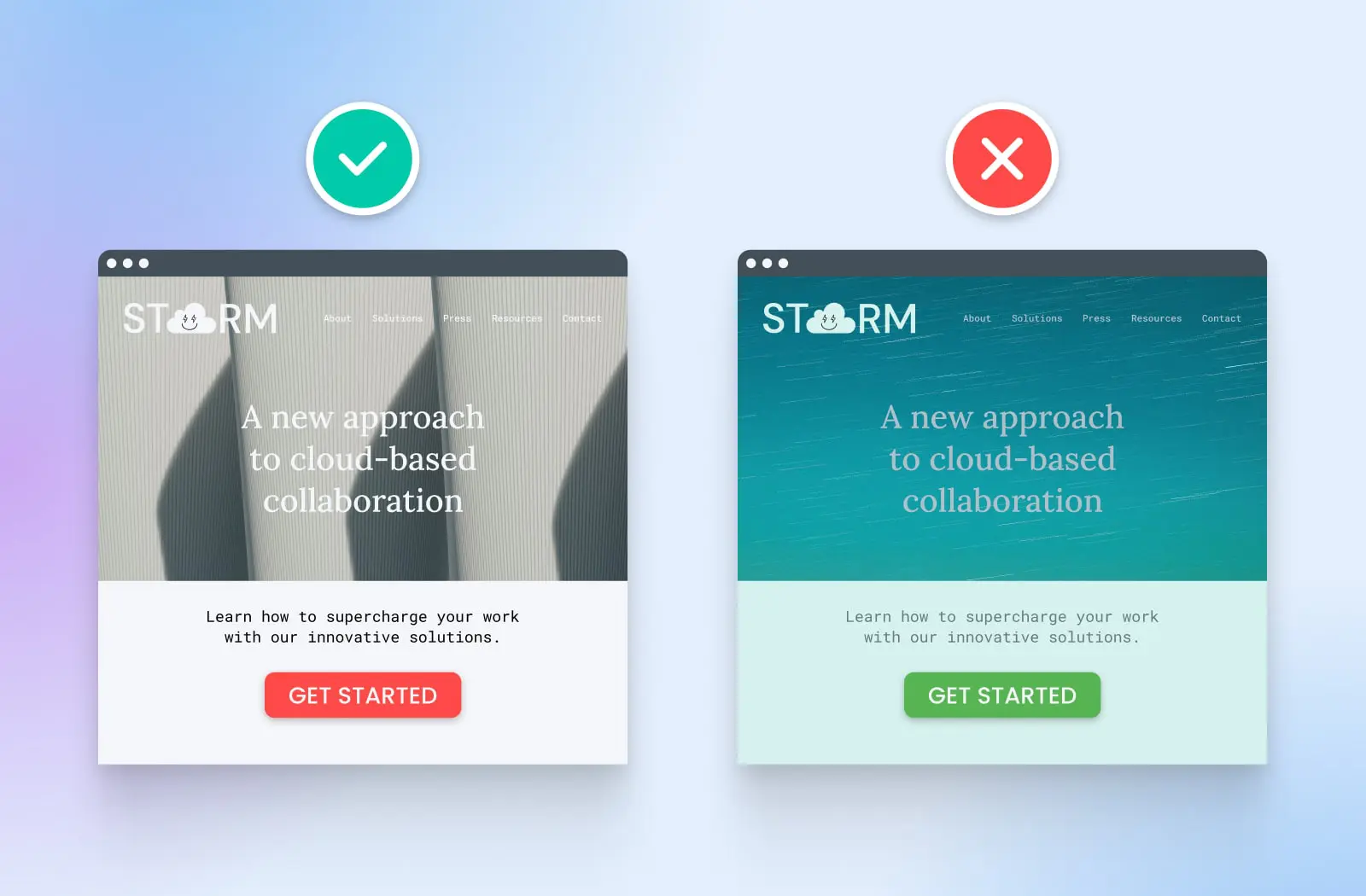
On a more practical note, your choice of color scheme can make it easier (or harder) for visitors to use your website.
Imagine you created a site with a blue background and purple text. Visitors would find reading your blog posts and product descriptions almost impossible. In this example, changing to a color palette with better contrast would massively improve the overall user experience.
Colors can help visitors to navigate, as well. For instance, you can use brighter shades to highlight certain parts of your site, such as links.
It Can Increase Conversions
Speaking of important elements, here’s a fact that might surprise you: the color of buttons on your site affects how many people click them.
Obviously, brighter colors tend to stand out more. And it turns out that certain hues have a psychological effect.
One study of 2,000 visits found that a red CTA (call-to-action) button attracted 20% more clicks than the same button in green. In the context of running a business, that is a pretty massive jump.
We will look deeper into the psychology of color (yes, that’s a thing) a bit later.
40 Beautiful Website Color Schemes To Try
Professional designers often create the color scheme for big projects for each website from scratch, but this isn’t always necessary.
If you’re new to design or looking for inspiration, we recommend choosing a tried-and-tested color combination as a starting point. You can always adjust it later.
To point you in the right direction, we have curated some of the best color schemes on the planet.
Classic And Professional Color Schemes
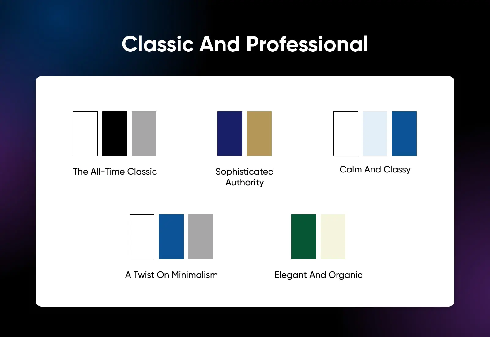
Let’s start with the basics. You can’t really go wrong with these timeless color schemes:
1. White, Black, And Gray (The All-Time Classic)
This simple combination might not win any awards for creativity, but it comes with a guarantee of readability and professional polish. Adding gray to the monotone look gives you more freedom in design. Best used on professional sites and personal blogs.
2. Navy And Gold (Sophisticated Authority)
Gold highlights sparkle on a cool navy blue background in this color combination. It’s a palette that engenders authority with a touch of luxury. Use it for finance and premium e-commerce.
3. Monochromatic Blue With White (Calm And Classy)
Using lighter and darker versions of the same blue creates a harmonious palette that radiates calming energy. Adding a white background helps to maintain strong usability. It would work well for health and wellness sites and water-related brands.
4. White And Blue-Gray (A Twist On Minimalism)
Even though we’re back to two colors, this scheme provides more interest than straight black and white. The slightly reduced contrast and cool hues create a relaxed yet polished user experience suited to spas and hotels.
5. Forest Green And Cream (Elegant And Organic)
Forest green adds a natural feel to designs and works well as a background for cream-colored content. This color scheme has an organic feel but is still elegant enough for lifestyle websites and sustainable living blogs.
Modern And Bold Color Schemes
While the classics never age, new ideas are worth exploring. If you want to embrace cutting-edge design and make a statement with your site, these attention-grabbing color schemes are worth exploring:
6. Coral And Teal (An Eye-Catching Duo)
The vibrant pink of coral and the blue-green tones of teal combine to make an eye-catching combination. It can work well for brands in the design space and other sites devoted to creativity.
7. Yellow, Black, And White (High Contrast, High Impact)
This high-viz color scheme injects life into your website while maintaining some white space for solid usability. It’s a favorite with tech startups and manufacturers of energy drinks and sports equipment.
8. Fuchsia Fading Into Purple (For Trend Setters)
Much like a creative haircut, a color palette that extends from fuchsia through to deep purple is sure to turn heads. Consider using this scheme if you’re trying to attract a younger, fashion-conscious audience.
9. Orange Fading Into Yellow (Sunset Vibes)
This attractive selection of warm hues is vibrant enough to hold the attention yet somehow quite calming. It suits the younger target market and works well for a wide range of brands — from sleep apps to beach bars.
10. Neon Accents (Make It Pop!)
If you’re looking for something a little more edgy, try adding hints of neon green or pink in a white and black design. It creates a futuristic, night-time look that would suit video games and entertainment venues.
Earthy And Natural Color Schemes
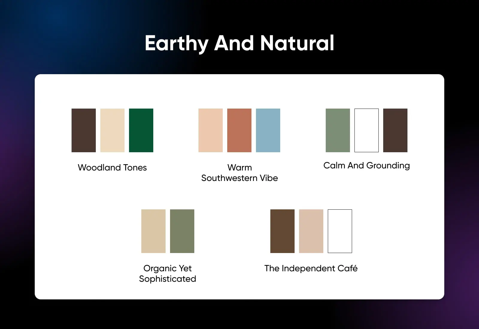
While colors like teal and fuchsia grab the attention, they can seem artificial — like lime green soda. If you’re trying to promote an organic or natural brand, these earthy color schemes might be a better fit:
11. Brown, Beige, And Forest Green (Woodland Tones)
Mimicking the hues of an evergreen forest, this color combo instantly transports your visitors to a shady woodland valley. You can use dark green or brown as the background color; choose this scheme for eco-friendly, organic products and gardening blogs.
12. Terracotta, Sand, And Sky Blue: (Warm Southwestern Vibe)
This collection of colors takes visitors to a warmer, drier environment. The earthy tones provide an excellent backdrop for handmade products or warm negative space around the content on travel blogs.
13. Sage Green, White, And Brown (Calm And Grounding)
This color palette is very pure and elemental, making it well-suited to the wellness and mindfulness space. The green color would also sync nicely with houseplants or all-natural skincare.
14. Muted Green And Tan (Organic Yet Sophisticated)
While this color scheme definitely has an organic vibe, it’s not quite “made from the earth.” Muted green and tan appear more sophisticated, like something you would expect to see on a home décor magazine site or slow-living blog.
15. Monochromatic Coffee With White (The Independent Café)
If you love those earthy tones, try playing with coffee-based colors. This color combo is obviously perfect for cafés. You could also use it to promote chocolates, baking, and leather goods.
Pastel And Playful Color Schemes
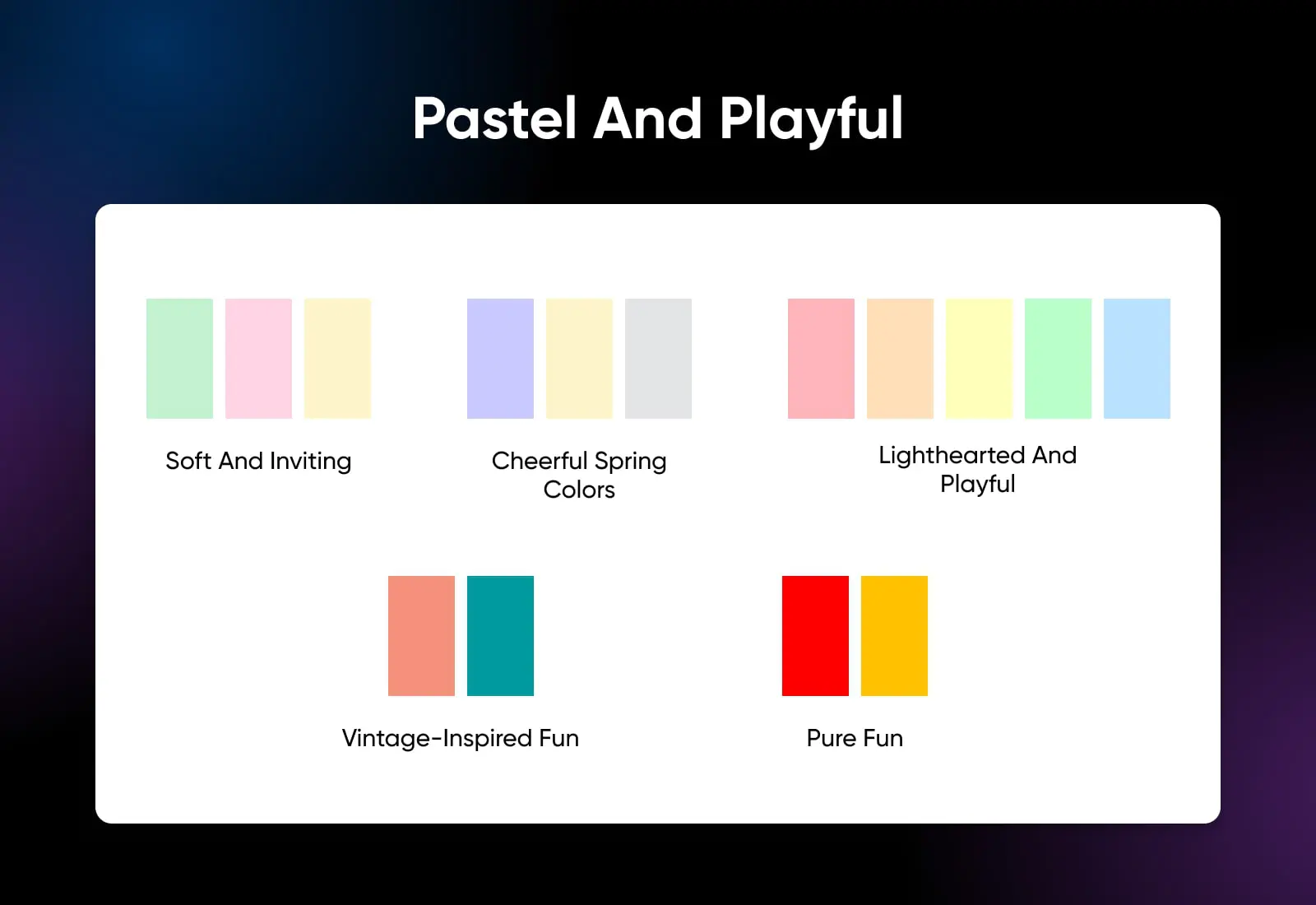
Light, breezy color schemes are a common choice in the lifestyle and home décor space. If you’re building a site in this niche, here are some color palettes to try:
16. Mint Green, Blush Pink, And Cream (Soft And Inviting)
This is a very common color combination in modern home décor, and it’s now appearing online. Blush pink adds softness, while mint green seems lush. Use them together with cream on a lifestyle blog or bakery business website.
17. Lilac, Light Yellow, And Gray (Cheerful Spring Colors)
This selection of colors is sure to remind visitors of vibrant spring blooms. At the same time, the lilac provides a sense of calm. You could use this color scheme for blogs on creative hobbies or parenting.
18. Pastel Rainbow (Lighthearted And Playful)
Combining multiple subtle hues, this color combination gives your website a playful, dreamy vibe. It works nicely for sites aimed at younger kids and other brands that want to evoke that carefree feeling.
19. Peach And Turquoise (Vintage-Inspired Fun)
Faded festival T-shirts, 1970s furniture, and hippy album covers — that’s the style you get with peach and turquoise. It’s a relaxed mix that can work well for summery fashion websites and music blogs.
20. Red And Yellow (Pure Fun)
You know when the paint starts flying in kindergarten? You can get that same kind of energy from combining strong red and yellow on your website. This one is definitely for the kids!
Dark And Dramatic Color Schemes
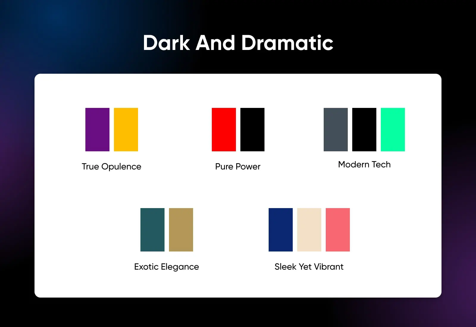
Of course, not everyone likes sunshine and rainbows. If you’re more of a dark and brooding type, these color schemes will better suit your style:
21. Deep Purple And Gold (True Opulence)
You can take the luxurious navy and gold color scheme to the next level by switching royal blue for dark purple. This creates an almost regal look, providing the perfect background for high-end e-commerce and exclusive services.
22. Black And Red (Pure Power)
These two very strong colors can be combined to powerful effect. Black provides the background, while hints of red create eye-catching highlights. Use this scheme if you want your website to feel edgy.
23. Dark Gray, Black, And Neon Accent (Modern Tech)
Drawing on Blade Runner influences, the combination of dark gray, black, and streaks of neon feels sleek and modern. It comes with the implication of futuristic technology, making it well-suited to tech-focused business sites and gaming blogs.
24. Dark Teal And Gold (Exotic Elegance)
You often see the gold leaf and turquoise pairing often in modern jewelry. Using the same colors on your site can introduce exotic elegance; use it for your lifestyle blog or handmade brand.
25. Dark Blue, Beige, And Coral Red (Sleek Yet Vibrant)
Switching out black for deep blue makes your site a little less brooding while maintaining a sleek feel. Coral red provides a nice color contrast for buttons and links. Try this scheme if you’re selling professional services or grooming products.
Fresh And Vibrant Color Schemes
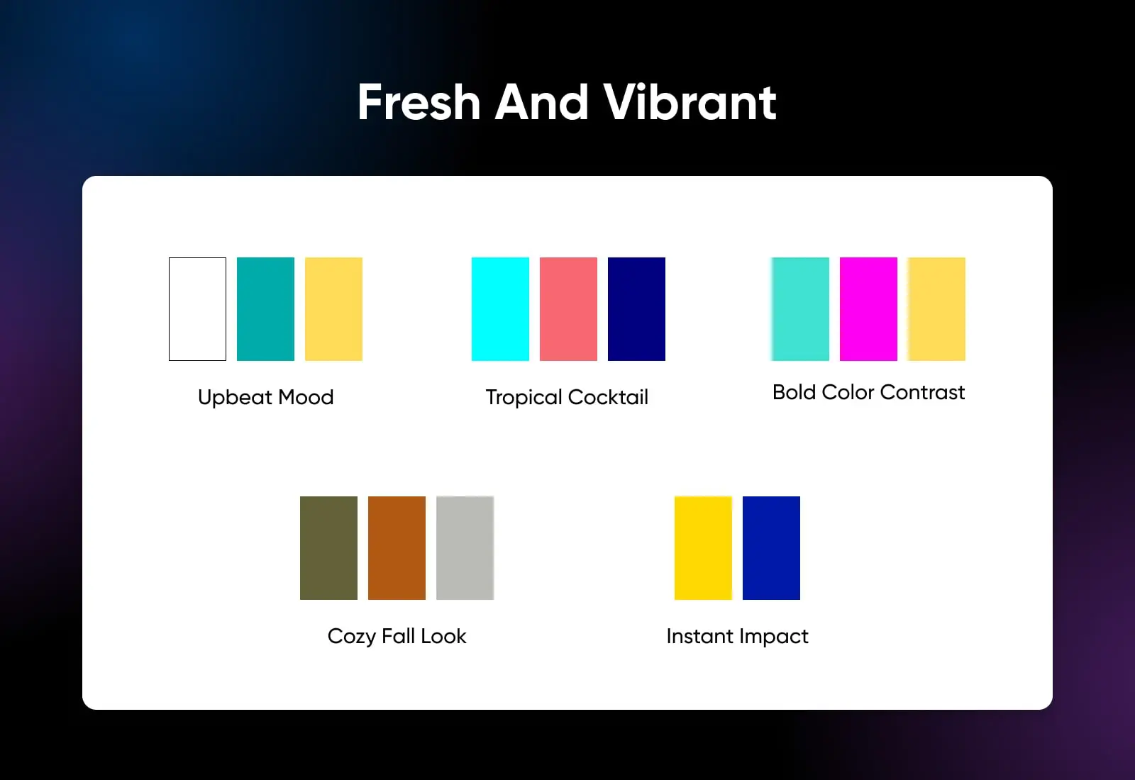
Vibrant color doesn’t have to be child-like. These fresh color schemes should boost your site with a hint of warm midday breeze and a squeeze of zesty lemon:
26. Mustard Yellow, Teal, And White (Upbeat Mood)
Summery yellow and cooling teal work together like chili and sour cream — it’s the perfect match. This cheerful palette would look great on your personal blog. It would also work nicely for creative brands.
27. Aqua, Coral, And Navy (Tropical Cocktail)
If you want your visitors to feel like they’re sipping on a piña colada, this trio of tropical colors should fit the bill. It’s often used by travel bloggers and outdoor brands, but it can bring the sunshine to any site.
28. Turquoise, Magenta, And Gold (Bold Color Contrast)
The contrast between these three strong colors doesn’t suit every project, but it can make your site visually distinctive. Consider using it within your art portfolio website, or for promoting live events online.
29. Burnt Orange, Olive Green, And Cream (Cozy Fall Look)
Like falling leaves, these autumnal colors conjure up the feeling of sipping hot cocoa by an open fire. It’s a cozy vibe that will invite readers into your food blog or have them shopping for home décor in your online store.
30. Bright Yellow And Blue (Instant Impact)
If you’re aiming for maximum impact, you could try pairing together these primary colors. The contrast is intense, but it feels fresh — like blue sea and hot sand. Use it for any project where you’re promoting a new way of doing things.
Soft And Sophisticated Color Schemes
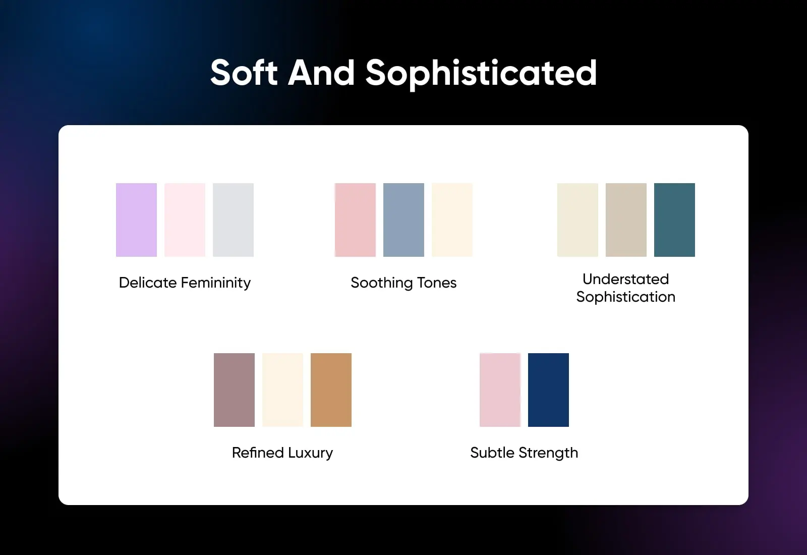
You don’t always have to use powerful colors to catch the attention of your audience. These beautiful color schemes combine subtle colors to great effect:
31. Lavender, Blush Pink, And Light Gray (Delicate Femininity)
This color scheme combines delicate floral notes to turn your website into one big bouquet. The light gray background also makes a great backdrop for photos. Use this scheme for wedding services, planning and photography, or for your cosmetics brand.
32. Dusty Rose, Pale Blue, And Cream (Soothing Tones)
Rather than contrasting, the colors in this palette blend together. It produces a soothing, delicate look that would be great for baby products, mindfulness coaching, and wedding dressmakers.
33. Beige, Tan, And Soft Teal (Understated Sophistication)
Another appearance for teal? Yes, because it’s awesome. Pairing it with neutral colors like beige and tan creates a sophisticated look that perfectly suits premium cosmetics, interior design, and fashion.
34. Mauve, Cream, And Gold (Refined Luxury)
Everything about this color scheme feels luxurious. It’s the palette you would expect to see on the packaging of high-end moisturizer. You can use it for the same purpose — pretty much any premium lifestyle brand.
35. Pastel Pink And Navy Blue (Subtle Strength)
Although this color scheme is still relatively muted, using dark blue as a background or accent color helps to inject some power. It best promotes strong femininity, such as for fragrance and cosmetics brands.
Unique And Eye-Catching Color Schemes
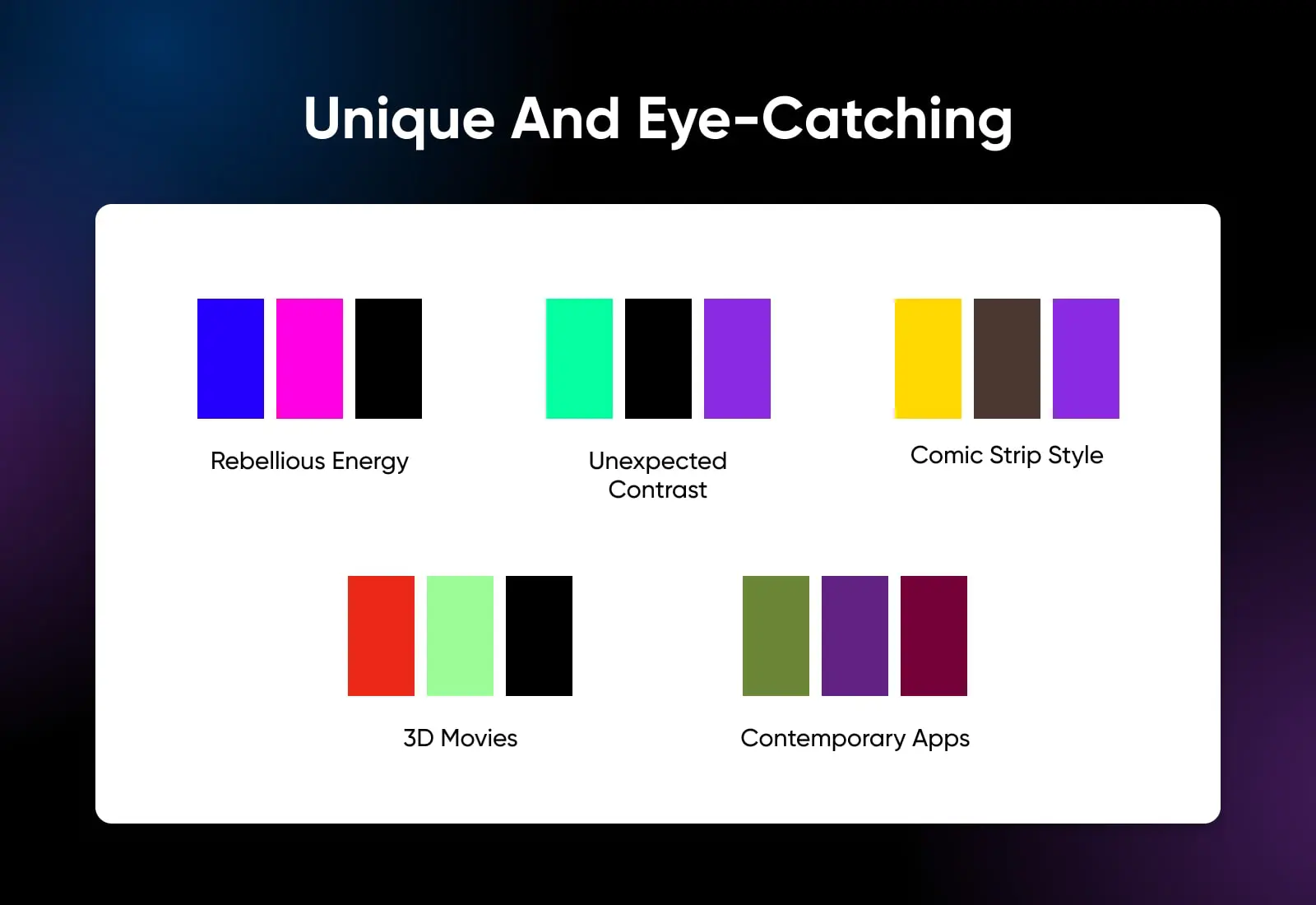
Sometimes, going with the grain means blending in. If you want your website to stand out from the crowd, try exploring these unique color schemes:
36. Electric Blue, Hot Pink, And Black (Rebellious Energy)
This zingy, super-bright color scheme pumps your website design full of energy. It’s also quite lighthearted, making it perfect for quirky café sites, music blogs, and indie fashion shops.
37. Lime Green, Purple, And Black (Unexpected Contrast)
Purple and green in the same design? Controversial. But also, very engaging. This unusual color combo hints at an alternative approach — great for showing off technical innovation or cutting-edge gaming products.
38. Yellow, Brown, And Purple (Comic Strip Style)
This might look like an unlikely match on paper, but it actually works. The end result looks a bit like a comic book, with all the associated visual punch. Consider using this color scheme for a creative portfolio.
39. Vermilion, Russian Green, And Black (3D Movies)
With a black background and contrasting green and red, this color scheme reminds us of old-school 3D movie glasses. It’s a surprisingly appealing palette, with enough polish for promoting professional services and events.
40. Mountain Green, Purple, And Burgundy (Contemporary Apps)
Finishing up our roundup, this color scheme offers an interesting mix of hues. There’s significant color contrast here, but each part fits together nicely. It’s perfect for showing off your brand-new app or online service.
How To Choose Your Website Color Scheme
Taking inspiration from proven color schemes is a smart move. It gives you an idea of what is likely to work. Plus, you can use an existing palette as the basis for your design.
That said, we wouldn’t recommend grabbing a template straight off the shelf. Why? Because every brand is different. If you want your website to have a unique identity, it needs custom colors.
Creating the color scheme for your website starts with selecting a base color. This provides the primary theme for your design. You then build your color scheme by selecting other colors that work well with the base color.
And how do you choose a base color? By studying a little psychology.
Picking Your Base Color With Psychology
For as long as we have been creating art and building civilizations, humankind has assigned symbolic meanings to colors and explored how our brains perceive them.
The ancient Egyptians mixed mineral-based pigments to infuse their art with color-based meanings. The 19th-century German poet and statesman Goethe, conducted a philosophical exploration of the color wheel, opening the door for enduring scientific color studies in the emerging field of Western psychology.
Even today, color plays an important role in how we perceive the world. Research indicates that color alone can enhance brand recognition by up to 80%.
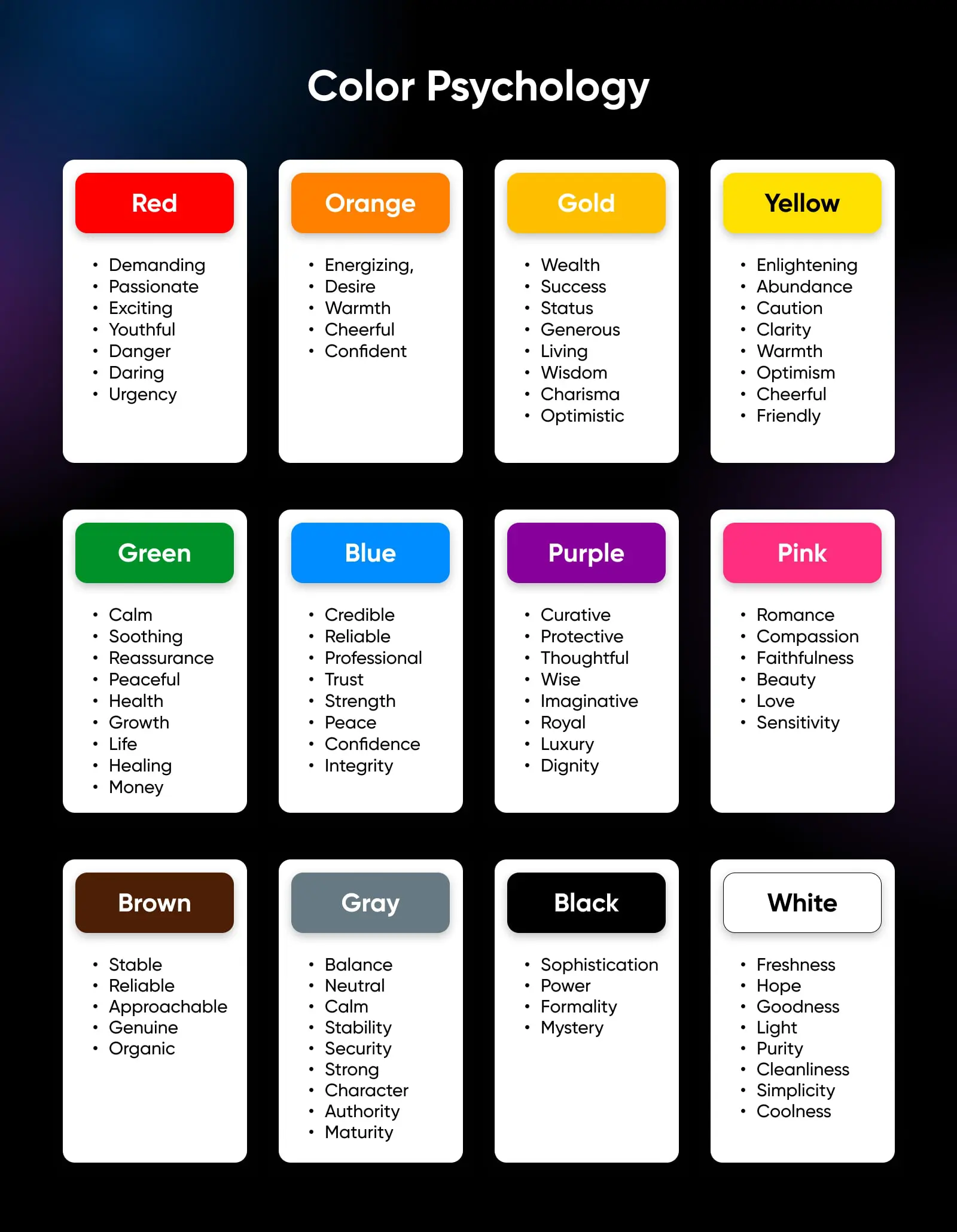
The way people react to any given color depends partly on their age, gender, and cultural upbringing.
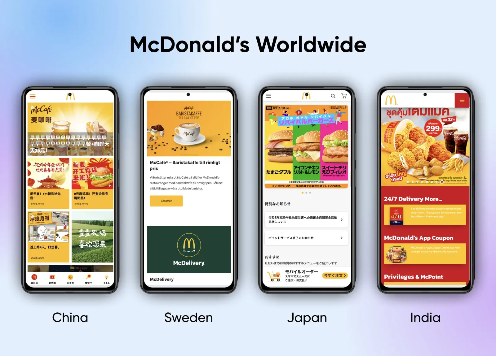
Consider the way purple is perceived around the world. While most people in Western countries associate purple with luxury and wealth, this color represents mourning and sorrow in India and Thailand.
Similarly, the yellow in the McDonald’s logo is associated with happiness virtually worldwide. But the company adapts its color scheme to fit the cultural preferences of customers in different nations.
It’s not worth agonizing over whether your blog should be accented with teal or lilac. But do keep in mind how your target audience may perceive those color choices.
For instance, blues and greens are widely accepted as safe choices, while reds and oranges can evoke more emotion. Younger folks tend to prefer brighter colors, but people’s preferred palettes tend to become more muted with age.
Understanding Color Theory
Once you’ve chosen a dominant color that captures the character of your website, it’s time to zero in on the secondary color to round out your scheme. Here are the options laid out on the color wheel:
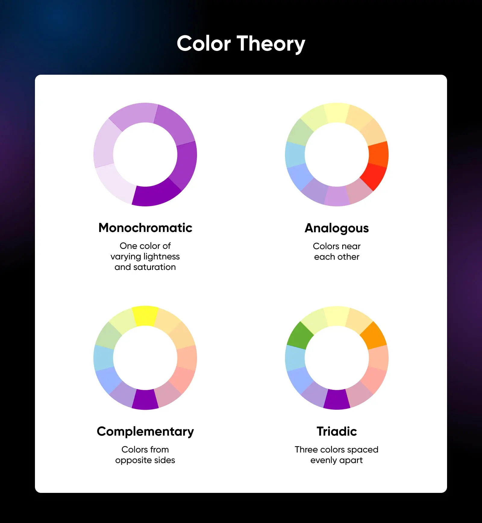
- Monochromatic color schemes are based around a single color, with different variants of light and saturation. While monochromatic schemes are considered easiest on the eyes, they run the risk of being bland. A well-placed splash of complementary yellow or an analogous purple can accomplish a lot on a page awash with blue tones.
- Analogous colors are next to each other on the color wheel, and they generally create combinations that are visually appealing. Analogous color schemes are often found in nature, and they typically have a harmonious effect.
- Complementary colors appear opposite each other on the color wheel, creating high contrast, vibrant, attention-grabbing schemes when used together. Use them sparingly to emphasize details you want to stand out (cough *call-to-action buttons* cough).
- Triadic color schemes use colors that are spaced evenly apart on a color wheel, like the points of a triangle. Purple, green, and orange is a classic example of a triad scheme — which is best applied when one color dominates and the other two are used as bold feature colors.
Choosing color schemes can feel overwhelming, especially when delving into more complex combinations like split-complementary and tetradic schemes. But just remember — some of the most visually pleasing and effective color schemes keep it really simple.
Color Scheme FAQs
If you’re still keen to learn more about color schemes, check out these frequently asked questions:
What are the 7 major color schemes?
The seven major color schemes include the four we mentioned earlier: monochromatic, analogous, complementary, and triadic.
The lineup also covers:
- Split Complementary — One base color matched with two colors on either side of the complementary choice on the color wheel.
- Square — Four colors that are evenly spaced around the color wheel.
- Rectangle or Tetradic — A base color, along with three more colors placed at 60 degrees, 180 degrees, and 240 degrees on the wheel.
Which color catches the eye first?
Studies into human behavior suggest that red is the clear winner here. It’s the color associated with blood, love, anger, danger, and all things passionate. Given these connections, we just can’t ignore a little crimson.
What is the 60-30-10 color rule?
It’s like a rule of thumb for creating color schemes. The framework is based on percentages, where:
- 60% of your design should be the primary color.
- 30% should be the secondary color.
- 10% is devoted to the accent color.
It’s a useful starting point. Just remember that rules were made to be broken…
What is the best color scheme for readability?
Scientific research over a long period has established that black text on a white background is the optimum color scheme for readability. But you can definitely deviate from this combination and still maintain clear text. The key is to maintain a good contrast between the background and your content.
Upgrade Your Website Today
Creating a website color scheme isn’t just about picking out your favorite shades. As we have discovered, top brands use color psychology and color theory to find the perfect combination.
If you’re planning to build a new site or revamp your online presence, try using the same principles when you pick your colors. Think about:
- What mood you want to set.
- How colors fit together.
- And how your color scheme will affect usability.
Break it down into these small chunks, and the choice won’t seem so overwhelming.
Once you decide on your color scheme, make sure to test it on your website. To configure your perfect color scheme in WordPress, try using our WP Website Builder. It’s super easy to use, and it works on all our hosting plans.
(Don’t fancy doing it yourself? Our professional web design team is always on standby!)
When you’re ready to launch your new design, make sure you have the hosting to match. At DreamHost, we offer sizzling performance and 99.9% uptime on all hosting plans, starting from just $2.59/month. Sign up today to try it for yourself!

Create a Website for All
With automatic updates and strong security defenses, DreamPress takes server management off your hands so you can focus on what really matters: creating a site that can be enjoyed by every user.
Choose Your Plan