Imagine you’re building your first website. Everything looks perfect — the layout is sleek, the colors are on point, and the images are crisp.
Then you hit “publish”…and disaster strikes.
While you spent hours choosing your font, it doesn’t display correctly for everybody.
Instead of the modern, stylish typeface you carefully selected to fit your site’s vibe, some visitors are seeing something that looks more like a 1990s Word document — not exactly what you had in mind (and neither did your visitors).
Font
Font is the size, style, and weight variation in a typeface. A typeface is a general lettering design that includes these different font variations.
What if we told you that this could’ve been avoided altogether? That’s right, web safe fonts are the heroes of the typeface world.
Web safe fonts are typefaces that come pre-installed on nearly every device and operating system, so they display properly no matter where — or how — they’re viewed. Every visitor to your site, whether they’re using the latest version of Chrome or they somehow never updated from V1 of Internet Explorer, will see the font you chose exactly how you want them to see it.
In this guide, we’re diving into everything you need to know about web safe fonts: what they are, what makes a font web safe, and why they’re still essential.
Plus, we’ve curated a list of 25 web safe fonts for you to try out on your own site.
There’s a lot to cover, so let’s get started!
The AI website builder that turns conversation into designer-level sites. Free with hosting.
Start Free Trial
What is a web safe font?
A web safe font is commonly installed across major operating systems, allowing browsers to render it without downloading a font file. Availability still varies by device and operating system, so use a CSS font stack rather than assuming every visitor will see the same font.
There’s no official registry of web safe fonts, but MDN Web Docs names six that are available on nearly all instances of the most-used operating systems: Arial, Courier New, Georgia, Times New Roman, Trebuchet MS, and Verdana (with the caveat that Trebuchet MS isn’t widely available on mobile operating systems). Beyond those six, the list below includes familiar fonts whose availability varies by platform. Treat them as design options rather than universally web-safe choices, and either provide fallbacks or serve them as properly licensed web fonts.
Why do web safe fonts matter?
Web safe fonts matter because:
- They make sure your website’s text looks the same across all devices and browsers.
- They enhance user experience (UX).
- They maintain your site’s visual integrity.
- They make sure your message is delivered as intended.
In some cases, using web safe fonts may improve the loading times of your pages. Since they’re pre-installed on most popular operating systems, modern browsers don’t have to download them from your server while rendering your site. This can improve both UX and search engine optimization (SEO).
User Experience (UX)
UX refers to how online visitors interact with a website. Users often evaluate their virtual experience based on a site’s usability and design, as well as their general impression of its content.
If a visitor’s device doesn’t have the font your site calls for, their browser falls back to the next font in your CSS stack — or, if you haven’t set one, to its own default font.
Since fallback fonts have different letter widths and heights, that swap can change your line breaks and spacing, and your carefully planned design suddenly looks off.
And if a hard-to-read substitute makes visitors squint? Typically, they won’t stick around. Hard-to-read content can increase bounce rates and disrupt traffic and conversions.
Even when the fallback is perfectly readable, an unplanned font can disrupt your website’s overall design and cause inconsistency in your branding.
Are web safe fonts still necessary?
Yes, web safe fonts are still necessary, even in today’s advanced digital and web environment. Maybe especially so.
While web fonts have expanded the range of typefaces available for websites, you have to remember that not all users have access to the latest browsers or even high-speed internet connections.
Web safe fonts give all internet users a reliable fallback. They make sure your site’s typography remains functional and aesthetically pleasing for everyone, regardless of their browsing capabilities.
Types of web safe fonts

When it comes to web safe fonts, variety is the spice of life. There are different types of fonts that serve different purposes and fit unique design preferences.
Helpfully, these categories line up with the five generic font families that CSS defines: serif, sans-serif, monospace, cursive, and fantasy. End your font stack with one of these generic names, and the browser can always show something appropriate.
These are the most common types of fonts:
Serif
Serif fonts are characterized by the small lines or strokes attached to the end of larger strokes in a letter or symbol.
These fonts convey a sense of tradition, reliability, and professionalism.
Sans serif
Sans serif fonts don’t have the decorative lines seen in serif fonts, which gives them a cleaner and more modern appearance.
They’re often used for digital content because of their clarity and readability on screens.
Monospace
Monospace fonts, also known as fixed-width fonts, have characters that each occupy the same amount of horizontal space. This uniformity makes them ideal for coding and displaying tabular data.
Cursive and fantasy
Cursive and fantasy fonts can add a touch of creativity and whimsy to your website. Cursive fonts mimic handwriting, offering an elegant and personal feel, while fantasy fonts are more decorative and playful.
The top 25 web safe fonts to use on your website
There are many different web safe fonts out there that you can choose from when designing your site.
You shouldn’t have too much trouble finding one that matches your brand’s tone and personality.
To give you a head start, we’ve rounded up some popular choices for your consideration.
Best web safe serif fonts
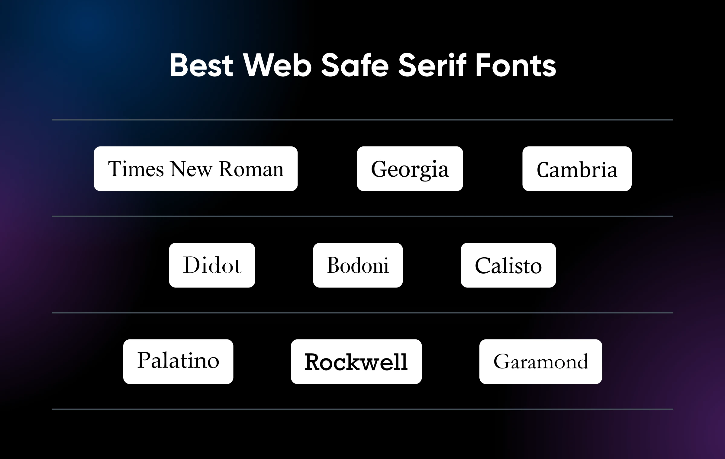
1. Times New Roman
Times New Roman is one of the most recognizable fonts in the world. Designed for The Times of London, where it debuted in 1932, it has shipped with Windows since Windows 3.1. It combines readability with a classic, formal appearance, and its widespread availability makes it a safe choice for any website looking to maintain a professional tone.
What makes Times New Roman unique: Highly legible and widely available.
When to use it: Ideal for legal, educational, and corporate websites that require a formal tone.
2. Georgia
Georgia is a serif font built for clarity on digital screens. Designed by Matthew Carter and first released by Microsoft in 1996, it was drawn specifically to stay friendly and legible at small sizes on low-resolution displays — a big part of why it’s still a favorite for body text.
What makes Georgia unique: Excellent readability on screens, even on small sizes.
When to use it: Perfect for body text on blogs, news sites, and any content-heavy website.
3. Cambria
Cambria is a serif font designed for reading long documents on screen as well as in print. Created in 2004 by Jelle Bosma as part of Microsoft’s ClearType font collection, and included with Windows since Windows Vista, it features a slightly more modern and robust look compared to other serif fonts.
What makes Cambria unique: Designed for on-screen reading with clear, even spacing.
When to use it: Especially suitable for digital documents, presentations, and web content.
4. Didot
Didot is an elegant serif font with a distinctive contrast between thick and thin strokes. It exudes sophistication and is often associated with high-end fashion and luxury brands.
What makes Didot unique: High contrast and refined design, ideal for upscale aesthetics.
When to use it: Great for fashion websites, luxury brand promotions, and elegant headings.
5. Bodoni
Bodoni is another high-contrast serif font known for its stylish and classic look. It’s characterized by flat, unbracketed serifs and a strong vertical emphasis.
What makes Bodoni unique: Stylish with a strong vertical emphasis and high contrast.
When to use it: Ideal for large headings, logos, and hero sections on visually-driven websites.
6. Calisto
Calisto MT is a versatile serif font designed by Ron Carpenter for Monotype. Its even color on the page and slightly calligraphic letter shapes give it a warm and welcoming look.
What makes Calisto unique: Warm and inviting appearance with versatile applications.
When to use it: Great for body text in personal blogs, literary websites, and any site aiming for a friendly and approachable tone.
7. Palatino
Palatino is a serif font designed by Hermann Zapf in 1950 — Microsoft’s typography documentation calls it “one of the world’s most widely used typefaces.” The Palatino Linotype version that ships with Windows was drawn with special care for on-screen legibility.
What makes Palatino unique: Classic elegance with excellent readability.
When to use it: Use this font for body text on academic, historical, and cultural websites.
8. Rockwell
Rockwell is a slab serif font with a strong, geometric design. It stands out because of its bold and confident appearance, making it suitable for headlines and other attention-grabbing text.
What makes Rockwell unique: Strong, geometric slab serif with a bold presence.
When to use it: Best for impactful headlines, call-to-action sections, and promotional banners.
9. Garamond
Garamond is a timeless serif font with roots in the 16th century: the version distributed with Microsoft products is based on types cut by Jean Jannon in 1615, which followed Claude Garamond’s designs from the century before. It’s known for its readability and elegant, classic style.
What makes Garamond unique: Elegant and highly readable with a classic heritage.
When to use it: Perfect for body text on literary sites, high-end blogs, and any other websites looking for sophistication.
Best web safe sans-serif fonts
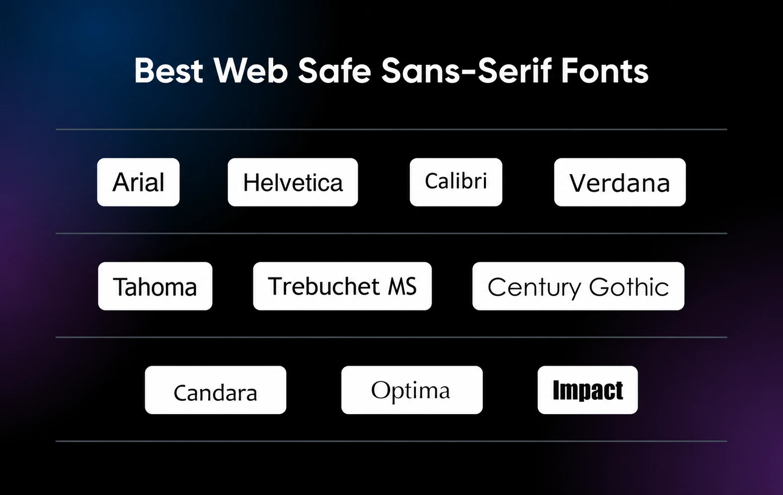
10. Arial
Arial is about as close to universal as a typeface gets — MDN Web Docs describes it as “found on any computer.” Its simple, clean, modern look makes it a go-to font for both print and digital media.
What makes Arial unique: Simple, clean design with wide compatibility.
When to use it: Ideal for body text and headings on business, technology, and e-commerce websites.
11. Helvetica
Helvetica has been a favorite among designers since 1957, when it was first released as Neue Haas Grotesk under the direction of Max Miedinger and Eduard Hoffmann at the Swiss Haas Type Foundry (Linotype rebranded it “Helvetica” in 1960). Its neutral, modern appearance makes it a good fit for a wide range of applications. One tip: Arial is more broadly available, so the classic stack lists Helvetica first with Arial as the fallback.
What makes Helvetica unique: Neutral and highly legible, with a timeless appeal.
When to use it: Perfect for minimalist websites, professional portfolios, and corporate branding.
12. Calibri
Calibri is a modern sans-serif font with a soft and rounded look, making it both stylish and easy to read. For both print and digital text, it’s a consistently popular choice.
What makes Calibri unique: Soft, rounded design with modern aesthetics.
When to use it: Use this font for websites focusing on readability and modernity, such as blogs, tech sites, and online publications.
13. Verdana
Verdana was designed by Matthew Carter specifically for on-screen display and first released in 1996. Its generous character width and spacing keep it clear and legible even at small sizes, which makes it a tried-and-true choice for digital content like website copy.
What makes Verdana unique: Exceptional readability, even in small sizes.
When to use it: Best for body text on content-heavy websites like news sites, blogs, and forums.
14. Tahoma
Tahoma offers a clear and highly legible text with a narrow design. It’s widely used in user interfaces and websites where space is a consideration.
What makes Tahoma unique: Narrow design with clear, readable text.
When to use it: Ideal for user interface elements, navigation menus, and content where space is limited.
15. Trebuchet MS
Trebuchet MS has a unique, slightly quirky appearance that sets it apart from other sans-serif fonts. It lends a friendly and inviting feel to the text. One caveat from MDN Web Docs: Trebuchet MS isn’t widely available on mobile operating systems, so give it a solid fallback in your font stack.
What makes Trebuchet MS unique: Distinctive, slightly quirky design.
When to use it: Great for creative websites, blogs, and educational content that needs a friendly touch.
16. Century Gothic
Century Gothic is a geometric sans-serif font with a sleek, modern look. Its clean lines and simple shapes make it visually appealing for digital use.
What makes Century Gothic unique: Geometric design with a sleek, modern appearance.
When to use it: Good for fashion sites, design portfolios, and any website looking for a contemporary feel.
17. Candara
Introduced as part of Microsoft’s ClearType Font Collection, Candara has an approachable, flowing style that works well in both print and digital media. It adds a touch of warmth and friendliness to the text.
What makes Candara unique: Flowing, approachable design with humanist elements.
When to use it: Ideal for personal blogs, lifestyle websites, and any site aiming for a warm, friendly look.
18. Optima
Optima blends classical proportions with a modern sans-serif style, offering a unique, elegant look while maintaining readability.
What makes Optima unique: Elegant design with a blend of classical and modern elements.
When to use it: Best for upscale brands, luxury websites, and high-end digital publications.
19. Impact
Impact is a bold, condensed sans-serif font with a strong presence, making it perfect for headlines and attention-grabbing text.
What makes Impact unique: True to its name, its bold, condensed design makes a strong visual impact.
When to use it: Ideal for headlines, banners, and promotional content that needs to stand out.
Best web safe monospace fonts
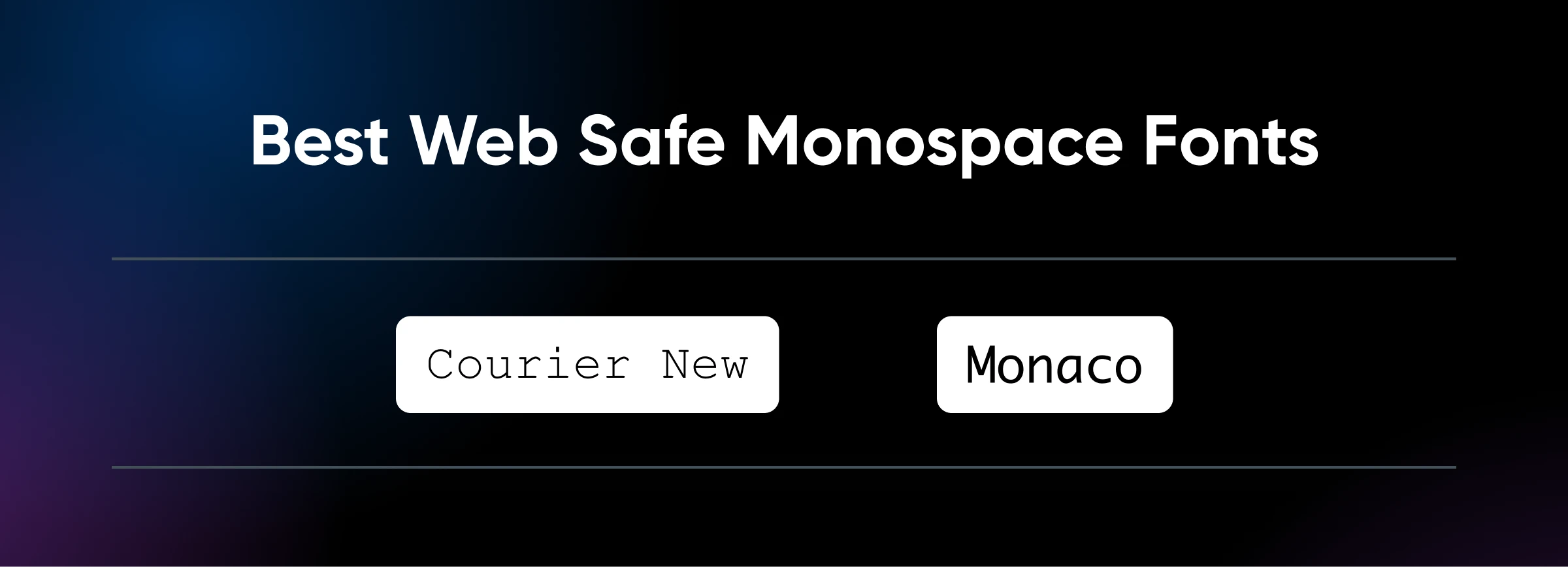
20. Courier New
Courier New is a classic monospace font with a typewriter look. Each character occupies the same amount of horizontal space, making it ideal for maintaining alignment and readability in code and tabular data.
What makes Courier New unique: Typewriter-like appearance with uniform character spacing.
When to use it: Perfect for displaying code snippets, programming-related content, and any tabular data that requires precise alignment.
21. Monaco
Monaco is a clean and highly legible monospaced font commonly used in coding environments. Its crisp and distinct characters make it easy to read, even for extended periods.
What makes Monaco unique: Clean and highly legible with distinct characters.
When to use it: Ideal for coding tutorials, developer blogs, and any website featuring extensive programming content.
Best web safe cursive and fantasy fonts
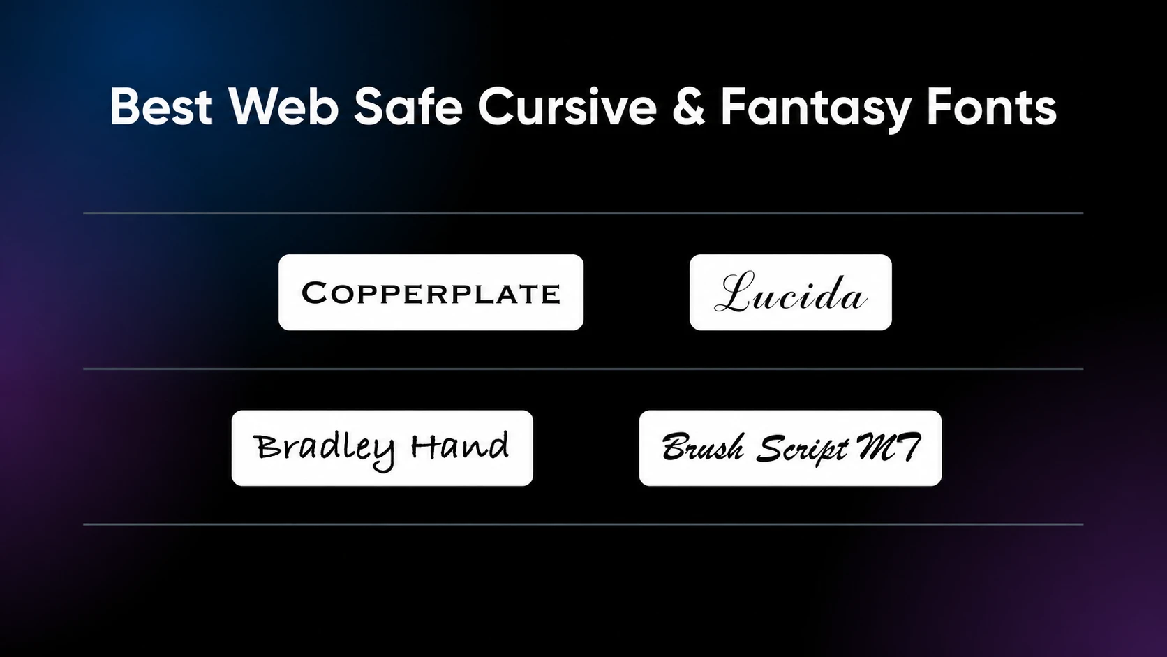
22. Copperplate
Copperplate is a unique font that combines traditional serif elements with a more decorative, engraved look. It exudes an air of sophistication and formality while maintaining a distinctive style.
What makes Copperplate unique: Engraved, formal appearance with decorative serifs.
When to use it: Ideal for headings, invitations, and any website aiming for an elegant, upscale look.
23. Lucida
Lucida is a versatile font family that includes various styles, from sans-serif to cursive. Lucida Handwriting, in particular, offers a casual and friendly handwritten appearance.
What makes Lucida unique: Casual, friendly handwritten style.
When to use it: Perfect for personal blogs, creative projects, and websites that want to feel warm and personal.
24. Bradley Hand
Bradley Hand is a cursive font designed to mimic natural handwriting with a slightly playful, casual look. It adds a personal and approachable feel to your text.
What makes Bradley Hand unique: Natural, playful handwriting style.
When to use it: Great for personal blogs, artistic sites, and any other projects that benefit from an informal, relaxed feel.
25. Brush Script MT
The Brush Script MT font features bold, cursive strokes that look like they were painted with a brush, as the name suggests. It’s dynamic and eye-catching, making it suitable for creative and expressive text.
What makes Brush Script MT unique: Bold, brush-painted cursive appearance.
When to use it: Best for logos, headlines, and promotional content that needs a touch of creativity and flair.
What are font stacks?
Font stacks are collections of fonts listed in the CSS code of a website that make sure text is displayed in a preferred style, even if the first-choice font is unavailable.
By specifying a sequence of fonts, starting with the desired one and ending with a generic family, font stacks provide a fallback mechanism that maintains the website’s design and readability across different browsers and devices.
Examples of font stacks you can try
Font stacks allow you to specify a primary font and use fallback fonts to make sure your brand and web design look great, no matter what fonts are available on the user’s device.
Here are some examples of effective font stacks:
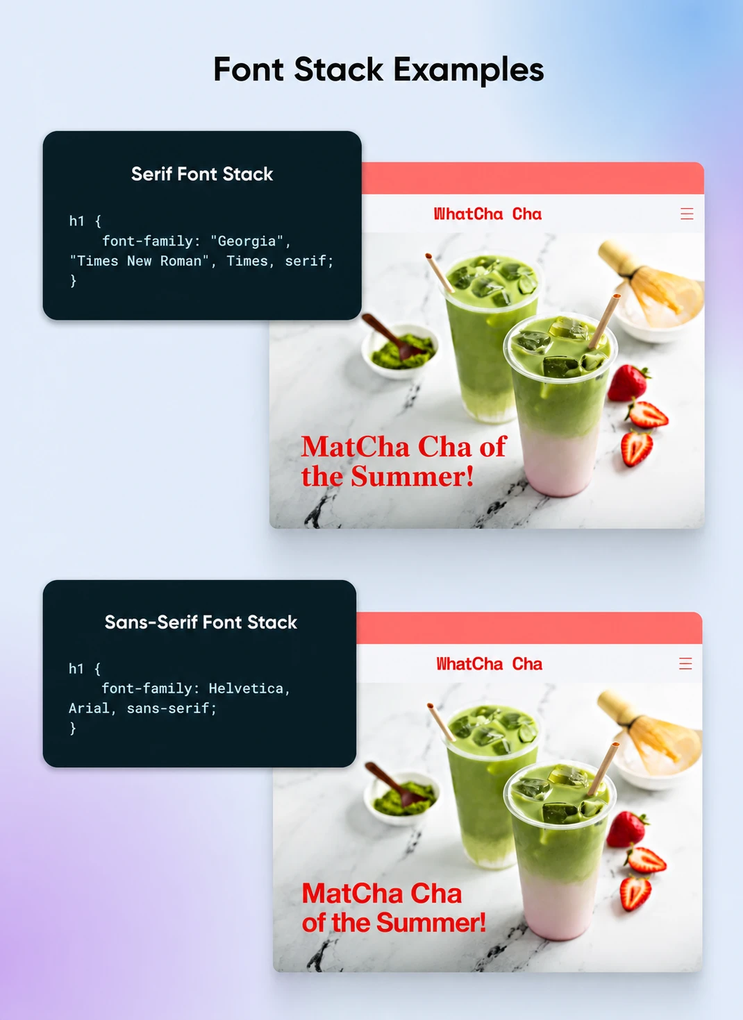
Serif font stack:
font-family: "Georgia", "Times New Roman", Times, serif;
This stack starts with Georgia for its modern readability, followed by Times New Roman and Times for classic serifs, and ends with a generic serif font.
Sans serif font stack:
font-family: Helvetica, Arial, sans-serif;
This stack begins with Arial for its simplicity, followed by Helvetica for a more refined look, and defaults to any available sans-serif font.
Where to download web safe fonts
Short version: you typically shouldn’t have to download web safe fonts.
Since they’re already pre-installed on all popular operating systems, you can simply code them into your site using CSS, and they should appear as intended across all devices.
That being said, if you do need to download a particular web safe font, you can find them in most of the popular font libraries, such as Google Fonts, DaFont, or FontSpace.
Keep in mind, however, that just because a typeface is available on one of these resources doesn’t automatically mean it’s a web safe font.
How to add web safe fonts to your website
You can add fonts to your website using the CSS font stack method we outlined above.
The best practice is to include your preferred font (which may or may not be web safe) and a fallback font (which should always be web safe). This way, if your primary font choice is not compatible with a user’s operating system, you can still have a say in the backup font that’s shown in its place.
There are a few different options for adding the CSS to incorporate web safe fonts on your website. If you’re using WordPress, you can put it in the Additional CSS section of the Customizer. If your theme uses the block-based Site Editor instead, you can manage typography through WordPress Global Styles.
Alternatively, you can change your website’s font in its stylesheet (style.css). There should be a fonts and typefaces section of this file where you can specify which fonts should be used for different types of text.
Here’s an example:
p {font-family:Montserrat,Arial,sans-serif; }
In this snippet, we’ve set the paragraph text to display the Montserrat font first. If a user’s device doesn’t have Montserrat installed, Arial will be used instead. You can include more than two fonts if you wish and use different fonts for body text, headings, and titles.
Make sure to always preview your site to check how fonts appear on different browsers before you publish your website.
Web safe fonts FAQ
How do I know if a font is web safe?
A font is web safe when it comes pre-installed across the major operating systems, so there’s no official list — it’s a question of availability. The safest bets are the six fonts MDN Web Docs lists as available on nearly all systems: Arial, Courier New, Georgia, Times New Roman, Trebuchet MS, and Verdana. Whatever you choose, always end your CSS font stack with a generic family (like serif or sans-serif) so the browser has a fallback.
What fonts can you use in HTML?
HTML itself doesn’t ship any fonts — until you set one with the CSS font-family property, each browser displays its own default font. You can request any font in CSS, but the browser will only use it if it’s available on the visitor’s device, which is why web safe stacks like Arial, Helvetica, sans-serif are the standard approach. CSS also defines five generic family names you can always fall back on: serif, sans-serif, monospace, cursive, and fantasy.
Are Google Fonts web safe fonts?
Not in the strict sense. Fonts served from Google Fonts are web fonts: font files the visitor’s browser downloads when your page loads, rather than fonts already installed on the device. That’s not a bad thing — web fonts give you far more design choice — but you should still list a web safe fallback and a generic family after them in your font stack in case the download fails.
What’s the difference between a web safe font and a web font?
A web safe font is one that’s commonly pre-installed on devices, so when it’s available the browser can render it with no download; if it isn’t, the browser moves to the next font in your stack or to its own default. A web font is a font file your site tells the browser to fetch (via CSS @font-face or a service like Google Fonts) so you can use typefaces the device doesn’t have. Web fonts expand your options; broadly available system fonts make useful fallbacks, and a generic family at the end of the stack gives the browser a final available option.
What are the best web safe fonts for email?
The same logic applies to email, only stricter: your message is rendered by whatever email app each recipient happens to use, and you can’t control which one that is. Web safe fonts with cross-platform coverage — Arial, Verdana, Georgia, and Times New Roman — are the dependable picks, and it’s smart to end your stack with a generic family just as you would on a web page.
Do you have a favorite web font?
If you’re not an experienced designer, it’s easy to overlook the importance of choosing the right fonts.
However, typefaces play an important role in your branding. Choosing a font that isn’t viewable on all devices can disrupt the UX or even prevent visitors from reading your content entirely.
This guide should’ve given you a better understanding of the importance of web safe fonts. And you now know how to identify the best web safe fonts, make a good font choice, and add them to your site.
Ready to dive in and start designing your new site? DreamHost web hosting comes with a free handcrafted starter website built by real humans, a 100% uptime guarantee backed by credits, and true 24/7 support from an in-house team — the same hosting behind 1.5 million+ active websites.
Check out our Web Hosting plans and start building your site today!