
WordPress blocks and Full-Site Editing (FSE) features make building and styling a successful website quick and easy.
Global Styles can help you unify the appearance of your WordPress site without having to edit single blocks or pages. So whether you want to change your background color or adjust the heading typography, you’ll be able to make your modifications in a single place, resulting in a more cohesive and all-around better User Experience (UX).
In this post, we’ll walk you through Global Styles. We’ll explain what they are, their benefits, and how the new features work. Then we’ll discuss how to use them to style your WordPress website. Let’s get started!
An Overview of WordPress Global Styles
Before working with Global Styles, it’s important to understand what they are and how they operate. This feature works in conjunction with theme.json, a new theme settings file. Developers can use theme.json to define defaults for a site as well as individual blocks. Gutenberg automatically applies this JSON when you place the file in the root directory of a block-based theme.
This file is one of the most useful tools of the new full site editor in WordPress 5.9. The file lets theme authors share Global Styles as well as Global Settings. WordPress reformats the data taken from these JSON objects and turns it into CSS. Then users can further customize the styles in the WordPress editor.
In previous iterations of the Gutenberg plugin, you had to register support for the style properties of a block before you were able to work with them in theme.json. Also, in classic themes and older versions, you had to use PHP to define things such as your color choices and fonts. Then you needed to add styles for the front and back end sides of your theme.
However, with the latest release, when you use a theme with the theme.json file in place, WordPress automatically adds the styles defined there to your stylesheet. You can use this system to add entirely new color palettes, change the typography of themes, and more.
Why Use WordPress Global Styles
No matter your skill level, you’ll likely find using Global Styles an intuitive and accessible experience. Overall, it can streamline the web design process by making it easier to change the look and feel of your site. If you’re a WordPress beginner, taking advantage of these Global Styles may mean that you won’t need to hire a developer in order to design your website. Sorry, developers.
On the flip side though, this new feature might be particularly useful for theme developers. That’s because Global Styles helps WordPress developers style blocks within the Block Editor. This can be highly advantageous, especially for new theme authors. It offers a variety of controls that minimize the need to create custom solutions for styling a site.
In other words, Global Styles simplifies theme development to a great degree. As a result, it can help developers avoid damaging design mistakes.
Creating the theme.json File
The theme.json file contains two important parts: settings and styles. Settings refer to a list of global or contextual configuration values that determine how the editor and blocks behave. For example, it influences which controls are enabled by default, which controls are hidden from the User Interface (UI), the available color palette, typography settings, etc.
Styles handles the theme’s design language and enables theme authors to define elements such as:
- Font size
- Line height
- Background colors
- Link colors
If you want to create a theme.json file, you can make a new file of that name and then place it inside the root folder of your theme. All the contents of your file should be inserted inside two curly brackets: { }.
Next, you’ll use property names and values within double quotes and separated with a colon, for example:
{

"property-name": "value"

}
The property name can either be a setting or a block name. Below is an example of a very basic theme.json file:
{

    "version": 1,

    "settings": {},

    "styles": {},

    "customTemplates": {},

    "templateParts": {}

}
Version 1 of the theme.json format is the earliest, most stable version. However, version 2 is used starting with WordPress 5.9. While the version section must be the first to follow the opening curly bracket, the subsequent sections can be placed in any order.
As we mentioned, the two main sections of the file are Settings and Styles. So let’s have a closer look at the presets for each.
Settings Presets
Presets refer to the default controls as well as any custom CSS properties and are generated by the values in theme.json. Some of the main preset categories include:
- Color
- Typography
- Layout
- Spacing
Categories can also have subcategories. For example, a subcategory of Color could be Color Palette:
{

"version": 2,

"settings": {

"color": {

"palette": [

{
Each preset also creates a custom CSS property using the “–wp–preset–{preset-category}–{preset-slug}” naming convention.
There are a ton of presets and examples that you can use to create your theme.json file, so we won’t go over all of them here. However, you can refer to the WordPress Handbook for more detailed guidance.
Styles Presets
Styles presets control the styles of objects within blocks. For example, the following would be a way to use the hex value for a background and a Global Styles preset for the text color:
{

        "version": 2,

"settings": { ... },

"styles": {

"color": {

"background": "#FBF",

"text": "var(--wp--preset--color--purple)"

}

}

}
If we wanted to change the heading color of a block, it would look similar to this:
{

        "version": 2,

"settings": {...},

"styles": {

...,

               "blocks": {

             "core/heading": {

     "color": {

      "text": "var(--wp--preset--color--blue)"

     }
Again, there are nearly infinite examples and ways to use presets for block styles. You can refer to WordPress documentation for a full breakdown.
There are also Template and Template parts sections. These include the base files of your theme, such as index.html, as well as sections to organize and structure your theme.
How to Style Your WordPress Site Using Global Styles
If you’re looking for a beginner-friendly way to use Global Styles to style your website, you can use the Global Styles interface with a WordPress block theme. Note that you will only have access to the Styles interface with WordPress 5.9 or higher.
Choosing a Block-Based Theme
First, you’ll need a block-based theme. To find one, you can navigate to the WordPress Theme Directory from your admin dashboard by browsing to Appearance > Themes > Add New. Next, you can click on the Feature Filter and select Full Site Editing, followed by Apply:
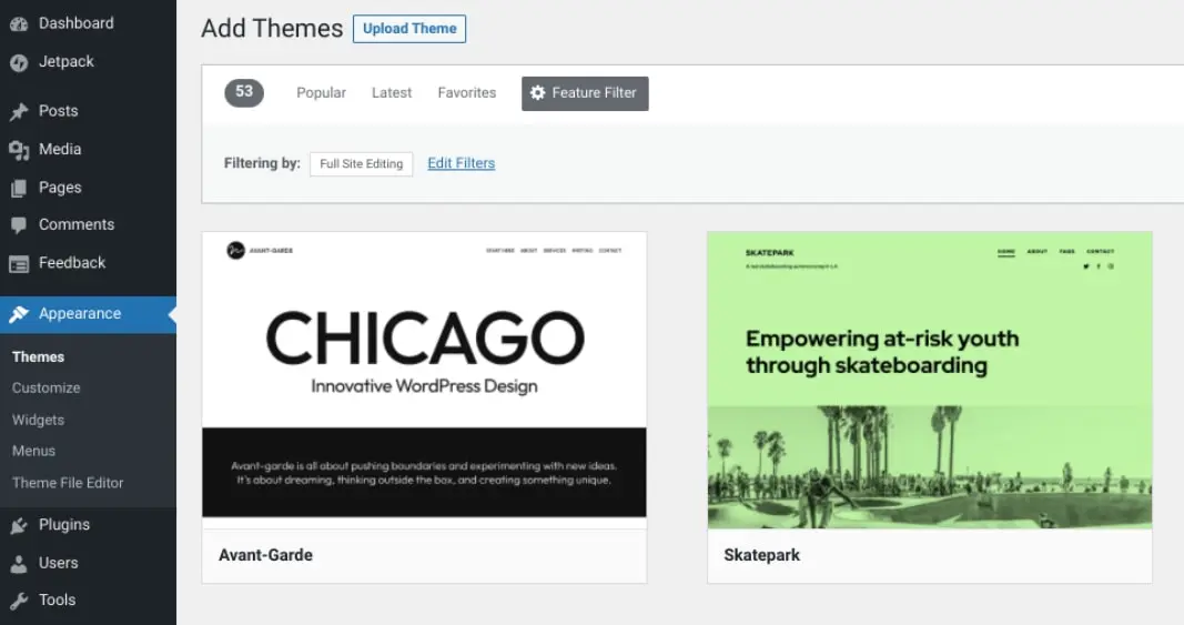
Once you find a WordPress theme you like, you can hover your mouse over it, then select Install followed by Activate. We’ll be using Twenty Twenty-Two, which may already be installed if you are using WordPress 5.9 or later.
Accessing the Styles Interface
Next, head over to your Theme Editor (Appearance > Editor). In the top right-hand corner of the screen, you’ll see a half-shaded circle, which represents the Styles panel:
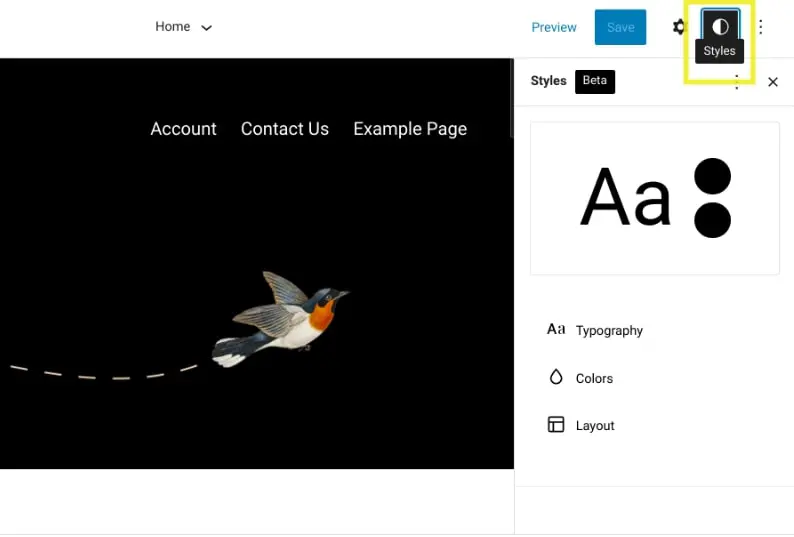
When you first click on it, it will present a Styles Welcome Guide. If you need access to this in the future, you can find it by clicking on the three vertical dots in the upper right-hand corner and selecting Welcome Guide.
The preview window shows you how the current style of your theme looks. Under the Styles panel, you’ll find settings for:
- Typography
- Colors
- Layout
- Blocks
Let’s take a closer look at each.
Typography
Under Typography, you can manage the typography settings for two elements: Text and Links.
You can change the font family and size:
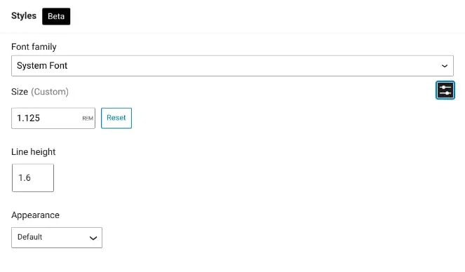
You can also adjust the line height and select a font-weight. You’ll have these same options for your links. When you’re done, remember to save your changes.
Colors
Under Colors, you’ll find the default color presets that come with your theme. To create your own color palettes, you can enter the HEX value numbers or use the drag-and-drop color picker to generate your preferred colors:
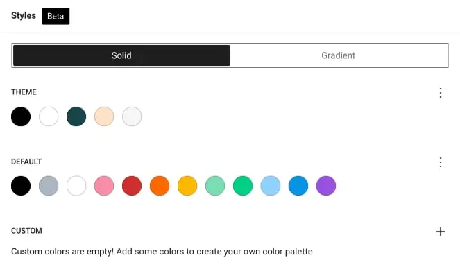
You can also rename the colors to something more identifiable or descriptive than the standard hexadecimal alphanumeric values. You can add custom gradients, apply duo-tone filters to images, and more.
Next, you can modify the colors for three main elements: Background, Text, and Links. You can also select any of these elements to customize the styling. The changes will be applied instantly as you are editing.
Layout
Under Layout, you can adjust padding and other elements. This is straightforward and can be very useful when you need to make a minor adjustment (for example, for the sake of page symmetry).
Blocks
Finally, you can change the appearance of individual blocks. After you select Blocks from the Styles panel, you’ll find a list of blocks on your site.
Let’s say you wanted to change the style of your Heading block. You can select Heading from the list, then adjust its Colors and Typography settings:
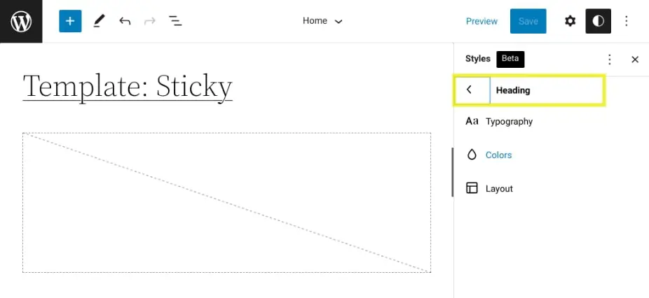
When you’re done, you can click on Save. If you ever want to revert back to the theme styles you had before making changes, you can navigate to the Styles panel, click on the three vertical dots, and then select Reset to defaults.
A Better Way to Use and Style WordPress
WordPress is continuously working to improve the editing experience for its users. Now, thanks to Global Styles, theme development has just become that much easier for both beginners and seasoned professionals.
As discussed in this post, you can create a theme.json file to apply Global Styles configurations to your theme. You can also use the Styles editor with a block-based theme to customize the appearance of your site. All this makes designing a successful website a breeze.
DreamHost is a team of experienced web experts. We understand the importance of optimizing your WordPress experience. We promise to support your efforts using the latest open-source tech and award-winning support. Check out our Managed WordPress hosting plans today to learn more!

Do More with DreamPress
DreamPress Plus and Pro users get access to Jetpack Professional (and 200+ premium themes) at no added cost!
Check Out Plans