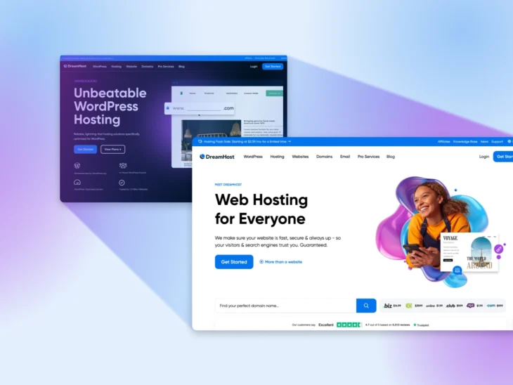
Have you ever landed on a website and immediately thought, “Hard pass”?
Maybe the fonts are fighting each other. Maybe the stock photo is a guy in a suit inexplicably eating salad. Or maybe, just maybe, the hero section isn’t, well…heroic.
Your hero section is the banner area at the top of your homepage — the first thing visitors see before they scroll. A good hero pairs a clear headline and short supporting text with one call to action (CTA) and a visual that shows what you offer, so people instantly know what your site is about and what to do next.
And you don’t have long to make that happen. Jakob Nielsen’s analysis of page-dwell data for Nielsen Norman Group found that users often leave a web page within 10–20 seconds, and that a page needs to communicate a clear value proposition within the first 10 seconds to earn a longer visit.
In this guide, we’ll cover the three things every high-performing hero section gets right, how to build one yourself (no design degree, agency budget, or case of Red Bull required), and 12 real homepage examples worth borrowing from.
Ready to give your homepage its main-character moment? Let’s get started.
The 3 must-haves of a clear hero section
Hero sections come in all shapes and sizes — but if yours isn’t doing these three things, you’re probably leaving conversions on the table:
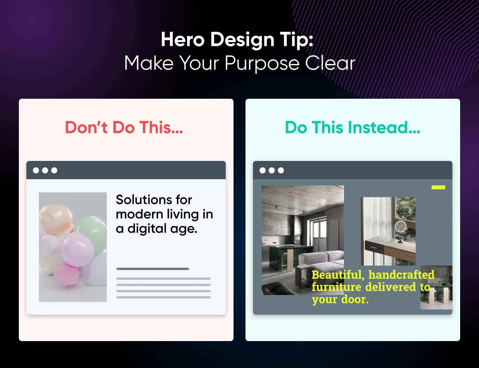
1. Tell me what this site is about (fast)
If someone lands on your page and can’t figure out what you do within a few seconds, they’re probably gone. Your headline should be ultra-clear and value-packed.
Think something along the lines of: “Beautiful, handcrafted furniture delivered to your door” instead of “Solutions for modern living in a digital age.”
2. Show me what I’ll get
Your hero image, supporting copy, and any visual elements (like photos or videos) should answer one question: “Why should I stay on this site?” Give visitors a taste of the benefit, experience, or vibe they can expect. A little appeteazer, if you will.
3. Invite me to take one clear action
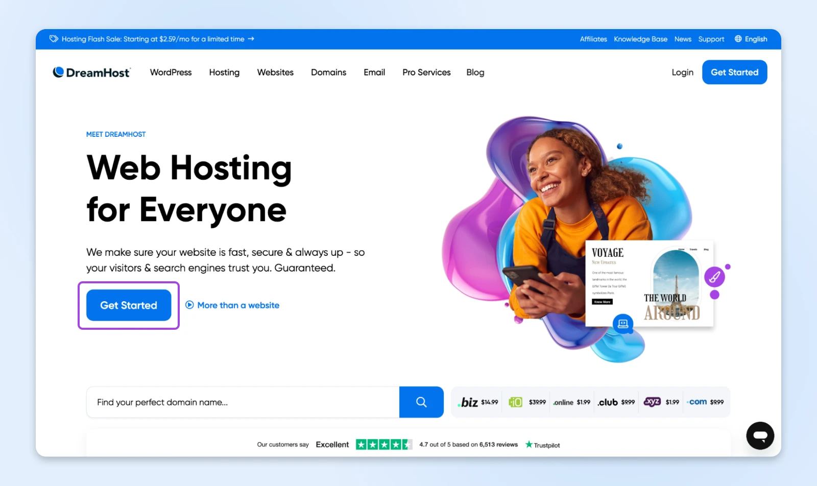
Don’t overwhelm your hero with four buttons and a newsletter form. Choose one crystal-clear call to action (CTA). Think, “Shop Now,” “Get Started,” “Book a Demo,” or something along those lines. Finally, make it big, bold, and easy to spot.
Even the most creative hero sections stick to these fundamentals. You should too.
How to build a homepage hero that works (even if you’re not a designer)
These are the elements that separate a hero that looks good from a hero that gets results.
Headline first, always
Your hero headline is your homepage elevator pitch. It should:
- Communicate your core value in 10 words or less.
- Start with a strong verb or result (for example, “Grow,” “Design,” or “Simplify”).
- Avoid fluff, like “Welcome to our site!” or “We make things better.”
Pro tip: Ask yourself what problem you solve, and turn that into your headline. For example, if you make software that automates payroll for small businesses, your headline can be something like, “Make payroll stress-free.”
Write supporting text that converts
The subheadline or paragraph below your headline should:
- Clarify your offer or audience (for example, “Designed for remote teams”).
- Reinforce your unique selling proposition.
- Stay brief (like, one or two lines maximum).
Pro tip: Follow a high-impact sentence structure like this: “[Product] helps [audience] [achieve result] without [pain point].”
Add a CTA that’s clear and click-worthy
Your call-to-action button should:
- Be visually prominent (for example, use a bright color or large text).
- Use action-oriented language (like “Start My Free Trial” vs. “Submit”).
- Be placed above the fold (the part of the page visible without scrolling) always.
Pro tip: Limit yourself to one primary CTA. Every extra button competes with the one action you actually want visitors to take.
Use visuals that reinforce your message
Your visual, whether you use an image, video, or animation, should:
- Match the product, audience, or vibe you want to convey.
- Avoid generic stock photos.
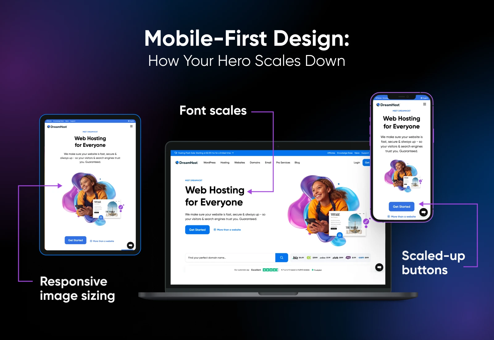
- Load quickly and scale well on mobile.
Here are some ideas to get you started:
- Selling software? Use a product demo gif.
- Selling a physical product? Show it in use.
- Selling a service? Use lifestyle or customer imagery that shows outcomes.
Make it mobile-first and accessible
Mobile devices generated 52.57% of worldwide web traffic in July 2026, according to StatCounter — more than desktop (45.93%) and tablets (1.5%) combined. Your hero section must:
- Load fast on all devices. Remember to optimize your image sizes!
- Have tap-friendly buttons.
- Use legible fonts and good color contrast.
- Include alt text for any non-decorative images.
Pro tip: Preview your hero section on different devices to ensure it works on all screen sizes.
12 real hero section examples that get it right
Sometimes the best way to figure out what to do is to see what other people are already nailing. We’ve curated examples across industries, including e-commerce, SaaS, creatives, and nonprofits, so you can see how versatile (and powerful) a well-designed hero section can be.
Whether you want your site to shout, soothe, or sell, there’s something here worth borrowing.
One note before we dive in: brands refresh their homepages constantly, so treat each screenshot below as a snapshot of the hero we reviewed. The lessons hold either way.
E-commerce
1. TRUFF
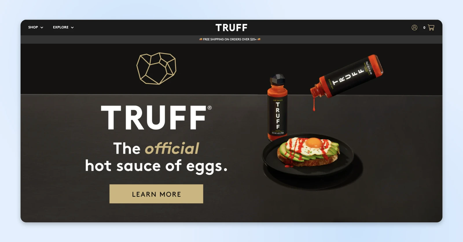
Why it works: A sharp, flavor-packed image of their signature hot sauce dripping onto a plate of breakfast food commands the screen. The headline, “The official hot sauce of eggs,” says it all in just a few words.
Takeaway: Choose one product or offer to feature and lead with it boldly. Let your visuals carry the emotion, and the copy do the selling.
2. Allbirds
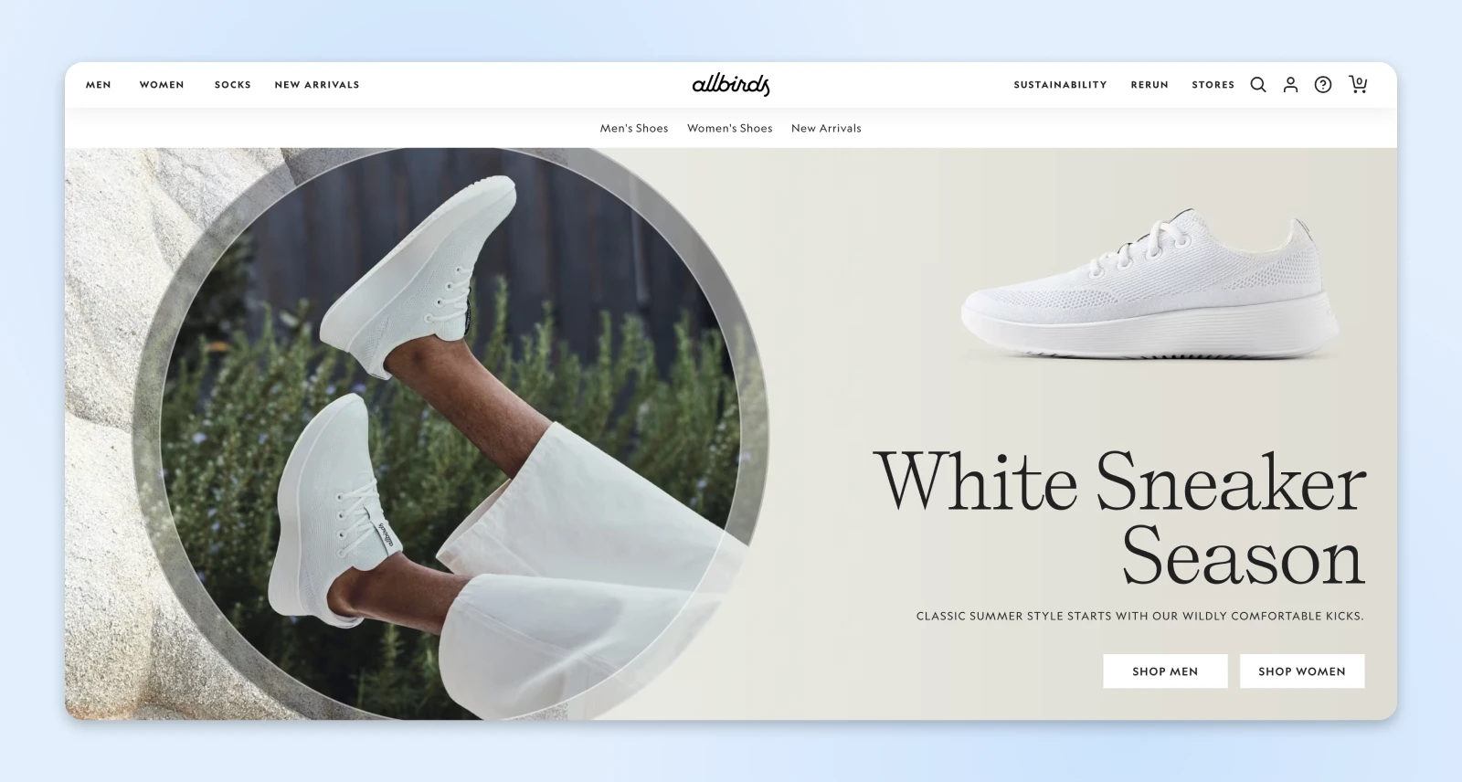
Why it works: In the hero above, a seasonal drop sits front and center with a lifestyle image and split CTAs for “Shop Men” and “Shop Women.” It’s clean, clear, and conversion-ready.
Takeaway: If you have a new or seasonal product, make it the star. Use CTAs that match your audience segments without crowding the layout.
3. Omsom
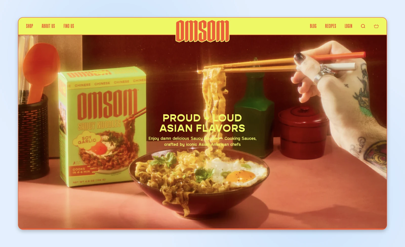
Why it works: Bold colors and cheeky copy come together in a loud, proud hero section. It’s branding-first but also buttoned up with truly delicious imagery.
Takeaway: Don’t mute your personality. Use bold visuals and a strong voice to connect with your ideal audience.
4. Feals
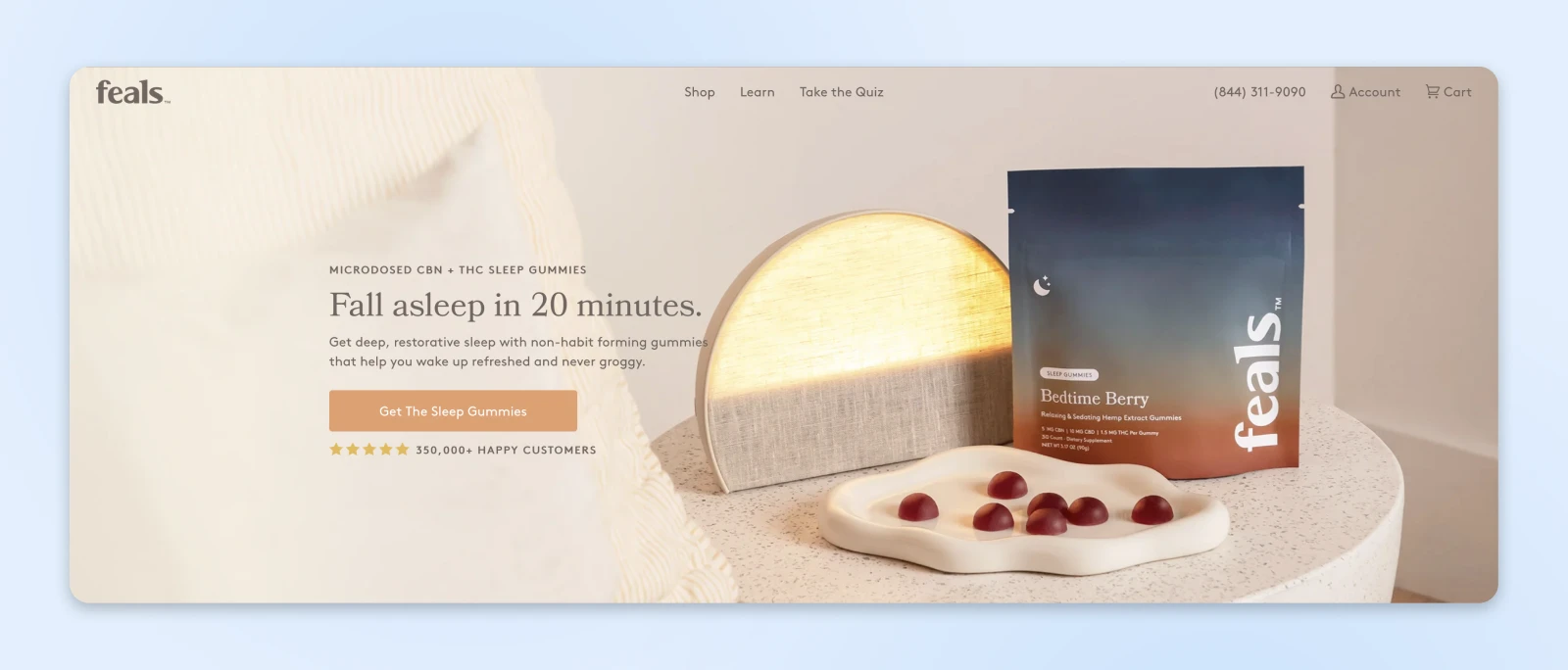
Why it works: Muted colors and clean typography match the product’s calming benefits. The headline (“Fall asleep in 20 minutes”) clearly spells out the solution to the audience’s pain point.
Takeaway: Make your hero section evoke the feeling your product delivers.
SaaS and digital tools
5. Notion
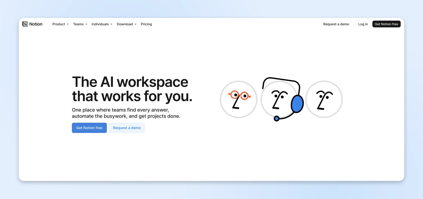
Why it works: It’s clean and simple, with a clear headline (“The AI workspace that works for you”) and a CTA to match (“Get Notion free”). You can’t be more straightforward than that.
Takeaway: Let users see exactly what they’re signing up for without having to scroll.
6. Framer
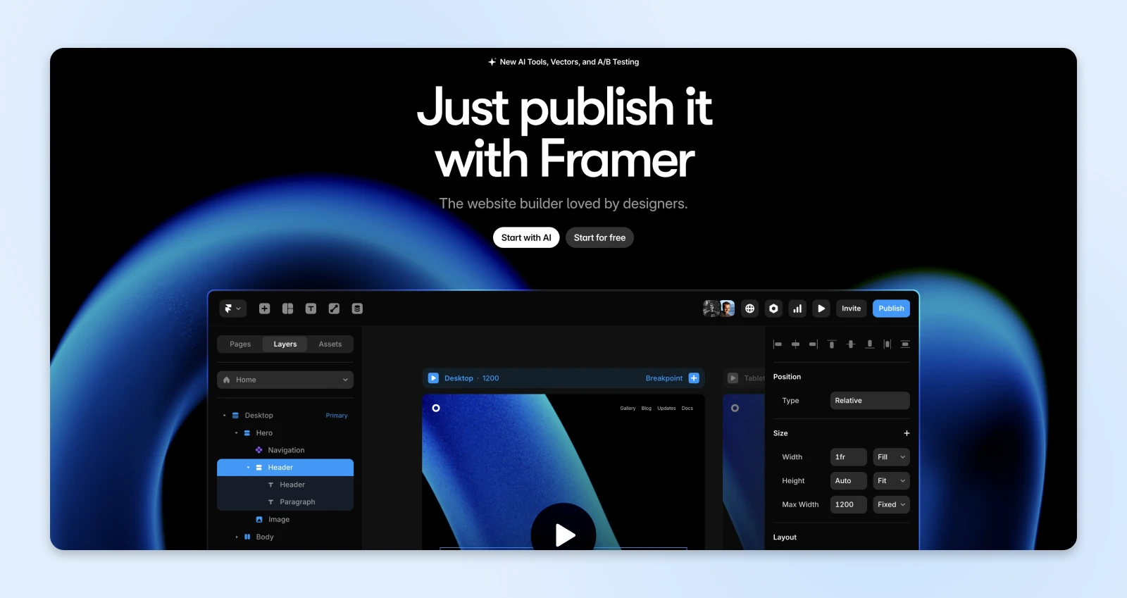
Why it works: The hero itself functions as a mini product demo. Paired with a short, benefit-led headline and a strong CTA, it’s instantly engaging.
Takeaway: Consider how interactivity can convert curious visitors into active users right from the homepage.
7. Webflow
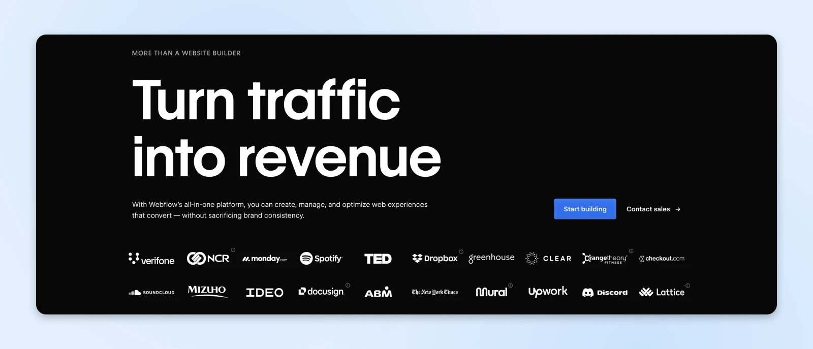
Why it works: Webflow’s hero section mirrors the product: simplicity. There’s not much here, but the text tells you exactly what you’re getting: a no-code website builder that will “Turn traffic into revenue.”
Takeaway: You don’t always have to bring bells and whistles. Sometimes you just need to tell it like it is.
8. Pitch
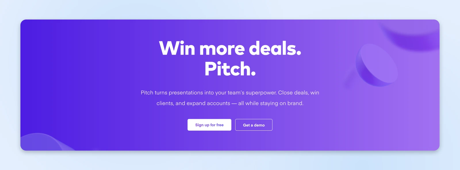
Why it works: Pitch uses two CTAs, which goes against the typical best practice, but here, it works. Visitors have the option to try the product for free or request a demo, giving them a choice between a self-service trial or a guided tour.
Takeaway: If your hero is simple and clean, more than one CTA can work. It’s a good reminder that rules are meant to be broken (occasionally).
Creators and personal brands
9. Josh Comeau
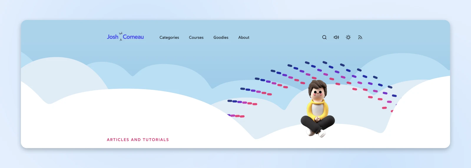
Why it works: Whimsical animation, clear copy, and a personable tone. It says who he is and what he does within seconds.
Takeaway: Let your design style and tone match your brand voice. If you are your brand, put yourself front and center.
10. Meg Lewis
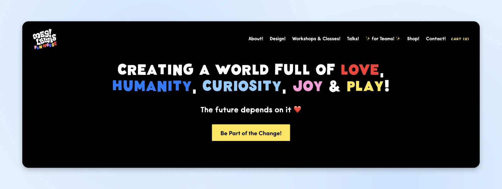
Why it works: Meg’s hero section radiates personality with quirky illustrations, playful colors, and a friendly headline.
Takeaway: A strong personal brand doesn’t have to be flashy; it just needs to feel human. Use color, copy, and character to stand out.
Mission-driven organizations and nonprofits
11. The Ocean Cleanup
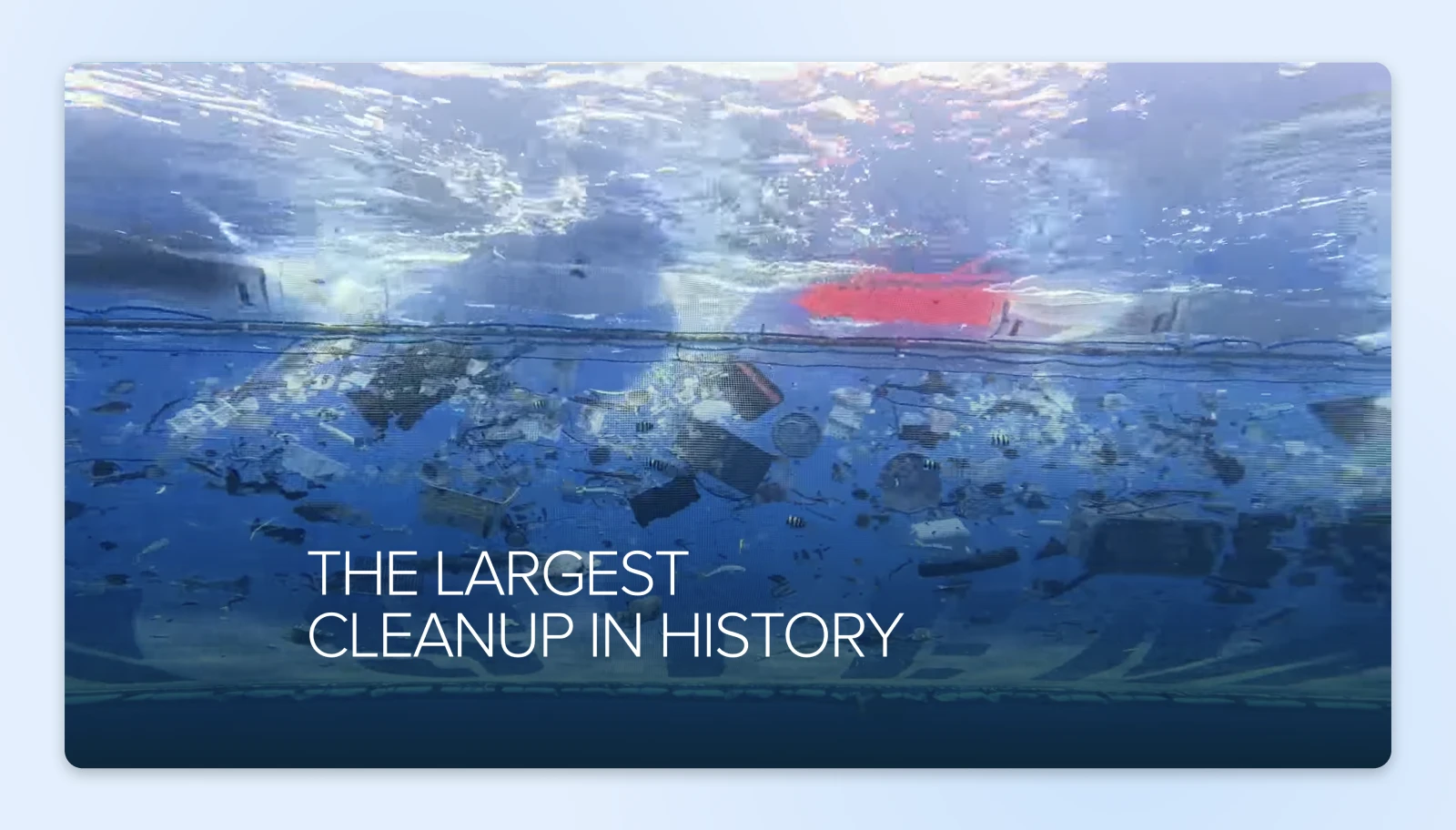
Why it works: Video footage of ocean cleanup efforts loops silently in the background, making the tone serious, urgent, and action-focused.
Takeaway: Use your hero to put the problem (and your solution) front and center. Let visuals build emotional connection.
12. Every.org
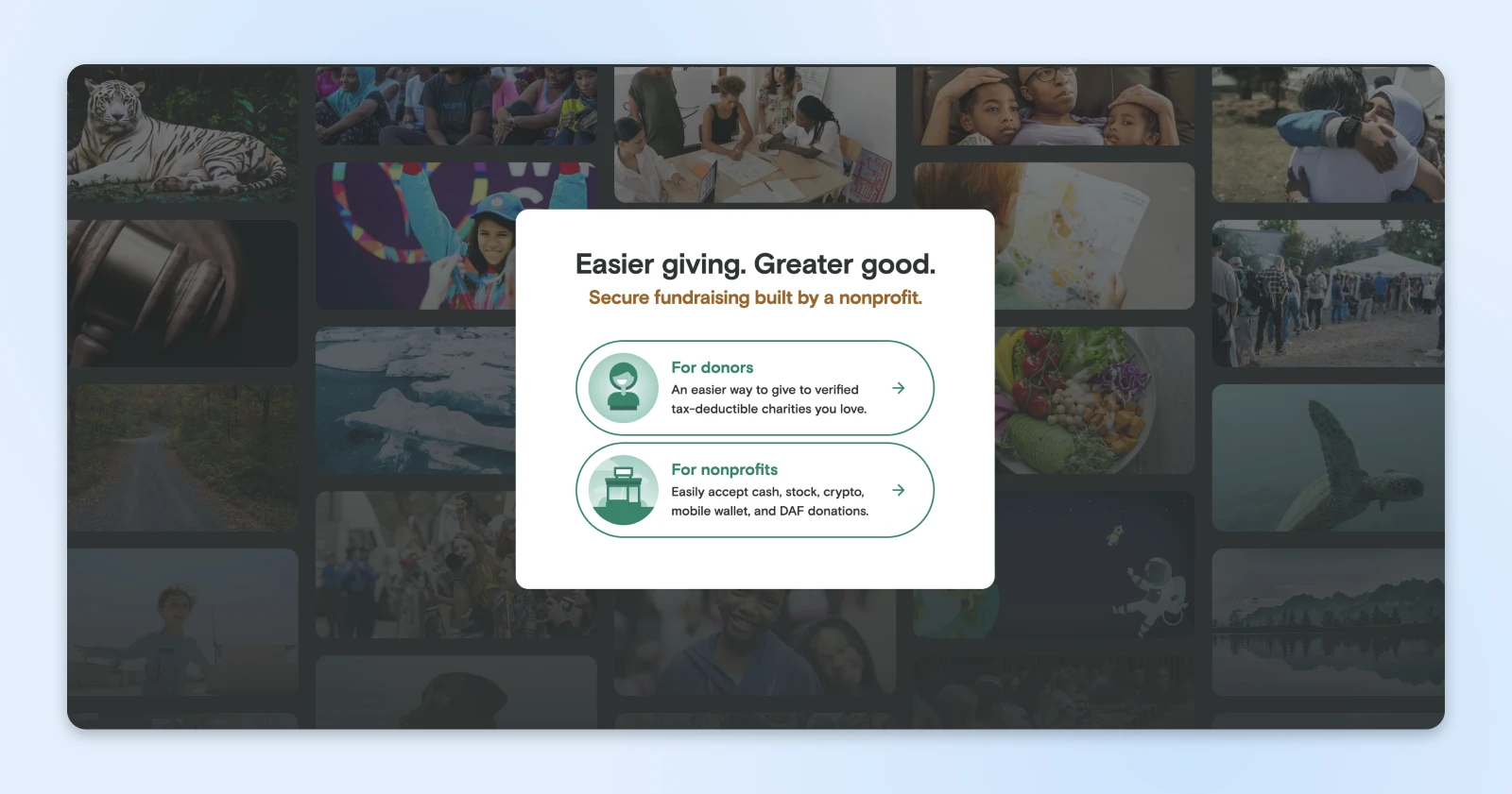
Why it works: A grid of images based on causes creates an emotional connection with visitors, while the copy is simple (“Easier giving. Greater good.”) and the split CTAs guide visitors to two products: one for donors and one for nonprofits.
Takeaway: You don’t have to yell to convert. Friendly, inclusive copy and visual calm can still drive action.
Which hero style is right for you?
Not every homepage hero needs to shout. Some need to reassure. Others need to get out of the way and let a product speak for itself.
So, how do you pick the right style for your brand? Start with the type of product or service you sell, and go from there.
For e-commerce sites
- Lead with your product imagery and CTA.
- Use bold color or texture.
- Highlight your top-selling item.
For SaaS or services
- Solve a problem upfront.
- Include video, animation, or product screenshots.
- Make the CTA button irresistible.
For creatives and portfolio websites
- Showcase your work or personality.
- Use a short intro and one CTA.
- Add a strong visual hook (like a photo, animation, or logo).
For nonprofits and cause-based businesses
- Lead with emotion and mission.
- Use impact-driven visuals.
- Your CTA should prompt action: “Donate,” “Volunteer,” “Join,” etc.
Torn between styles? Default to the formula that rarely fails: one benefit-led headline, one line of support, one CTA, one visual. Add personality once that skeleton converts.
Hero section FAQs
What is a hero section on a website?
A hero section is the large banner area at the top of a webpage, and the first thing visitors see before scrolling. It typically combines a headline, short supporting text, a call to action, and a prominent image or video that together explain what the site offers.
Why is it called a hero section?
The name comes from the “hero image”: the web design term for a large photo, graphic, or video placed in the most prominent section of a website. Big banner-style headers are also called “hero headers.” Add a headline and a CTA to a hero image, and you’ve got a hero section.
What’s the difference between a hero section and a landing page?
A hero section is one part of a page; a landing page is an entire standalone page built around a single offer or campaign. Many landing pages open with a hero-style section, but a hero section on its own is not a page.
How big should a hero section be?
There’s no standard pixel size for a hero section, because screens vary too much. Design it to fill most of the first screen, and make sure the headline and CTA stay visible without scrolling on both a phone and a laptop. If visitors have to scroll to find your CTA, the hero is too tall.
Does every page need a hero section?
No. Your homepage and landing pages benefit most, because they’re where visitors decide whether to stay. Interior pages (blog posts, product detail pages, contact pages) usually work better with a smaller header so readers can get to the content faster.
Want a hero that gets the job done? Start with reliable hosting
You can have the world’s best-looking hero section, but if it loads slower than dial-up in a thunderstorm, visitors will be gone before they ever see it.
That’s why your website design and your hosting need to work together.
DreamPress, our managed WordPress hosting, includes tools that keep your hero fast and let you experiment safely:
- A WordPress-tuned caching stack (NGINX FastCGI caching, Redis object cache, and PHP OPcache), so your homepage isn’t rebuilt from scratch for every visitor.
- 1-Click Staging, so you can test a new hero design before pushing it live.
- A free Essential CDN (powered by Bunny CDN) that serves your hero image from locations closer to your visitors.
- Automated and on-demand performance scans covering site speed, SEO, accessibility, and best practices, with AI guidance on what to improve.
- Daily automated backups stored offsite, so a redesign gone wrong is always recoverable.
Plus, if you’d rather not DIY your homepage at all, check out our custom web design services. We’ll create a fully branded site that looks great and performs even better — hero section included.

Is Your Website Driving Potential Customers Away?
First impressions happen in under 50 milliseconds. This 42-page playbook gives small business owners practical tactics to look as credible as the big players — no agency, no redesign budget required.
Get The Playbook