You need a website. And it seems like WordPress is the best choice.
At least, that’s what every blog post is telling you. But WordPress has some limitations, right? Surely one platform doesn’t fit all.
That’s true. There are some things WordPress can’t do… but not many.
Aside from blogs, WordPress runs some of the world’s most popular websites and brands. We recommend it for everything apart from a few niche use cases.
To prove the point, we decided to collect great examples of WordPress websites in every category we could think of. Chances are, you’ll see something just like what you need!
Why WordPress Is Probably Right for Your Project
WordPress is as flexible as an Olympic gymnast. You can contort the platform into any form, and it will still deliver an outstanding performance.
You can customize the admin interface, completely reshape your site with a quick theme change, and add incredible features via over 70,000 plugins.
WordPress is also flexible in terms of scale — it can handle anything from a one-page profile site to a global news network.
Just as importantly, WordPress is a proven winner.
Over 590 million websites currently use WordPress, making it the most popular content management system (CMS) by some distance. There’s a fair chance someone has already built a site similar to the one you have in mind.
So, what does this mean for your project? WordPress is likely to be a strong option, no matter what niche you’re working in.
Which Website Projects Are Not Suited to WordPress?
In theory, you can build pretty much any site with WordPress, but there’s a small number of use cases that might work better on other platforms:
- Your site needs bank-level security: While WordPress is pretty secure, some third-party plugins create vulnerabilities that hackers could exploit. Hence, financial and medical sites tend to use custom platforms.
- You have zero technical knowledge: Most people can learn how to use WordPress, but if you call tech support for help switching on your computer, self-hosting might be a bit too technical.
- Your online store starts to rival Amazon: You can run a great store on WordPress with WooCommerce and other e-commerce plugins. That said, performance might dip once your inventory fills warehouses and you’re serving thousands of shoppers every day.
- You want to build something totally bespoke: Again, WordPress is very flexible. But if you’re trying to build a custom web app or a unique project with your own code, you’re probably better off starting from scratch.
See, not many reasons to avoid WordPress.
Keen to see the proof? The examples are coming up next!
What Are Some WordPress Site Examples for My Use Case?
Understanding how WordPress can work for your project is much easier when you can study real-life examples. And boy, do we have some beauties to share.
Below is a list of great WordPress websites, big and small, sorted by category. Scroll to the area that matches your niche to deliver a ton of inspiration straight to your eyeballs!
Creative Websites: Portfolios, Galleries, and More
Many creative professionals use WordPress to build agency websites, portfolios, and project sites. Here are some top examples:
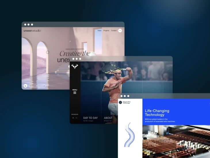
1. Unseen: Immersive Creative Portfolio
You’d expect a motion graphics and branding studio to deliver a feast for the eyes. Unseen rose to the occasion, with a distinctive portfolio that feels more like a virtual reality experience than a website.
Why it works:
- Beautiful visual (and audio) effects grab the attention: Trippy visuals and mouse effects make you feel like you’re exploring a virtual gallery. The experience is enhanced by an audio track that follows the user journey, warping in real-time as you click.
- Unique, intuitive navigation makes you want to explore: Every screen has clear CTAs that guide you through the site. There’s also a “World” view that allows you to move through Unseen’s site via an infinite canvas.
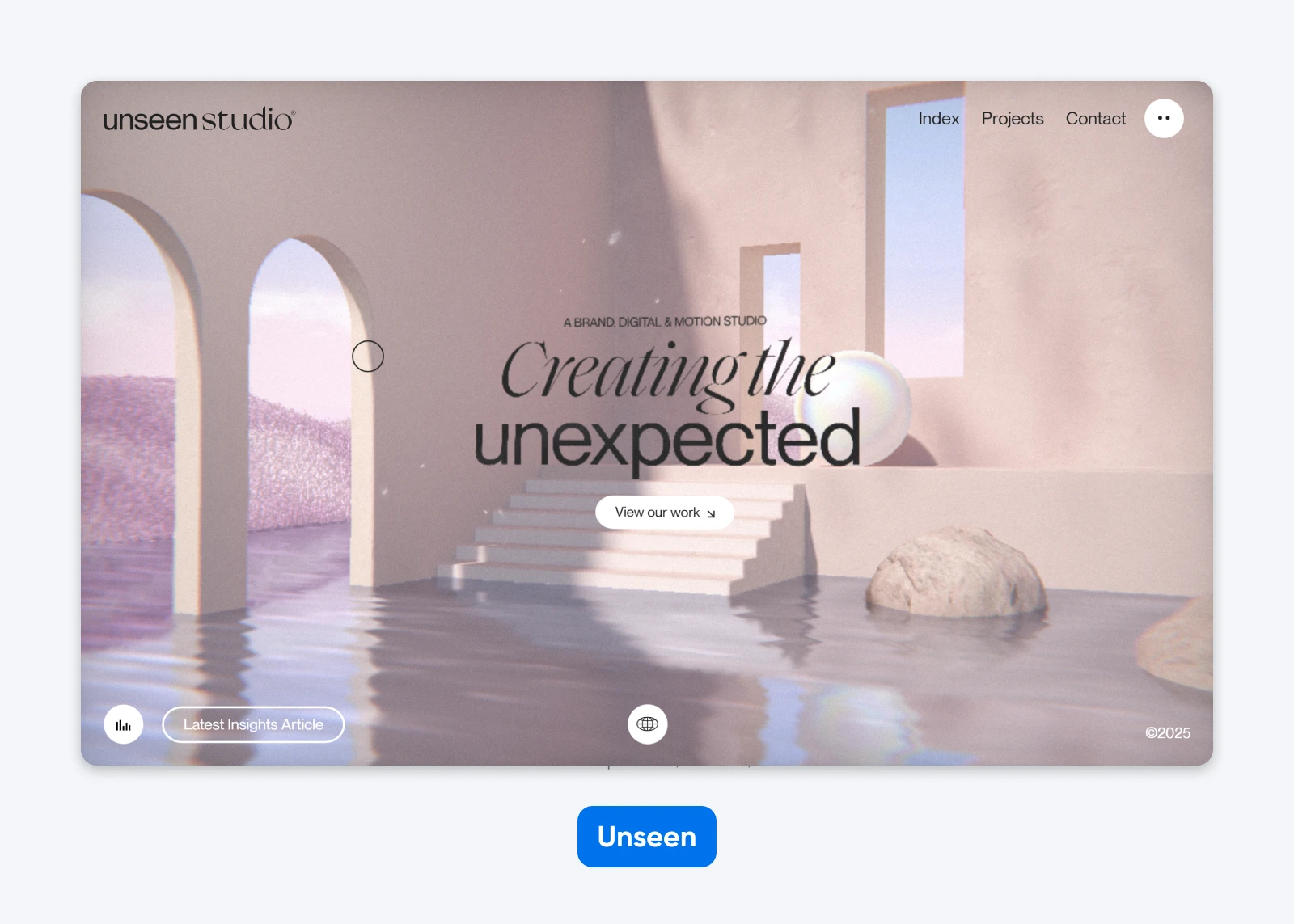
2. AC Pro Photography: Simple Sports Photography Showcase
Not every website needs flashy effects. The home of AC Pro Photography is a simple, clean, one-page affair that tells clients everything they need to know. Portfolio images are the main event, with words providing only the essential details.
Why it works:
- There are no distractions: A photography website should be about images, not a fancy background or navigation. And that’s what we get here.
- A full-width gallery puts the work in the spotlight: As you scroll down the page, images fill the screen. By the time you hit the contact section at the bottom, you’re certain that this snapper is legit.
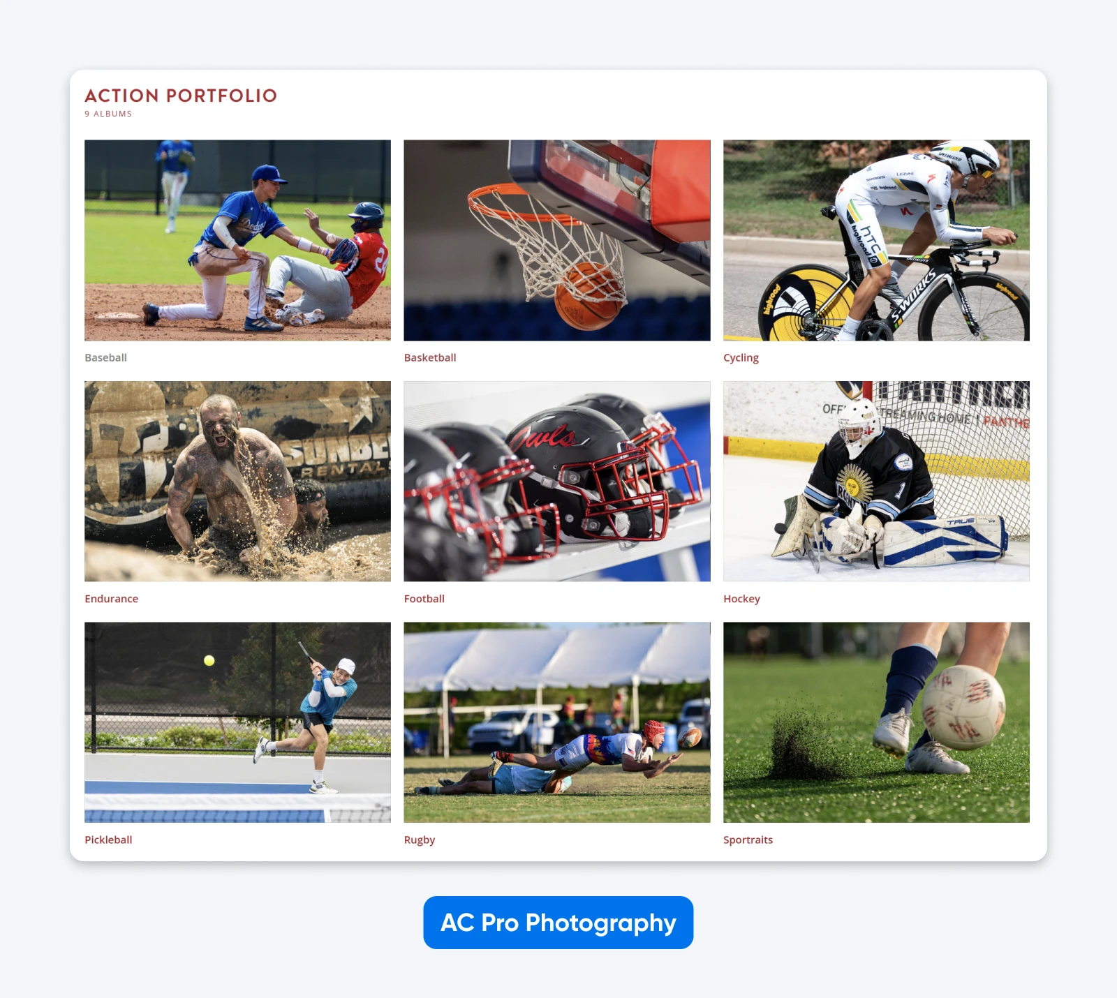
3. The Alice Paradox: Movie Teaser Gallery
Say you’re making a movie, but don’t have any clips ready yet. How do you promote the project? The folks behind The Alice Paradox decided to build a gallery of atmospheric shots, along with key information and links.
Why it works:
- Distinctive colors and fonts set the mood: The site feels like an interactive movie poster; if you love spooky movies, the design will instantly grab your attention.
- A one-page site keeps things simple: There’s nothing cluttered about this site. The template leaves plenty of room between the main elements, and the use of drop-down bios keeps the cast section looking really clean.
E-commerce Websites: Sell Online With WordPress
Thought e-commerce was a niche use case for WordPress? Think again. WooCommerce powers over six million stores, and that’s just the most popular solution.
Here are some examples of brands selling on WordPress:
4. Nutribullet: Health Food Accessories Store
What really stands out about Nutribullet’s site is the punchy imagery. The page is filled with colorful product photos, each doubling as a doorway to a specific part of the store.
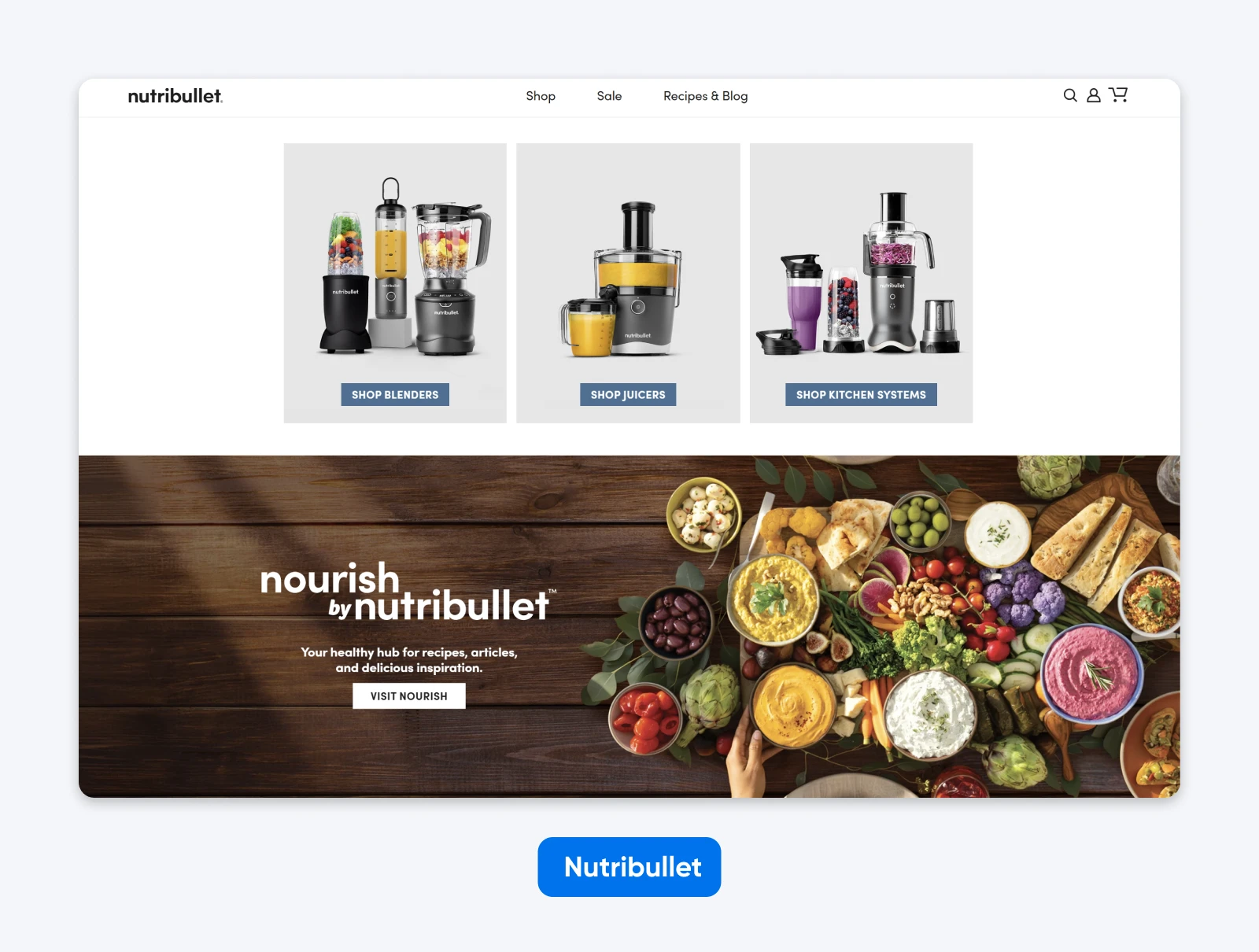
Why it works:
- It has great features for shoppers: Nutribullet has enabled star ratings on products, multiple payment options, and even quick links to product documentation.
- There are loads of appealing CTAs: The hero image serves up attractive discounts, and visitors have multiple “Shop Now” buttons to choose from.
5. AFI Shop: Merch Store for Movie Buffs
The American Film Institute raises funds by selling branded merchandise through a WordPress-powered store. It’s simple, clean, and effective.
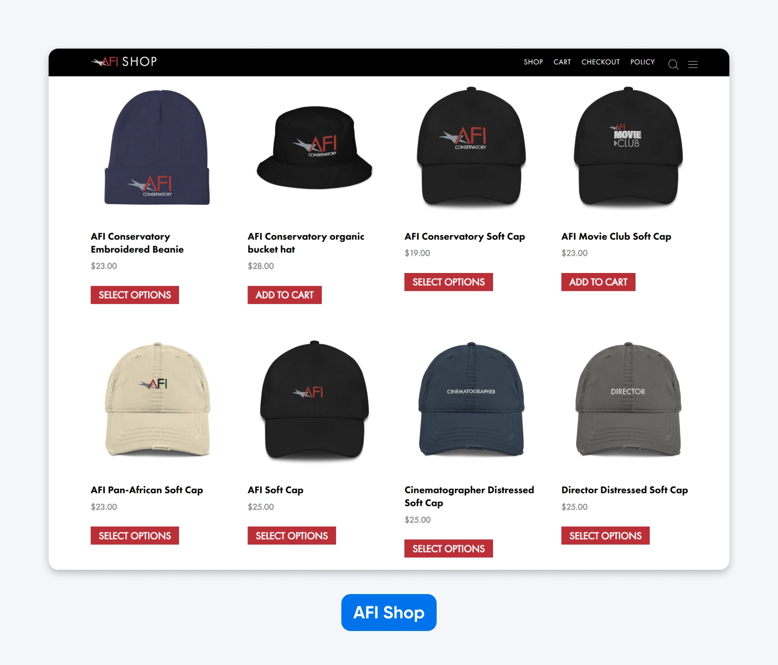
Why it works:
- You see the goods up front: The hero image of this store shows you several popular products, giving you a quick overview of the merchandise on offer.
- Visitors can sort by type and range: If you’re looking for something specific, you can find it quickly via the main menu.
Non-Profit Websites: Spread the Word and Raise Funds
Most websites for non-profit organizations are designed to inform visitors about the mission. Some also need to gather donations.
Here are some sites that get it right:
6. NASA: Explaining Space Exploration
Okay, technically NASA is a government department. But this site shows what WordPress can do for non-profits. The homepage is packed with informational content and stunning images, showing what the agency is all about.
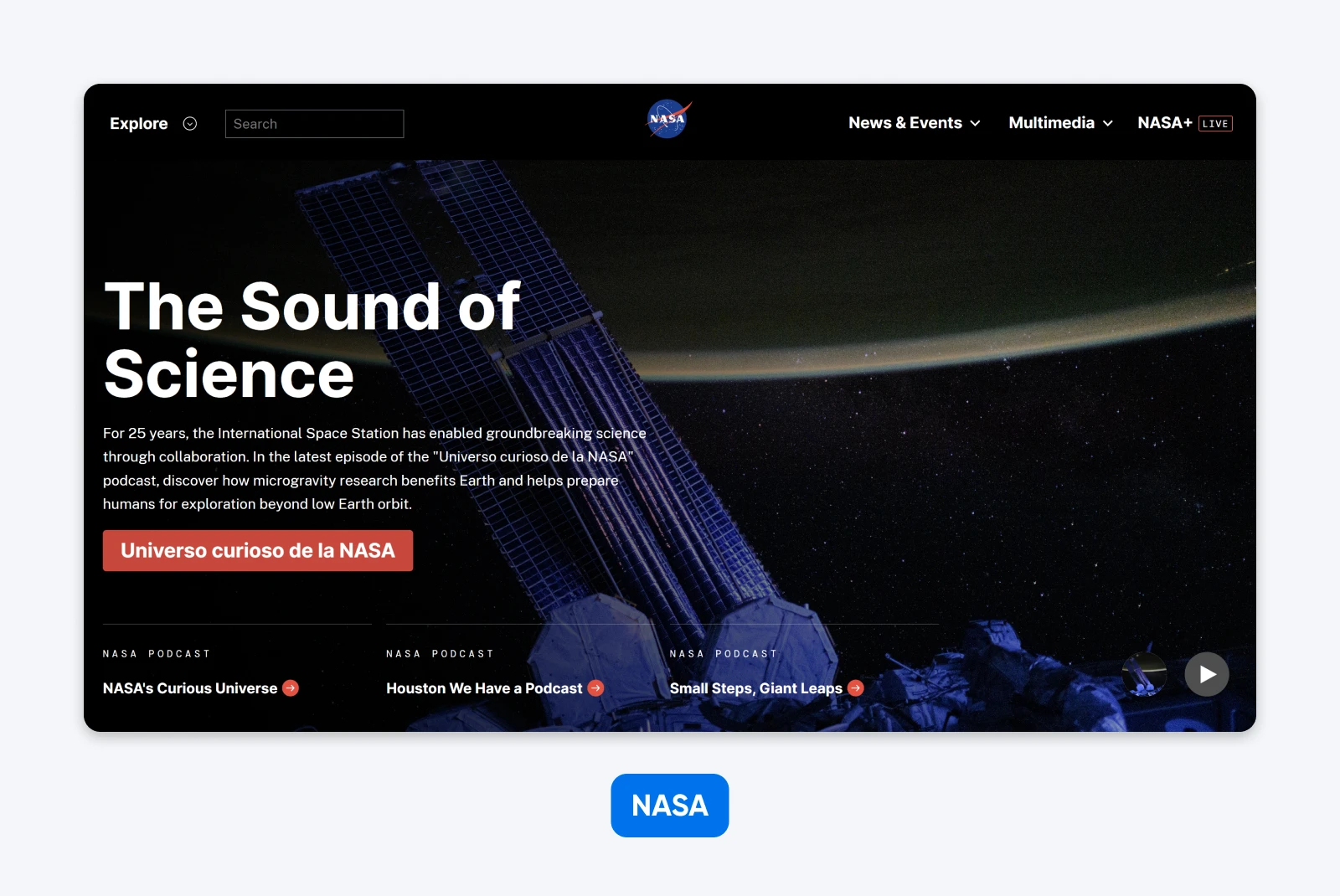
Why it works:
- You’re invited to enjoy livestreams and on-demand video: NASA has its own TV channel, which you can watch live through the site. You can also enjoy a huge library of multimedia on the site.
- The sectioned layout helps you navigate the content: Rather than wading through menus, you can simply scroll to see different areas of the NASA site.
7. Music for Minors: Music Education Non-Profit Site
There’s nothing flashy about the website of Music for Minors, but this 49-year-old non-profit does a great job of guiding visitors to the content that matters to them.
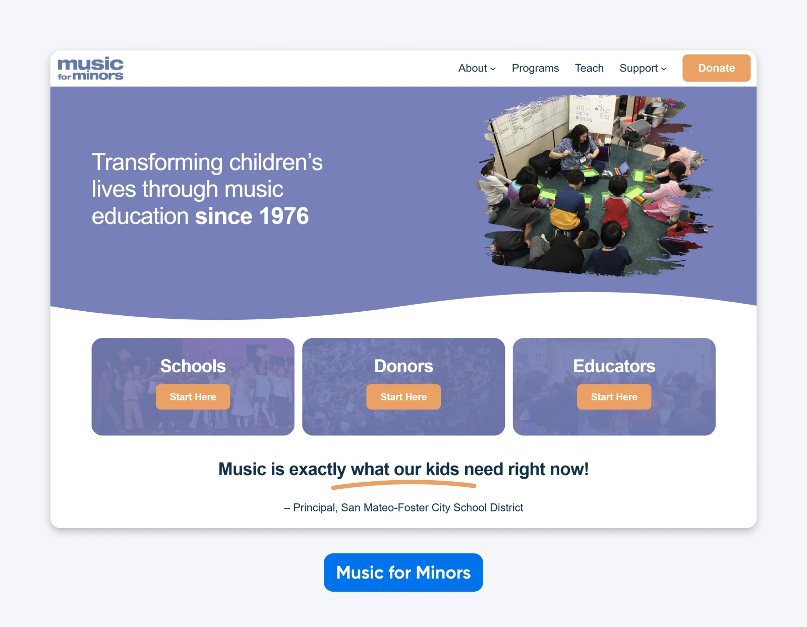
Why it works:
- Great front-page signposting: Straight after the headline, visitors are guided in different directions depending on who they represent.
- Smart use of social proof where it counts: Just before the footer, you’re encouraged to subscribe to the organization’s newsletter. Not convinced? Right next to the form, there are three awards proving this non-profit is legit.
Corporate Websites: WordPress for Serious Business
Not every website is about selling something right now. A good corporate site should impress visitors with professionalism, so they return when there’s a deal to be done.
Here are a couple of solid examples:
8. Disney Experiences: Travel and Leisure Portfolio
With resorts, cruise ships, theme parks, and experiences around the world, Disney owns a sprawling business. Their website breaks down the parts of this business in clear categories within a clearly-defined sub-sites drop-down menu.
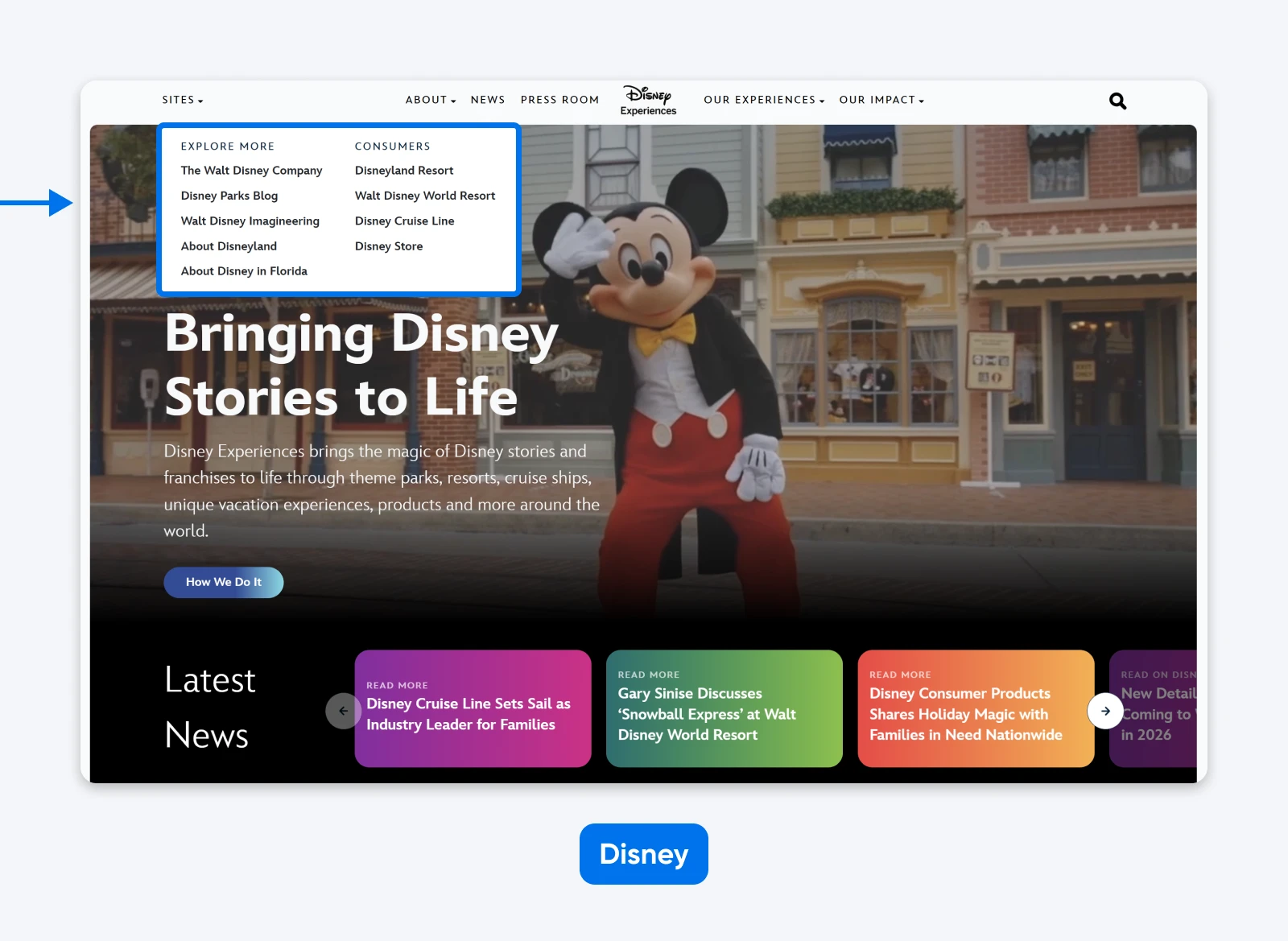
Why it works:
- Sub-sites are better for orientation: Each Disney location has its own branded area. This is much easier to navigate than one tangled mess of sub-pages.
- Strong use of video keeps you interested: As you might expect from a world famous movie-making business, there’s video all over this site. It’s way more engaging than walls of corporate-speak text.
9. Magnet Wire Technology: Electronic Manufacturing Company Site
You probably don’t think about enamelled wiring that often. For folks who work in the electronics industry, though, this stuff really matters — and MAG’s site shows why.

Why it works:
- Unique, visually clean layout: It’s like a minimalist’s version of Tetris. Large blocks fit together neatly and guide the eye, with only a few carefully chosen words.
- Excellent readability: All that white space means that MAG can include deeper explanations without towering walls of text.
Event and Destination Websites: Helping Us Dream
If you’re going to spend good money on a vacation or wellness retreat, you want to be confident that the destination is worth a visit. The best event and experience websites leave you excited about the trip. Here are some examples:
10. Relais de Chambord: Luxury Hotel Website
The website of Relais de Chambord feels as luxurious as the hotel it promotes. You can explore the entire site from the comfort of your sofa, and easily build the perfect stay.
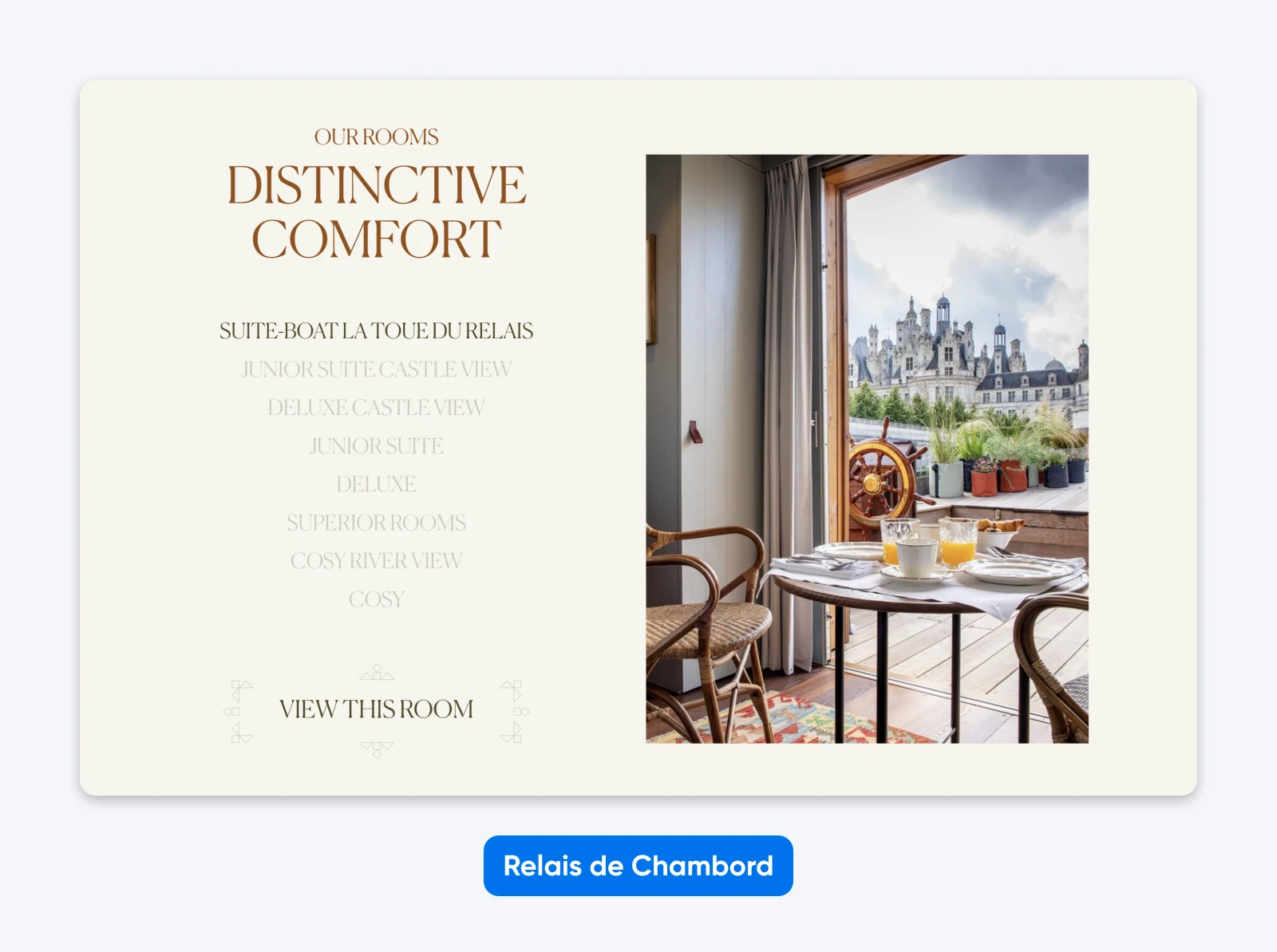
Why it works:
- It uses video backgrounds for instant engagement: Rather than a static image, this site has a frontpage video that instantly catches your attention.
- The fonts and motifs reflect the beauty of the place: Scrolling through this website feels like admiring the menu of a Michelin-starred restaurant. It’s super refined, classy, and luxurious.
11. Bosque Chaiik: Natural Living Residential Site
The residential retreat of Bosque Chaiik isn’t yet built, but potential buyers get a strong sense of what the village will look like, thanks to this preview site.
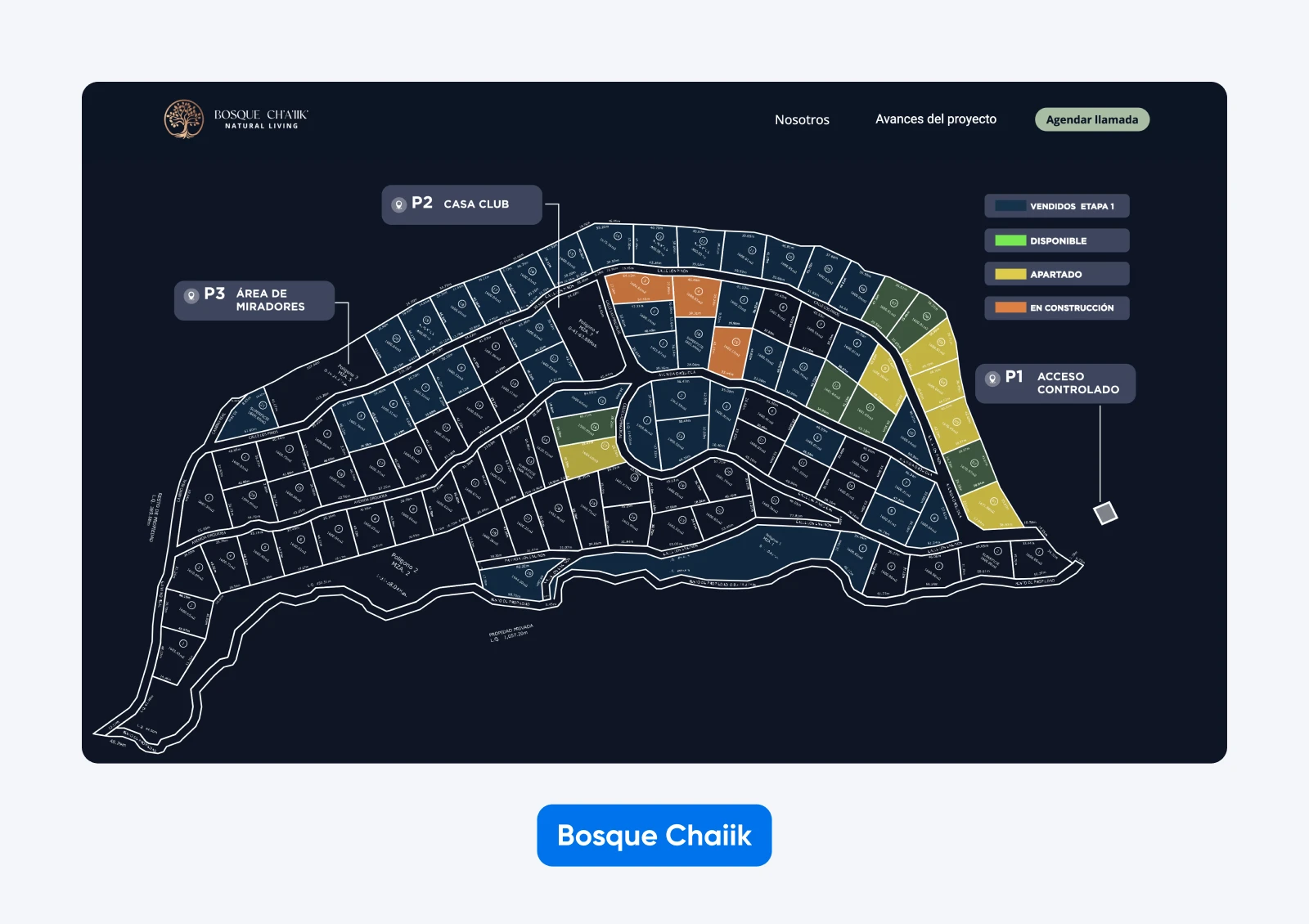
Why it works:
- Evocative videos and photorealistic mockups set the scene: Even though the village doesn’t yet exist, you can still get a strong sense of what it will look like.
- Regular project updates: Committing to buying property is a big decision, and this site reassures potential buyers with photos showing progress.
Personal and Professional Websites: Building Your Brand on WordPress
You don’t need to be a Kardashian to think about your personal brand. A simple WordPress site can help you to spread the word about what you do and pick up some adoring fans.
Here are some particularly inspiring examples:
12. Rafael Nadal: Home of a Sporting Legend
If you’re a tennis fan, Rafa Nadal’s website will definitely catch your eye. The structure is relatively simple, but the use of powerful visuals makes it feel like something special.
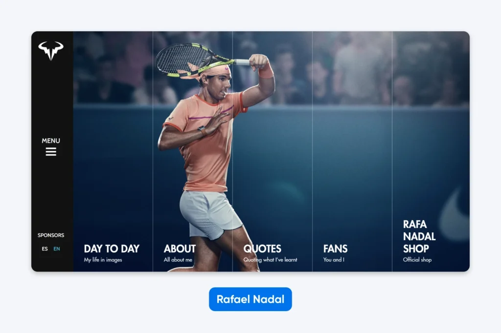
Why it works:
- A strong visual identity shows you where you’ve landed: Nadal’s site has the stylish dynamism of a Nike advert. The homepage typifies this, with a hero image that doubles as a main menu.
- The content is presented in unusual but appealing ways: While the content is actually quite sparse, the site doesn’t feel empty. Block quotes, embedded social posts, and professional imagery fill the space.
13. Jason Zweig: Archive of Financial Essays
For any author, words must come first; but as you browse the website of Jason Zweig, you’ll notice that the long-time Wall Street Journal columnist still uses visual elements to keep things interesting.
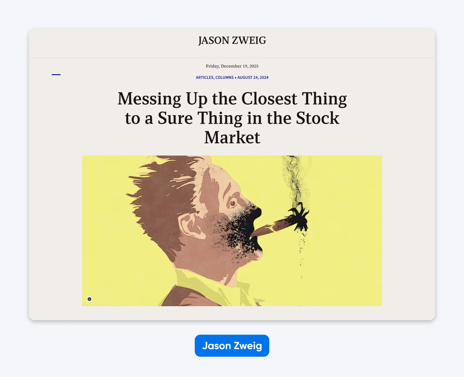
Why it works:
- The layout jumps straight into the content: Writers are judged by their writing, and Zweig’s site guides you toward his latest work.
- Almost every single post has an impactful featured image: For almost every story on the site, there’s a beautiful illustration that accompanies it. This guides the eye and makes the site feel more like a magazine.
News and Magazine Websites: What WordPress Was Made for
WordPress is a great platform for telling stories; the clue is in the name. If you’re thinking of setting up the next big thing in online publishing, take a minute to check out these examples:
14. The Harvard Gazette: Digital Student Newspaper
It might be a student newspaper, but the Harvard Gazette is a serious publisher. The website reflects this, with an elegant design that screams high-end journalism.
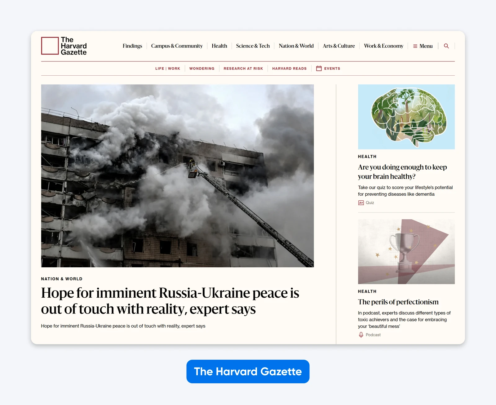
Why it works:
- You can get to what you want, fast: Two banks of menus allow readers to see the topics they care about with a single click. That means far fewer frustrated visitors clicking away.
- The site uses large, high-quality featured images: Every featured story comes with a photo or illustration that visually summarizes the story — again, great for quick navigation.
15. Vox: Breaking News, Made Beautiful
Vox was one of the first digital-only news publishers to hit the big time. The site is not revolutionary, but it’s filled with great design choices.
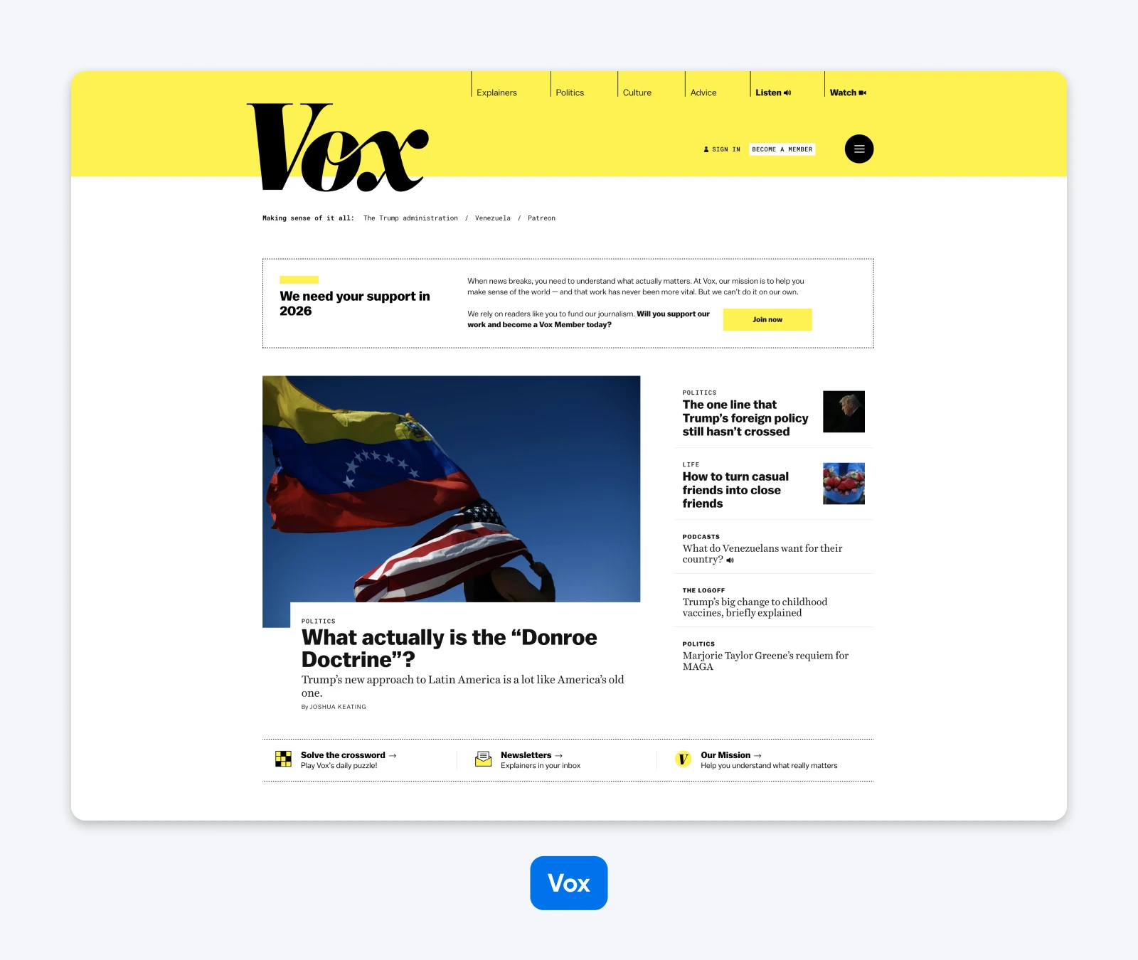
Why it works:
- The branding is bright and eye-catching: Love it or hate it, you can’t ignore Vox’s color scheme. It hits you between the eyes like the sun rising in the tiny gaps between your bedroom curtains.
- There are loads of CTAs, but they don’t annoy you: No one enjoys dismissing pop-ups when they’re reading an article. Vox gets around this by placing multiple subtle buttons around the site, asking readers to subscribe and donate.
So, What Are the Key Takeaways From Top WordPress Sites?
If you study every example in our list — or just a few — you might start to notice some recurring themes. The best sites utilize the strength of WordPress to deliver a great user experience for every visitor.
Here are the key takeaways:
- WordPress is very customizable. Take advantage of it: From theme builders and premium plugins to the built-in block editor, you have so many tools to work with.
- You don’t have to go big now; WordPress can scale: Start with a one-page site, and grow from there. The only thing that changes is your hosting plan.
- WordPress can handle any type of content: From short quotes to full movies, you can use this platform to share your best work.
- Your site starts with a great structure when you build with WordPress: Even if you don’t do much customization, you’ll have all the essential technical stuff for easy navigation and strong SEO.
Right, that’s enough time spent idolizing other sites. Grab a hosting plan, install WordPress, and let’s see what you can make!
Beautiful Websites, Designed From Scratch
Stand out from the crowd with a modern WordPress website that’s 100% unique to you.
See MoreWordPress Website Examples FAQs
Still wondering whether WordPress has what it takes to run your site? We have answers!
Is WordPress still relevant in 2026? Surely there’s something newer and shinier…
Whoa, whoa, hold your horses. Don’t be disrespecting the OG like that. WordPress might be 22 years old, but the latest version is at the cutting edge of online publishing. It’s robust, fast, free, regularly updated, and supported by a huge community of site owners.
What’s not relevant about that?
Do I need to code to create sites like the examples above?
Not at all. In fact, we’d bet good money that most of them didn’t require any custom development. (Partly because we know several were designed using our very own Liftoff AI tool… we’ll let you guess which ones!)
I have big ambitions — can WordPress really handle my super fancy business site?
Obviously, it depends on the specifics; however, there’s a good chance the answer is “yes.” Some of the world’s most popular websites are powered by WordPress, so neither scale nor complexity is an issue.
Is WordPress actually secure?
That’s a fair question. Any website can be a target, regardless of which system it’s running on.
WordPress has a dedicated community that is constantly working to identify and patch vulnerabilities, which is more than some platforms have. If you keep WordPress updated, along with your plugins and themes, your site should be well locked up.