
Starting a React app is easy. Rebuilding every button, menu, and form by hand isn’t. React UI component libraries are collections of pre-built, ready-to-use interface elements (buttons, forms, tables, menus) that you drop into a React project instead of coding each one from scratch. Shadcn UI is best for code ownership, Material UI for breadth, and Mantine for an extensive ready-made toolkit. The best ones speed up development, keep your design consistent, and handle accessibility for you — the rest of this guide helps you pick the right one for your project.
Each time you start a new React project, you face the same decision: build every interface element yourself, or lean on a UI component library?
UI
User Interface (UI) is where humans and computers interact on web pages, devices, or apps. It’s a web design element focused on user engagement.
While a UI library helps speed up work and improve the design across the app, choosing one isn’t as simple as picking one at random. You need one that fits your project’s needs and its design language.
Whether you are a beginner React developer or an experienced one, you can confidently pick the right UI library for your next project by the end of this post.
What are React UI libraries?
First, a quick refresher: React builds every interface out of components — small, reusable pieces of code that return JSX (HTML-like markup) and receive data through props. The official React docs describe a UI as components nested inside other components, from buttons up to entire pages.
React UI component libraries hand you those building blocks pre-written. They provide a variety of ready-to-use elements, ranging from basic items like buttons and input boxes to more intricate options such as tables and menus.
Think of it this way: you get pre-built blocks you can piece together like a puzzle instead of making everything from scratch.
You save time and effort, similar to building with Legos. This allows you to focus on designing your website, and not fuss over the tiny details.
Using a UI library also makes your site look consistent. This is because all components share the same design. You can skip the boring parts and focus on making your application unique.
Why use React component libraries?
Building everything yourself is tempting, but a component library offers serious advantages. Let’s explore why they’re a developer’s secret weapon.
- Build things faster: Imagine it as a toolbox of ready-to-use UI elements. Need a button? Grab one from the box, customize it, and continue building. You no longer waste time recreating the same component over and over again. This speed boost is significant in a project’s early stages.
- Create a polished, unified look: Expert design and development teams craft UI libraries. You automatically benefit from their experience when you use one, and your interfaces will look great and function smoothly. The result? A professional and polished application.
- Make accessible apps: The best UI libraries prioritize accessible components. They follow standards like Accessible Rich Internet Applications (ARIA), making your application accessible to everyone. They’re also tested rigorously across browsers and devices, saving you from cross-browser headaches.
- Build responsive designs: Modern UI libraries include responsive design features. They offer flexible grids and components that adapt to any screen size, making building layouts easy, no matter the device.
- Get ongoing support: Reputable libraries receive continuous maintenance and updates from their communities. This keeps you current with best practices and makes sure your application evolves with browsers and devices. It’s like having a dedicated team maintaining your components for you.
How to choose the right UI component library for your project
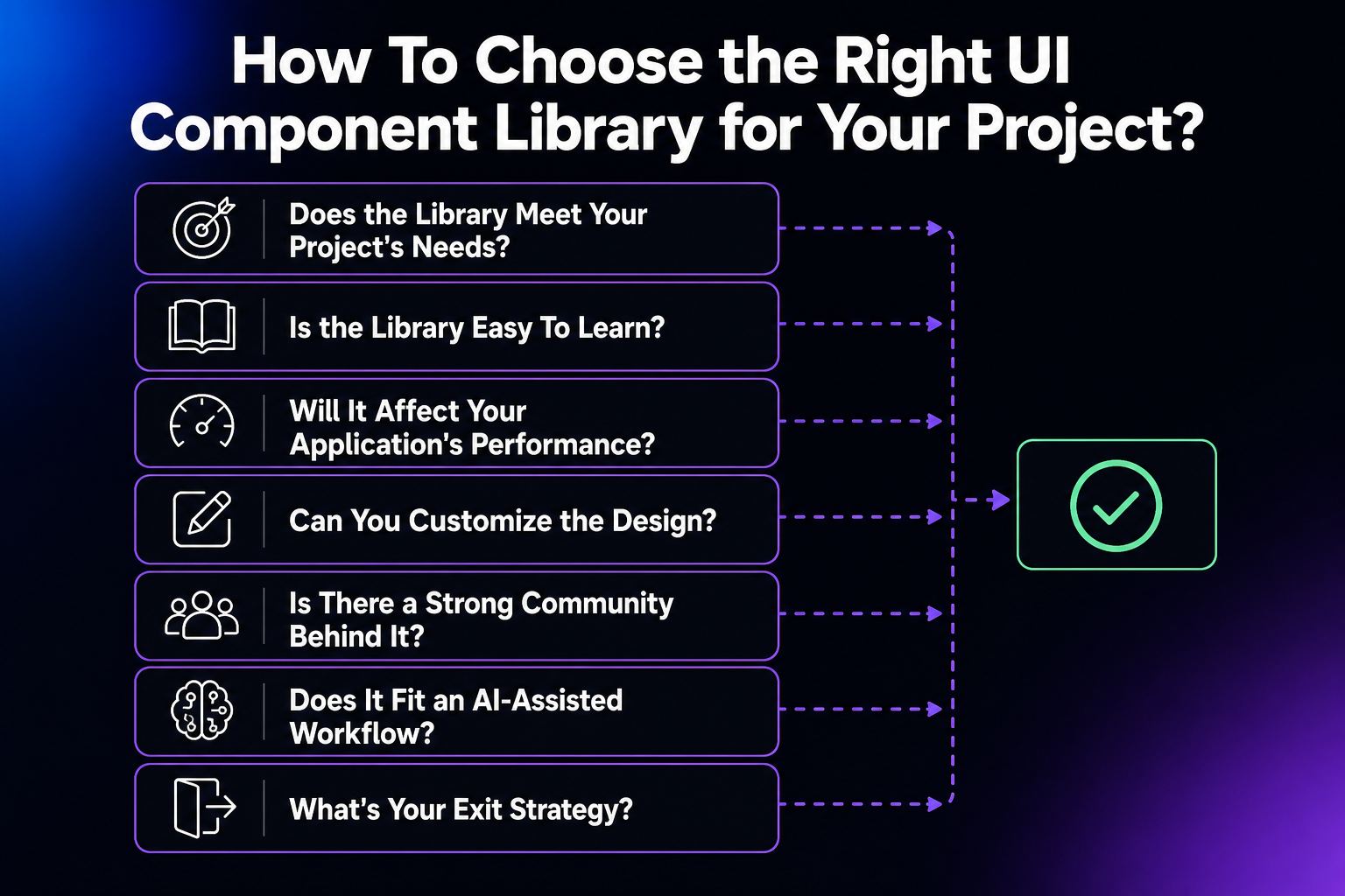
Picking the right UI library can make or break your project.
Let’s explore the essential factors to consider.
Does the library meet your project’s needs?
Begin by listing the core UI elements and interactions your application requires. Then, evaluate libraries based on how well they support these use cases.
Also, look at edge cases or less common scenarios within your app. A library that covers more of your needs out of the box reduces the need for custom component development and saves you a lot of time.
Is the library easy to learn?
Some libraries are beginner-friendly, while others cater to advanced users with complex APIs. Chakra UI or Ant Design are great starting points for a team of React beginners because of their clear, well-documented APIs.
For seasoned React developers, a lower-level approach (like Tailwind CSS utilities, or a headless component library you style yourself) might offer the flexibility they crave. (The once-popular styled-system hasn’t shipped a release since 2020, per npm, so skip it for new projects.) Find a balance that challenges your team without overwhelming them and slowing down development.
Will it affect your application’s performance?
The size of a UI library directly impacts your application’s performance, which is especially important for applications that need fast loading times across various devices and networks.
Evaluate the size of their production builds and see if they offer optimization options like tree-shaking or individual component imports. Benchmarking and performance comparisons provide insights into how different libraries perform.
Weigh the features and flexibility against the potential impact on performance. Sometimes, a larger bundle size is acceptable for the time saved on development, while other situations demand a leaner, more performant library.
One more 2026 wrinkle: if you use React Server Components or the Next.js App Router, check how the library handles styling. Libraries that rely on runtime CSS-in-JS generally have to render as client components, while zero-runtime approaches fit server components more cleanly — Mantine, for example, styles with native CSS, and Chakra UI’s README specifically notes it works with Next.js RSC.
Can you customize the design?
To make sure your application has a consistent and strong brand identity, or if you need specific design elements, prioritize a library with strong theming and customization options. Some libraries offer rigid designs, while others provide extensive tools for style adjustments.
Look for well-documented theming systems with clear instructions on customizing colors, fonts, spacing, and design tokens.
Pre-built themes or tools for generating custom themes are a bonus. A word of caution: remember that greater flexibility often means increased complexity.
Find the right balance between your customization needs and the complexity you’re willing to take on.
Is there a strong community behind it?
Widely used libraries with large communities are more stable, well-documented, and actively maintained.
Check for factors like stars on GitHub, npm downloads, and Stack Overflow questions. An active community makes it easy to find help when you need it, and also reduces the risk of the library becoming obsolete.
Does it fit an AI-assisted workflow?
New for 2026: how well a library works with AI coding assistants like Cursor, Claude Code, and v0 is a real selection criterion. Copy-paste libraries have an edge here because the component code lives in your own repository, where an assistant can read and modify it — Shadcn UI’s docs call the project “AI-ready,” with open code “for LLMs to read, understand, and improve.” Traditional npm packages are more opaque to an assistant, though some are adapting: Mantine now ships LLM-optimized docs and an MCP server, and says it’s designed to work with Cursor, Claude Code, Windsurf, and other AI coding tools.
What’s your exit strategy?
Assume any library can stall. The warning signs: releases dry up, issues and pull requests pile up unanswered, and the docs stop tracking current React versions. It happens to popular projects, too — styled-system and Semantic UI React were fixtures of lists like this one, and both are now effectively unmaintained. To limit the damage, wrap third-party components in thin wrappers of your own (your code imports AppButton, not the library’s button directly) so a future migration touches one file per component instead of your entire codebase. Moving away is never free, but wrappers turn a rewrite into a refactor.
11 best React UI component libraries to consider in 2026
Keeping the above key considerations in mind, let’s examine some of the most popular React UI libraries available today. Here’s the whole field at a glance:
| Library | Best for | Components | Styling approach | Standout trait |
|---|---|---|---|---|
| Shadcn UI | Code you own outright; AI-assisted workflows | Dozens (copy-paste) | Tailwind CSS + Radix UI | Components live in your repo, not node_modules |
| Material UI (MUI) | Feature-rich apps and dashboards | Vast selection | Themeable Material Design | Google’s Material Design language |
| Ant Design | Enterprise applications | 60+ | CSS-in-JS with global style variables | Minimalist design, wide internationalization |
| React Bootstrap | Teams already using Bootstrap | Bootstrap’s set | Bootstrap themes | Native React rebuild of Bootstrap |
| Chakra UI | Accessible, composable product UIs | Modular set | Composable, themeable components | Simple API, dark mode built in |
| Mantine | Full-featured apps, fast | 120+ (plus 70 hooks) | Native CSS | Huge hooks library, AI-ready docs |
| PrimeReact | Data-heavy apps, full design control | 130+ | Styled or unstyled (e.g., Tailwind CSS) | Pre-built themes plus a headless layer |
| Blueprint | Data-dense desktop-style interfaces | 30+ | Customizable themes | Palantir-built for heavy data |
| Semantic UI React | Existing Semantic UI projects only | 50+ | Theming via variables | Human-readable code; no longer maintained |
| Grommet | Mobile-first, accessibility-first apps | 50+ | Theme designer tools | HPE’s responsive grid |
| Evergreen | Large enterprise apps | 30+ primitives | CSS-in-JS (ui-box) | Composable primitives from Segment |
Here’s how each one earns its spot.
1. Shadcn UI
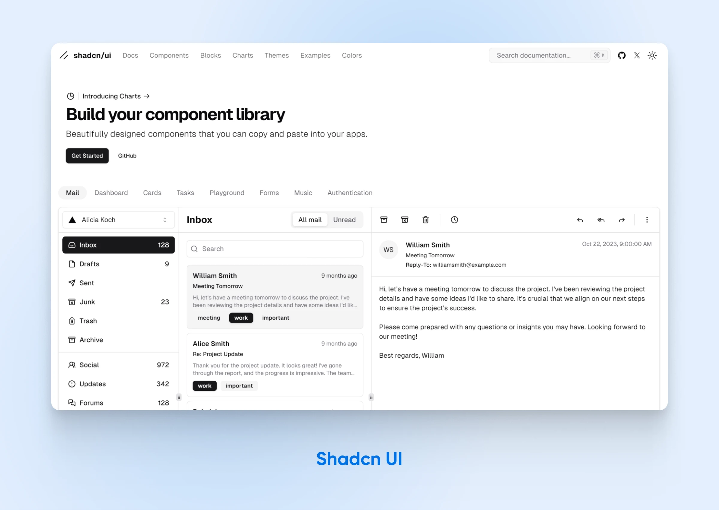
Shadcn UI has quickly become popular, with its viral status and strong community support showing just how effective and appealing it is to developers. Shadcn UI is a unique open-source UI library designed to help developers create stunning and customizable user interfaces. Unlike traditional component libraries, it offers a collection of reusable components that you can copy and paste directly into your project, allowing for extensive customization and flexibility.
Features:
- Reusable Components: Offers dozens of copy-paste components, from buttons and inputs to tables, toasts, dropdowns, and navigation menus.
- Built on Tailwind CSS and Radix UI: Ensures easy customization and styling; new projects use the new-york style (the old default style was deprecated in February 2025).
- Customizable Themes: Use the theme editor for colors, border radius, and light/dark modes.
- Accessibility: Accessible components built on accessibility-focused primitives.
- Wide Framework Support: Compatible with Next.js, Vite, Laravel, React Router, Astro, and TanStack Start.
- Performance Focus: Lightweight and designed for high performance, with direct integration into your codebase.
- Active Community and Support: 120k+ stars on GitHub (as of August 2026). Built by shadcn at Vercel and backed by a supportive community. Includes unofficial extensions and significant contributions from developers.
Shadcn UI’s hands-on approach to UI design, backed by a supportive community and a growing list of features, makes it an attractive choice for developers seeking a customizable and flexible UI solution. It’s also a natural fit for AI-assisted coding: the component code sits in your own repo, where tools like Cursor or v0 can read and edit it — Shadcn UI’s docs call the approach “AI-ready.” Just be mindful of the trade-off: maintaining and optimizing that included code is on you.
2. Material UI (MUI)
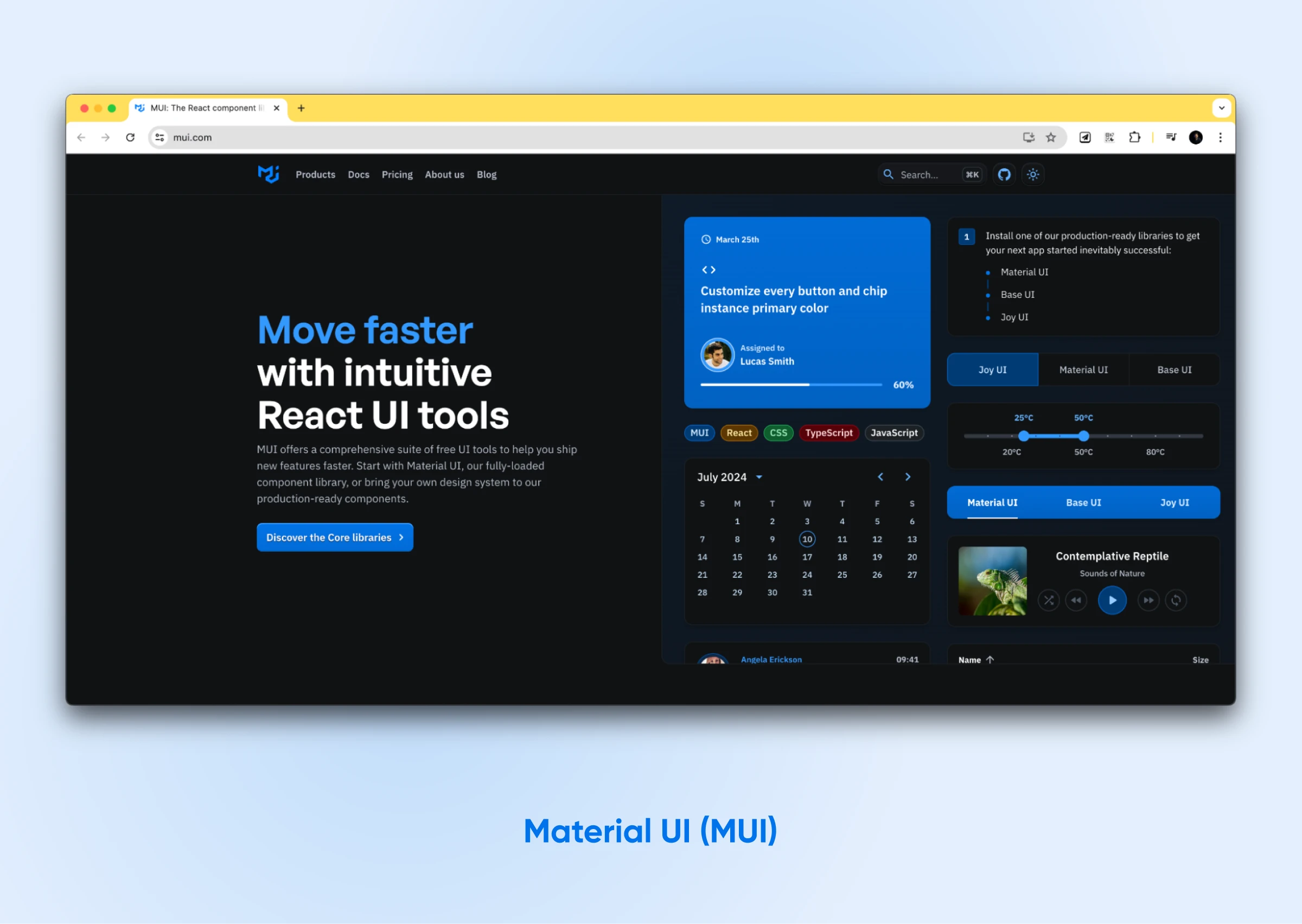
Material UI, or MUI, is one of the most popular and comprehensive React UI frameworks. It offers a massive toolbox of customizable components, all based on Google’s Material Design system. This means you can build beautiful, functional user interfaces that align with a widely recognized design language.
Features:
- Material UI offers a vast selection of customizable components: You can adapt these components to fit your specific design requirements.
- A user-friendly theming system simplifies customization: This makes achieving your desired look and feel straightforward.
- Accessibility is a core design principle in MUI: The library ensures your applications are accessible to everyone.
- You’ll find thorough documentation and practical examples to guide you: These resources empower you to maximize MUI’s potential.
MUI offers the breadth and flexibility you need, from easy-to-use applications to intricate dashboards. For heavier needs, there’s also MUI X, a companion line of advanced components like the data grid and date pickers, split between a free tier and commercially licensed plans.
3. Ant Design (AntD)
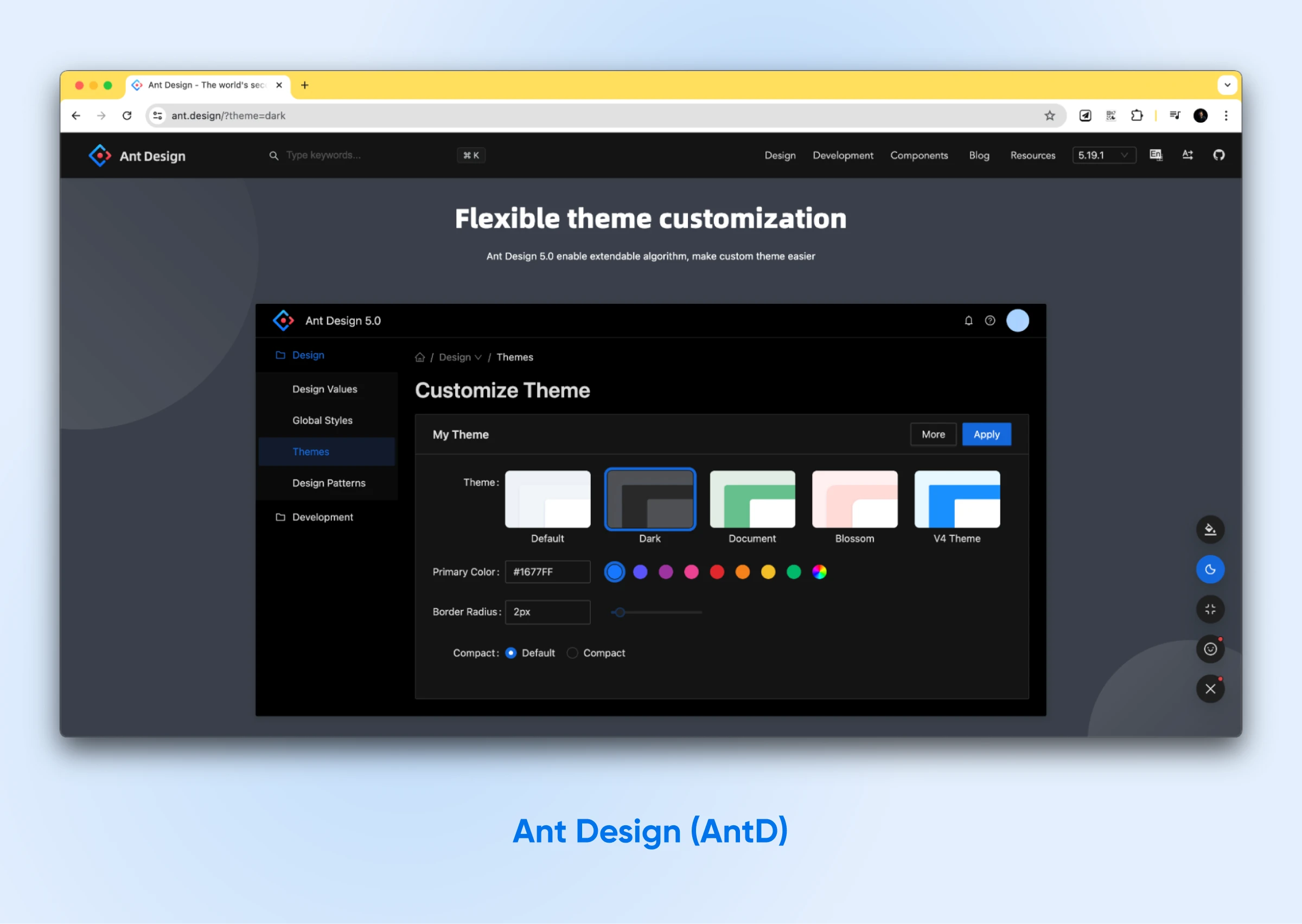
Ant Design, sometimes called AntD, is yet another popular choice. It comes from the Ant Group (formerly Ant Financial) design team and boasts a clean, minimalist design — perfect for big, enterprise-grade applications.
Features:
- Over 60 customizable components: Covering all the essentials you’ll likely need.
- A composable design: Focused on giving your users the best experience possible.
- Built-in support for CSS-in-JS styling: With fewer variables, making styling a breeze.
- Easy theming through global style variables: Maintains a consistent look and feel.
- Extensive internationalization support: Available in dozens of languages, per Ant Design’s docs, allowing you to reach a global audience effortlessly.
If you’re drawn to that signature minimalist look and need a wide range of consistently designed components, give Ant Design a shot.
4. React Bootstrap
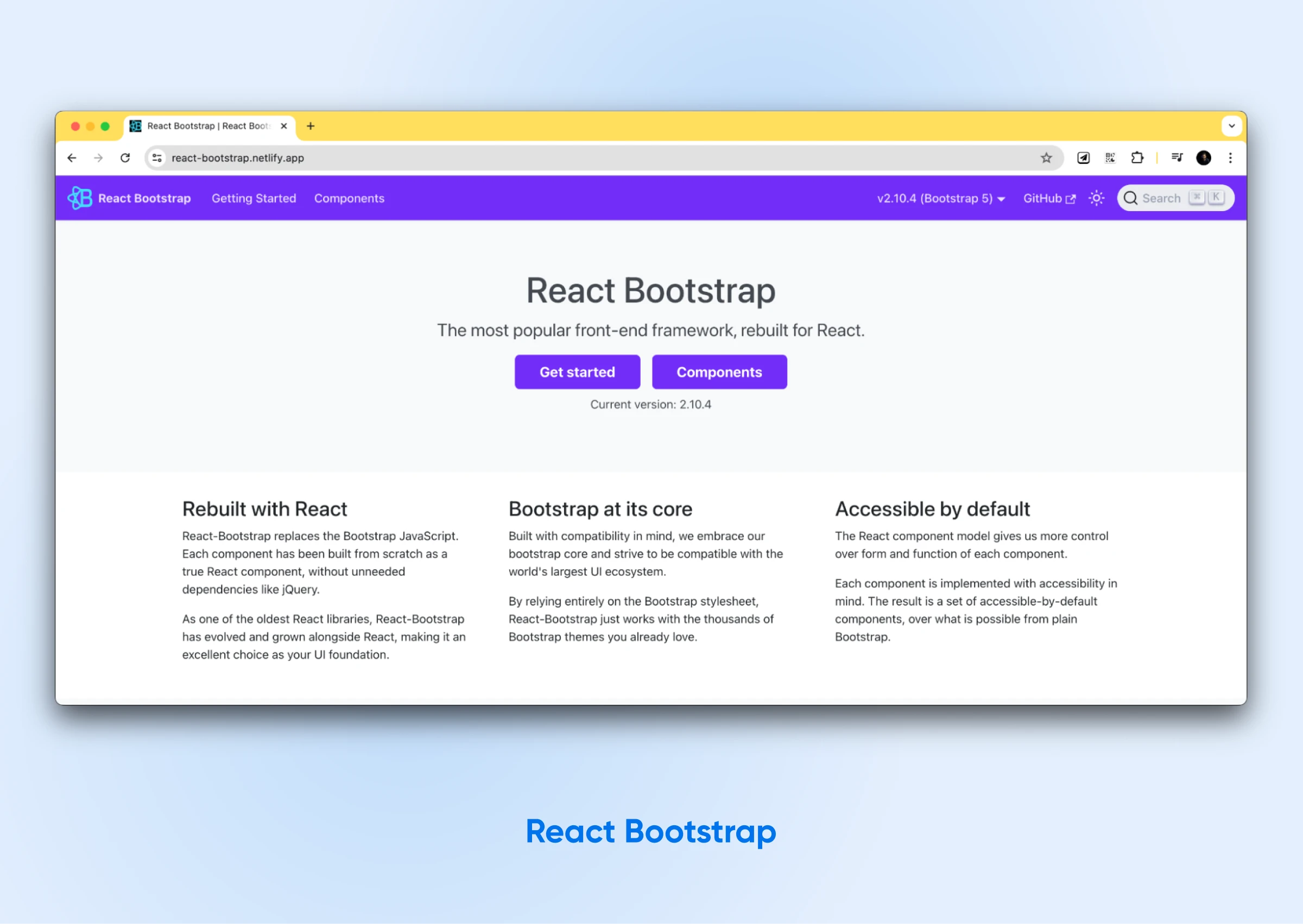
Do you already use the popular Bootstrap CSS framework? If so, React Bootstrap will feel like a natural fit. This library cleverly rebuilds Bootstrap components so that they work as native React components, offering smooth integration with any React project.
Features:
- Transition smoothly: By retaining your current Bootstrap themes without conflict.
- Build with inclusivity in mind: React Bootstrap’s components follow best practices for accessibility, which allows you to create applications that are accessible to a wider audience.
- Avoid unnecessary bloat in your project: Import only the specific components your application requires.
- Find clear, concise documentation: Paired with practical examples that speed up the development process and help you troubleshoot issues.
React Bootstrap gives you the best of both worlds. You can have the simplicity of Bootstrap combined with the power and flexibility of React.
If you prefer Tailwind CSS over Bootstrap, you can combine React and Tailwind CSS to develop your apps.
5. Chakra UI
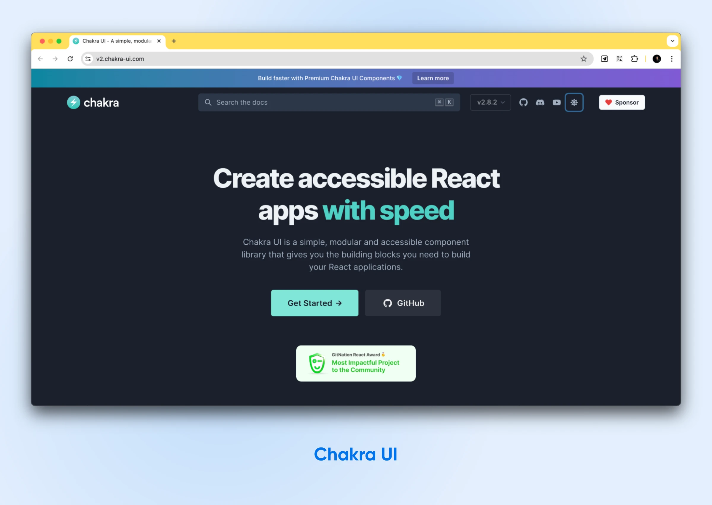
Chakra UI is a modular React UI library that developers love for its simple design and flexibility. Now on version 3, Chakra UI provides accessible and composable components, which make building responsive applications easy — and its README notes it works with Next.js React Server Components.
Features:
- Customizable and extensible components: Chakra UI is a modular library that provides easily customizable and extendable components, allowing developers complete control over their designs.
- Built-in dark mode support: This makes for a great user experience in different lighting conditions.
- Accessibility-focused: Chakra UI’s design is geared towards accessibility, which means more users can access and enjoy the applications built with it.
- Intuitive and developer-friendly API: Easy for developers to learn and use.
Chakra UI uses a modular architecture, allowing you to use only the necessary components. This keeps your bundle size small and your application fast.
6. Mantine
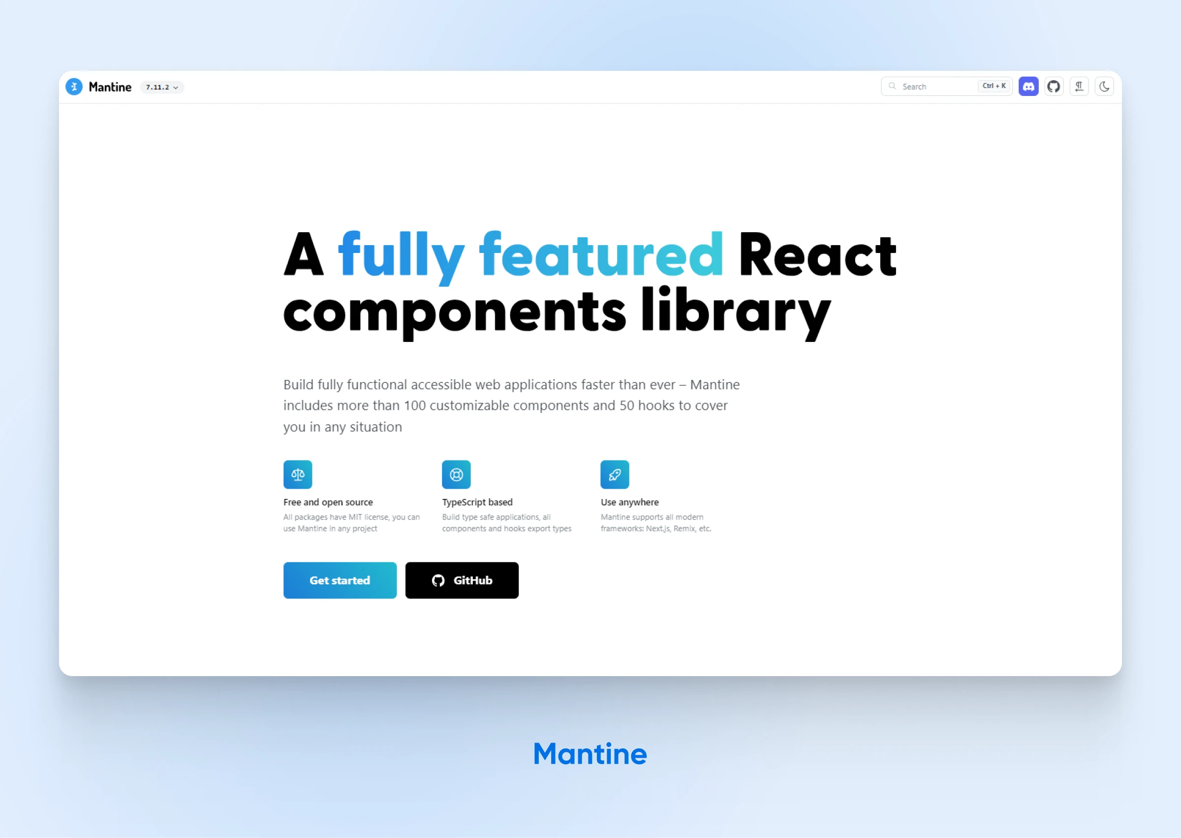
Mantine offers a comprehensive set of more than 120 customizable components and 70 hooks (per mantine.dev, August 2026), enabling developers to build fully functional and accessible web applications with ease. Mantine components are built with native CSS, which the project says keeps styles performant and easy to override.
Features:
- Extensive Component Library: More than 120 UI components covering inputs, date pickers, overlays, navigation, rich text editor, carousel, and more.
- Dark and Light Themes: Supports easy theming with both light and dark modes, exportable global styles, and components supporting a dark theme out of the box.
- Customizable Components: Allows visual customizations through props and supports styles overriding for internal elements.
- TypeScript Based: Ensures type-safe applications with all components and hooks exporting types.
- Built for AI-assisted workflows: Ships LLM-optimized docs, agent skills, and an MCP server — Mantine says it’s designed to work with Cursor, Claude Code, Windsurf, and other AI coding tools.
Choose Mantine for its extensive range of customizable components, strong theming options, and excellent support for modern web development frameworks.
7. PrimeReact
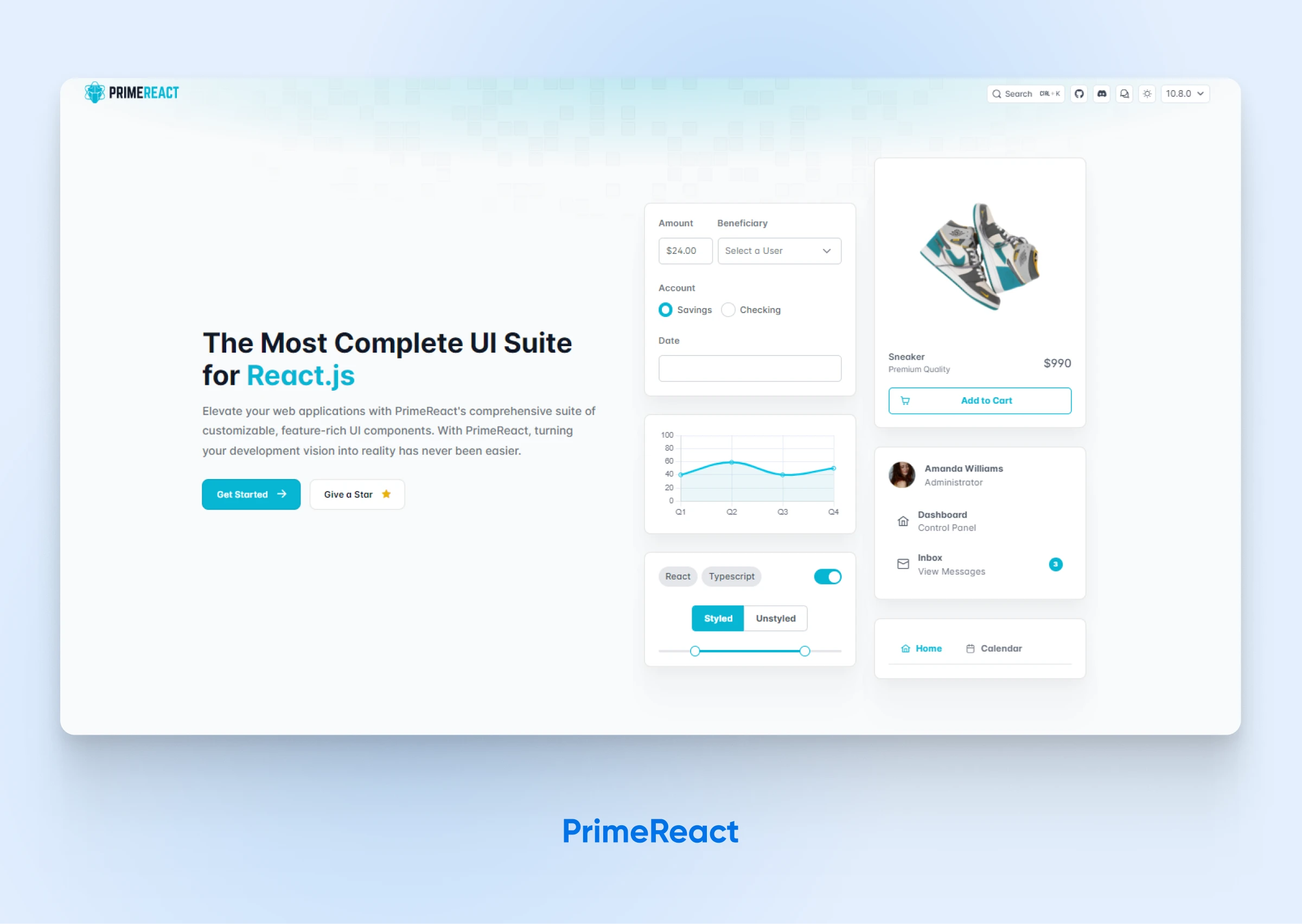
PrimeReact enhances web applications with its extensive suite of customizable, feature-rich UI components, simplifying the process of bringing your development ideas to life.
Features:
- Extensive Component Library: Offers 130+ React components (per primereact.dev, August 2026), covering everything from data tables to dialogs and menus.
- Styled or Unstyled: Choose from a variety of pre-built themes or implement your own design systems with the CSS library of your choice, such as Tailwind CSS.
- Accessibility: WCAG compliant, with keyboard navigation, screen-reader support, and focus management out of the box.
- Enterprise Support: Guaranteed-response enterprise support is available as a paid offering from PrimeTek, the company behind PrimeReact.
- Blocks: Pre-designed, copy-paste-ready UI blocks are available through PrimeBlocks, a separate paid add-on.
- TypeScript Support: Comprehensive support for TypeScript with types and tooling assistance, ensuring type-safe applications.
Choose PrimeReact when you want complete control over your design system. Plus, skip worrying about adding weight to your app. Its bare-bones approach is excellent if you like to get your hands dirty and manually choose the components needed for your app.
8. Blueprint
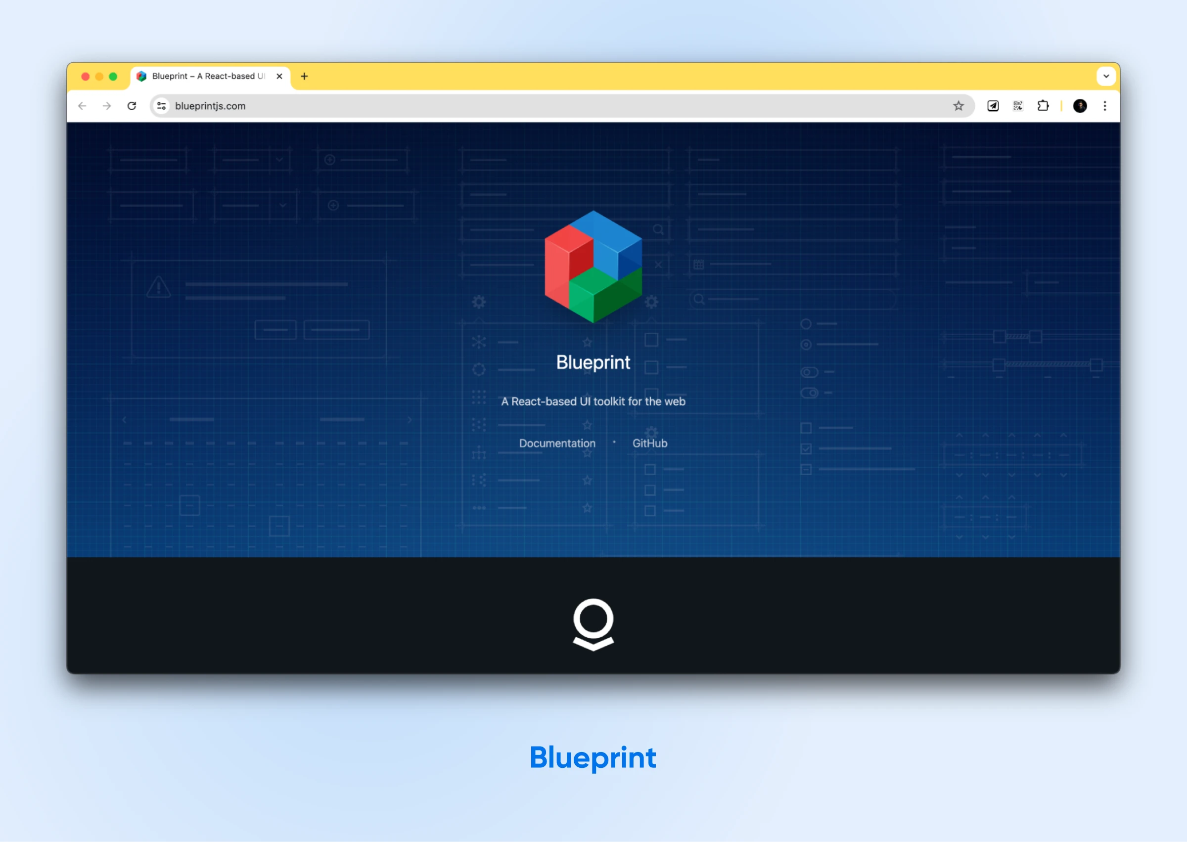
Created by Palantir, Blueprint excels at building intricate, data-intensive interfaces. This library is handy for desktop applications and data visualization projects that require handling a lot of data simultaneously.
Features:
- Over 30 UI elements: These are designed explicitly for applications handling substantial data.
- Built for data-dense interfaces: Blueprint is optimized for complex, data-dense interfaces like tables and dashboards.
- Customizable themes: Blueprint lets you customize themes to tailor the look and feel of your application.
- Extensive documentation and practical examples: Development becomes easier because of the detailed documentation and practical examples.
Blueprint is a good choice if you want to build an application that manages a lot of data or calls for advanced visualization features.
9. Semantic UI
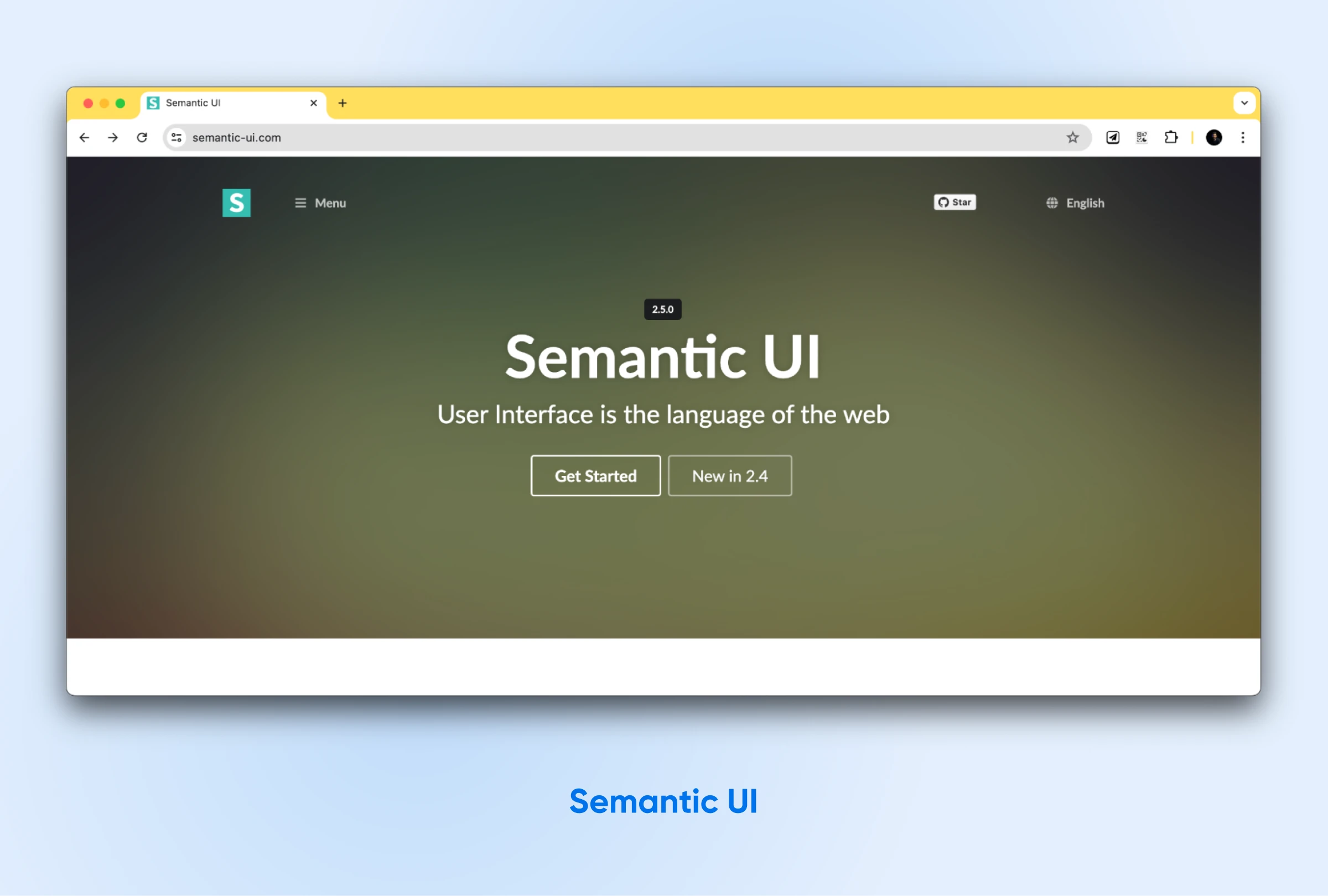
Semantic UI React officially brings the power of Semantic UI — a popular development framework known for its intuitive, human-friendly HTML — directly to your React projects. This integration allows you to build web applications focusing on clear, readable code and a smoother development experience.
Features:
- Provides a rich toolkit of 50+ reusable UI components: Helps you quickly build diverse and feature-rich user interfaces, simplifying your development workflow.
- Offers simple theming: For easy customization of your application’s visual style using variables, ensuring consistency and brand alignment.
- Encourages accessible interfaces: With various features, such as built-in keyboard navigation, React ARIA support, and thoughtful markup, to make your applications usable by everyone.
- Has an augmentative approach: By putting together the components piece by piece, you can gradually improve your existing designs and get complete flexibility and control over the styling.
One big caveat: Semantic UI React is no longer actively maintained. The project’s own migration guide says the team doesn’t plan to maintain it and recommends considering a migration, and a July 2025 GitHub issue confirms the repository has gone quiet.
If you appreciate Semantic UI’s focus on human-readable code and you’re maintaining an existing Semantic UI project, it still works. For a new project in 2026, though, pick an actively maintained library from this list instead.
It can still come in handy when you need to keep UI elements consistent inside an existing Semantic UI design system — just go in with the maintenance risk clear.
10. Grommet
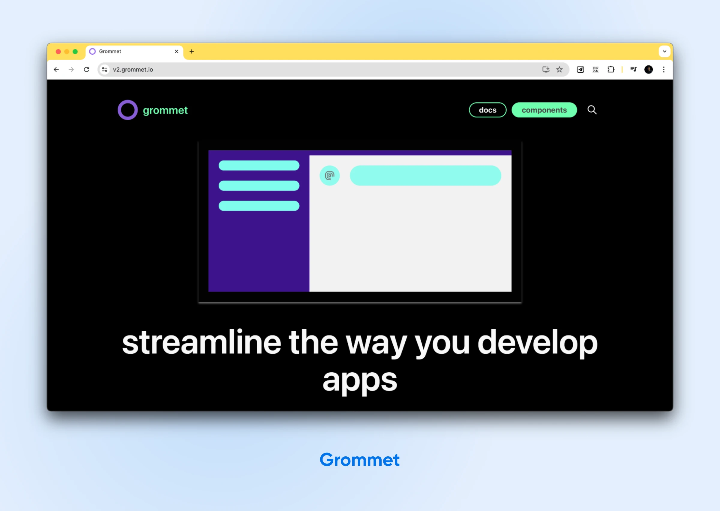
Grommet, created by Hewlett Packard Enterprise (HPE), is a React-based framework for building responsive and accessible mobile-first web applications.
Features:
- 50+ components: Including layouts, forms, controls, and visualizations.
- Responsive grid system: For designing mobile-friendly layouts.
- Accessibility support: Available across the entire component library.
- Powerful theming tools: Including a web-based theme designer.
- Starter templates: Ideal for standard app layouts and patterns.
Grommet is an excellent choice if accessibility and responsive design are your top priorities. The responsive grid and mobile-first components allow you to create interfaces that adapt fluidly to different devices.
11. Evergreen
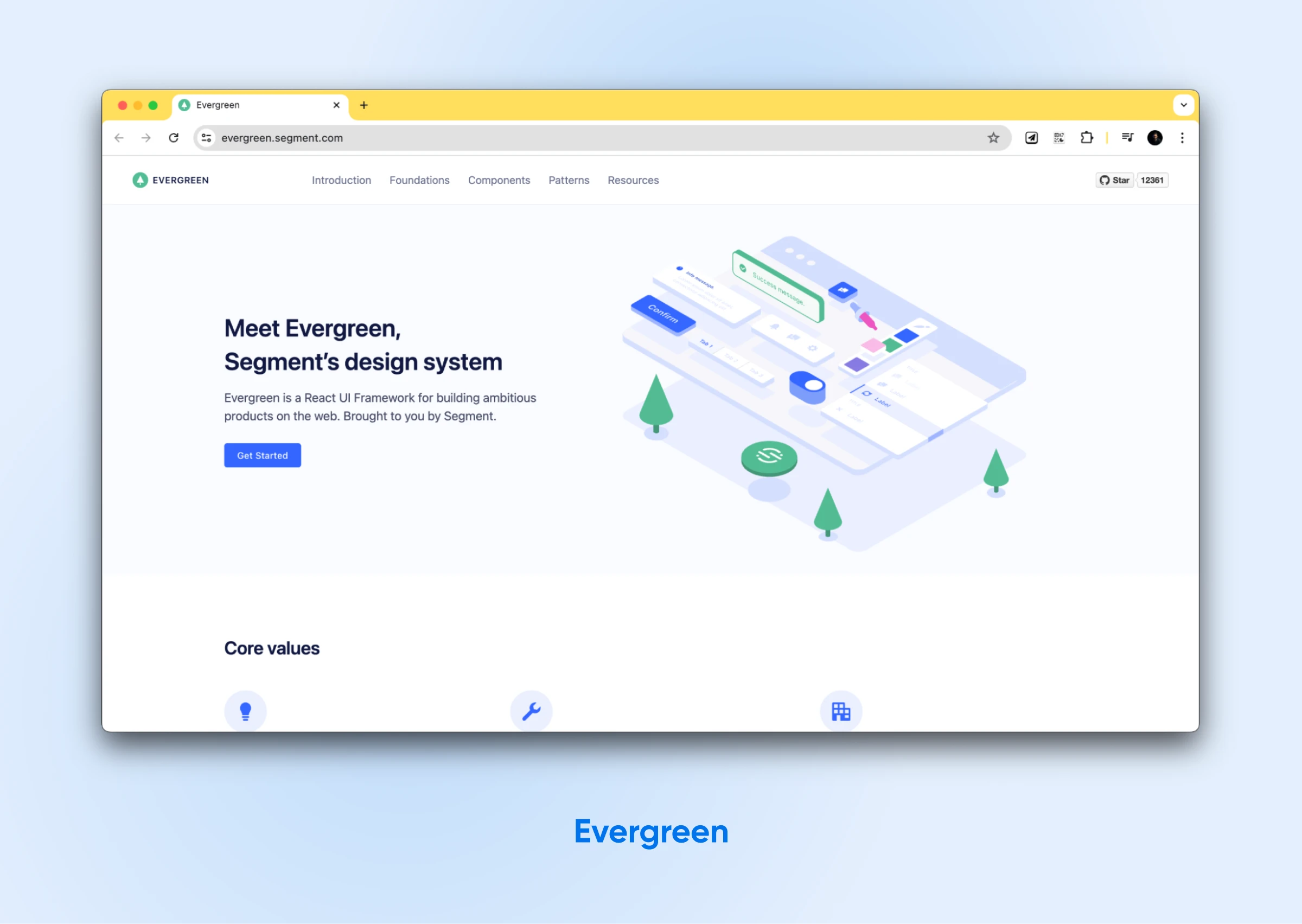
Evergreen, Segment’s brainchild, provides a pragmatic UI framework built for the demands of enterprise-grade applications. This framework provides a set of polished, pre-built React components that can be effortlessly plugged into your projects to accelerate the development process.
Features:
- Evergreen offers over 30 flexible primitive components: These can be used as building blocks to construct user interfaces.
- Extensive library of ready-made, composable patterns: Includes a large collection of patterns for commonly used components that are ready to use.
- Carefully managed APIs: Evergreen manages its component APIs for smooth interoperability. Having a cohesive codebase allows for smooth integration with existing codebases and promotes teamwork.
- Built with accessibility in mind: Accessibility is part of Evergreen’s component design, helping you keep your applications inclusive.
- Simplifies managing complex layouts: To fine-tune your application’s structure, you can use Evergreen’s built-in tools for z-indices, portals, and CSS resets.
Evergreen is perfect if you need dependable components ready for a large-scale application. You’ll save time using these pre-built components instead of configuring every detail yourself.
Plus, Evergreen is built to work well with other tools and scale quickly with your more complex projects.
React UI libraries FAQs
How do I get started with a React component library?
It’s generally easy to install any of these libraries using npm or yarn. Once installed, you can import the library into your React project and start adding the UI components for your app.
Can I use multiple UI libraries together in one project?
Can you? Yes. Should you? We wouldn’t recommend it. Since multiple libraries can end up modifying the same component using CSS or duplicate components, you may see glitches on your app front end. This will also make debugging and fixing the problem more difficult.
What if I can’t find a component I need in my chosen library?
Component libraries cannot provide all the UI components you’ll ever need. That’s because every app has different and unique needs. However, almost all UI libraries will allow you to create your components using basic building blocks and the overall design language, such as Box or Grid components.
This is also where strong communities come into play. You can check out the respective communities to see if others have already created the necessary components.
Will using an external library bloat my application’s bundle size?
Yes. Any UI library will add code and some bloat to your project. However, in our opinion, the benefits of using pre-designed and lightweight components outweigh the slight bloat. Many of the modern libraries also use techniques like tree-shaking and module imports so the final app only imports the code that’s required for the modules you used, and nothing else.
Speed up your React projects with UI component libraries
The right React UI component library can make or break your next project. Why? Because it directly affects the performance of your application, the speed of development, and the user experience.
However, you can’t just pick the first one that comes to mind or pops up on Google, and run with it.
The best React UI library depends on your needs, design preferences, and the development team’s skillset. So, evaluate your options and confidently choose a library that improves your productivity and ensures a polished user interface, giving your project a strong foundation for success.
And when you’re ready to deploy your React applications, try a reliable and developer-friendly hosting provider like DreamHost.
DreamHost’s VPS hosting fits when your app needs a server: API routes, server-side rendering, a database, or room to scale on your own schedule. If you’re shipping a purely static React build, a simpler static-hosting setup may be all you need — start small and upgrade when the app demands it.