
Tailwind CSS or Bootstrap? It’s the first fork in the road for almost every front-end project, and the right choice comes down to how you like to build.
Tailwind vs. Bootstrap: the short answer
Bootstrap is a component-based CSS framework: you assemble pages from prebuilt, pre-styled parts like navbars, cards, and modals. Tailwind CSS is a utility-first framework: you compose fully custom designs from small, single-purpose classes. Choose Bootstrap for speed and consistency with minimal CSS work; choose Tailwind for complete design control and lean, automatically optimized stylesheets.
| Bootstrap | Tailwind CSS | |
|---|---|---|
| Current version | 5.3.x | 4.x |
| Styling approach | Prebuilt, pre-styled components | Low-level utility classes |
| Pre-built components | Extensive free library built in | None built in; official Tailwind Plus library is a paid add-on |
| JavaScript behavior | Bundled (dropdowns, modals, carousels) | Not included; bring your own (Headless UI, Alpine.js, or custom JS) |
| Setup | Drop-in via CDN, no build step needed | Build step (Tailwind CLI, PostCSS, or Vite plugin) |
| Shipped CSS | Full framework stylesheet unless you trim it | Only the classes you use, generated automatically |
| Learning curve | Gentler for beginners | Steeper at first |
| Best for | Fast builds, admin UIs, standard layouts | Custom designs and design systems that scale |
That’s the verdict. The rest of this guide shows how we got there — and why the design side of this choice deserves so much care. In a 2004 Northumbria University study (Sillence et al.), 94% of users’ first-impression feedback about health websites related to visual design.
There’s more to it than people liking or disliking your design.
In Stanford’s 2002 web credibility study (Fogg et al.), 46.1% of consumers’ credibility assessments referenced the site’s visual design.
The bottom line? You need a visually appealing website — there’s just no way around it. This is where CSS frameworks help.
CSS
Cascading Style Sheets (CSS) is an essential coding language used for styling webpages. CSS helps you create beautiful pages by modifying the appearance of various elements, including font style, color, layout, and more.
These powerful tools can help you create stunning, responsive designs quickly and efficiently. Among the sea of options, two frameworks stand out: Tailwind CSS and Bootstrap.
But which one should you choose for your next project?
In this article, we’ll compare Tailwind and Bootstrap, exploring their strengths, weaknesses, and unique features.
By the end, you’ll know exactly which framework is right for your project, helping you build a site that looks great and earns users’ trust.
What are CSS frameworks?
Quick refresher before we get into the nitty-gritty (we cover this in depth in our full guide to CSS frameworks): CSS frameworks are pre-written collections of CSS code that simplify and speed up website development, so you’re not starting from scratch every time.
Think of it like having a toolbox filled with all the essentials you need to build a house. You could always go out and buy each tool individually, but why not save yourself the hassle and get everything in one convenient package?
One of those essentials is responsive design. In a GoodFirms survey of 200+ web design agencies and freelance designers, 73.1% named non-responsive design as a top reason visitors leave a website.
Bootstrap: the reliable classic
First up, let’s talk about Bootstrap.
Bootstrap has been around since 2011 and has become a staple in the web development world. It’s like the comfort food of CSS frameworks: reliable, familiar, and always satisfying.
One of the biggest advantages of Bootstrap is its extensive library of pre-built components.
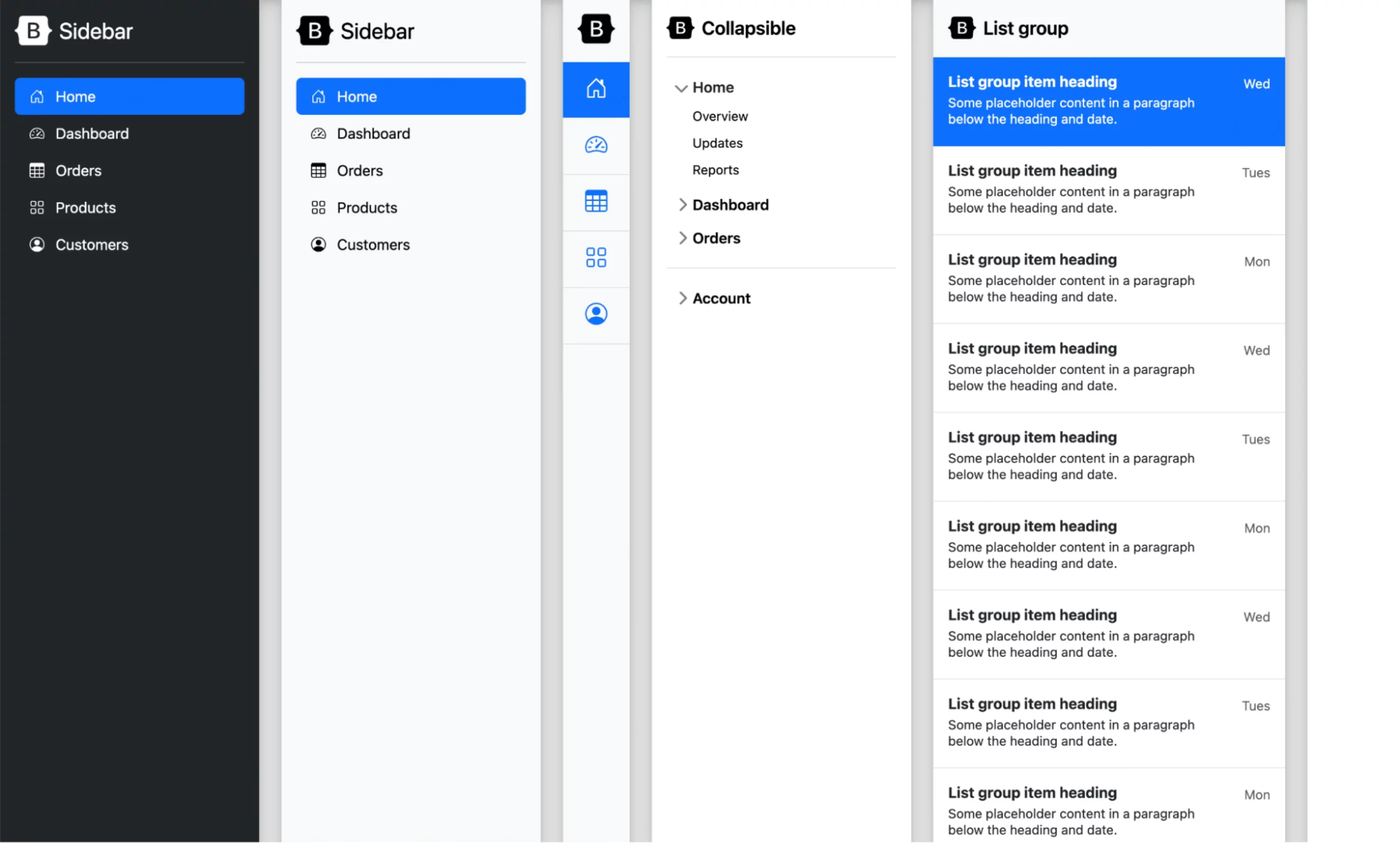
From navbars and buttons to carousels and modals, Bootstrap has you covered. And it’s not just CSS: Bootstrap also bundles the JavaScript that makes those components interactive, so dropdowns open, modals pop up, and carousels slide without any extra libraries. The components share the same design system, so they look consistent without much custom CSS.
But wait, there’s more! Bootstrap also comes with a powerful grid system that makes it easy to create responsive layouts. With just a few classes, your website can look fantastic on any device, whether it’s a desktop computer, a tablet, or a smartphone.
Another reason Bootstrap is so popular is its extensive documentation and community support. If you ever get stuck or have a question, chances are someone else has already asked (and answered) it on Stack Overflow or the Bootstrap forums. Plus, with so many developers using Bootstrap, you’ll find plenty of tutorials, templates, and plugins to help you along the way.
Of course, no tool is perfect, and Bootstrap has its limitations. Some developers argue that it’s too opinionated, meaning that it can be difficult to customize if you want to stray too far from the default styles. Others point to payload: Bootstrap’s compiled CSS weighs around 16KB gzipped (per a 2025 Tailkits framework roundup), plus its JavaScript bundle on top, and you ship all of it whether you use three components or thirty.
Tailwind CSS: the utility-first approach
Now, let’s talk about Tailwind CSS. It stopped being the new kid a long time ago: Tailwind launched in 2017, and the framework you’ll install today is the v4 line (v4.0 shipped January 22, 2025) — a mature, mainstream choice in the web development community.
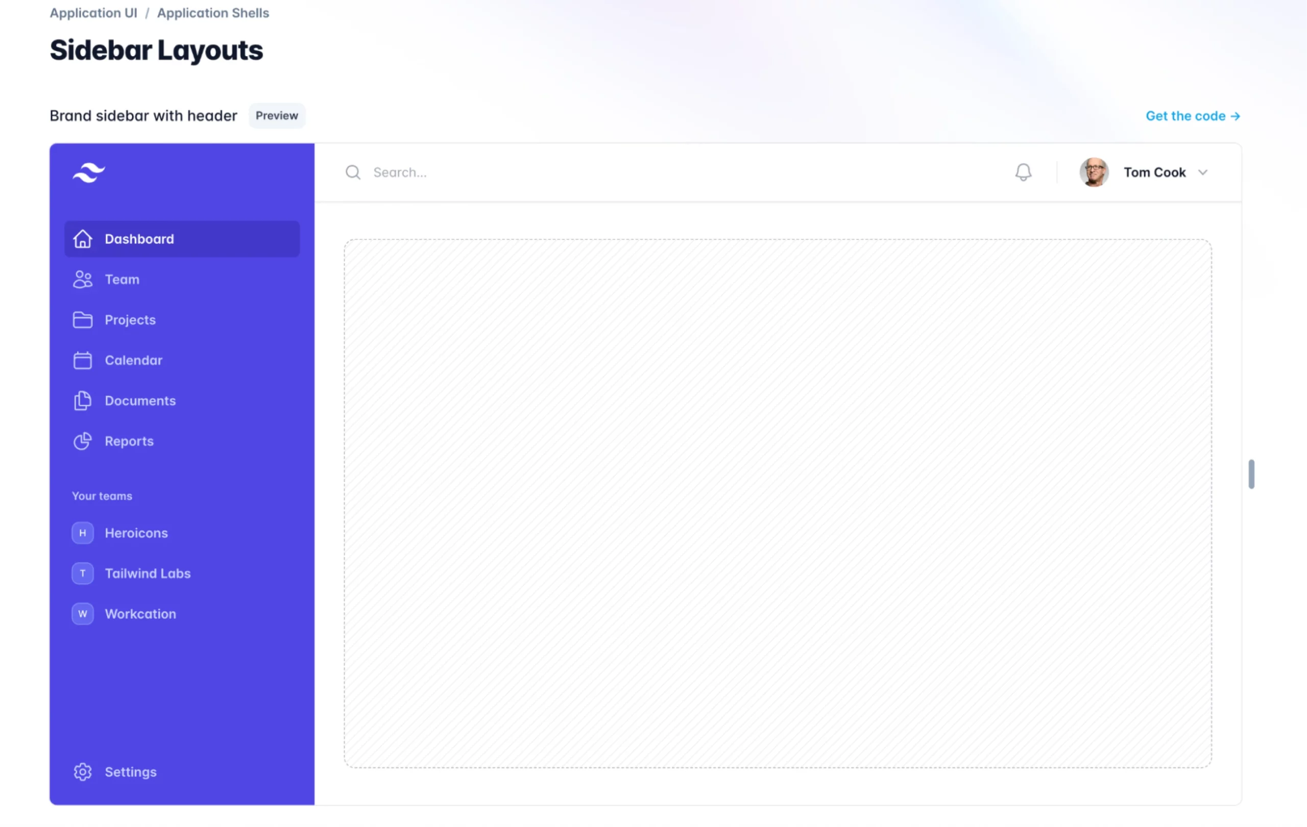
Unlike Bootstrap, which relies heavily on pre-built components, Tailwind takes a different approach. It provides a set of low-level utility classes that you can use to build your own custom designs.
This means you have complete control over the look and feel of your website, without being constrained by someone else’s design decisions. The framework itself ships no components, though the gap is smaller than it used to be: Tailwind’s creators sell Tailwind Plus, an official library of templates and UI blocks. The practical difference from Bootstrap isn’t whether components exist — it’s that Bootstrap’s are free and bundled, while Tailwind’s official ones cost extra.
One caveat before you commit: Tailwind is CSS only. Bootstrap bundles the JavaScript that powers its dropdowns and modals; with Tailwind, interactive behavior comes from a companion library (Headless UI, Alpine.js) or JavaScript you write yourself.
So, Tailwind’s utility classes might seem a bit overwhelming.
Instead of using semantic class names like btn-primary, you’ll see things like bg-blue-500 and px-4. As you get used to it, you’ll start to appreciate the flexibility and power that comes with this approach.
One of the biggest advantages of Tailwind is its ability to create responsive designs with ease. You can easily specify different styles for different screen sizes, all without leaving your HTML. And the modern feature set goes well beyond breakpoints: Tailwind v4 added first-class container queries (styling elements based on their container’s size, no plugin required), design tokens exposed as native CSS theme variables, a wide-gamut P3 color palette, and logical properties that simplify right-to-left layouts. There’s a dark: variant for dark mode, too.
Another thing that sets Tailwind apart is its focus on performance. Tailwind generates only the classes you actually use — since v4 it detects your template files automatically, no configuration needed — so your final CSS file stays lean without any manual pruning.
Then again, like Bootstrap, Tailwind, too, isn’t perfect.
Some developers find the learning curve to be a bit steeper, especially if they’re used to more traditional CSS frameworks. And because Tailwind relies so heavily on utility classes, your HTML can start to feel a bit cluttered and harder to read. Accessibility is also on you: Bootstrap’s components ship with keyboard handling and ARIA patterns baked in, while a hand-rolled Tailwind component has only the accessibility you build into it. (To be fair, neither framework guarantees an accessible site — test with real users and tooling either way.)
How do you then select the right framework?
Tailwind vs. Bootstrap: which CSS framework should you choose?
Short version: choose Bootstrap when you want prebuilt components and the fastest path to a consistent, professional-looking site; choose Tailwind when you want a fully custom design and fine-grained control. Now let’s pressure-test that answer against the four factors that matter most in real projects.
Project complexity and scalability
One of the first things to consider is the complexity and scalability of your project. If you’re building a simple, one-page website or a small personal blog, Bootstrap might be the way to go. Its pre-built components and straightforward grid system make it easy to get up and running quickly.
However, if you’re working on a more complex application or a large-scale website with a lot of custom functionality, Tailwind might be a better fit. Its utility-first approach allows you to create highly customized designs that can scale as your project grows.
Here’s an example of how you might create a simple button in Bootstrap vs. Tailwind:
Bootstrap:
<button type="button" class="btn btn-primary">Click Me!</button>
Tailwind:
<button type="button" class="bg-blue-500 hover:bg-blue-700 text-white font-bold py-2 px-4 rounded">
  Click Me!
</button>
Notice the Bootstrap example is more concise and relies on a pre-defined class (btn-primary), while the Tailwind example uses a combination of utility classes to achieve the same result.
This flexibility can be especially valuable as your project becomes more complex and requires more granular control over styles.
Note: While you can customize Bootstrap styles, it’s more work and you might just write the CSS yourself. Tailwind is quite nice in this case because of its built-in flexibility.
Design flexibility and consistency
If you’re working with a design team or following strict brand guidelines, Tailwind’s utility-first approach can be a great fit for you.
It allows you to create custom designs that match your exact specifications, without being limited by pre-defined components or styles.
On the other hand, if you’re looking for a more standardized, consistent look and feel across your site, Bootstrap’s pre-built components can be a good choice. They provide a solid foundation that you can customize as needed, while still maintaining a cohesive overall design.
Here’s an example of how you might create a card component with a button in Bootstrap vs. Tailwind:
Bootstrap:
<div class="card" style="width: 18rem;">
  <img src="https://getbootstrap.com/docs/5.3/assets/brand/bootstrap-logo-shadow.png" class="card-img-top">
  <div class="card-body">
    <h5 class="card-title">Card title</h5>
    <p class="card-text">Some quick example text to build on the card title and make up the bulk of the card's content.</p>
    <a href="#" class="btn btn-primary">Go somewhere</a>
  </div>
</div>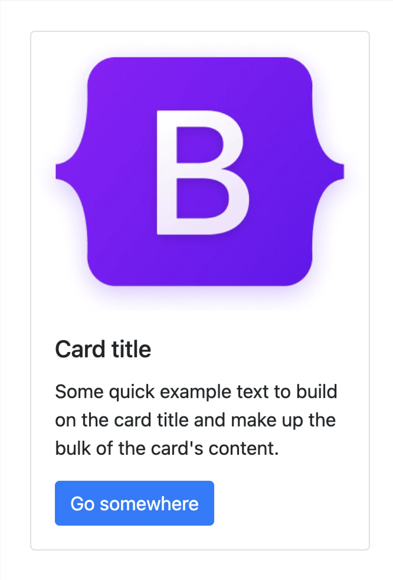
Tailwind:
<div class="m-6">
<div class="max-w-sm rounded overflow-hidden shadow-lg">
   <div class="flex justify-center">
      <img class="h-16 mt-4" src="https://tailwindcss.com/_next/static/media/tailwindcss-mark.3c5441fc7a190fb1800d4a5c7f07ba4b1345a9c8.svg" alt="Tailwind CSS Logo">
   </div>
   <div class="px-6 py-4">
      <div class="font-bold text-xl mb-2">Card title</div>
      <p class="text-gray-700 text-base">
         Some quick example text to build on the card title and make up the bulk of the card's content.
      </p>
   </div>
   <div class="px-6 py-4 flex justify-center">
      <a href="#" class="inline-block bg-blue-500 hover:bg-blue-700 text-white font-bold py-2 px-4 rounded">
      Go somewhere
      </a>
   </div>
</div>
</div>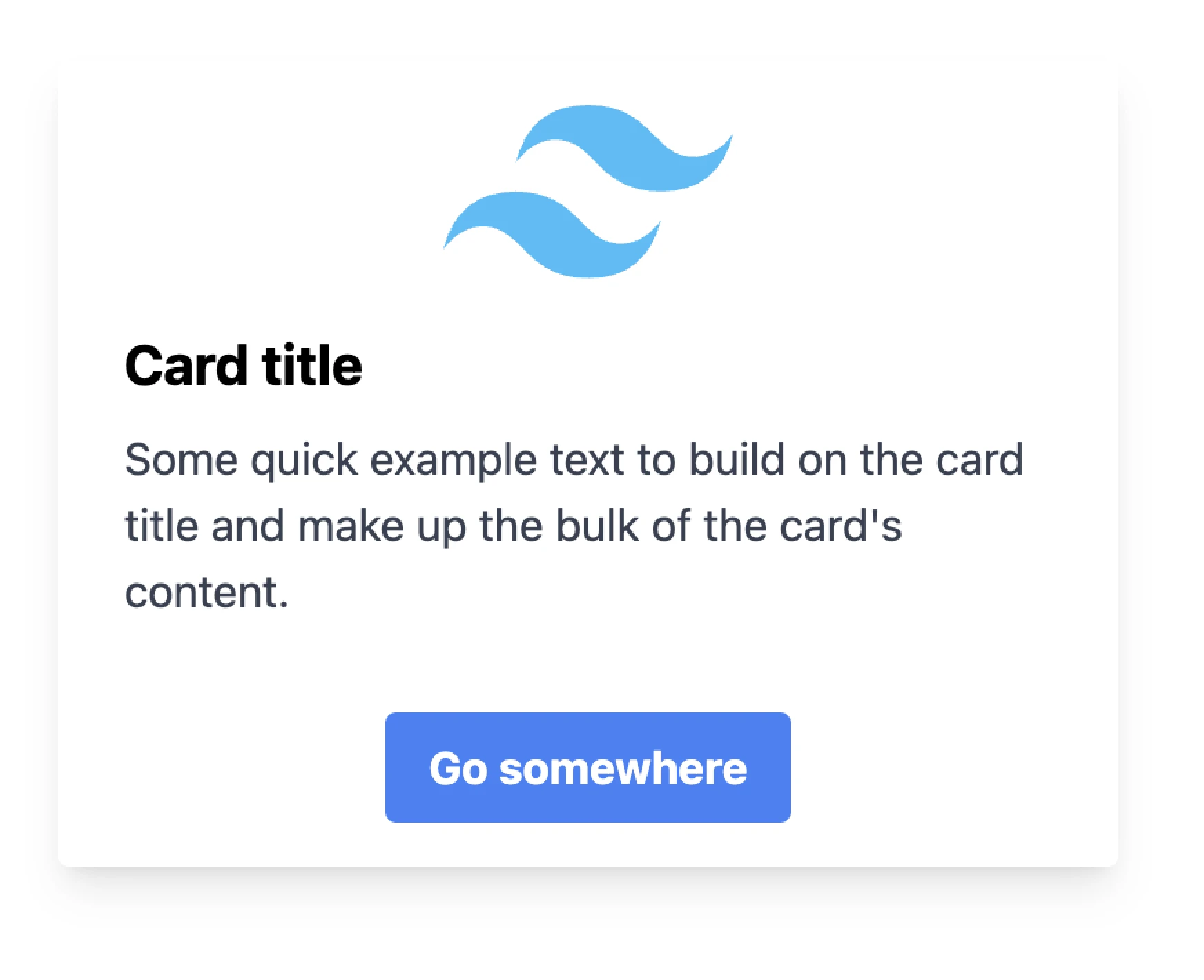
Above, you’ll see that the Bootstrap example uses the pre-defined card class and its associated sub-components (card-img-top, card-body, etc.) to create a consistent card layout.
The Tailwind example, on the other hand, uses a combination of utility classes to achieve a similar result, but with more fine-grained control over the specific styles applied.
Our take: Tailwind takes this round for its out-of-the-box customizability. If you’re just starting with designing, you may not take much notice of the design nuances when using Bootstrap. But as you start creating more complex components, the limitations start to show, and here’s where Tailwind’s utility classes can make things much easier in the long run.
Learning curve and developer experience
It’s also worth considering the learning curve and developer experience associated with each framework. If you or your team are already familiar with Bootstrap, it might make sense to stick with what you know.
Bootstrap has a large community and a wealth of resources available, which can make it easier to get started and find answers to common questions.
Tailwind, on the other hand, has a bit of an uphill learning curve, especially if you’re not used to thinking in terms of utility classes. However, once you get the hang of it, many developers find that Tailwind’s approach is more intuitive and efficient in the long run. (One 2026 wrinkle: AI coding assistants speak fluent Tailwind, so asking one for a pricing card gets you working utility markup and softens that curve considerably.)
There’s also a practical difference in what it takes to get started. Bootstrap can be added to any HTML page with two CDN tags and no build tools at all, which is part of why it stays so approachable for WordPress tinkerers and static-site builders. Tailwind realistically requires a build step — the Tailwind CLI, a PostCSS plugin, or a Vite plugin — so plan on a small tooling setup before you write your first class.
Here’s an example of how you might create a responsive navigation bar in Bootstrap vs. Tailwind. One note first: Bootstrap’s version collapses into a working toggle menu on small screens because its bundled JavaScript handles the behavior. The Tailwind version is a responsive layout only; a mobile toggle would need JavaScript you add yourself (Alpine.js and Headless UI are the usual picks):
Bootstrap:
<nav class="navbar navbar-expand-lg navbar-dark bg-dark">
  <div class="container-fluid">
    <a class="navbar-brand" href="#">Navbar</a>
    <button class="navbar-toggler" type="button" data-bs-toggle="collapse" data-bs-target="#navbarSupportedContent" aria-controls="navbarSupportedContent" aria-expanded="false" aria-label="Toggle navigation">
      <span class="navbar-toggler-icon"></span>
    </button>
    <div class="collapse navbar-collapse" id="navbarSupportedContent">
      <ul class="navbar-nav me-auto mb-2 mb-lg-0">
        <li class="nav-item">
          <a class="nav-link active" aria-current="page" href="#">Home</a>
        </li>
        <li class="nav-item">
          <a class="nav-link" href="#">Link</a>
        </li>
        <li class="nav-item dropdown">
          <a class="nav-link dropdown-toggle" href="#" id="navbarDropdown" role="button" data-bs-toggle="dropdown" aria-expanded="false">
            Dropdown
          </a>
          <ul class="dropdown-menu" aria-labelledby="navbarDropdown">
            <li><a class="dropdown-item" href="#">Action</a></li>
            <li><a class="dropdown-item" href="#">Another action</a></li>
            <li><hr class="dropdown-divider"></li>
            <li><a class="dropdown-item" href="#">Something else here</a></li>
          </ul>
        </li>
        <li class="nav-item">
          <a class="nav-link disabled" href="#" tabindex="-1" aria-disabled="true">Disabled</a>
        </li>
      </ul>
      <form class="d-flex">
        <input class="form-control me-2" type="search" placeholder="Search" aria-label="Search">
        <button class="btn btn-outline-success" type="submit">Search</button>
      </form>
    </div>
  </div>
</nav>
Tailwind:
<nav class="flex flex-wrap items-center justify-between bg-teal-500 p-6">
  <div class="mr-6 flex flex-shrink-0 items-center text-white">
    <img class="mt-1 h-5" src="https://tailwindcss.com/_next/static/media/tailwindcss-mark.3c5441fc7a190fb1800d4a5c7f07ba4b1345a9c8.svg" alt="Tailwind CSS Logo" />
    <span class="text-xl">Tailwind</span>
  </div>
  <div class="block w-full flex-grow lg:flex lg:w-auto lg:items-center">
    <div class="text-sm lg:flex-grow">
      <a href="#responsive-header" class="mr-4 mt-4 block text-teal-200 hover:text-white lg:mt-0 lg:inline-block"> Docs </a>
      <a href="#responsive-header" class="mr-4 mt-4 block text-teal-200 hover:text-white lg:mt-0 lg:inline-block"> Examples </a>
      <a href="#responsive-header" class="mt-4 block text-teal-200 hover:text-white lg:mt-0 lg:inline-block"> Blog </a>
    </div>
    <div>
      <a href="#" class="mt-4 inline-block rounded border border-white px-4 py-2 text-sm leading-none text-white hover:border-transparent hover:bg-white hover:text-teal-500 lg:mt-0">Download</a>
    </div>
  </div>
</nav>
The Bootstrap example uses a combination of pre-defined classes (navbar, navbar-expand-lg, navbar-dark, and bg-dark) to create a responsive navigation bar with a toggler button for smaller screens. The Tailwind example, in contrast, uses utility classes to build the same bar with more control over style and layout — minus the toggle behavior, which Tailwind leaves to your JavaScript.
Our take: Bootstrap is much easier for beginners to pick up. The only downside to using Bootstrap is that you may create websites that look similar to others without customizing the styles. With Tailwind, the styles are independent of the components, which provides a lot more flexibility, meaning you end up with fairly unique layouts just by combining the existing classes.
Performance considerations
Speed isn’t optional. In Google and SOASTA’s 2017 mobile page-speed research, the probability of a visitor bouncing increased 32% as page load time went from one second to three seconds. Every kilobyte of CSS you ship works against that clock.
Here’s where this comparison has changed the most in recent years, and where a lot of older advice will steer you wrong.
Bootstrap ships as a complete, prebuilt stylesheet plus an optional JavaScript bundle. That roughly 16KB-gzipped CSS baseline we mentioned earlier arrives whether you use three components or thirty, and slimming it down means customizing which parts of the framework you import.
Tailwind works the other way around: it generates your stylesheet from the utility classes you actually use in your templates. Since Tailwind v4 (released January 2025), that happens automatically — the framework discovers your template files with zero configuration, and unused styles are never built in the first place. There’s no PurgeCSS step and no trimming of screen sizes; if a tutorial recommends either, it’s describing Tailwind v1 and v2, not the framework you’ll install today.
So which one ships less CSS? Exact numbers vary by build: they depend on which Bootstrap modules you include, which Tailwind classes you use, and how everything is minified and compressed. But because unused CSS is removed automatically in production, Tailwind’s own docs note that most Tailwind projects ship less than 10KB of CSS to the client.
Our take: This round goes to Tailwind, and it’s no longer close. Minimal output is the default, so most real projects ship less CSS than Bootstrap’s full bundle with zero extra optimization work. Bootstrap’s payload is still perfectly reasonable for most sites — just know that keeping it lean is your job, not the framework’s.
So, why not both frameworks?
“Why do I have to choose just one? Can’t I use both, Bootstrap and Tailwind, in the same project?”
The short answer is: yes, you absolutely can! In fact, many developers find that combining the two frameworks gives them the best of both worlds.
For example, you might use Bootstrap’s grid system and pre-built components for the overall structure and layout of your site, but then use Tailwind’s utility classes to fine-tune the styles and create custom elements. This approach can help you strike a balance between rapid development and granular control.
Of course, mixing frameworks can also introduce some complexity and potential conflicts. So you need to know both frameworks thoroughly before knowing what parts of each framework work well together.
For instance, a few class names overlap between the two (like .container), and their base styles and resets can conflict, causing unexpected styling when mixed.
The future of CSS frameworks
Being in the front-end space, it’s exciting to watch these frameworks evolve — and the market has already picked a direction. Per the State of CSS 2025 survey, roughly 37% of developers now actively use Tailwind versus 21.6% for Bootstrap. Bootstrap has been sliding from its 2017 Google Trends peak for years, and Tailwind isn’t “picking up” anymore; it’s the established leader.
The more interesting shift is happening underneath the frameworks. CSS itself keeps absorbing capabilities that used to require tooling — container queries, cascade layers, wide-gamut color — and modern frameworks are being rebuilt on top of those native features. Tailwind v4, for example, is built on native cascade layers, registered custom properties, and color-mix(). Expect frameworks to keep getting thinner as the platform does more of the work.
Tailwind vs. Bootstrap FAQs
Is Tailwind better than Bootstrap?
Neither wins outright. Tailwind is better for custom designs, design systems, and lean production CSS; Bootstrap is better when you want prebuilt components, bundled JavaScript, and the fastest possible start. Match the framework to the project, not the hype.
Can you use Tailwind and Bootstrap together?
Yes. A common pattern is Bootstrap for the grid and components, with Tailwind utilities for fine-tuning. Watch out for the few overlapping class names (like .container) and conflicting base styles when you mix them.
Is Bootstrap outdated in 2026?
No. Bootstrap’s v5.3 line is actively maintained and still one of the most-used frameworks on the web. Tailwind now leads it in developer usage, per the State of CSS 2025 survey, but Bootstrap remains a reliable, well-supported choice.
Do you need a build step to use Tailwind CSS?
Practically, yes. Tailwind runs through the Tailwind CLI, a PostCSS plugin, or a Vite plugin, which generates your stylesheet. Bootstrap needs no build step at all — you can add its CSS and JavaScript with two CDN tags.
What are the alternatives to Bootstrap and Tailwind?
Plenty. Bulma (a CSS-only, Flexbox-based framework) and enterprise design systems like Ant Design are among the most established, and our guide to CSS frameworks walks through more options and when each makes sense.
Wrapping up
So, where does that leave you? Choose Bootstrap for bundled components, bundled JavaScript, and the quickest start. Choose Tailwind for custom design systems and a production stylesheet that contains only what you use.
Put differently: Bootstrap trades design freedom for speed, and Tailwind trades setup time and a steeper learning curve for control. Neither trade is wrong; it just has to match your project.

Take Charge with Flexible VPS Hosting
Here’s how DreamHost’s VPS offering stands apart: 24/7 customer support, an intuitive panel, scalable RAM, unmetered bandwidth with no overage bills, and NVMe SSD storage.
Choose Your VPS Plan