
With the introduction of WordPress 5.9, you can now use Full-Site Editing to customize the appearance of your theme. Furthermore, you can access more design features to build your website without coding using a block-based theme. However, these basic settings might not meet your needs.
Fortunately, you can easily add custom templates and template parts to your WordPress block theme. Whether by using Full-Site Editing or editing your theme file, you can create a custom layout to reuse when designing new content.
In this article, we’ll discuss what templates and template parts are. Then, we’ll show you how to create these in WordPress. Let’s get started!
An Introduction to WordPress Page Templates
Themes are some of WordPress’ most versatile features. By installing a theme on your site, you can radically alter its appearance to suit your needs. Plus, it’s usually easy to find themes that cater to your particular niche and offer lots of flexibility during the design process.
However, there are a few things that are difficult to do if you’re only using a theme to customize your site’s appearance. For example, what if you want your archives to have a very different layout than the rest of your pages? Similarly, you might want the sidebar to contain different information on various page types.
Enter page templates — a way to get more control over your site’s look. In some ways, page templates are very similar to themes. Both are files with code that tell your site how to display information.
As the name suggests, however, a page template only controls the style of a particular page (or type of page). Many themes come with various page templates to choose from, but you can also create your own. That way, you can decide exactly how it should be set up and what pages should be assigned to follow that template.
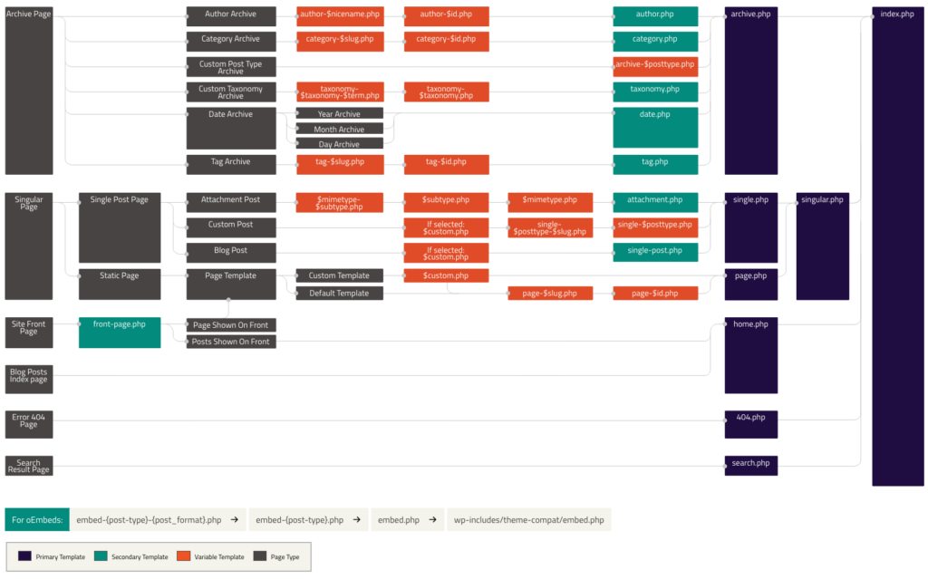
Understanding and using templates is a bit more technical than dealing with themes. If you really want to get a feel for how templates work, you may want to spend some time reading up on the WordPress Template Hierarchy. This system assigns a priority level to each type of template so that your WordPress site always knows which one to display.
We won’t go into too much detail about this concept right now since we’ll first be focusing specifically on page templates. Let’s start by exploring why you might want to use templates in the first place.
The Benefits of Using Page Templates
By now, you should have some idea of why page templates are so useful. They provide a lot more control over your site’s look and layout than you can usually get by modifying your theme. The applications for page templates are numerous — the only limit is your own creativity.
To give you a sense of the importance of this feature, however, here are a few examples of situations in which you might want to use a page template:
- If you want a particular page to have a full-width layout while keeping a fixed-width design for the other pages.
- To create a custom page that uses widgets not displayed on other pages.
- For displaying recommended posts to readers that are relevant to the specific content they’re browsing.
- To build a page with a unique set of features, such as a contributor or archives page.
At the end of this post, we’ll show you how to do each of these things. Once you’ve started experimenting with page templates and getting a feel for how they work, you’ll be able to do whatever you’d like with them.
An Introduction to Full Site Editing With Templates and Template Parts
Using Full-Site Editing, you can design the layout of your website with blocks. You probably already use blocks to create WordPress posts. Now, they can build your entire site, including non-content areas.
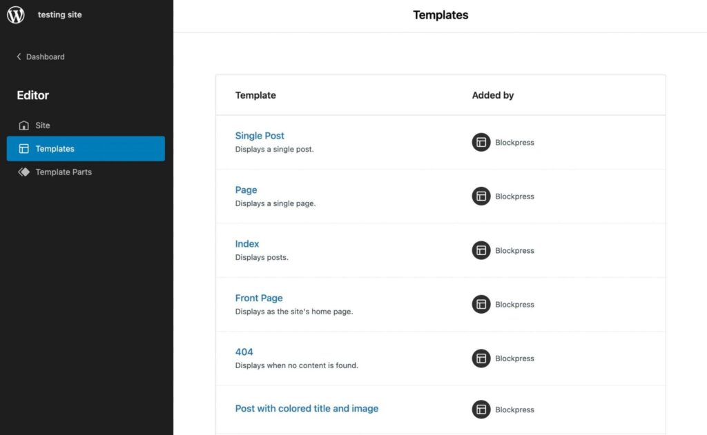
One advantage of Full-Site Editing is its page templates. They allow you to easily see and customize your templates without having to edit your theme files manually:
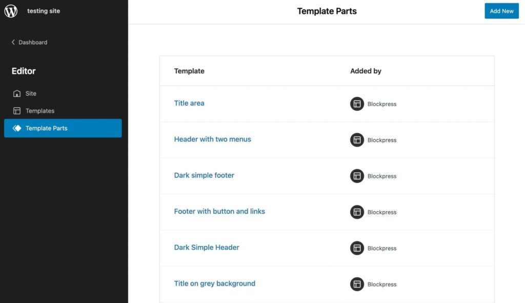
In WordPress, there are also template parts, which function as smaller structural sections of a page template. You will usually see template parts for headers or footers:
Using a template, you can build pages with unique features. For instance, you might not want your home page to have the same layout as the rest of your content. Therefore, you can achieve a unique design with a page template.
Furthermore, you can save time during the design process by reusing templates and template parts. By simply clicking on a template or individual element, you can implement it instantly.
How to Make Templates in WordPress with the Template Editor
If you’re using a block theme, it comes with the Template Editor. Using this feature, you can create and edit templates for any page or post on your website. It works similarly to the Block Editor, enabling you to customize your theme with blocks.
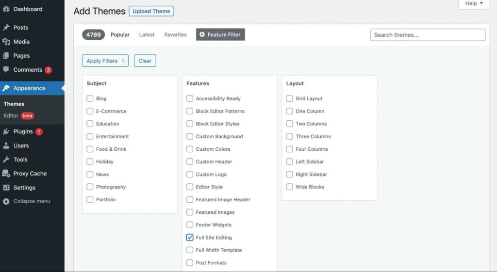
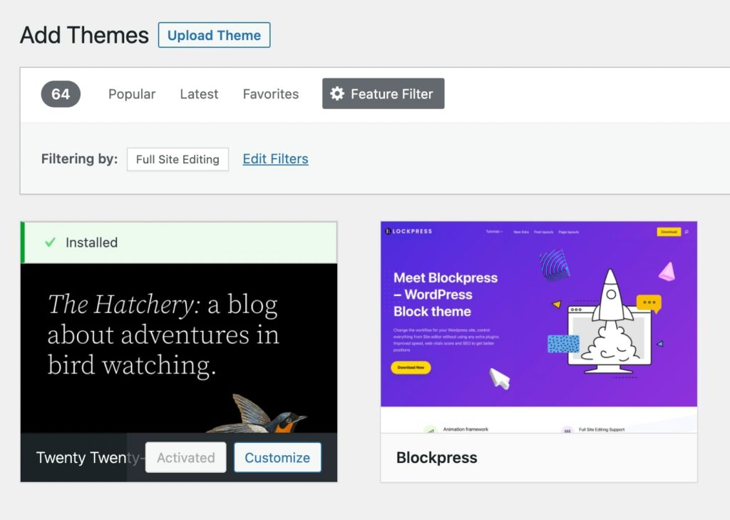
To get started, you’ll need to install a block theme. In your WordPress dashboard, navigate to Appearance > Themes > Add New. Then, filter the results with a Full Site Editing tag:
Select Apply Filters. In the search results, install and activate a theme. We’ll be using the default Twenty Twenty-Two theme for this tutorial:
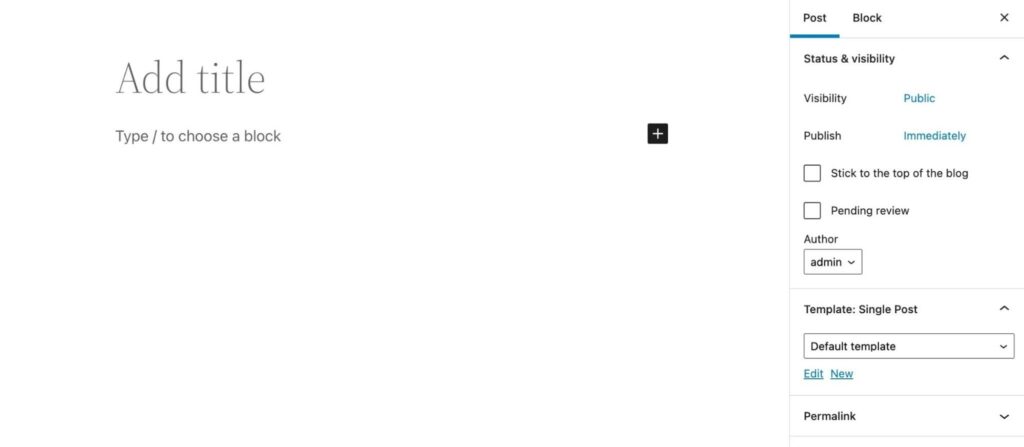
To create a new template, start by adding a new post or page. Then, in the Post settings tab, find the Template section and select the New button:
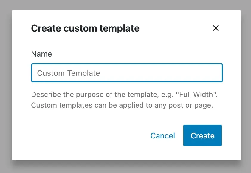
In the pop-up window, give your new template a name. Then, select Create:
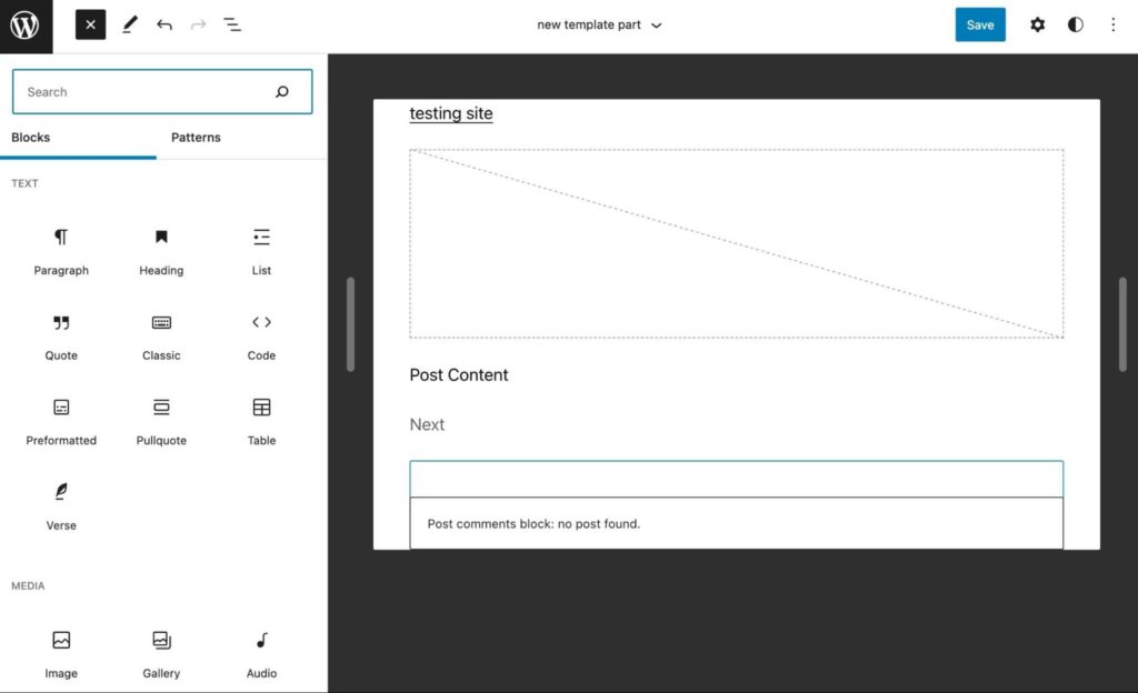
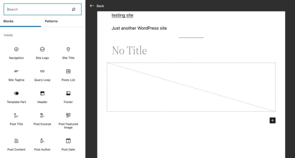
This will automatically open the Template Editor. You can design your template using the same blocks you’d use in a post. However, it’s important to note that these blocks will be added to every post with this template:
You can also insert blocks related to your theme. By scrolling down to the Theme section of the block options, you can display a logo, tagline, post comments, and more:
When you finish customizing your template, click on Publish. Then, whenever you want to assign a post or page to that template, simply select it in the settings tab.
How to Create Template Parts in WordPress with the Site Editor
With a block theme, you can edit templates with the Site Editor. You can edit your theme directly rather than making a new post or page.
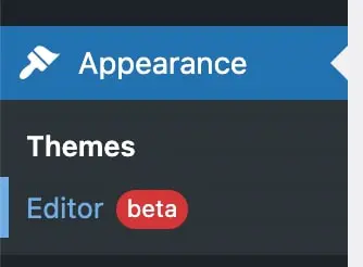
First, go to your dashboard. Then, select Appearance > Editor (beta):
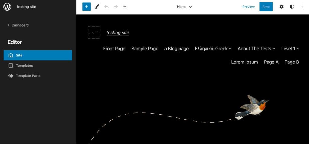
This will open the Site Editor. To find your theme’s templates and template parts, click on the WordPress icon in the upper left corner:
After selecting Template Parts, you’ll see a list of default options. To add a new template part, click on the Add New button:
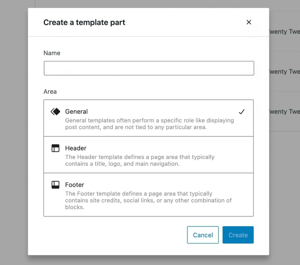
Then, create a name for your template part and choose where to place it. The three placement areas are General, Header, and Footer:
When you’re done, select Create. This will take you to the isolated template part, which you can customize by adding blocks:

You could display a simple call to action, website logo, or anything you might want to reuse as a template part. Once it’s saved, you can add it to any template by simply inserting the Template Part block.
How to Create Custom Templates and Template Parts in WordPress (Manual Coding)
Although Full-Site Editing enables you to create templates and template parts for an existing theme, you might want to develop your theme. In addition, this option can give you more control over the appearance of your website.
If you’re building your new theme from an existing one, we recommend creating a child theme. This step ensures that new updates on the parent theme won’t override your customizations.
Step 1: Add a Configuration File
With previous PHP-based themes, you could edit the header of your template file. However, to create custom content in a block-based theme, you’ll need to create a new theme.json file.
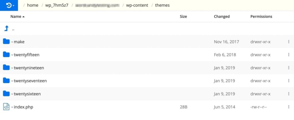
You’ll first need to access your site via Secure File Transfer Protocol (SFTP) or your hosting provider’s site manager dashboard. Then, look for the themes folder, which should be under wp-content:
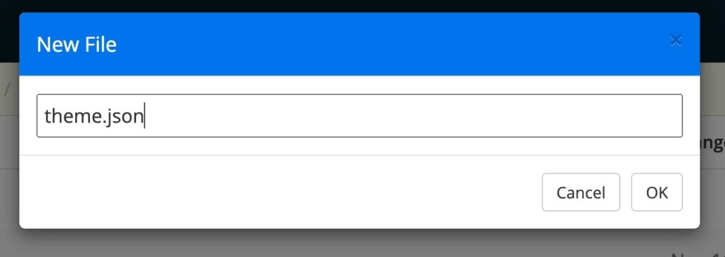
In your child theme folder, create a new file. Label it “theme.json”:
In this file, include the version number within curly brackets. If you don’t add this, it will be read as “version 0”:
{
    "version": 2
}
You’ll have to configure this theme.json file to support the width of your content. After your version number, copy and paste this extra code:
{
        "version": 2,
"settings": {
"layout": {
"contentSize": "840px",
"wideSize": "1100px"
 }
 }
}
This will set your content width to 840px. The wide width will also be updated to 1100px. These values match the default widths in the Site Editor, but you can edit them as needed.
Since the content width is now 840px, it will provide a lot of space for each line of characters. Depending on your chosen font and size, you might need to adjust it so that viewers can comfortably read your content.
Step 2: Create New Template Parts
Then, go back to your themes folder and open the templates folder:
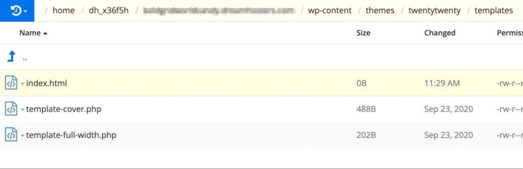
Here, create an index.html file:
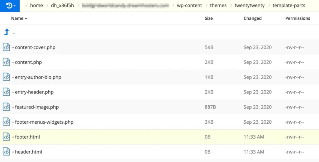
Return to your theme folder and click on template-parts. Inside this folder, create files for footer.html and header.html:
Inside the header.html file, add code for your site title and tagline blocks. You can do this by including this block markup:
<!-- wp:site-title /-->
<!-- wp:site-tagline /-->
Next, go to the footer.html file and paste the following code:
<!-- wp:paragraph {"align":"center"} -->
<p class="has-text-align-center">Proudly powered by
<a href="https://wordpress.org/">WordPress</a>.</p>
<!-- /wp:paragraph /—->
Once you add these template parts, they can easily be identified when you’re ready to test your theme.
Step 3: Combine the Template Parts
The next step is to place block markup for your template parts into your template HTML file. Open the templates folder and find the index.html file you created in the last step.
Then, you’ll need to add code for your two template parts:
<!-- wp:template-part {"slug":"header"} /-->
<!-- wp:template-part {"slug":"footer"} /—->
Based on the name of the template part file, this name will become the slug. For example, the header.html template part will have “header” as its slug.
Next, add the correct HTML element for each template part. They will identify the location of the template part:
"tagName":"header"
"tagName":"footer"
If you plan on using CSS to identify this header and footer, you’ll need to add a custom CSS class name. You can place this code at the end of each line:
"className":"site-header"
"className":"site-footer"
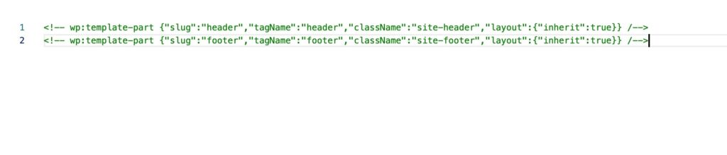
Lastly, the layout setting you inserted into the theme.json file needs to be supported. To do this, add this code to each template part:
"layout":{"inherit":true} Here’s what the resulting code should look like:
Once you’ve finished coding, you can preview your site to view these changes to your layout.
Ready to Create Your Own Custom Templates?
If you want to streamline your website design process, it’s a good idea to use Full-Site Editing. You can easily customize your site’s appearance with templates and template parts using this feature. This approach can be a simpler alternative than completely redesigning every page from scratch.
To review, here are the different ways you can create templates and template parts in WordPress:
- Make a new template with the Template Editor.
- Create template parts with the Site Editor.
- Manually code templates and template parts.
Coding your own theme can be tricky, especially if you don’t have experience with web development. If you need to customize your layout from scratch, you might want to hire a professional designer. With our Custom Web Design Pro Service, you can avoid this complicated coding process and get a high-quality website designed for your brand!

Get a Custom Website You’re Proud Of
Our designers will create a gorgeous website from scratch to perfectly match your brand.
Learn More