
So, you’re a consultant. Or a freelancer. A small business owner? Or maybe just an expert in your field.
However you define yourself, one thing’s for certain: you know your stuff. And you probably want other people to recognize that.
A resume website (sometimes called a CV website or online resume) is a personal website that presents your work history, skills, and proof of results as easy-to-browse web pages — typically a short intro, a detailed resume or CV section, work samples, and a clear way to contact you, plus a downloadable PDF of your traditional resume. Unlike that PDF, it gives you a persistent page to share and can appear when someone searches your name.
Ready to build one? This is your chance to show off your track record in the most elegant way possible. Get it right, and you can help potential clients and employers understand what you offer.
The tricky part is to figure out exactly what to include and how to present your professional history. In this post, we’ll look at the key ingredients, walk through 10 real-world examples, and show you how to build your own.
How a Great Resume Site Can Open Doors
A traditional resume is simply a (carefully curated) list of your work experience and achievements. Your online presence can be way more than that.
A well-made resume website is the foundation of your personal brand.
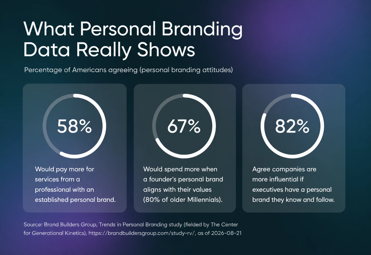
That might sound like something a Kardashian-wannabe would say, but the numbers back it up. Brand Builders Group’s Trends in Personal Branding study, a national research study fielded by The Center for Generational Kinetics, found that:
- 58% of Americans would be willing to pay more to receive services from a professional who doesn’t work at a large company but has an established personal brand.
- 67% of Americans (and 80% of older Millennials) would be willing to spend more on products and services from companies whose founder’s personal brand aligns with their own values.
- 82% of Americans agree that companies are more influential if their executives have a personal brand they know and follow.
In other words, this stuff is pretty important.
The Recipe for a Strong Resume Website
Any old resume site is usually better than none. At least you’re not invisible.
But if you really want to feel the benefits, your site needs to impress visitors. Blow their socks off. Give ’em the razzle dazzle.
Not sure where to start? Here are the seven key ingredients for a strong resume site.
- Start with a short, punchy introduction. Use 1–2 sentences to highlight what makes you unique and which clients or roles you’re targeting.
- Sprinkle in some strategic lingo. Align your language to clients in your target field or the job postings you’re aiming for. It’s good for search, and gives you instant credibility with potential employers and clients.
- Focus on outcomes and social proof. People love to see how you’ve overcome challenges and hit big numbers. Don’t have anything tangible? Throw in some quotes from happy clients and coworkers.
- Break up the wall of text. Unless you’re an astronaut or a spy gone rogue, your work history probably isn’t that interesting. Use clearly marked sections to make your resume easy to scan.
- Make it pretty. You can turn your resume into eye candy with photos, colors, and a layout that guides the eye down the page.
- Add some interactive content. Clickable features and embedded media (e.g., social posts) can make your professional resume much more engaging.
- Include some solid calls to action (CTAs). What would you like visitors to do after checking out your resume? Whether it’s booking a call, sending you a message, or taking a look at your work, make it obvious and easy.
10 Standout Resume Websites (And Why They Rock)
You now know the key components of a great online resume, but how do you put it all together? Sometimes, it’s easiest to walk in someone else’s footprints.
Here are ten inspiring resume website examples that stand out for all the right reasons.
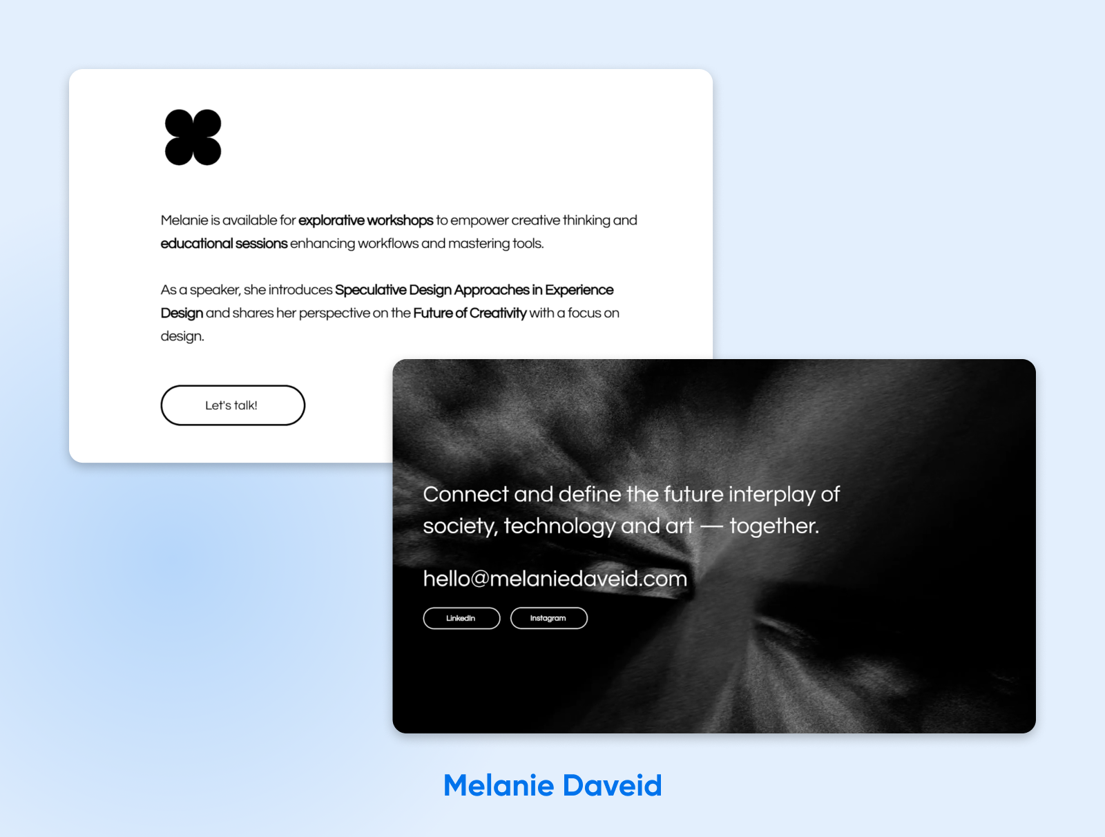
1. Melanie Daveid (Experience Designer & Artist)
Let’s start with something bold. Melanie’s site comes out swinging, with a strong monochrome theme and impressive content. It immediately grabs your attention.
Key features:
- Instant clarity with a pared-back header: The first screen’s statement, “Experience Design — with a rich synthesis of digital ecosystems, physical products and emerging technologies,” tells visitors exactly what Melanie does in one line.
- Career history presented on the page: The site highlights stops including Nothing, eBay, Onefootball, and Adobe alongside quotes, so visitors can browse key parts of Melanie’s experience without first opening a separate resume file.
- Multiple contact cues: An email link at the top, a friendly mid-page “Let’s talk!” button, and prominent email and LinkedIn links in the footer encourage visitors to reach out.
2. Erik Kindel (Freelance Writer)
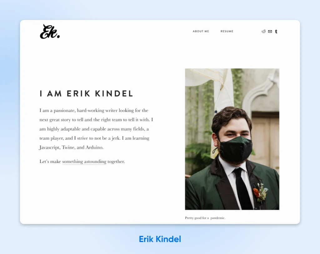
Everything about Erik’s site is subtle, but that doesn’t mean it’s boring. The front page doesn’t leave you guessing, and you can explore more via navigation.
Key features:
- A landing screen with plenty of personality: Erik greets visitors with a wink (“Will work on contingency? No, money down!”) before a direct, conversational introduction: he’s “a passionate, hard-working writer looking for the next great story to tell.” In two lines, you get both his wit and his pitch.
- Three-part navigation with zero clutter: About Me, Resume, Portfolio. That’s the whole menu, so visitors are never more than one click away from the thing they came for.
- Frictionless contact: Erik’s email address sits right on the page — no forms to fill out, no gatekeeping.
Quick Tip: If you link to social media from your resume site and later change usernames, update them on your website as well. You don’t want people excited to look at your socials, just to be met with a “No Longer Available” message.
3. Allison M. Driscoll (Digital Marketing Strategist)
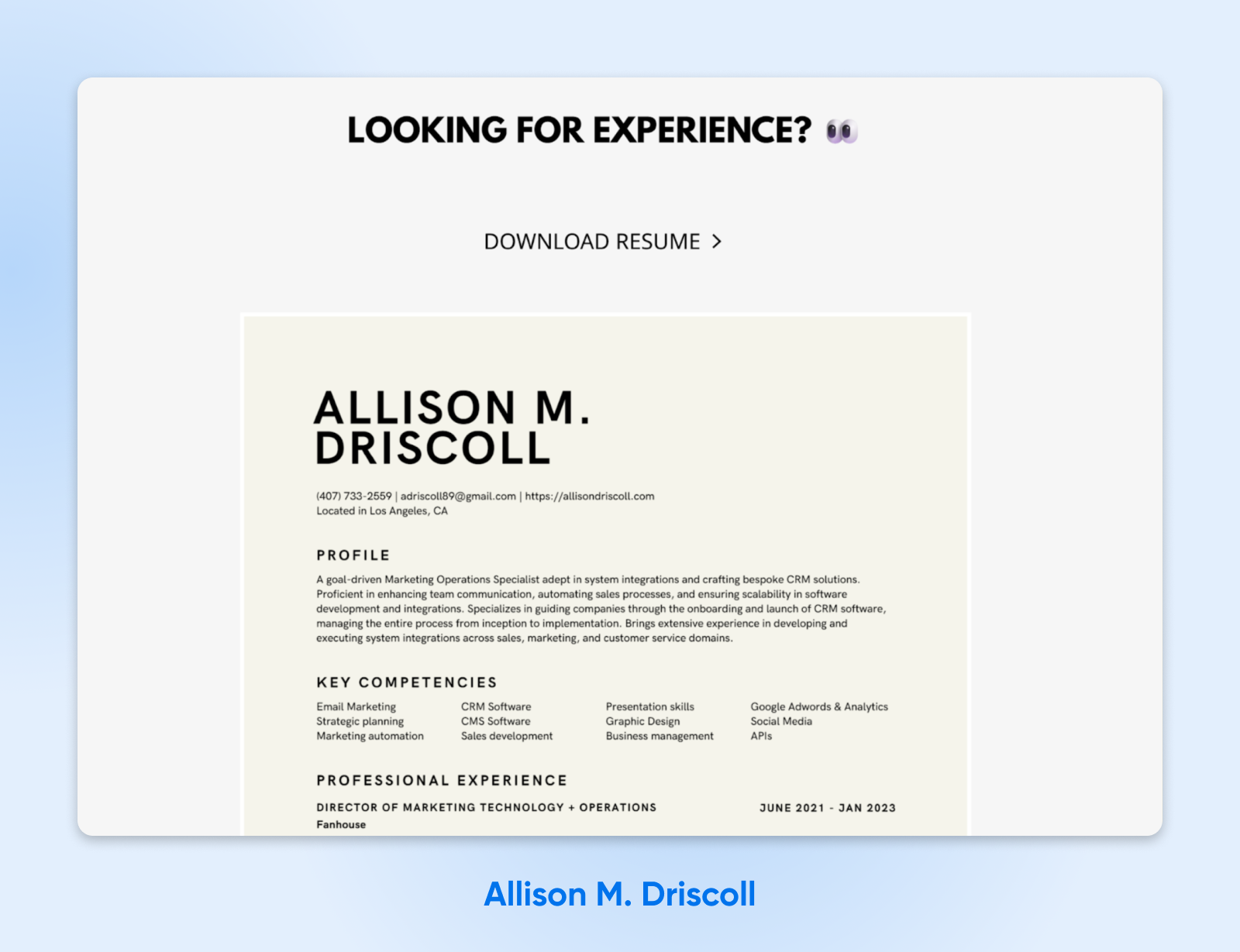
Don’t let that friendly landing-page smile fool you — Allison means business. Her site features some laser-guided messaging that we can all learn from.
Key features:
- Outcome-oriented language over fluffy adjectives: Instead of throwing around generic claims, Allison talks about concrete benefits like “enhancing team communication” and “automating sales processes.”
- Digital resume supplemented by the original: If you decide Allison is the person you want to work with, you can download her full resume with a click — perfect for taking to your boss for approval!
Quick Tip: Some website builders will include advertising links on your website by default. They may show up in the footer, or as a pop-up at the top of the page. We recommend using a website builder that will avoid adding those extra links (like WordPress!)
4. Emily Sullivan (Actor, Singer, and Writer)
Even if you’re not an aspiring star, you can learn something from Emily Sullivan’s site. It’s a great example of how to structure an online resume.
Key features:
- Establishes credibility with a wall of critical praise: After a quick intro, we’re immediately hit with quotes from directors and reviewers. This social proof leaves no doubt that Emily can deliver.
- Instant access to essentials: After introducing herself, Emily provides links to the key items her target audience (casting directors) is looking for: her reel, headshot, and full resume.
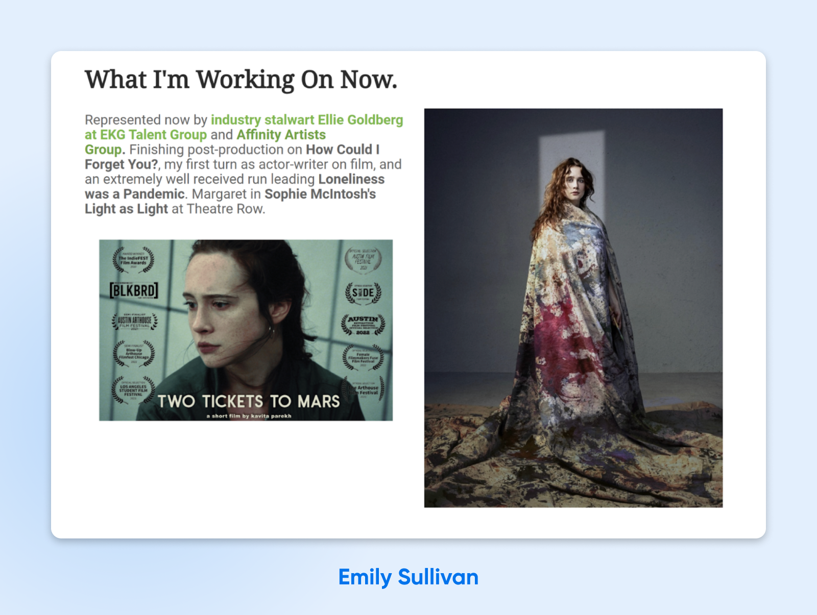
- A ‘What I’m Working On Now’ section: This dedicated section lets visitors see the projects Emily currently highlights.
5. Nathan Barry (Tech Entrepreneur and CEO)
As the founder of Kit — “the operating system for creators who mean business,” as his site puts it — Nathan Barry doesn’t need anyone’s approval. Regardless, the landing page of his website is a kind of resume, aimed at engaging visitors and guiding them toward his projects.
Key features:
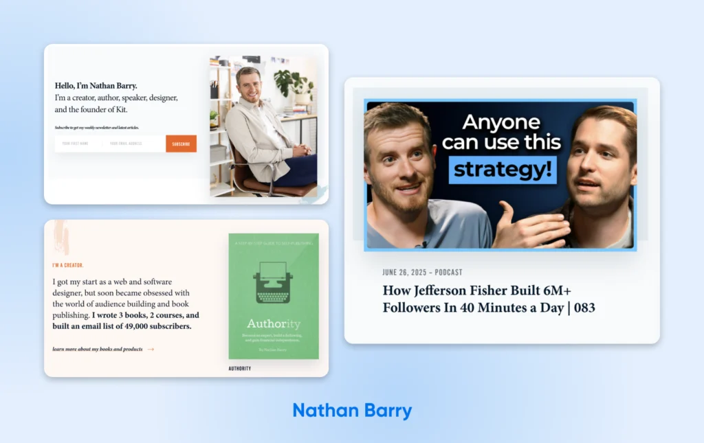
- Friendly yet direct introduction: In two short headlines, we learn who Nathan is and what he does. The generous font size makes this introduction very scannable.
- Each role has its own section: Rather than using a timeline, Nathan splits his work history into different roles. In separate sections, we learn about his past as a product designer, his work as a content creator and author, and his success in founding Kit.
- Numbers that do the bragging for him: The Kit section stacks up stats — 50,000+ creators, “100% bootstrapped,” “$45M+ annual recurring revenue” — a masterclass in letting outcomes speak.
- Many ways to engage: From this one page, you can sign up for his newsletter, check out his books, and browse his latest podcast episodes.
6. Maddie Harris (Senior UX Designer)
You don’t need a lot of content to make a visually appealing resume, and you certainly don’t need flashy web design. As Maddie Harris proves with her site, it’s more about being thoughtful with what you include.
Key features:
- A clear “who I am and what I do” hero: When the page loads, the first thing you see is Maddie’s name, her role, and a concise, value-oriented tagline. In five seconds, visitors know exactly who she is and why they should keep scrolling.
- A friction-free overview or click for more detail: The menu lets you jump to anchored sections (About, Skills, Projects, Contact), and the “See Resume” button provides one-click access to her full resume.
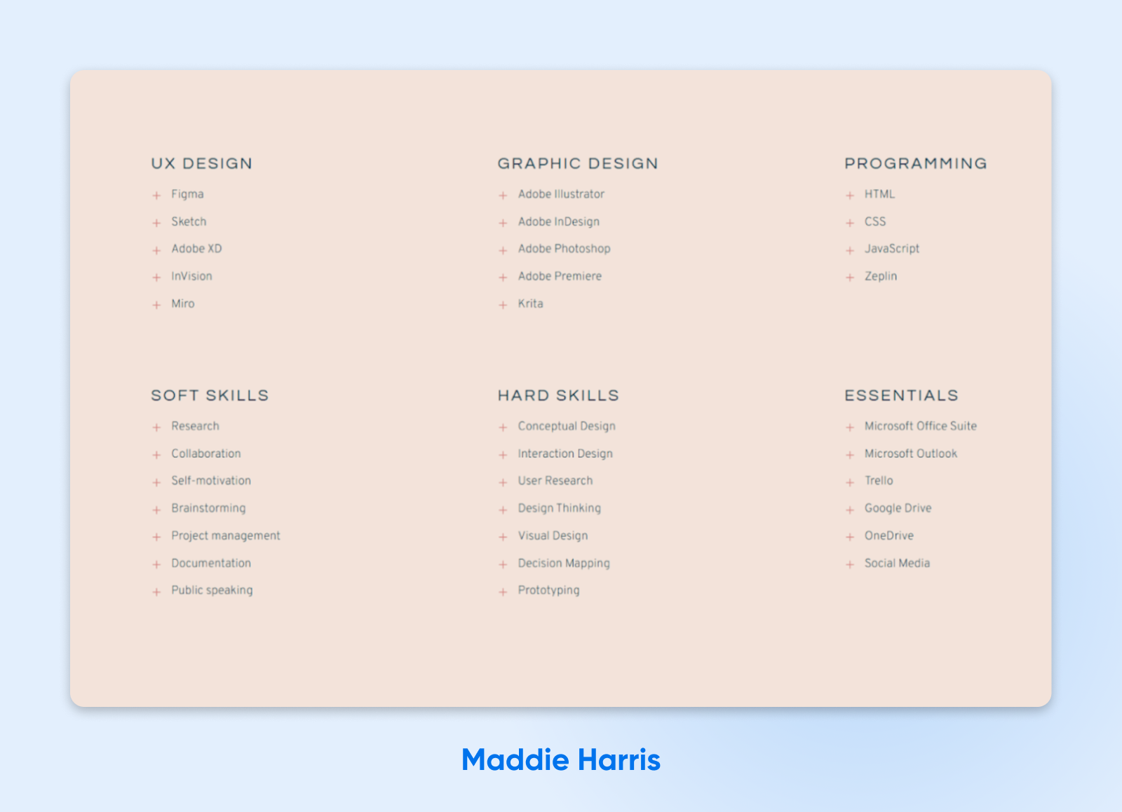
- Credibility at a glance: The skill matrix shows what Maddie can do, and her project gallery — including a 100-day daily UI design challenge — proves she puts those skills to work.
7. Derek Sivers (Music Entrepreneur and Public Speaker)
You might be surprised by how much you can leave out of your visual resume. Derek Sivers strips his down to short lists and one-line summaries — and it works.
Key features:
- Radically concise introduction: The “Me in 10 Seconds” section sums Derek up in four words (“Xenophile, programmer, netizen, and conversationalist”), then compresses a hugely varied career — musician, entrepreneur, author, and speaker — into a handful of dated one-liners. Instantly, we know what this guy is about.
- Navigation that offers depth on demand: Want more? “Me in 10 minutes” lives on his About page, and a “what I’m doing now” page keeps things current. This keeps his resume super clean and easy to scan.
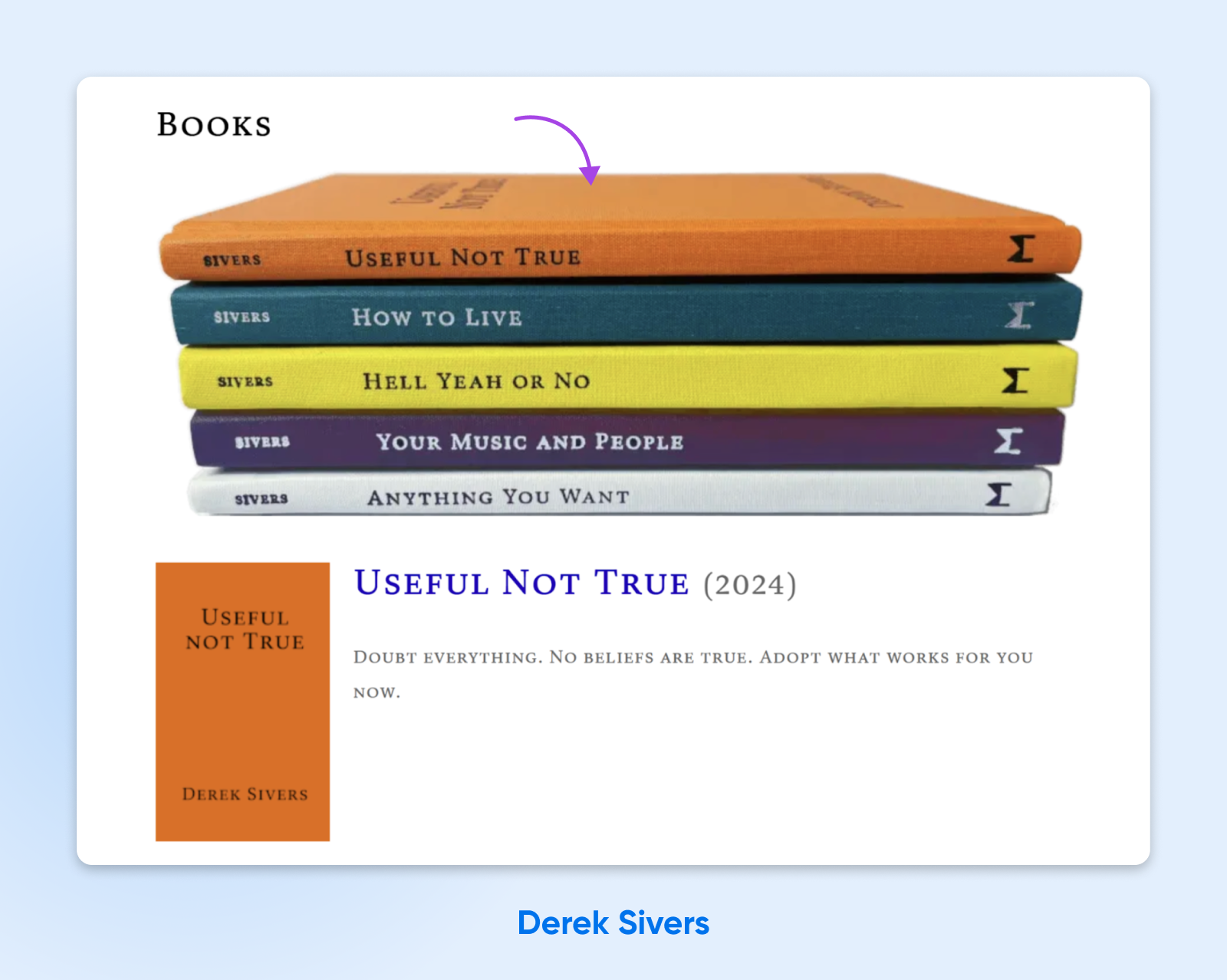
- Social proof in a fun, virtual bookshelf: It’s only a simple image, but that stack of books at the bottom of the page is actually a great addition. It informs us about Derek’s written work, displays his expertise, and gives us a way to engage with his personal brand.
8. Dr. Vicki McIntosh (Doctor and Medical Business Owner)
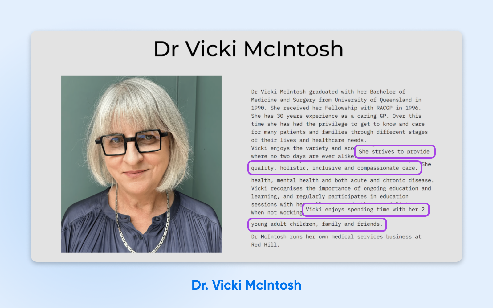
You won’t find a more stripped-back resume than that belonging to Dr Vicki McIntosh. Yet this simple page is impactful, thanks to concise writing and clear navigation.
Key features:
- Leading with credentials to create authority: Her medical degree, Royal Australian College of General Practitioners (RACGP) fellowship, and 30 years of experience as a caring GP all appear in the first few lines. Prospective patients are sure to be impressed.
- Simple contact hub: Physical address, phone, and an embedded message form sit together, so visitors can choose their preferred channel without a lengthy search.
- Blending personal with professional for a human touch: A glimpse of life away from work (time with her two young adult children, family, and friends) and a friendly portrait make the site feel personal, not clinical.
9. Daniel G. Siegel (Tech Consultant)
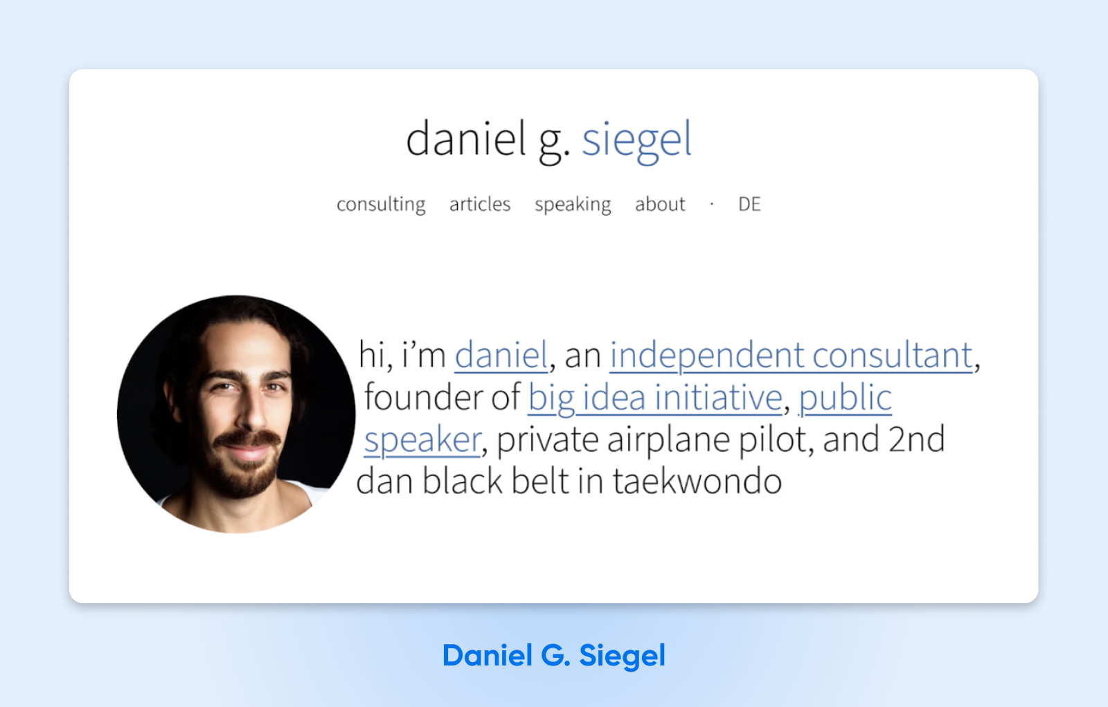
There’s a lot to like about Daniel G. Siegel’s website resume. It highlights the three main pillars of his professional life, with a format that’s very easy to digest. Impressive stuff.
Key features:
- An introduction that doubles as navigation: The one-line opening statement includes multiple links, each providing quick access to further information. This allows potential clients to go straight to relevant content.
- “Good consulting, good ideas, good talks.” Daniel introduces his services in clear, concise terms and shows how they connect, with a separate block of text explaining each one.
- Friendly profile picture: The small photo of Daniel at the top of the page helps to build an instant connection with clients. It’s putting a face to the message.
10. Diogo Correia (Student Developer)
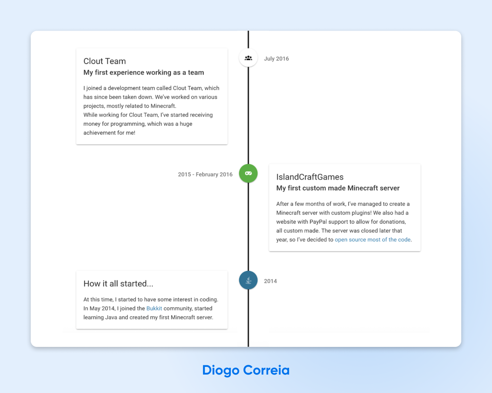
Our final resume example is a beauty. Diogo Correia presents his career as a developer in a timeline format, giving recruiters and clients the chance to explore his story.
Key features:
- A direct hero tagline: “Student, Developer & Runner” positions Diogo in three words. No jargon, no filler.
- So many ways to engage: With nine links to social and code platforms — from GitHub and Strava to email — visitors have plenty of ways to connect with Diogo.
- A pretty timeline: Newest milestones first — his master’s thesis and cybersecurity competitions at the top, earlier projects further down — the timeline lets visitors explore Diogo’s story in order. It’s a great format for anyone whose career is still unfolding.
How To Build Your Own Resume Site (Quickstart Guide)
Okay, you’ve done the homework. It’s time to put that knowledge into action.
Here’s a quickstart guide to making your own resume website and showcasing your professional chops online.
Step 1: Get a Domain and Sign Up for Web Hosting
Before your resume website can go live, you need two things: a domain name and a place for your site to live.
There are endless ways to acquire these, but a DreamHost web hosting plan covers both: every plan includes unlimited free SSL certificates, a free domain for the first year on annual and multi-year terms, and a 3-month free trial of professional email at your domain (yourname@yourname.com looks a lot sharper on an application than an old free-email handle).
For the domain itself, we recommend using your full name followed by .com if it’s available. You can check whether your preferred domain name is free using our domain search tool.
If your preferred choice isn’t available, you can consider adding an extra word or using a less popular Top-Level Domain (TLD). For example, if your name is Joe Smith, but the domain name joesmith.com is not available, you could consider options such as:
- Joesmithresume.com
- Hirejoesmith.com
- Joesmith.co
You get the idea!
Step 2: Build Your Site in Minutes With Remixer
Next, it’s time to actually build your resume website. One quick option is Remixer, DreamHost’s AI website builder. It’s free to try for 30 days — no credit card or domain required — with your trial site previewing on a remixer.ai subdomain until you’re ready to publish.
Describe what you need in your own words, and Remixer generates a complete website — the average is two to three minutes.
Prefer WordPress? Every DreamHost web hosting plan includes a free handcrafted starter website — a 4-page WordPress site set up by our team, not a bot, at no extra cost.
Step 3: Create Your Resume Website Pages
When you describe your site, tell Remixer which pages you want to include. We would recommend these:
- Homepage: offers a brief overview of who you are (think of it as your cover letter).
- Resume/CV: gives a more detailed CV, complete with details about your education, past employment, and so on.
- References: includes testimonials or a note that references are available on request. Publish a reference’s contact details only with their explicit permission.
- Portfolio: houses samples of your work that you want to share with a potential employer.
- Contact form: which includes information about how to contact you.
Building on WordPress instead? You can add new pages via your WordPress dashboard.
Step 4: Fill Your Pages With Content
Next, add relevant content to your professional resume website. Remixer drafts your pages as it builds, and you can rework any section just by asking. (Building on WordPress? The block editor’s pattern library makes it easy to insert standard, predesigned sections with one click.)
Here are a few things to include:
- A professional photo
- Your bio
- A downloadable PDF of your existing resume
- Examples of your work
- Testimonials and references
- Links to your social media profiles
- A contact form
Remember: short and sweet is much better than long and boring.
Step 5: Launch Your Site and Track Performance
Finally, it’s time to launch your website. Make sure you’re happy with the content of each page, and hit that Publish button. (On Remixer, this is the point where you choose a plan and connect your domain.)
Once you’ve launched your website, be sure to hook up Google Search Console and Google Analytics. These tools can track how many clicks your new website is earning and where they are coming from.
You can use this information to refine your content and tweak your design.
Resume Website FAQs
Still weighing it up? Here are quick answers to the questions people ask most about resume websites.
Should I Create a Website for My Resume?
If you’re job hunting, freelancing, or building a client base, yes. A resume website gives you a persistent page that can appear when someone searches your name, and it can hold proof a PDF can’t: work samples, testimonials, embedded media, and a way to contact you on the spot.
How Do I Turn My Resume Into a Website?
Register a domain (ideally yourname.com), pick a builder or WordPress, and give each resume section its own page or block: intro, experience, work samples, and contact. Keep your original resume available as a downloadable PDF for recruiters who still need the document.
Can I Build a Resume Website for Free?
You can start free: Remixer is free for 30 days with no credit card, previewing your site on a remixer.ai subdomain. To publish at a custom domain, though, budget for a plan — yourname.com makes a far better first impression than any builder subdomain.
What Should a Resume Website Include?
At minimum: a 1–2 sentence introduction, your work history and skills, proof of results (numbers, work samples, or testimonials), a professional photo, a downloadable PDF resume, and one clear call to action — a contact form, an email link, or a booking button.
What Is the Best Email Address and Domain for a Resume?
Your own name, at your own domain. Register yourname.com if it’s available, then use a matching address like jane@janesmith.com on your resume and applications. DreamHost Professional Email works with any domain you own — even one registered elsewhere — and every DreamHost web hosting plan includes a free 3-month trial.
What Is the 7-Second Rule for Resumes?
In Ladders’ 2018 eye-tracking study, recruiters spent an average of 7.4 seconds on their initial screening of a traditional resume. The study did not test resume websites, but its result is a useful reminder to keep your downloadable resume scannable with clear headings, short bullets, and your strongest evidence near the top.
Time To Get Noticed Online
You might still need a traditional document for job applications, but a resume website is where you control the story. When a client or recruiter searches your name, your site — not a Word file — is your chance to make the impression.
If you want to make a good impression, remember these key principles when building your resume website:
- Make it clear and punchy.
- Use language tailored to your target audience.
- Focus on real results and social proof.
- Make it easy to digest.
- Don’t be afraid to embed media and interactive content.
- Always include at least one call to action.
If you’re ready to get started, the DreamHost team is here to help. Our DreamHost web hosting plans include everything you need to launch an impressive resume site: unlimited free SSL certificates, a free domain for the first year on annual and multi-year terms, and even a free handcrafted starter website built by our team. Or try Remixer free for 30 days and watch your site build itself.