You’ve written the HTML, your CSS seems just right, and your web page looks great. But something’s missing: everything just sits there.
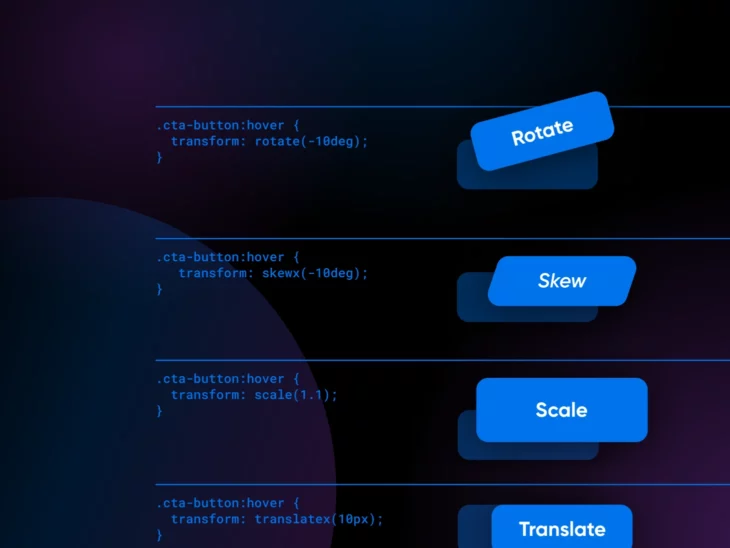
That’s the job of the CSS transform property. It lets you rotate, scale, skew, or translate (move) an element, in 2D or 3D space, without touching your HTML. The image that tilts when you hover over it, the product photo that zooms in for a closer look, the button icon that slides to the right? All CSS transforms working behind the scenes.
It’s one property, but it can completely change how your website feels to use. In this guide, we’ll walk through the 2D and 3D transform functions with copy-paste examples, then cover the two things most tutorials skip: keeping your effects fast, and keeping them accessible.
Understanding the basics of CSS transform
Before jumping into transforms, you need a solid CSS foundation. If selectors and properties are still new to you, start with our guide to learning CSS, then come back.
The syntax is a single declaration: a selector, the transform property, and one or more transform functions. Here’s what adding a simple CSS transform to an element looks like:
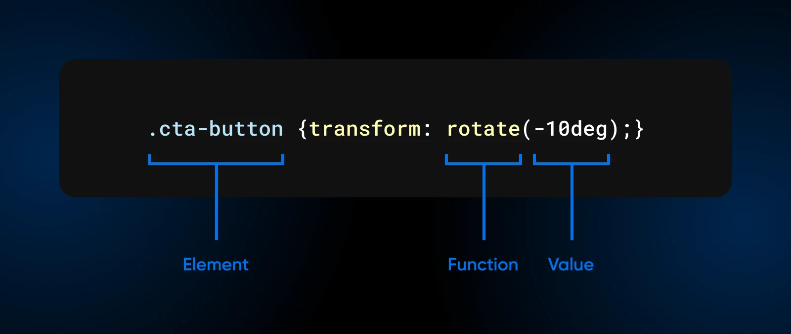
Here:
- .
elementis the selector for the element you’re transforming. function(value)tells you the specific transformation and how much of it you want.
The transform property supports over 20 functions, which can be combined to create complex 2D and 3D transformations. Browser support is broad: MDN’s transform reference marks the property Baseline “Widely available,” supported across browsers since September 2015, and Can I Use puts global browser support for 2D transforms at 96.69% (usage data as of July 2026).
Do you still need -moz-transform or -webkit-transform?
No. Those are vendor prefixes: -moz- is Firefox’s, and -webkit- belongs to WebKit and Chromium browsers like Safari and Chrome. Per MDN, browser vendors used to ship experimental CSS behind prefixes like these, which is why older codebases and old tutorials repeat every declaration three or four times. The unprefixed transform property has been supported across browsers since September 2015, so new code only needs one line:
/* The old, prefixed way you'll see in legacy code */
-moz-transform: rotate(10deg);    /* old Firefox */
-webkit-transform: rotate(10deg); /* old Chrome and Safari */
transform: rotate(10deg);

/* All you need today */
transform: rotate(10deg);
The 2D transform functions: rotate, scale, skew, and translate
2D transforms move and reshape elements on the flat plane of the page: up, down, left, right, bigger, smaller, tilted. Think of it like moving stuff around in real life, but with code. These four functions cover almost every hover effect you’ve admired on someone else’s site.
Rotating elements with rotate()
One of the most common things you can do with CSS transformations is rotate stuff. In a left-to-right layout, a positive angle rotates an element clockwise, and a negative angle rotates it counterclockwise.
Let’s say you have a call-to-action button on your website: Click Me. Here’s how you can use rotate() to make it stand out:
.cta-button {
  transition: transform 0.3s;
}

.cta-button:hover {
  transform: rotate(-10deg);
}
So, what are we doing here?
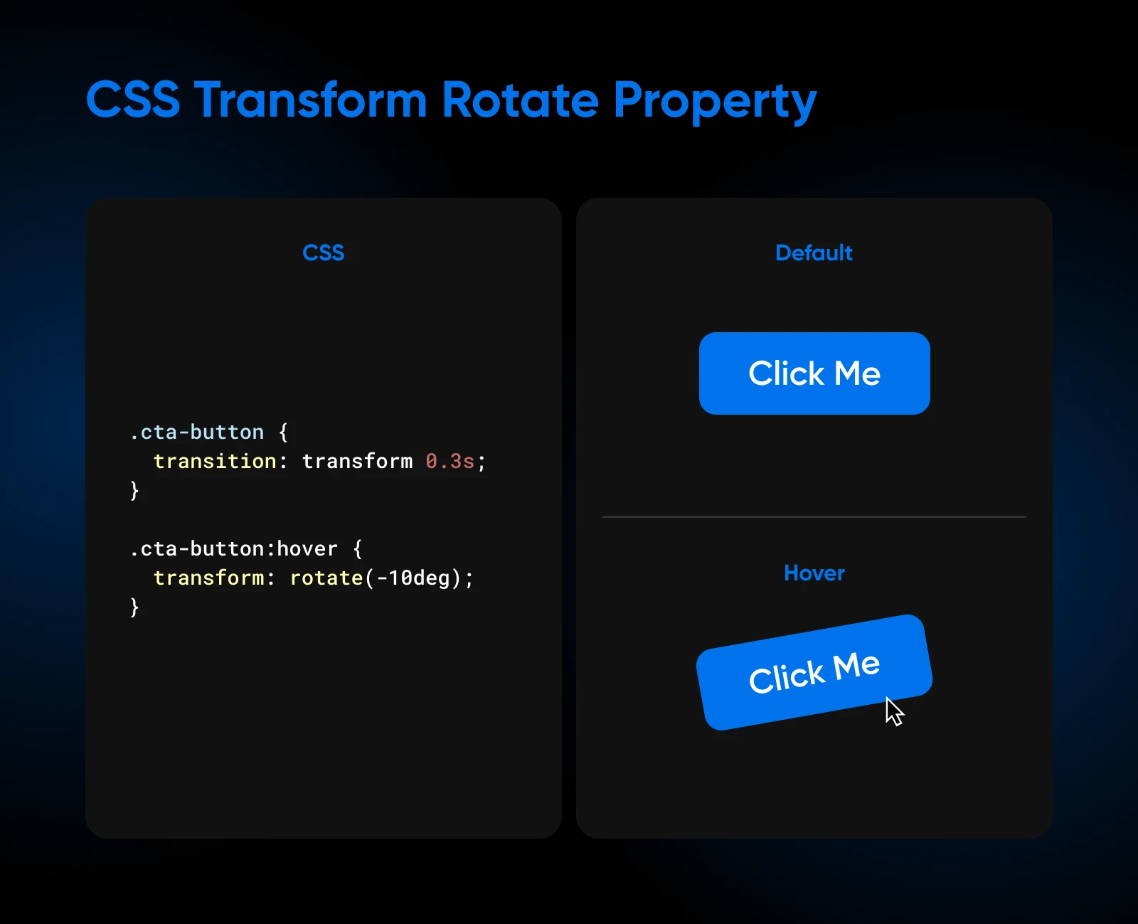
We’ve specified that when someone hovers their mouse over the button, it should rotate by -10 degrees.
The transition of 0.3s specifies how long the change should take. So, instead of snapping to the rotated position in a jerk, the button eases from normal to rotated over a third of a second. You’ll see this transition pairing in every example below; without it, transforms happen instantly.
Scaling elements with scale()
The scale() function resizes an element: values above 1 grow it, values between 0 and 1 shrink it. It’s the standard way to create emphasis and visual hierarchy on hover.
Let’s say you have a few customer testimonials on hand; something you’d like to show off to your website visitors.
Now, we don’t just want them sitting there flatly on the page. With a bit of CSS transform, you can make them pop when a user’s cursor hovers over them.
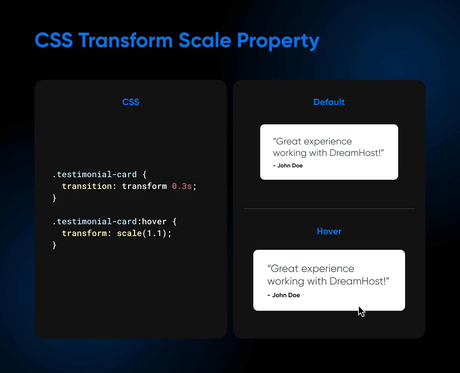
.testimonial-card {
  transition: transform 0.3s;
}

.testimonial-card:hover {
  transform: scale(1.1);
}
What are we doing here?
- First, we’re targeting each testimonial container, which uses the class
testimonial-card. - The
transitionproperty smooths out the scaling effect over 0.3 seconds, so it feels natural. - When a user hovers their mouse over a card, it scales up to 1.1 times its original size.
This little change grabs the user’s eye and makes that particular testimonial stand out. It’s a subtle difference on the page, but certainly a noticeable one.
Skewing elements with skewX() and skewY()
Skewing tilts an element along the X or Y axis, creating a sense of movement without actually moving it anywhere.
Consider a section dedicated to customer testimonials. Here’s how you can use skewX() to make them stand out:
.testimonial {
  transition: transform 0.3s;
}

.testimonial:hover {
  transform: skewX(-10deg);
}
When a user hovers over a testimonial, it’ll subtly tilt along the X-axis by -10 degrees.
This slight skew adds visual interest without being overly distracting. There’s a skewY() for vertical tilts, and skew(x, y) handles both axes at once.
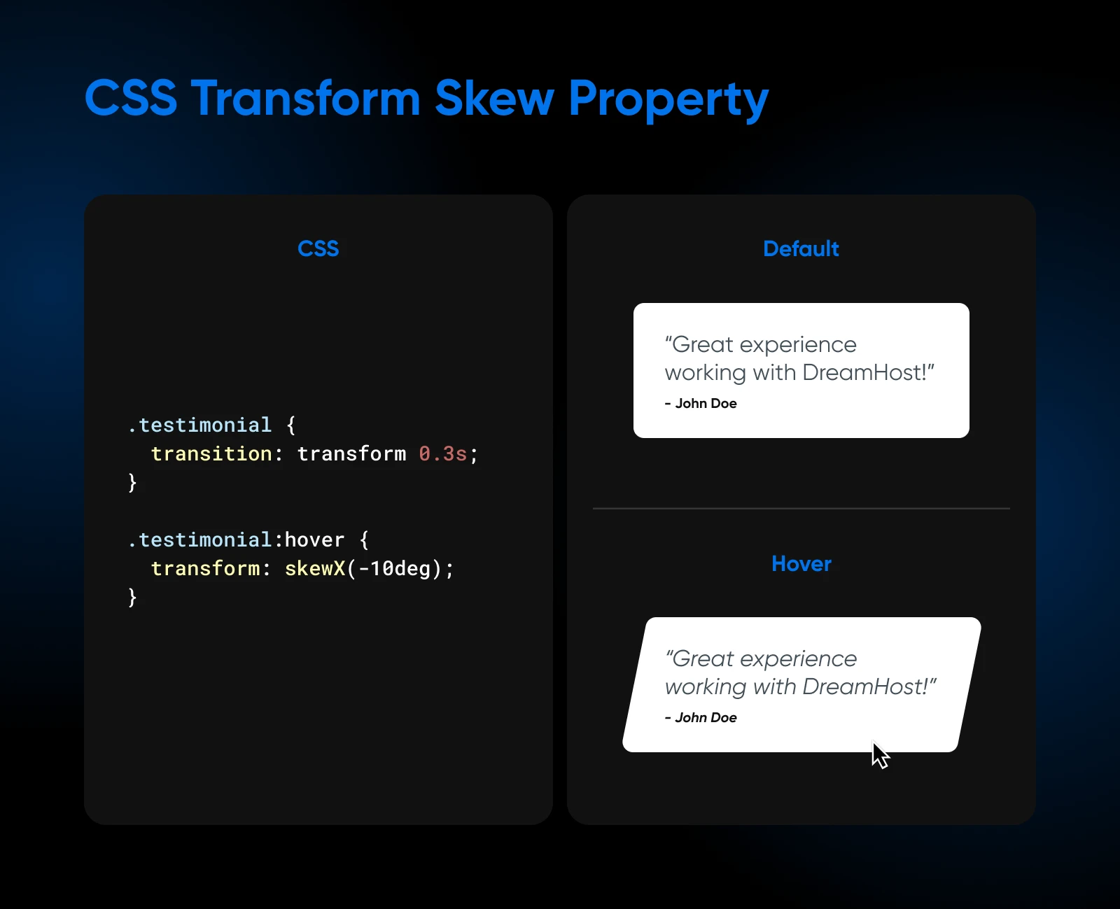
You’ll also notice that we consistently add the transition property specifying the time as 0.3s for the change to complete.
Translating (moving) elements with translate()
Translation means moving an element around the page.
Think of it like this: you’re positioning elements on a grid, and you can shift them along the X, Y, or even Z axis without changing or moving anything else. translateX() moves an element horizontally, translateY() moves it vertically, and translate(x, y) does both in one call.
Say you have a navigation bar on your website. You want it to subtly react when a visitor’s cursor hovers over the menu items.
With translate( ), you can make that happen. Let’s see some code to understand this better:
.menu-item {
  transition: transform 0.2s;
}

.menu-item:hover {
  transform: translateX(10px);
}
What we’ve done here is apply a simple transition effect. Now, when you hover the cursor over a .menu-item, it smoothly moves 10 pixels to the right. Cool, right?
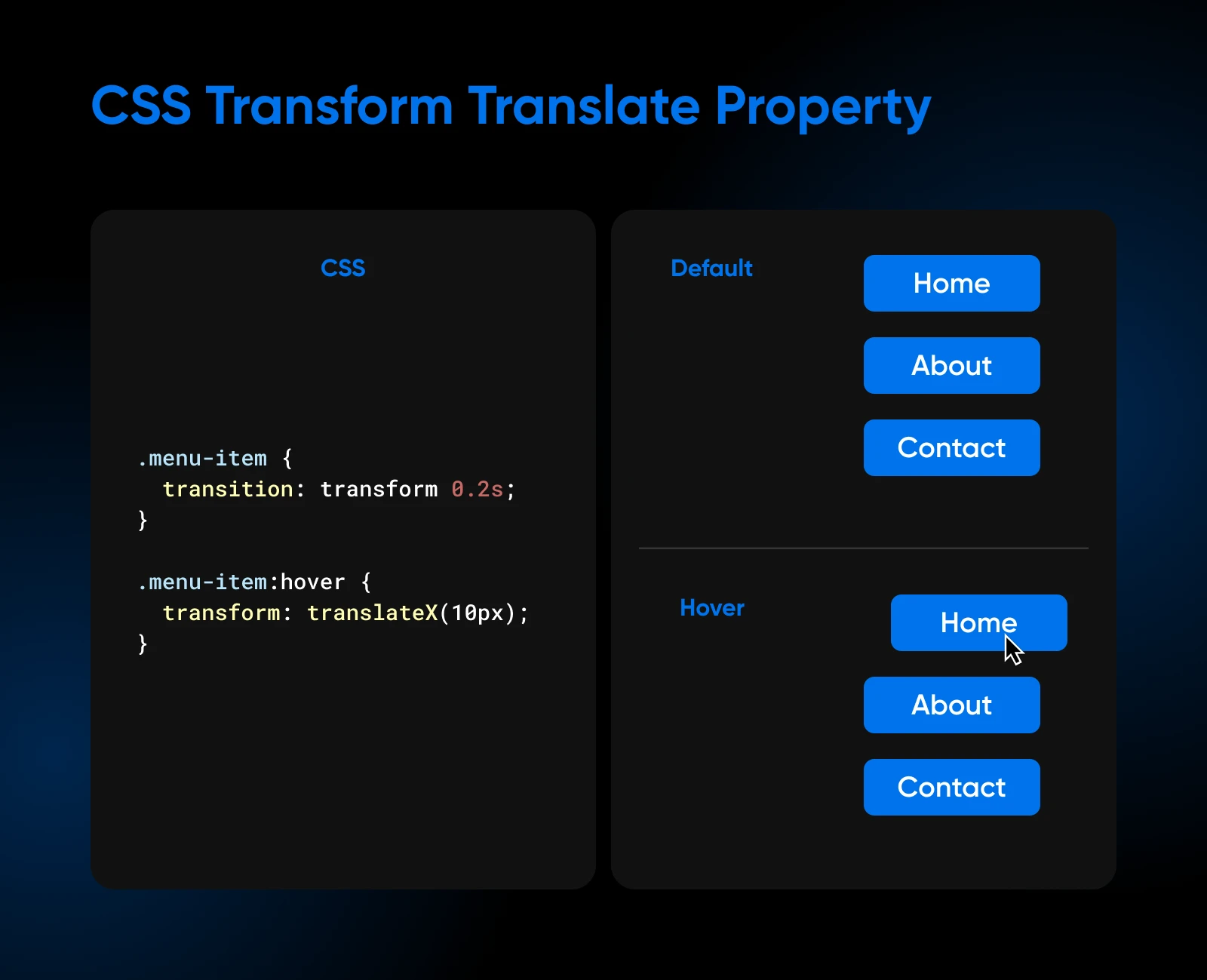
The beauty of translations is that they aren’t limited to hover effects. You can use them to create entrance and exit animations for your website elements, center content (see the FAQ below for the famous translate(-50%, -50%) trick), and much more.
Basics of 3D CSS transformations
We’re now familiar with moving things up, down, left, and right — that’s our typical 2D movement.
However, CSS allows you to step into the world of 3D transformations, where we can manipulate elements along the z-axis: the line running from your screen toward your face.
So, what 3D transformations does CSS offer?
- First, the rotation functions:
rotateX(angle),rotateY(angle), androtateZ(angle). To put this in perspective,rotateZis our spinning wheel,rotateYis a turning page, androtateXis a coin flip. They each control the rotation around their respective axes. translateZ(z)translates, or moves, an element along the z-axis. A positive value moves it toward the viewer, while a negative value pushes it farther away. Think of it as adjusting the zoom on a camera, focusing on different depths.- The
scaleZ(z)function multiplies the z-coordinate of every point in the element. On a flat element it does nothing visible by itself; combine it with another 3D function liketranslateZ(), and it stretches or compresses the depth of the effect.
To give this 3D effect visible depth, set the perspective property on the parent element. The perspective property determines the distance between the viewer and the z=0 plane, affecting how the 3D transformations are perceived.
Let’s add a few more styles, like width, height, and background color to make the transition clearer when you look at it from your screen:
.parent {
  perspective: 500px;
  width: 200px;
  height: 200px;
  margin: 100px auto;
}

.child {
  width: 200px;
  height: 200px;
  background-color: blue;
  transform: rotateY(45deg);
  transition: transform 0.5s;
}

.child:hover {
  transform: rotateY(0deg);
}
Here’s what the HTML would look like:
<body>
  <div class="parent">
    <div class="child"></div>
  </div>
</body>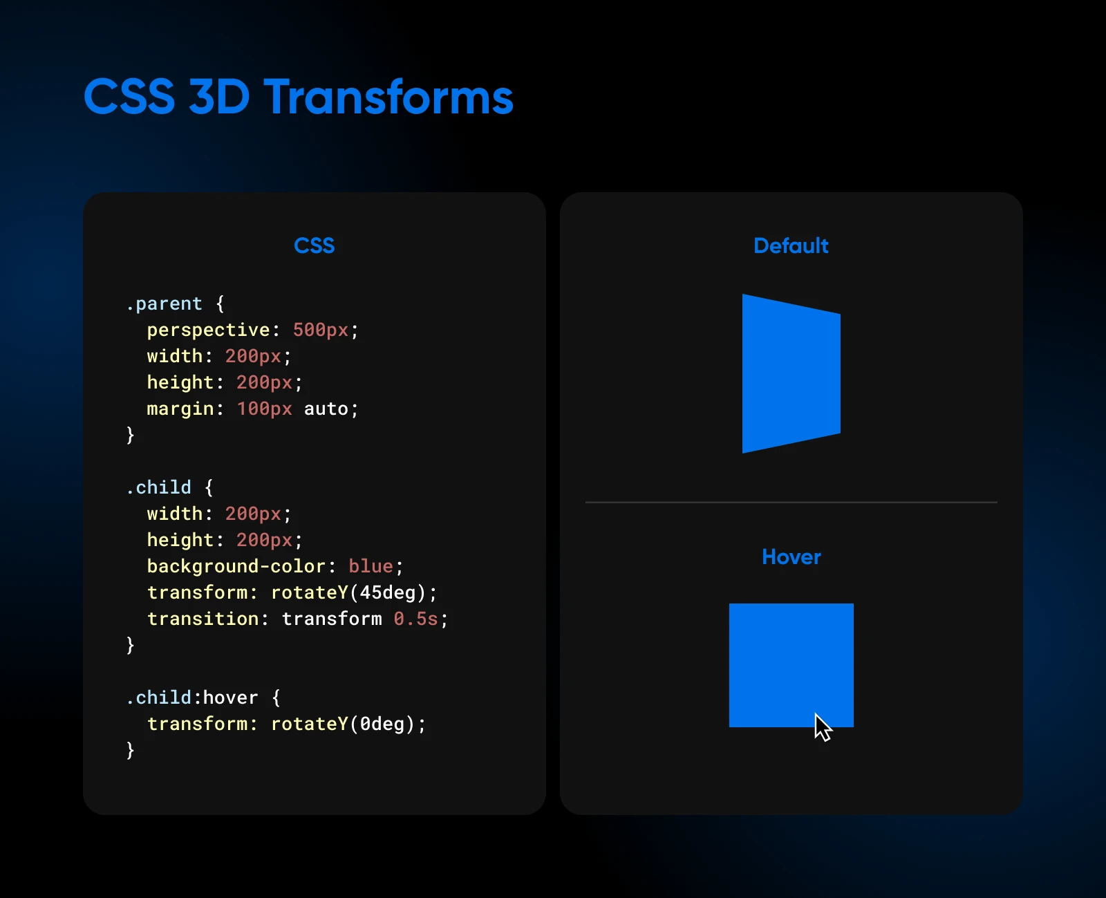
We have two divs, parent and child. The parent, our stage, has its perspective set to 500 pixels. The child, a blue square, is initially rotated 45 degrees along the Y-axis using rotateY(45deg).
On hover, we use transform: rotateY(0deg) to reset the rotation, allowing it to return smoothly to its original position.
Controlling the CSS transform-origin
By default, CSS transformations occur around the center of an element. However, you can change this point of origin using the transform-origin property. This property allows you to specify the X, Y, and Z coordinates of the point around which the transformation should occur.
The syntax for the transform-origin property is as follows:
.element {
transform-origin: x-axis y-axis z-axis;
}
The x-axis and y-axis values can be specified using length units (e.g., pixels), percentages, or keywords (left, center, right, top, or bottom). The z-axis value is only relevant for 3D transformations and must be a length unit — a percentage there makes the declaration invalid.
Here’s an example that demonstrates how changing the transform-origin affects a rotation:
.box {
transform: rotate(45deg);
transform-origin: top left;
}
In this case, the element will rotate 45 degrees around its top-left corner instead of its center.
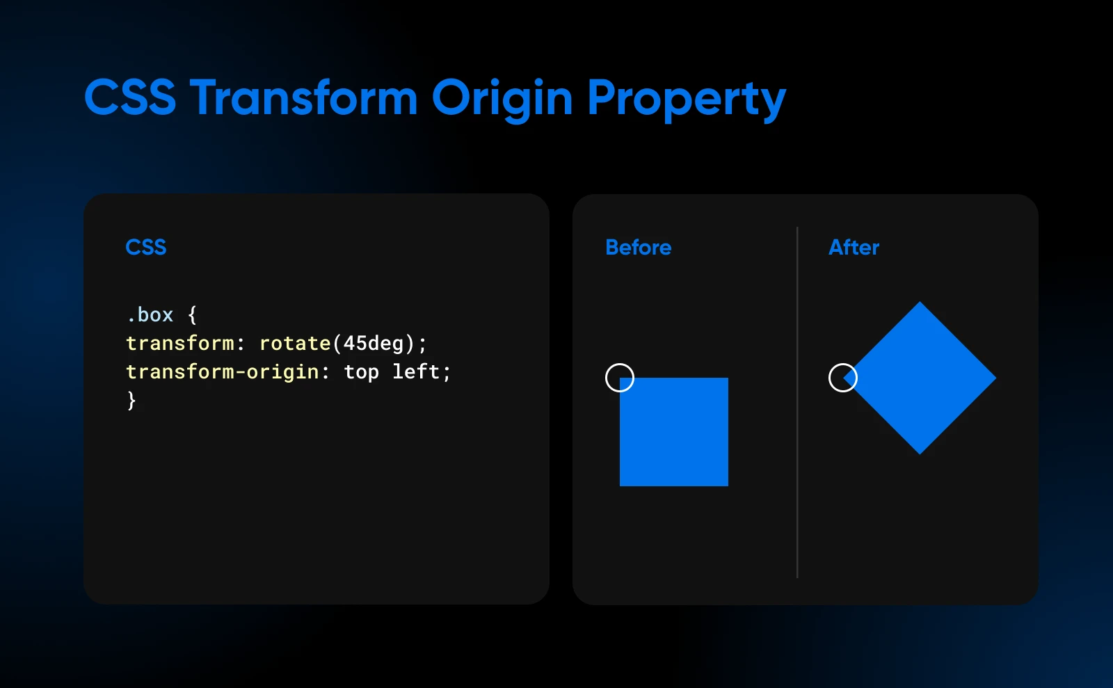
The transform-origin property gives you fine-grained control over how transformations are applied, allowing you to create more precise and visually appealing effects.
Creating complex effects by combining transforms
You can chain multiple transform functions in a single declaration, separated by spaces. This is where the property gets genuinely fun.
Let’s say you have a product card on your e-commerce website. When a user hovers over the card, you want it to scale up, rotate slightly, and lift off the page with a shadow effect:
.product-card {
  transition: transform 0.3s, box-shadow 0.3s;
}

.product-card:hover {
  transform: scale(1.05) rotate(5deg);
  box-shadow: 0 10px 20px rgba(0, 0, 0, 0.2);
}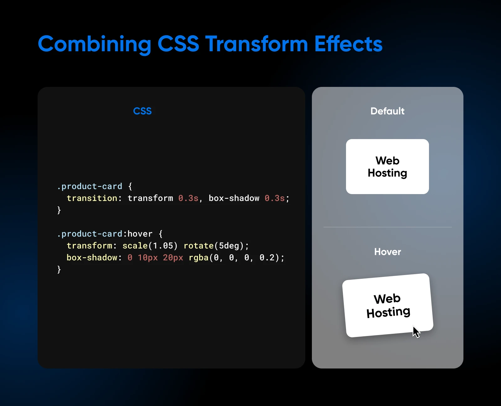
When a user hovers over the product card, it smoothly scales up to 1.05 times its original size, rotates by 5 degrees, and gains a box shadow that creates a lifted effect. The combination of scaling, rotation, and shadow makes the card feel interactive.
One thing to watch: the browser applies transform functions from left to right, so their order changes the result. translateX(200px) rotate(135deg) moves the element and then rotates it in place, while rotate(135deg) translateX(200px) rotates the coordinate space first, so the element travels along the rotated axis and lands somewhere else entirely.
Modern CSS also offers individual translate, rotate, and scale properties that work alongside transform. They let you change one transformation without re-declaring the others; browsers apply them in the order translate, rotate, scale, and finally transform. There’s no individual skew property, so skew() still lives inside transform.
Keeping transforms fast and accessible
Transforms are also the fast way to animate. Google’s web.dev guidance on high-performance CSS animations recommends restricting animations to transform and opacity, and warns that an animation built on a property that triggers the browser’s layout or paint work probably can’t be kept smooth. In web.dev’s side-by-side demo, moving an element by animating top and left dropped 50% of frames; the same movement done with transform dropped only 1%. If your animation stutters, this is the first thing to check.
One side effect worth knowing: per MDN, any transform value other than none creates a stacking context, and the transformed element becomes the containing block for position: fixed or position: absolute elements inside it. If a child element jumps to a strange spot the moment you add a transform, that’s why.
Motion also has an accessibility cost. MDN warns that scaling and zooming animations are a common trigger for certain types of migraine, and recommends giving users a way to turn animations off, including honoring the prefers-reduced-motion media query. Respecting it takes a few lines:
@media (prefers-reduced-motion: reduce) {
  .cta-button,
  .testimonial-card,
  .product-card {
    transition: none;
    transform: none;
  }
}
Skip reduced-motion handling, and motion that feels polished to most visitors may be uncomfortable for some. One caveat: an override like this only covers the selectors it lists, so extend it to the other animated selectors in this guide (.testimonial, .menu-item, and .child) and to any others on your site. Include the :hover states too — a more specific rule like .cta-button:hover would otherwise still apply its transform.
FAQs about the CSS transform property
How do you use two transforms at once in CSS?
List the functions in one transform declaration, separated by spaces: transform: scale(1.05) rotate(5deg);. Don’t write two separate transform lines for the same element: the second declaration replaces the first, it doesn’t add to it. And remember the functions apply from left to right, so their order changes the outcome.
What does transform: translate(-50%, -50%) do?
Percentages in a transform refer to the element’s own bounding box, so translate(-50%, -50%) shifts an element left by half its own width and up by half its own height. Pair it with position: absolute; top: 50%; left: 50%; and that shift pulls the element’s center onto the center of its container — the classic CSS centering trick.
What’s the difference between transform and transition?
The transform property defines what changes: the rotation, the scale, the movement. The transition property defines how the change plays out over time. In our button example, transform: rotate(-10deg) is the destination and transition: transform 0.3s is the journey; without the transition, the button snaps instantly to its rotated state.
Why isn’t transform working on my element?
The usual culprit is an inline element. MDN’s rule is that only elements whose layout is governed by the CSS box model can be transformed, and non-replaced inline boxes (like a plain <span> or <a>) are excluded. Give the element display: inline-block or display: block and the transform will take effect.
Can CSS transforms run without hovering?
Yes. Hover is just the easiest trigger to demo. You can apply a transform statically (a permanently tilted badge, for example), toggle a class with JavaScript in response to clicks or scrolling, or animate transforms over time with @keyframes. Our guide to CSS animation covers that step by step.
Wrap-up and continued learning
You’ve put in the time learning about CSS transforms: rotating, resizing, skewing, and positioning, which lets you create some sophisticated visual effects. This skill is really valuable for building websites that work well on different screens and for making your sites more visually appealing.
However, there’s even more you can do with this. If you’re interested in going further, you could look into some of these areas:
- Using CSS to make smooth transitions and animations.
- Exploring 3D transforms to add depth to your designs.
- Learning how to animate SVG images for more complex effects.
- Finding creative ways to combine transforms with other CSS properties.
- Learning Tailwind CSS and Bootstrap CSS to style whole pages faster.
The best way to get better is to keep working with it and trying new things. That’s how you discover what’s possible and develop your own unique style.
And experiments are more fun on a live site. DreamHost web hosting gives your HTML and CSS a home on NVMe SSD storage, and every plan includes on-demand performance scans that check your site’s speed and accessibility — handy once those new hover effects go live.