The Top 22 Web Safe Fonts to Use on Your Website
Whether you’re a budding professional web designer or a DIY business site builder, you may have come across the term “web safe fonts.” This is an important element for any successful design, but finding and using the best typefaces for the web can be tricky.
Fortunately, web safe fonts are easier to access and incorporate into your website than you think. They not only ensure consistency across your branding but also provide advantages in terms of User Experience (UX) and Search Engine Optimization (SEO).
This article will explain what web safe fonts are and why they’re important from a web design perspective. Then we’ll share some popular examples, resources where you can acquire them, and instructions for using them. Feel free to use the links below to jump to the section that most interests you.
- Introduction to Web Safe Fonts
- 22 Web Safe Fonts to Use on Your Website
- Where to Download Web Safe Fonts
- How to Add Web Safe Fonts to Your Website
There’s a lot to cover, so let’s get started!
An Introduction to Web Safe Fonts (And Why They Matter)
A web safe font is simply a typeface that is viewable on most devices, including desktop and mobile. Typically, they come pre-installed on each Operating System (OS).
This is important because if a visitor tries to view your website and it uses a font that is not installed on their device, they will see a generic typeface such as Arial or Times New Roman instead. In some cases, your content may even become unreadable on certain devices.
Of course, the latter situation is undesirable, as users won’t typically stick around if they can’t read your site. However, even having to display a generic font family can disrupt your website’s overall design. It may also lead to inconsistencies in your branding.
In some cases, using web safe fonts may improve your pages’ loading times. Since they are pre-installed on most popular operating systems, modern browsers don’t have to download them from your server while rendering your site. This can improve both UX and SEO.
Struggling to Choose a Specific Font?
Don’t worry; when you partner with DreamHost, you get access to WP Website Builder and more than 200+ industry-specific starter sites for free!

The Top 22 Web Safe Fonts to Use on Your Website
Fortunately, there are many different web safe fonts out there that you can choose from when designing your site. Finding one that matches your brand’s tone and personality shouldn’t be too much of a challenge.
To give you a head start, we’ve rounded up some popular choices for your consideration. Let’s start with the basics and then take a look at a few more unique options.
1. Arial
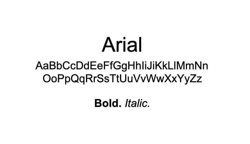
Many designers see Arial as simple or boring, but you can’t deny that it’s a tried and true web safe font. This is perfect for use as a fallback for a more unusual (and not always available) typeface. Plus, it’s highly legible.
2. Times New Roman
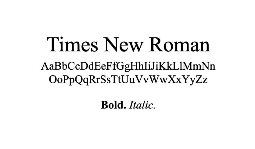
If you appreciate the reliability and simplicity of Arial but would prefer a serif font, Times New Roman is the way to go. Although it’s also somewhat lacking in personality, you can rest assured that it will be viewable on any device.
Related: Your Font Stack Can Increase Your Website’s Conversion Rate
3. Helvetica
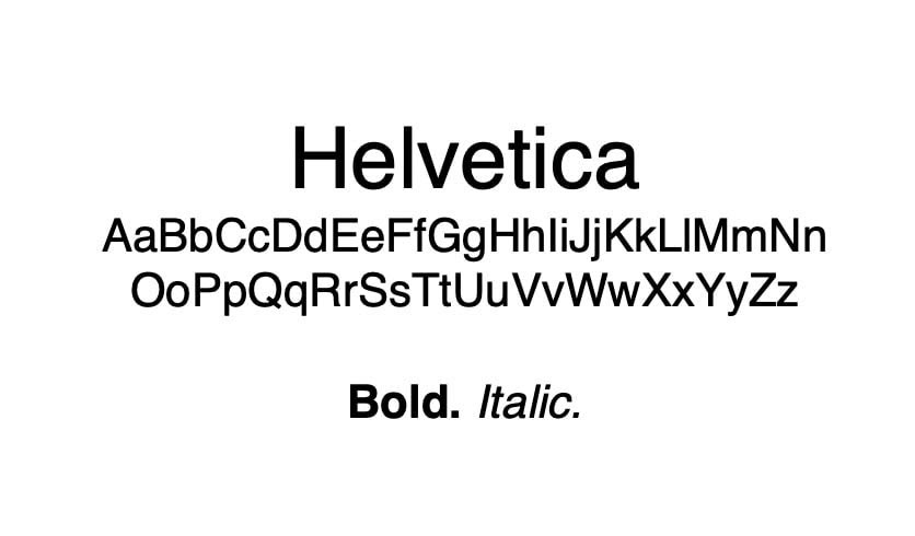
Helvetica is a sans serif font that many prefer as an alternative to Arial. It’s purposefully designed to be industrious and lacking in personality, making it useful for documentation or other no-frills content that you want to make sure is readable.
4. Calibri
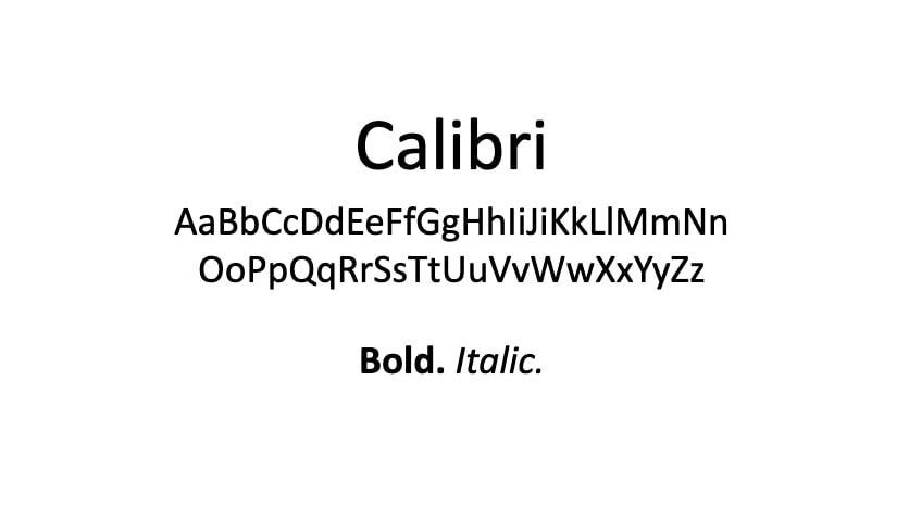
Calibri is another basic sans serif font, similar to Helvetica and Arial. It has been the default font for Microsoft Office for several years now and is an excellent pick for modern businesses and e-commerce sites. By using an unassuming, unintrusive font, you can draw more attention to your products and services.
Related: 11 Ways Your Online Store Can Compete with Mega-Retailers and Win
5. Georgia
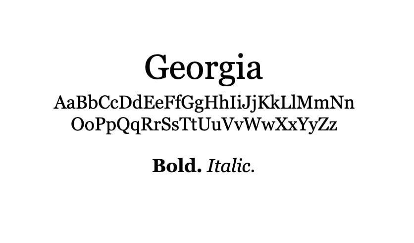
Classy, serifed Georgia has a timeless look that adds to your website’s tone and style without overwhelming the design. It’s ideal for lifestyle blogs and brands that want a slightly softer, not-too-edgy feel.
6. Cambria
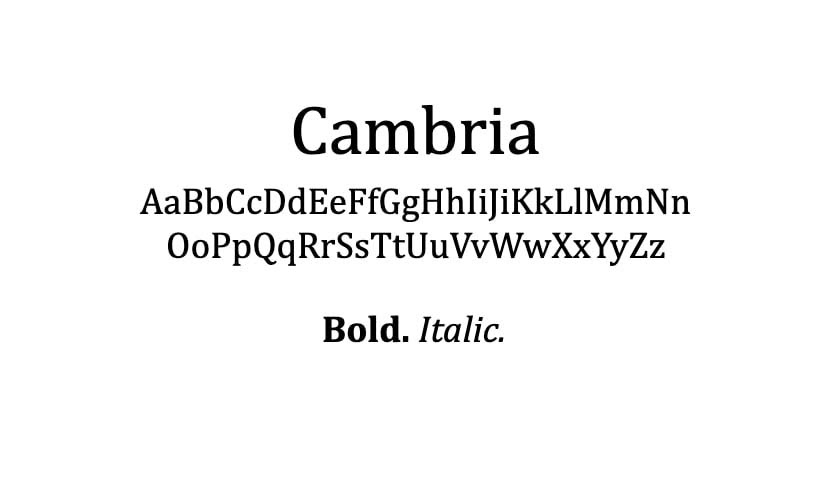
Cambria is similar to Georgia, but with a slightly more modern twist. Its serifs are a little more subtle, which can make it easier to read – especially on smaller screens.
Related: 10 Web Design Lessons You Can Learn From StarWars.com
7. Verdana
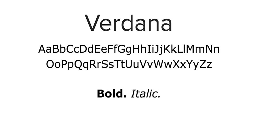
Verdana was designed specifically for on-screen use, and as a result, is particularly easy to read on all devices. It has a classic feel and certainly won’t distract from your content. It adapts well to headings or body text, so you can use it for just about any kind of content.
8. Tahoma
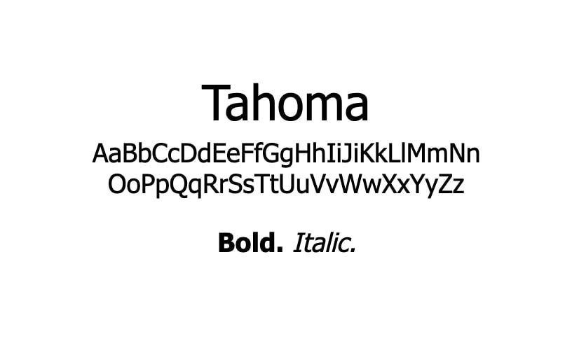
Tahoma is another clear and easy-to-read sans serif font. It’s flexible enough to work well for business sites, blogs, creative portfolios, or whatever else you need it for. The characters are clean, uniform, and easy on the eyes.
9. Trebuchet
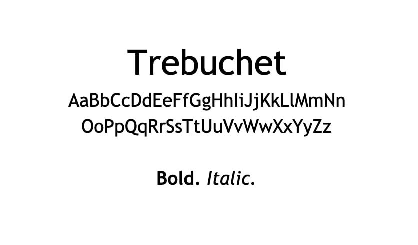
Designed for readability and usage in signs, Trebuchet is the perfect font for headings and titles. It also retains its legibility at smaller sizes, so don’t hesitate to use it in your body text as well.
10. Century Gothic
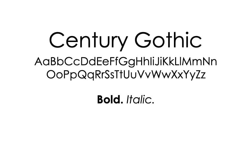
Sleek, clean, and geometric, Century Gothic makes a bold statement in headings and titles. If Arial and Helvetica are too plain for your tastes, but you still want a sharp sans serif font for your site, this one is worth considering.
11. Didot
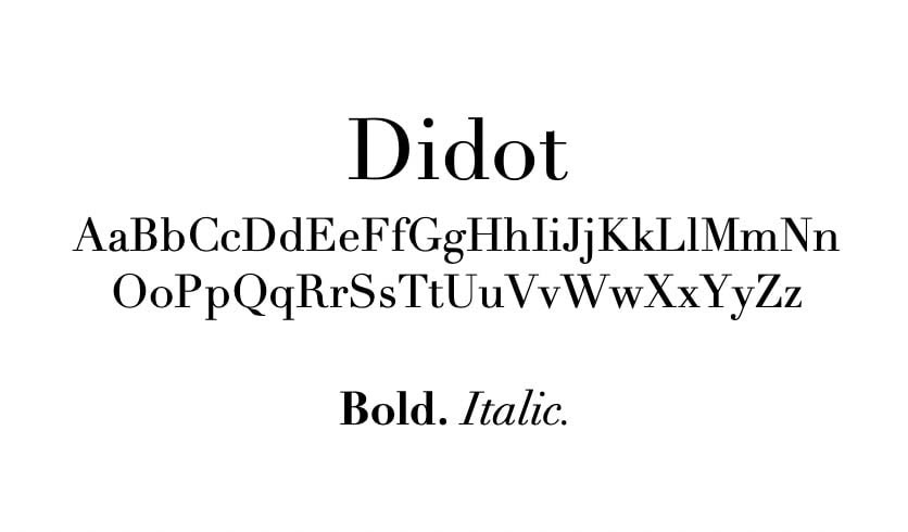
Classic, elegant Didot gives off an intellectual feel that would be well suited to a university site or even some blogs or startups. It features clean, straight lines with minimalist serifs that don’t take away from the text too much.
Related: Your Website Redesign Checklist
12. Bodoni
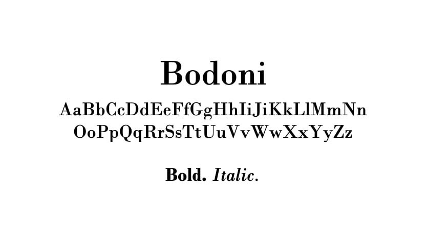
This eye-catching serif typeface is a more interesting alternative to the standard Times New Roman. Edgier than Georgia but not as in-your-face as something like Courier New or Rockwell, Bodoni a great middle-ground if you want your text to have some flair without taking over the design.
13. Calisto
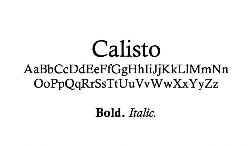
Calisto’s soft lines and dainty serifs give it a feminine air perfect for lifestyle blogging or female-run startups. Its tight spacing may not lend itself well to long blocks of text, but it will look stunning in headings and titles.
Related: 30 Ways to Be an Ally for Women in Tech
14. Candara
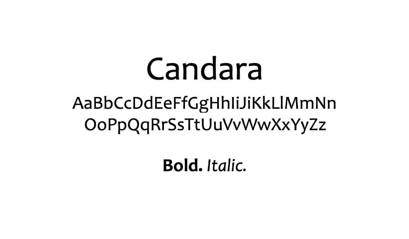
Featured in Microsoft’s ClearType Font Collection, Candara is often seen as one of the less modern-looking sans serif fonts. It projects an open, easy-going attitude that could lend a memorable tone to your website and brand.
15. Optima
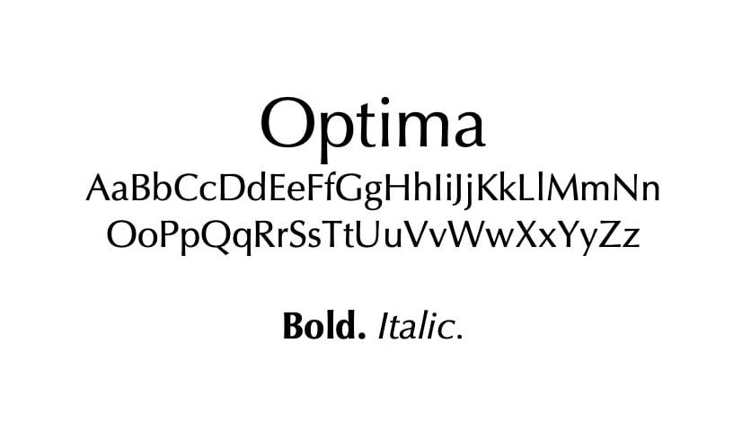
It can be hard to inject a lot of personality into a sleek and clean sans serif typeface, but Optima certainly accomplishes this. It’s memorable enough to lend itself well to developing your brand identity but won’t make long passages feel cluttered or intimidating to readers.
16. Palatino
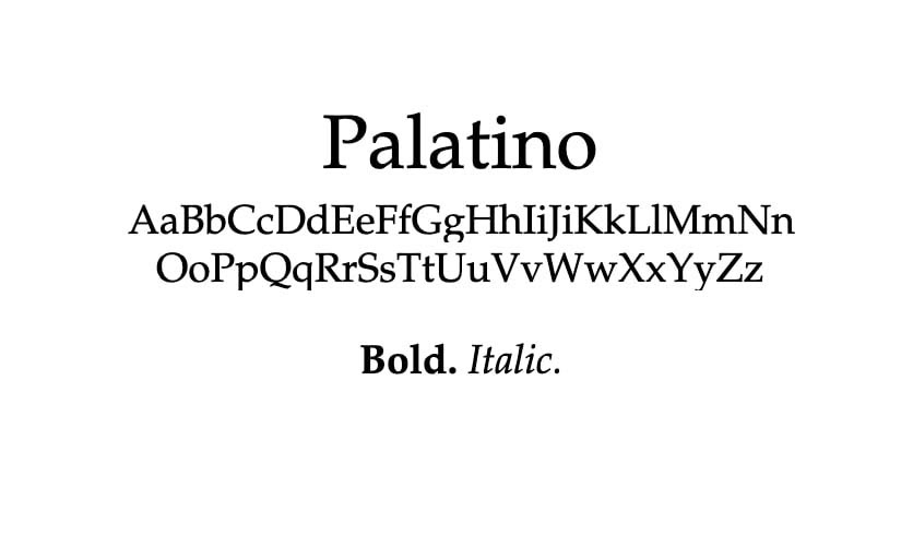
An ideal font for digital magazine headlines and other text that needs to make a bold statement, Palatino is a classic serif font. It feels a little less structured than Georgia and has much more personality than your standard Times New Roman.
17. Quicksand
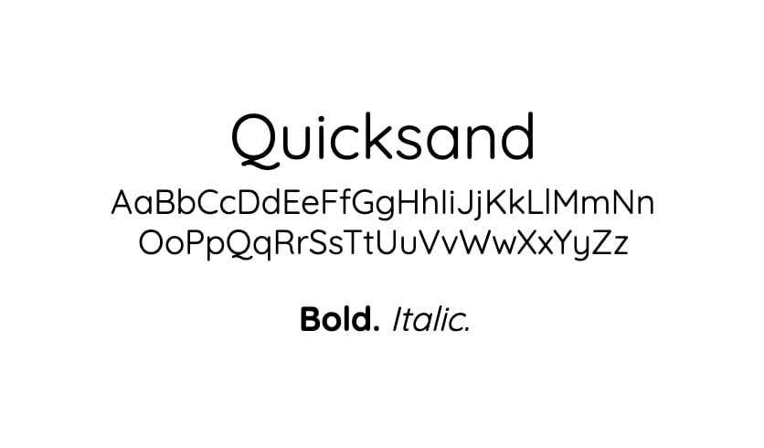
Quicksand is a modern font designed to look good on mobile devices. It’s simple and not too flashy, but still shows enough quirky personality to keep your body text interesting. This fairly streamlined typeface is easy to read as well, making it a solid pick for text-heavy sites.
18. Courier New
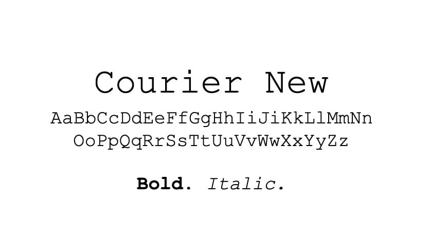
Courier New is a quirky font that is highly recognizable and packs a lot of personality. It is the perfect choice if you want your site to have a more vintage feel and are looking for a strong font that will convey your brand’s identity.
19. Rockwell
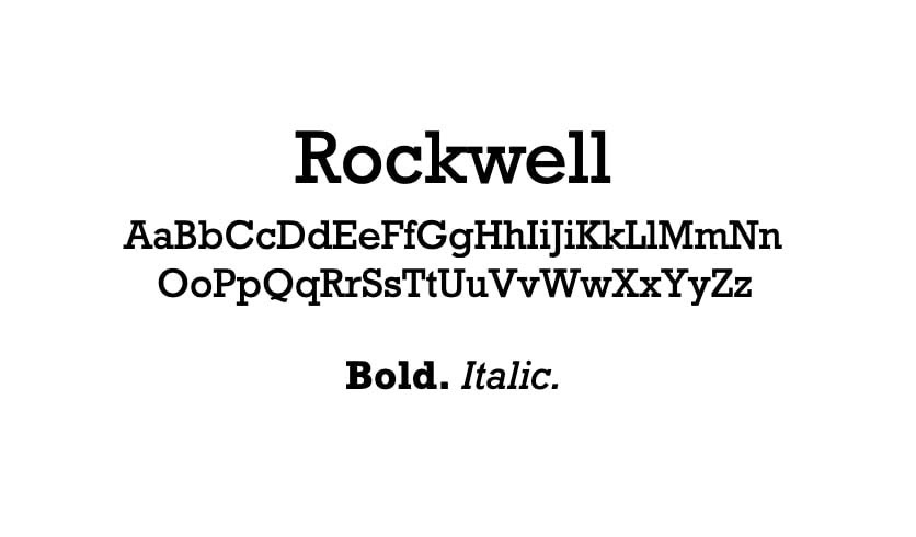
Rockwell’s distinctive serifs are reminiscent of Courier New, only without the overwhelmingly vintage vibe. It may be a little more difficult to read on smaller screens and at smaller sizes, but it can be a fun font for headings and titles.
20. Garamond
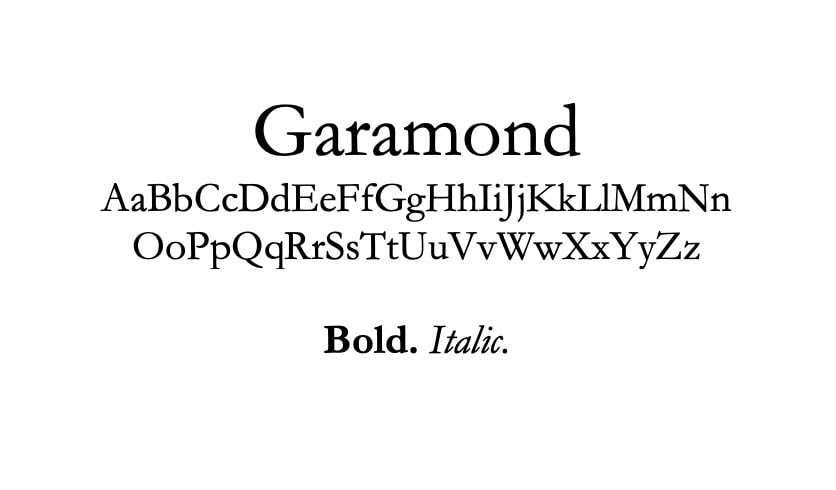
Garamond is a timeless font originally designed in 1615. Unfortunately, it’s easier to read in print than on the web. However, you can still make use of it as an accent typography font in headings, or perhaps even as a part of your logo.
Related: How to Design a Logo for Your Website That Visitors Will Love
21. Copperplate
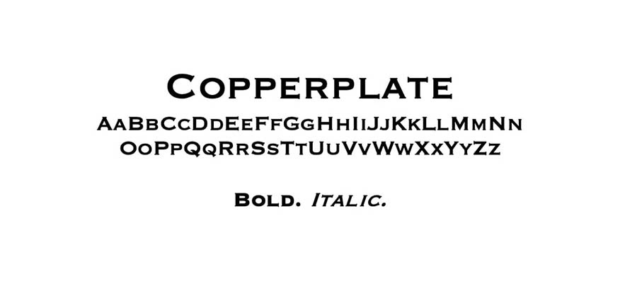
This highly distinctive font is hard to miss and brings an industrial, official feel to your text. Copperplate is the ideal typeface for drawing attention to your headlines or logo. Unfortunately, it could become hard to read when used for smaller body content.
22. Impact
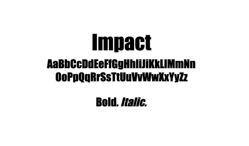
Aptly named, Impact is a statement font that you may want to reserve for headings and titles. This heavy font packs a punch and grabs readers’ attention as they scroll your blog roll or skim your posts for key information.
Get Content Delivered Straight to Your Inbox
Subscribe to our blog and receive great content just like this delivered straight to your inbox.
Where to Download Web Safe Fonts
In short, you shouldn’t have to download web safe fonts. Since they’re already pre-installed on all popular operating systems, you can simply code them into your site using CSS, and they should appear as intended across all devices.
With that being said, if you feel the need to download a web safe font for some reason, you can find them in most of the popular font libraries, such as Google Fonts, DaFont, or FontSpace.
However, keep in mind that just because a typeface is available via one of these resources doesn’t automatically mean it’s web safe.
How to Add Web Safe Fonts to Your Website
You can add fonts to your website with CSS. The best practice is to include your preferred font (which may or may not be web safe) and a fallback font (which should always be web safe). This way, if your primary font choice is not compatible with a user’s operating system, you can still have a say in the backup font that’s shown in its place.
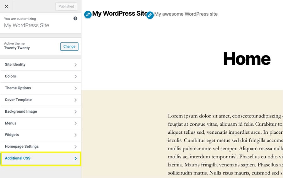
There are a few different options for adding the CSS to incorporate web safe fonts on your website. If you’re using WordPress, you can put it in the Additional CSS section of the Customizer.
Alternatively, you can change your website’s font in its stylesheet (style.css). There should be a fonts and typefaces section of this file where you can specify which fonts should be used for different types of text.
Here’s an example:
p {font-family:Montserrat,Arial,sans-serif; }
In this snippet, we’ve set the paragraph text to display the Montserrat font first. If a user’s device doesn’t have Montserrat installed, Arial will be used instead. You can include more than two fonts if you wish and use different fonts for body text, headings, and titles.
Do You Have a Favorite Web Font?
If you’re not an experienced designer, it’s easy to overlook the importance of your website’s font. However, this element plays an important role in your branding. Choosing a font that isn’t viewable on all devices can disrupt the UX or even prevent visitors from reading your content entirely.
In this post, we’ve explained the significance of web safe fonts and how you can add them to your site. We also shared 22 options that you can use in your upcoming designs, including common sans serif fonts such as Helvetica, classic serif fonts like Georgia, and some unique options, including Courier New and Quicksand.
Are you ready to start designing your new site? With our shared website hosting plans, you can have it up and running in no time. Check them out today!