What is Hue?
A hue can be described as the “color family” of a given color. For example, pink is a hue made by adding white to red.

More About Hue
How Hue is Used in Web Design
Hue is a key component in creating an aesthetically pleasing design. It offers designers the opportunity to draw attention to or away from certain elements of a page, create balance and harmony, or evoke certain moods within their designs.
When used effectively, it can help create a visually appealing website that stands out from the rest. In graphic design and web design specifically, hue helps to create contrast, depth, emphasis, unity, and structure–all important elements for creating a successful design.
Color Palettes
Color palettes or brand style guides are an important part of any website design. Hue plays an integral role in creating a cohesive look and feel across the entire project. Since hue establishes the color scheme, this helps to ensure that all design elements on the page remain consistent with each other and visually pleasing.
Typically, a brand’s color palette will consist of 3-5 primary colors and hues. These colors are chosen to help the website or project evoke certain moods, create contrast, depth, emphasis, unity, and structure.
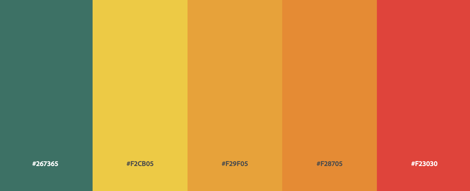
Primary colors can be complemented by secondary and tertiary hues to provide more subtle variations across the page.
Primary Colors
Red, blue, and yellow are considered primary colors when it comes to hue. Understanding how these colors interact is important for beginning designers.
Secondary Colors
Secondary colors are those created by mixing two primary colors together. These include orange, green, and purple. Knowing how these blend into each other will help you create more interesting designs.
Tertiary Colors
Tertiary colors are created by mixing a primary and a secondary color together. These can include warm and cool tones of any of the main six hues. Working with tertiary colors can give your designs more depth and texture.
Conversion Optimization
Using hues and colors effectively can create contrast on a webpage, drawing the eye of potential customers and increasing conversions. Variations in color schemes across the page can help to create visual interest that encourages people to stay longer on a page. Different shades or tones of the same color can also provide more subtle variations across the page.
Using bright colors for calls to action (CTAs) is an established practice in conversion optimization, as they attract attention and draw users towards them. Contrasting colored CTAs against white backgrounds can make them stand out even further, creating an even greater chance of users clicking them. Colors that are too bright or garish may be distracting, so using just the right amount is key in optimizing conversions with color.
Custom Website Design
Get a one-of-a-kind, mobile-friendly website that makes your brand truly shine. Share your vision with us and we'll take it from there.
Custom Web Design