What is Typography?
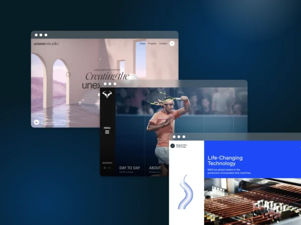
Typography is a process of arranging a typeface in variations of font, size, and spacing. This involves making text’s appearance, style, and arrangement readable and visually pleasing.

More About Typography
Typography vs. Fonts
Typography is the design and visual appearance of text, while fonts refer to the specific typefaces or families used in a typographic design. Fonts are used to create a distinct look for the text, while typography is the overall composition of this look.
The font is an important part of typography in any project as it can help to convey a certain mood or feeling. It can also make words easier to read and draw attention to key elements within the project. By carefully selecting fonts and combining them with other elements such as color, layout, and imagery, designers can tell stories with text that will be visually engaging and impactful.
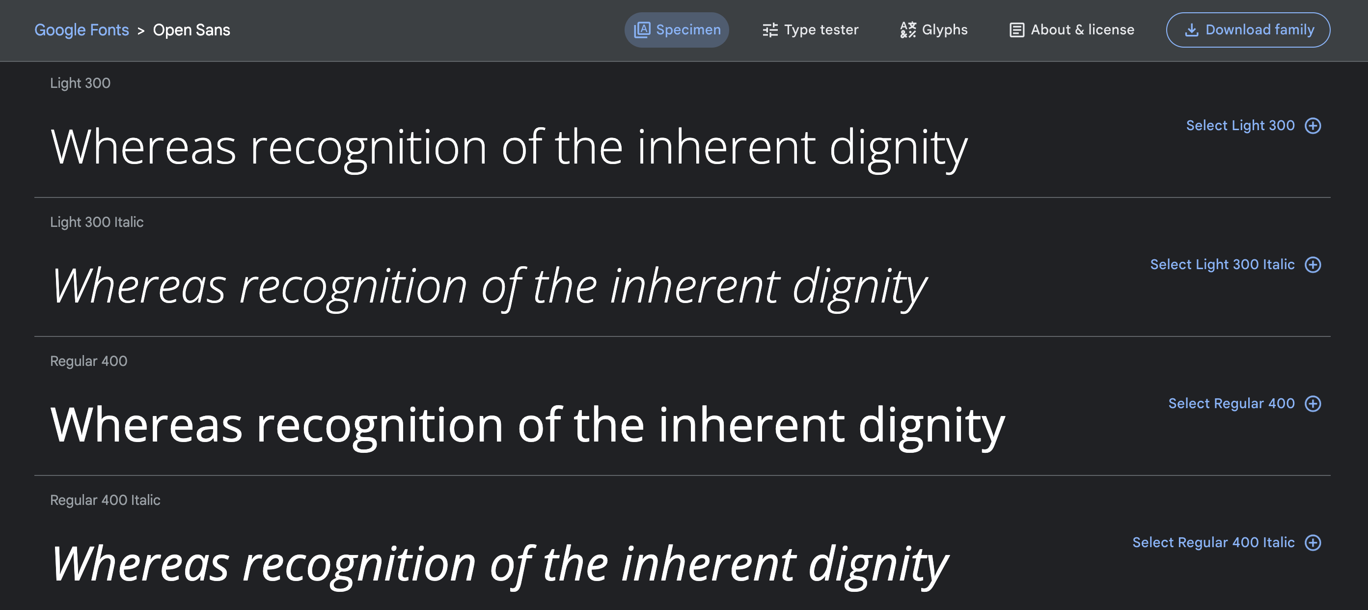
Typography vs. Typefaces
Typography is concerned with the overall visual appeal of a given piece of text. Fonts, on the other hand, are specific typefaces that can be used in typography to add a specific look and feel to the composition.
Though font and typeface are often used interchangeably, they are not the same thing. Fonts refer to the specific design of a letter or character – its size, weight, style, etc. – while a typeface is an overall family of fonts that share certain characteristics such as width and slant. For example, Times New Roman is a typeface with multiple different fonts; these fonts might vary in size from 12 point to 18 point.
When using typography to create visual appeal in design projects, it’s important to remember that fonts and typefaces are separate entities.
Line and Letter Spacing
Line and letter spacing, commonly known as tracking and kerning respectively, are extremely important aspects of typography. Line spacing (or line-height) is the distance between lines of text within a body of type. It can be adjusted to give a visual hierarchy to various pieces of text: adding more space between lines can make the text easier to read by separating sentences or ideas while using fewer line spaces makes it seem like everything is related.
Letter spacing, on the other hand, is the amount of horizontal space between individual letters which helps to create a distinct look for words and phrases in typography. Adjusting this setting can make it easier for readers to differentiate words from each other or create an intentional emphasis on certain words.
By manipulating these two elements within any given composition, designers have powerful tools at their disposal for creating cohesive designs that achieve their visual goals.
Working with Color in Typography
When it comes to using color in typography, there are a few best practices to keep in mind:
Legibility & Accessibility
It’s important to select colors that will be legible and aren’t difficult to read, as well as colors that contrast with the background for visibility.
Purpose & Meaning
Care must be taken when picking colors in order to make sure that the meaning behind the words isn’t lost. For example, red (action, intensity) may symbolize something different than blue (authoritative, trustworthy) or yellow (bright, calming).
Unity
It is also important to take into account the overall look and feel of your design composition when selecting colors for typography since each color may evoke a different emotion or feeling. Choosing colors and hues that create harmony with the rest of your composition will go a long way in creating cohesive designs.
Text Effects
Text effects can be a great way to draw attention to important words or phrases in your design composition, but too many effects can quickly become overwhelming and overly distracting.
Using subtle effects like shadows, outlines, and gradients can add depth and dimension to the overall message that is being conveyed. On the other hand, applying too much text effect will make it look busy and make it difficult for readers to digest the message.
Text effects should be used sparingly to improve readability and maintain a unified visual appeal.