
UPDATE: Our DreamUp with Duda is available to watch now! We discuss in depth about Google’s latest search update and the three approaches for making your website mobile-friendly.
In case you haven’t heard (and let’s be honest, you probably have by now), Google will be switching up its mobile search algorithm on April 21. The search engine-in-chief of the Internet has decreed that “mobile-friendliness” will now be taken into account as a ranking factor. This update is poised to be bigger than either Panda or Penguin, and will have a significant impact on websites worldwide.
Why? If your site does not pass Google’s new Mobile-Friendly Test, it could, and probably will, be severely penalized in mobile search results. However, if it’s properly optimized, you’re likely to see a boost in both your mobile search ranking and organic traffic. But what does Google actually define as “mobile-friendly?”
The biggest rule in mobile search rankings used to be to always maintain fresh, original content on your site. Of course, this is still important, but creating a great user experience has become a critical component as well. This means having a site that’s formatted for the small screen and adhering to some certain design principles. For example, links should be far enough apart that a person’s thumbs can easily click the one they intended to and text should be large enough that it can easily be read without pinching and zooming (16px is a pretty good size).

To meet these new requirements, Google has outlined three approaches for becoming mobile-friendly:
- Traditional Responsive Web Design
- Dynamic Serving
- Separate Mobile Site (m.domain)
However, simply selecting a site type and building it isn’t necessarily enough to pass Google’s new Mobile-Friendly Test. Each one comes with its own unique technical traps and pitfalls that could run you afoul of the new algorithm.
For example, a separate mobile website requires a redirect code to be added to the existing desktop site. A botched setup for a redirect is one of the most common problems site owners across the web are currently facing when trying to bring their sites into line with Google’s update. The good news is, if you’re hosting your existing site with DreamHost, you can quickly and easily create your mobile version without having to mess around with any code.

Why Partner with DreamHost? Simple!
Whether you’re running an e-shop, business website, or killer blog, our hosting plans make it easy to grow.
Choose Your PlanHere’s what the process looks like:
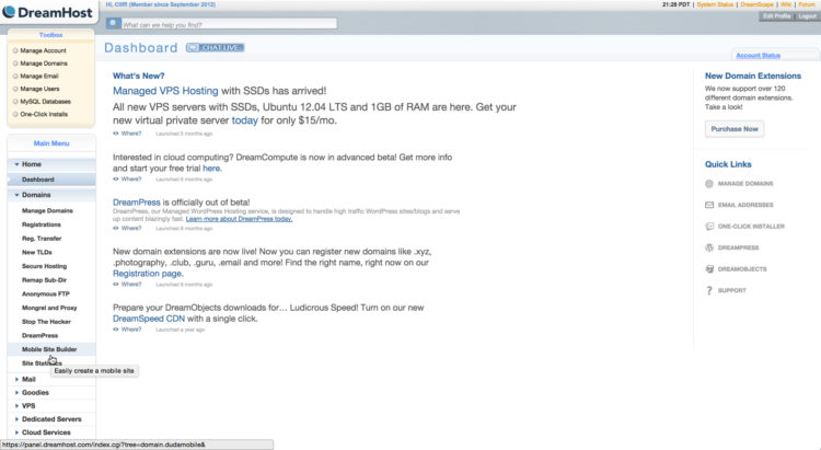
1. Log into your DreamHost Dashboard
2. Select the Domains tab in the Main Menu and click on Mobile Site Builder
3. Select a domain and click “Mobilize”
4. A mobile version of your site will automatically be created and you will have the option to publish it, edit its design or delete it (we recommend selecting to edit it because this is also where you will see a preview of what you’re publishing
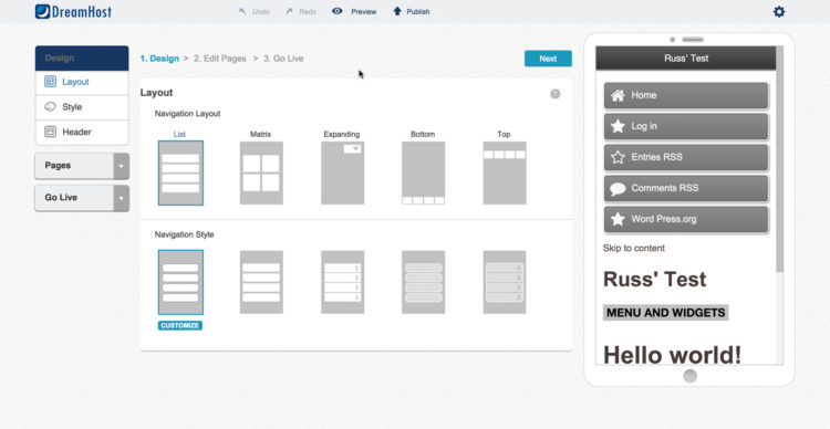
5. You will then be shown a drag-and-drop editor so you can edit the site to your liking
6. Once finished, exit the editor and click the publish icon
This is a very efficient way to prepare yourself for April 21, but if you’re thinking it’s time for a website overhaul, you may want to consider creating a brand new responsive website or one based on dynamic serving.
Just like a dedicated mobile website, both will work for the Google update; but also just like a mobile site, they both have their own unique challenges.
For dynamic serving, it’s essential that you signal to Google that the site is based on dynamic serving technology, instead of responsive design. This can be accomplished by adding an HTTP header setting to the website that indicates the website varies content based on the use-agent. This lets Google know that they should expect different content on different device types.

When building a responsive website from the ground up, it’s wise to begin building for the small screen first and then scale up to the desktop. This ensures that you aren’t adding any coding (like a custom table) that would render your site unfriendly for mobile, and delivers the best possible user experience. That latter point is possibly the most important takeaway from this SEO update.
For Google mobile experiences matter more than ever, but this is good news for site owners across the world. In all three methods of site building, if you’ve created an optimal experience, users are much more likely to engage with the site, which of course drives more conversions. And with some estimates as high as 60% of online searches now coming from mobile, the necessity of being mobile-friendly can no longer be ignored.
Watch: Google Declares Mobile-Friendly A Must for Websites

Itai Sadan is the CEO of Duda, an industry-leading website builder that helps small businesses connect with potential customers anywhere, anytime and anyplace. Itai’s mobile web and small business website expertise has been cited by USA Today, Website Magazine, The Huffington Post, Mobile Entertainment and more. He speaks regularly on the local, mobile and social space at industry events hosted by such organizations as BIA Kelsey, Constant Contact, Local Search Association and the Israeli Conference.