Greetings. Jace here again, pulling back the creative curtain to share how the newly redesigned DreamHost logo came about. In this post, we’ll discuss what influenced the change-up, who was involved, early concepts, and of course, how we ended up with a winner.
Cool? Let’s dive in.
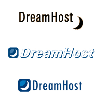
DreamHost has had three (notable) logo redesigns since 1997, with the last one being introduced in 2006. Throughout all of these renditions, the moon mark, or icon, has been the visual anchor. Some would even argue that it’s the most iconic piece of DreamHost’s identity, and it’d be tough to disagree with that.
Related: How to Design a Logo for Your Website That Visitors Will Love
Here’s the past logos, sexy as they wanna be:
So why the decision to redesign it for the fourth time? The easy answer would be that we wanted a fresh logo to compliment the new website design we’ve been working on. The deeper answer, as mentioned in the first blog post of this series, would be that we’ve grown quite a bit since the last redesign, and we wanted that to reflect through a fresh identity.
The design team was asked to develop a handful of concepts that incorporated the classic DreamHost look and feel, as well as some concepts that would push the envelope of change, and pitch them to the redesign committee. The committee consisted of our founders, as well as the CEO, the VP of Marketing and Communication, and a handful of other associates that we felt would benefit the project. We then put our heads together, threw some ideas around, and came up with a slew of different concepts that would be presented to the committee. Here’s a handful of those concepts:
The initial feedback from the committee was positive, and we ended up choosing three exciting concepts to expand on. Since there were three designers involved in the conception, we thought it would be a fun idea to give each designer one of the concepts, and let them further the design on their own. Here’s what came of it:
The first concept was one of my personal favs, sportin’ a fun tip of the cap to the old school moon while bringing the look forward with the futuristic, thin-stroke typeface. The second concept was the committee’s fav. Most likely because it was a familiar concept that resembled the logo that was currently being used; with that said, this particular rendition of the old logo gave off a sharper, more sophisticated look than the old logo. The third and final concept steered away from the moon and introduced a dreamcatcher icon in its place. While the story behind the dreamcatcher concept received a lot of praise, as a group, we felt that it moved too far away from our identity’s anchor – the moon – and leaned more towards the first two concepts as we sent out the company survey.
Yes, you read correctly: a company-wide vote went down.
I’ve been a professional designer and creative director for a while now. I’ve been a part of many company rebrands, both big and small, and never have I been asked to put logos up to a company-wide vote. I was James Van Der Beek’ing at the thought of putting all of our hard work up on a panel, because designing by committee isn’t necessarily the best way to determine how logos should be designed; however, DreamHost has a very democratic way of doing things – especially when it comes to suggesting change – so I went along with it, hoping for the best.
To my surprise, the vote was extremely eye-opening. The idea of having a fresh, polished look had excited everyone, and the amount of constructive feedback and support was incredible. Once the votes and input were tallied, concept number two pulled ahead as the most popular logo to run with. We then went back to the committee, shared the results, and agreed that it would be the one that we groom into our new logo:
Why number two? Why go with something that resembled the old one and not try out a visual anchor other than the moon? Sure, we entertained out of the box concepts throughout the redesign, but the goal here was to develop a look and feel that would complement the company’s growth and current status; not to just go with something different.

The DreamHost Logo Isn’t all We’re Known For
Web hosting is our specialty! We’ll make sure your website is fast, secure, and always up so your visitors trust you. Plans start at $2.59/mo.
Choose Your PlanThe DreamHost moon has been with us since the beginning. The icon is in our DNA, and it has been in front of millions of web users for nearly two decades. The new logo carries that old school swagger with the freshly refined moon icon, which is now facing forward – note the symbolism there – while the easy to digest typeface sits bold and confident. It made sense, and we all fell in love with it.

So, what comes next(?) The scoop on the redesign of DreamHost.com! Bookmark this bad boy, and/or keep your eyes on the DreamHost Facebook and Twitter feeds for the next installment of this blog post series.