The Great Pop-Up Debate (and Other Dark UX Problems)
User-centered web design is an almighty doctrine, ruling over countless online businesses and website owners across the galaxy. With user experiences and conversions critical to a site’s success, developers are keen to create layouts that guide visitors to predetermined outcomes.
With such a legacy to uphold, the UX design canon can be used for good or evil — much like the Force of Star Wars lore.
UX design Jedis opt for clear navigation, readable fonts, and strong color schemes; Sith-like developers, however, are typically behind hidden fees, hard-to-escape introductory periods, and the email lists that are impossible from which to unsubscribe.
However — and this is said with a grain of salt from the cantina — some parts of the dark side aren’t always as bad as we’ve been led to believe. Any well-meaning child of unknown parentage naturally flirts with the dark side when trying to harness the UX powers of growing a subscriber list or attracting more sales.
For instance, when do pop-up messages turn from business-boosting devices for engagement into experience-killing tools of spam?
We’ll dive into this question, along with the many other nuances of UX design in the sections below. Recognizing elements of the dark side and repackaging them into honorable, effective designs can help developers restore a balance in their website’s Force.
We’ll Always Support Your Dreams
Whatever your online goals, DreamHost will be right there with you, making sure your site is fast, secure, and always up. Plans start at $2.59/mo.

What is Dark UX, Anyway?
Dark UX, also known as dark patterns, capitalize on common online reading and browsing behaviors to trick visitors into buying or signing up for things they didn’t want. DarkPatterns.org crafted a list of the most common types of UX indiscretions. We’ve highlighted a few below:
- Roach Motel: A tactic commonly used for email subscriptions and free trials, companies suck you in with pre-checked boxes or tricky wordings to questions — then make it hard to cancel or opt out of services. Think of “Hotel California” by The Eagles: “You can check out any time you like, but you can never leave.”
- Forced Continuity: Who hasn’t signed up for a discounted introductory period of something you think you need, only to forget about it and later find the charges on your credit card statement? Then, the company makes canceling the automatic renewals far too complicated. Welcome to forced continuity.
- Hidden Costs: Hotels and airlines are notorious for this, though businesses of all types can sneak extra charges into the checkout process. The processing and convenience charges for those concert tickets? The exorbitant cleaning fee on that bargain Airbnb you discovered? All versions of dark UX.
- Sneak Into Basket: In another version of hidden costs, companies might slip add-on products into your shopping cart during the checkout process to run up your bill. This tactic is also known as negative-option billing.
DarkPatterns.org compiles a Hall of Shame to ridicule the worst offenders of dark UX. Email marketers and e-commerce shops are commonly among the most egregious dark pattern users. The numbers-driven side of online business sometimes means ethical corners might be cut in the name of increasing traffic and revenue.
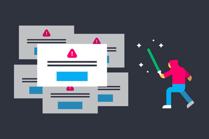
Pop-up modals can alert your customers to sale prices or encourage visitors to sign up for your newsletter to stay abreast of the latest news — or they can appear as disguised ads and redirect traffic for a more lucrative outcome.
Related: 10 Web Design Lessons You Can Learn From StarWars.com
Lighter Paths to UX Success
Sadly, we’ve seen several hosting providers deploy the “Sneak Into Basket” maneuver — for example, keep an eye out for surreptitiously-added security features or extra software, for example. Don’t worry, though; we’ll never do the same to you.
Instead, DreamHost offers customers a path to the light side: free domain privacy and genuinely optimized hosting infrastructure with ultra-performant solid-state drives. Fast web hosting can make all the difference in user-centered design experiences, as impatience and short attention spans lead potential customers to abandon your site in a fraction of a second.
For WordPress users, that means our SSDs are coupled with a cloud-based platform, automatic updates, and daily malware scans. DreamHost WordPress hosting reviews regularly praise our uptime and reliability, along with a generous money-back guarantee. Our fine-tuned web application firewall and free SSL certificates ensure secure browsing experiences and garner visitors’ trust, making them more likely to convert to paying or subscribing customers.
On the design front, Shneiderman’s Eight Golden Rules provide great goals for your noble UX aspirations: consistency, transparency, and the ability for users to reverse their actions should all lead the way when you’re designing or redesigning your website for 2018.
Types of Pop-Ups
Love ‘em or hate ‘em, pop-ups — also called modals, overlays, and interstitials — can be effective tools to disrupt a user’s mindless browsing and jolt their attention. Once you’ve woken up your readers and gotten them to concentrate on a very focused part of their screen, they’ll be more likely to do what the design encourages.
Before we get into the nitty-gritty analysis of how to use pop-ups effectively, let’s cover some groundwork and explain the basic types of pop-ups you might choose to deploy:
- Entry: On the bright side, every visitor will see entry pop-ups, which appear before visitors have a chance to view the page. The presence, however, is a double-edged sword. While effective, entry pop-ups carry the distinction of being the most UX-damaging.
- Timed: As the name suggests, timed pop-ups give users a chance to absorb some of your content before being interrupted. The length of the delay should be adjusted and tested to see what has the best effect.
- Scrolling: When visitors demonstrate an interest in your content by reading through an article or product description, scrolling pop-ups provide supplemental information or opportunities to deepen the user experience.
- Exit-Intent: Another way to use real-time user feedback, exit-intent pop-ups appear as a visitor’s mouse is headed toward the top of the page, meaning that person is getting ready to navigate elsewhere. These pop-ups are particularly useful for landing pages, as the extra information might tip the scales in favor of conversion.
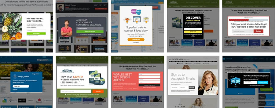
For one of the most aggravating experiences you’ll ever have when learning about the types of pop-ups, go to this Wishpond guide that seemingly tries to use as many as possible. There’s an overlay message, an entry modal, one triggered by scrolling, and an exit-intent pop-up. Add in the top banner, or what the company calls a click pop-up, and you can see precisely why site owners should be careful and discerning when using pop-ups.
Pros and Cons of Pop-Ups
Pop-ups’ reception in web design and development can be thought of like national politics: relatively small groups feel extremely passionate and polarized about the benefits and drawbacks, while the majority of users feel overwhelmed and unsure. In fact, when Justinmind asked if pop-ups were “here to stay,” more than half of respondents were undecided; roughly 20 percent defended pop-ups, while the same number of people wished for their destruction.
Those who support pop-ups argue that interruption marketing boosts conversion rates. Even if a user isn’t encouraged to buy a product after a pop-up introduces an exclusive deal, the tool is a fantastic way to collect email addresses for follow-up messages and continuing the relationship. Additionally, pop-ups extend users’ interactions with a website, perhaps lowering bounce rates.

People against using pop-ups, however, maintain that pop-ups frequently detract from an online brand’s credibility. In particular, exit-intent pop-ups can seem needy or insecure. Obviously, websites with poorly executed pop-ups risk annoying or angering visitors to the point where they won’t return because of the negative user experience.
Need an ally against pop-ups? How about the creator of pop-up advertising, who apologized in 2014 for creating “one of the most hated tools” in online marketing.
Possibly because pop-ups’ effectiveness is so dependent on how they’re deployed, the strategy can greatly help or harm your user experience — and, as such, significantly help or harm your conversions. How much risk are you willing to take?
How to Use Pop-Ups More Effectively
The Justinmind survey about audience reactions to pop-ups also revealed that website visitors were more likely to accept the engagement tool if it forces them to confirm an action or decision, provides useful feedback or advice, or focused them on one relevant task or piece of content. To ensure your pop-ups meet one of these criteria, here are some other quick tips you should consider:
- Don’t use entry pop-ups. Yes, everyone will see the message, but you’re putting up a barrier between your visitors and the information they’re seeking. Instead, rely on user engagement to display scrolling or exit-intent modals. Even timed pop-ups give readers a chance to connect with your brand before their experience is interrupted.
- Segment your audience and solve their particular problems. Use your analytics to craft different messages for new versus returning visitors, for example. Potential customers in the early stages of the buying process are more likely to sign up to receive more information, while those who are ready to convert might want some last-minute deal to convince them to hit the buy button.
- Focus on one outcome at a time. Whether you want to drive sales, build up an email marketing list, or improve customer service, you get one chance to redirect your reader — so don’t blow it. Make a concentrated effort to improve one part of your online business before moving on to the next goal.
- Only ask for what you need. Here, the “less is more” mantra is your friend. The more things you ask your web traffic to do, the less likely it is that anything will get accomplished. For newsletter subscriptions, all you need is an email address. If you want to personalize or segment your messages in the future, you can follow up to get names, locations, and other information.
- Offer an incentive or reward. Contrary to what you might like to think, access to your monthly newsletter doesn’t mean much to your readers. Offer potential customers a discount, for example, to get them to either make a purchase or fork over their email address.
As a website or small business owner, you’ll be hard-pressed to find a user that falls in love with your pop-ups. By keeping a few best practices in mind, however, you can keep readers from grumpily abandoning your site.
Programs That Make Pop-Ups Manageable for Non-Techies
If you still want to take the pop-up plunge, procuring the right platform is paramount. Just as selecting the right hosting provider or content management system guides your website’s performance, security, and overall success, the same can be said about which program you use to deploy, tweak, and test your pop-up messages.

For those site admins looking for pop-ups to fill out their subscriber lists, you should first check with your email marketing service provider. Most, including MailChimp and AWeber, already have their own suite of tools you can either embed directly onto your site or integrate with via plugins.
You could also check out OptinMonster. Wildly popular among WordPress enthusiasts, this plugin offers a wide variety of campaign options, including pop-ups, floating headers and footers, and mobile-specific forms.
Whichever route you take, find a solution that lets you customize the pop-up design and track performance metrics. Compare offerings based on integrations, support, designs, mobile-friendliness, and reporting tools. That’ll come in handy for our next section!
When in Doubt: Test, Test, Test!
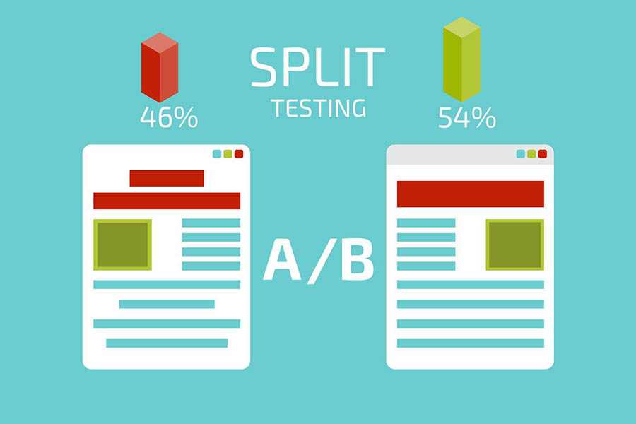
Even though we’ve covered the light and dark sides of pop-ups and UX design, implementations of the strategy can fall anywhere on the spectrum. Even if you refuse to stray from the honorable side of the Force, you’ll want to test, measure, and analyze the effectiveness of your campaigns. Every pixel, word, and punctuation mark can have surprising effects on your users’ willingness to convert.
Instead of blindly flailing about in the dark, gauge the impacts of incremental changes with A/B testing. Your audience will unknowingly be split and shown different variations of your website or pop-up messages. You can then examine the metrics to see which option converted better.
Most worthy pop-up platforms, including the ones listed above, include some sort of testing and analytics system — but it might be part of a premium plan that you can’t quite yet afford. For do-it-yourself testing, Evergage created a fantastic write-up explaining what elements are most important to test and how to succeed:
- Headlines: Find what clear and relevant language resonates the most, then adjust the font, color, and alignment.
- Box Design: What colors, dimensions, and imagery perform best? Discover what emotions your theme evokes.
- Escape Routes: How your visitors close the message can have grave light-versus-dark UX implications, but this could impact your conversions as well. Will you have a clear X or exit button or should visitors click on the background outside the pop-up?
- Body Copy: Maybe you want to use a lot of words, maybe you don’t. Perhaps you’ve got facts to back up your point, while others will make an emotional appeal.
- Call to Action: Use active verbiage to tell your readers exactly what you wish them to do, then dive into the colors, size, positioning, and functionality of the button. Do you know how much of a difference rounded corners make? Neither do we!
If you decided to concentrate your efforts on timed pop-ups, obviously that’s a key figure to get just right. A minute seems to be a good place to start, but each industry, business, and audience is different. Also, be sure to revisit your tests regularly to stay on top of user trends.
Get Content Delivered Straight to Your Inbox
Subscribe to our blog and receive great content just like this delivered straight to your inbox.
Why Sacrificing UX Can Be OK — Sometimes
As Yoda said, “A Jedi uses the Force for knowledge and defense, never for attack.” Pop-ups may increase conversions, but they also might annoy your audience. Designers are often caught between the dark side and the light side of UX design, but even they can agree pop-ups are an undeniably effective Force.
Even though it might feel like you’re losing a bit of honor by adopting pop-ups, the audience-building tool supports and grows your business and enables you to carry out more virtuous missions elsewhere on your website.
Ultimately, you must find balance in the Force by aspiring to be a design Jedi worthy of Yoda and Obi-Wan Kenobi’s tutelage. Do or do not. There is no try.